Display Pop-ups
Displaying an alert, asking a user to make a choice, or displaying a prompt is a common UI task. Xamarin.Forms has three methods on the Page class for interacting with the user via a pop-up: DisplayAlert, DisplayActionSheet, and DisplayPromptAsync. They are rendered with appropriate native controls on each platform.
Display an alert
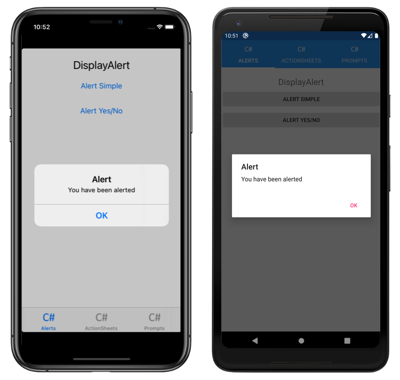
All Xamarin.Forms-supported platforms have a modal pop-up to alert the user or ask simple questions of them. To display these alerts in Xamarin.Forms, use the DisplayAlert method on any Page. The following line of code shows a simple message to the user:
await DisplayAlert ("Alert", "You have been alerted", "OK");
This example does not collect information from the user. The alert displays modally and once dismissed the user continues interacting with the application.
The DisplayAlert method can also be used to capture a user's response by presenting two buttons and returning a boolean. To get a response from an alert, supply text for both buttons and await the method. After the user selects one of the options the answer will be returned to your code. Note the async and await keywords in the sample code below:
async void OnAlertYesNoClicked (object sender, EventArgs e)
{
  bool answer = await DisplayAlert ("Question?", "Would you like to play a game", "Yes", "No");
  Debug.WriteLine ("Answer: " + answer);
}
The DisplayAlert method also has overloads that accept a FlowDirection argument that specifies the direction in which UI elements flow within the alert. For more information about flow direction, see Right-to-left localization.
Warning
By default on UWP, when an alert is displayed any access keys that are defined on the page behind the alert can still be activated. For more information, see VisualElement Access Keys on Windows.
Guide users through tasks
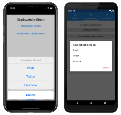
The UIActionSheet is a common UI element in iOS. The Xamarin.Forms DisplayActionSheet method lets you include this control in cross-platforms apps, rendering native alternatives in Android and UWP.
To display an action sheet, await DisplayActionSheet in any Page, passing the message and button labels as strings. The method returns the string label of the button that was clicked by the user. A simple example is shown here:
async void OnActionSheetSimpleClicked (object sender, EventArgs e)
{
  string action = await DisplayActionSheet ("ActionSheet: Send to?", "Cancel", null, "Email", "Twitter", "Facebook");
  Debug.WriteLine ("Action: " + action);
}
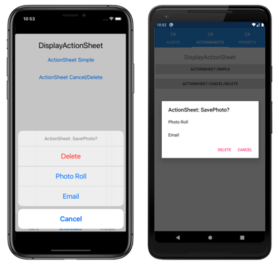
The destroy button is rendered differently to the other buttons on iOS, and can be left null or specified as the third string parameter. The following example uses the destroy button:
async void OnActionSheetCancelDeleteClicked (object sender, EventArgs e)
{
  string action = await DisplayActionSheet ("ActionSheet: SavePhoto?", "Cancel", "Delete", "Photo Roll", "Email");
  Debug.WriteLine ("Action: " + action);
}
The DisplayActionSheet method also has an overload that accepts a FlowDirection argument that specifies the direction in which UI elements flow within the action sheet. For more information about flow direction, see Right-to-left localization.
Display a prompt
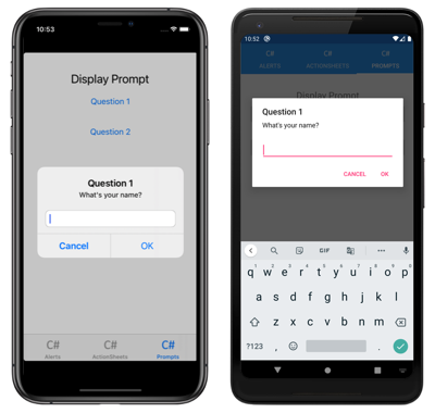
To display a prompt, call the DisplayPromptAsync in any Page, passing a title and message as string arguments:
string result = await DisplayPromptAsync("Question 1", "What's your name?");
The prompt is displayed modally:
If the OK button is tapped, the entered response is returned as a string. If the Cancel button is tapped, null is returned.
The full argument list for the DisplayPromptAsync method is:
title, of typestring, is the title to display in the prompt.message, of typestring, is the message to display in the prompt.accept, of typestring, is the text for the accept button. This is an optional argument, whose default value is OK.cancel, of typestring, is the text for the cancel button. This is an optional argument, whose default value is Cancel.placeholder, of typestring, is the placeholder text to display in the prompt. This is an optional argument, whose default value isnull.maxLength, of typeint, is the maximum length of the user response. This is an optional argument, whose default value is -1.keyboard, of typeKeyboard, is the keyboard type to use for the user response. This is an optional argument, whose default value isKeyboard.Default.initialValue, of typestring, is a pre-defined response that will be displayed, and which can be edited. This is an optional argument, whose default value is an emptystring.
The following example shows setting some of the optional arguments:
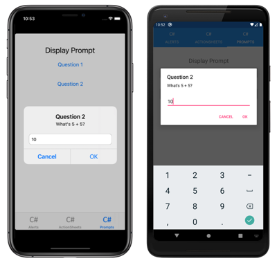
string result = await DisplayPromptAsync("Question 2", "What's 5 + 5?", initialValue: "10", maxLength: 2, keyboard: Keyboard.Numeric);
This code displays a predefined response of 10, limits the number of characters that can be input to 2, and displays the numeric keyboard for user input:
Warning
By default on UWP, when a prompt is displayed any access keys that are defined on the page behind the prompt can still be activated. For more information, see VisualElement Access Keys on Windows.
