Summary of Chapter 25. Page varieties
Note
This book was published in the spring of 2016, and has not been updated since then. There is much in the book that remains valuable, but some of the material is outdated, and some topics are no longer entirely correct or complete.
So far you've seen two classes that derive from Page: ContentPage and NavigationPage. This chapter presents two others:
MasterDetailPagemanages two pages, a master and a detailTabbedPagemanages multiple child pages accessed through tabs
These page types provide more sophisticated navigation options than the
NavagationPage discussed in Chapter 24. Page Navigation.
Master and Detail
The MasterDetailPage defines two properties of type Page: Master and Detail. Generally you set each of these properties to a ContentPage. The MasterDetailPage displays and switches between these two pages.
There are two fundamental ways to switch between these two pages:
- split where the master and detail are side by side
- popover where the detail page covers or partially covers the master page
There are several variations of the popover approach (slide, overlap, and swap), but these are generally platform dependent. You can set the MasterDetailBehavior property of MasterDetailPage to a member of the MasterBehavior enumeration:
However, this property has no effect on phones. Phones always have a popover behavior. Only tablets and desktop windows can have a split behavior.
Exploring the Behaviors
The MasterDetailBehaviors sample allows you to experiment with the default behavior on different devices. The program contains two separate ContentPage derivatives for the master and detail (with a Title property set on both), and another class that derives from MasterDetailPage that combines them. The detail page is enclosed in a NavigationPage because the UWP program wouldn't work without it.
The Windows 8.1 and Windows Phone 8.1 platforms require that a bitmap be set to the Icon property of the master page.
Back to School
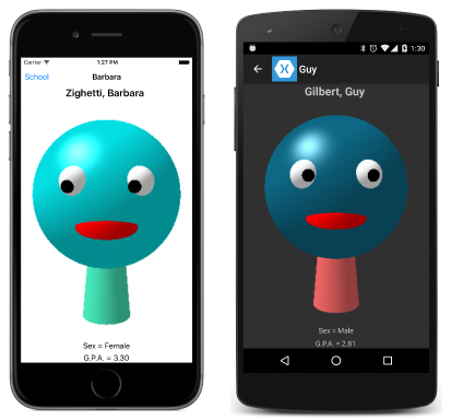
The SchoolAndDetail sample takes a somewhat different approach to constructing the program to display students from the SchoolOfFineArt library.
The Master and Detail properties are defined with visual trees in the SchoolAndDetailPage.xaml file, which derives from MasterDetailPage. This arrangement allows data bindings to be set between the master and detail pages.
That XAML file also sets the IsPresented property of MasterDetailPage to True. This causes the master page to be displayed at startup; by default the detail page is displayed. The SchoolAndDetailPage.xaml.cs file sets IsPresented to false when an item is selected from the ListView in the master page. The detail page is then displayed:
Your own user interface
Although Xamarin.Forms provides a user interface for switching between the master and detail views, you can supply your own. To do so:
- Set the
IsGestureEnabledproperty tofalseto disable swiping - Override the
ShouldShowToolbarButtonmethod and returnfalseto hide the toolbar buttons on Windows 8.1 and Windows Phone 8.1.
You must then provide a means to switch between the master and detail pages, such as demonstrated by the ColorsDetail sample.
The MasterDetailTaps sample demonstrates another approach using a TapGestureRecognizer on the master and detail pages.
TabbedPage
The TabbedPage is a collection of pages that you can switch among using tabs. It derives from MultiPage<Page> and defines no public properties or methods of its own. MultiPage<T>, however, does define a property:
Childrenproperty of typeIList<T>
You fill this Children collection with page objects.
Another approach allows you to define the TabbedPage children much like a ListView using these two properties that generate the tabbed pages automatically:
ItemsSourceof typeIEnumerableItemTemplateof typeDataTemplate
However, this approach does not work well on iOS when the collection contains more than a few items.
MultiPage<T> defines two more properties that let you keep track of which page is currently viewed:
CurrentPageof typeT, referring to the pageSelectedItemof typeObject, referring to the object in theItemsSourcecollection
MultiPage<T> also defines two events:
PagesChangedwhen theItemsSourcecollection changesCurrentPageChangedwhen the viewed page changes
Discrete tab pages
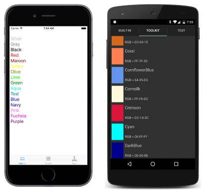
The DiscreteTabbedColors sample consists of three tabbed pages that display colors in three different ways. Each tab is a ContentPage derivative, and then the TabbedPage derivative DiscreteTabbedColorsPage.xaml combines the three pages.
For each page that appears in a TabbedPage, the Title property is required to specify the text in the tab, and the Apple Store requires that an icon be used as well, so the Icon property is set for iOS:
The StudentNotes sample has a home page that lists all the students. When a student is tapped, this navigates to a TabbedPage derivative, StudentNotesDataPage, that incorporates three ContentPage objects in its visual tree, one of which allows entering some notes for that student.
Using an ItemTemplate
The MultiTabbedColor sample uses the NamedColor class in the Xamarin.FormsBook.Toolkit library. The MultiTabbedColorsPage.xaml file sets the DataTemplate property of TabbedPage to a visual tree beginning with ContentPage that contains bindings to properties of NamedColor (including a binding to the Title property).
However, this is problematic on iOS. Only a few of the items can be displayed, and there is no good way to give them icons.

