Using Custom Controls with the iOS Designer
Warning
The iOS Designer was deprecated in Visual Studio 2019 version 16.8 and Visual Studio 2019 for Mac version 8.8, and removed in Visual Studio 2019 version 16.9 and Visual Studio for Mac version 8.9. The recommended way to build iOS user interfaces is directly on a Mac running Xcode. For more information, see Designing user interfaces with Xcode.
Requirements
The Xamarin Designer for iOS is available in Visual Studio for Mac and Visual Studio 2017 and later on Windows.
This guide assumes a familiarity with the contents covered in the Getting Started guides.
Walkthrough
Important
Starting in Xamarin.Studio 5.5, the way in which custom controls are created is slightly different to earlier versions. To create a custom control, either the IComponent interface is required (with the associated implementation methods) or the class can be annotated with [DesignTimeVisible(true)]. The latter method is being used in the following walkthrough example.
Create a new solution from the iOS > App > Single View Application > C# template, name it
ScratchTicket, and continue through the New Project wizard:Create a new empty class file named
ScratchTicketView:Add the following code for
ScratchTicketViewclass:using System; using System.ComponentModel; using CoreGraphics; using Foundation; using UIKit; namespace ScratchTicket { [Register("ScratchTicketView"), DesignTimeVisible(true)] public class ScratchTicketView : UIView { CGPath path; CGPoint initialPoint; CGPoint latestPoint; bool startNewPath = false; UIImage image; [Export("Image"), Browsable(true)] public UIImage Image { get { return image; } set { image = value; SetNeedsDisplay(); } } public ScratchTicketView(IntPtr p) : base(p) { Initialize(); } public ScratchTicketView() { Initialize(); } void Initialize() { initialPoint = CGPoint.Empty; latestPoint = CGPoint.Empty; BackgroundColor = UIColor.Clear; Opaque = false; path = new CGPath(); SetNeedsDisplay(); } public override void TouchesBegan(NSSet touches, UIEvent evt) { base.TouchesBegan(touches, evt); var touch = touches.AnyObject as UITouch; if (touch != null) { initialPoint = touch.LocationInView(this); } } public override void TouchesMoved(NSSet touches, UIEvent evt) { base.TouchesMoved(touches, evt); var touch = touches.AnyObject as UITouch; if (touch != null) { latestPoint = touch.LocationInView(this); SetNeedsDisplay(); } } public override void TouchesEnded(NSSet touches, UIEvent evt) { base.TouchesEnded(touches, evt); startNewPath = true; } public override void Draw(CGRect rect) { base.Draw(rect); using (var g = UIGraphics.GetCurrentContext()) { if (image != null) g.SetFillColor((UIColor.FromPatternImage(image).CGColor)); else g.SetFillColor(UIColor.LightGray.CGColor); g.FillRect(rect); if (!initialPoint.IsEmpty) { g.SetLineWidth(20); g.SetBlendMode(CGBlendMode.Clear); UIColor.Clear.SetColor(); if (path.IsEmpty || startNewPath) { path.AddLines(new CGPoint[] { initialPoint, latestPoint }); startNewPath = false; } else { path.AddLineToPoint(latestPoint); } g.SetLineCap(CGLineCap.Round); g.AddPath(path); g.DrawPath(CGPathDrawingMode.Stroke); } } } } }Add the
FillTexture.png,FillTexture2.pngandMonkey.pngfiles (available from GitHub) to the Resources folder.Double-click the
Main.storyboardfile to open it in the designer:Drag/drop an Image View from the Toolbox onto the view in the storyboard.
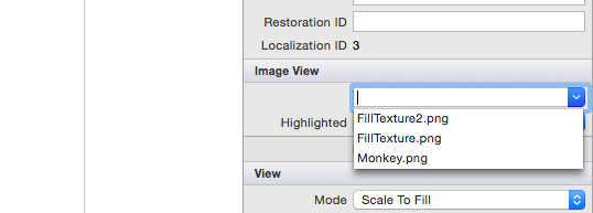
Select the Image View and change its Image property to
Monkey.png.As we are using size classes we'll need to constrain this image view. Click on the image twice to put it into constraint mode. Let's constrain it to the center by clicking the center-pinning handle and align it both vertically and horizontally:
To constrain the height and width, click on the size-pinning handles (the 'bone' shaped handles) and select width and height respectively:
Update the frame based on constraints by clicking the update button in the toolbar:
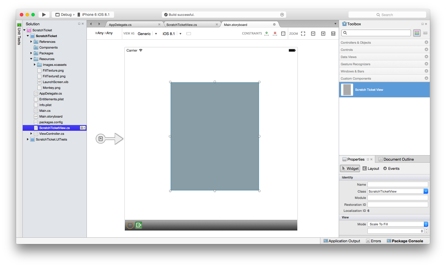
Next, build the project so that the Scratch Ticket View will appear under Custom Components in the Toolbox:
Drag and drop a Scratch Ticket View so that it appears over the monkey image. Adjust the drag handles so the Scratch Ticket View covers the monkey completely, as shown below:
Constrain the Scratch Ticket View to the Image View by drawing a bounding rectangle to select both views. Select the options to constrain it to the Width, Height, Center and Middle and update frames based on constraints, as shown below:
Run the application and “scratch off” the image to reveal the monkey.
Adding Design-Time Properties
The designer also includes design-time support for custom controls of property type numeric, enumeration, string, bool, CGSize, UIColor, and UIImage. To demonstrate, let’s add a property to the ScratchTicketView to set the image that is “scratched off.”
Add the following code to the ScratchTicketView class for the property:
[Export("Image"), Browsable(true)]
public UIImage Image
{
    get { return image; }
    set {
            image = value;
              SetNeedsDisplay ();
        }
}
We may also want to add a null check to the Draw method, like so:
public override void Draw(CGRect rect)
{
    base.Draw(rect);

    using (var g = UIGraphics.GetCurrentContext())
    {
        if (image != null)
            g.SetFillColor ((UIColor.FromPatternImage (image).CGColor));
        else
            g.SetFillColor (UIColor.LightGray.CGColor);

        g.FillRect(rect);

        if (!initialPoint.IsEmpty)
        {
             g.SetLineWidth(20);
             g.SetBlendMode(CGBlendMode.Clear);
             UIColor.Clear.SetColor();

             if (path.IsEmpty || startNewPath)
             {
                 path.AddLines(new CGPoint[] { initialPoint, latestPoint });
                 startNewPath = false;
             }
             else
             {
                 path.AddLineToPoint(latestPoint);
             }

             g.SetLineCap(CGLineCap.Round);
             g.AddPath(path);
             g.DrawPath(CGPathDrawingMode.Stroke);
        }
    }
}
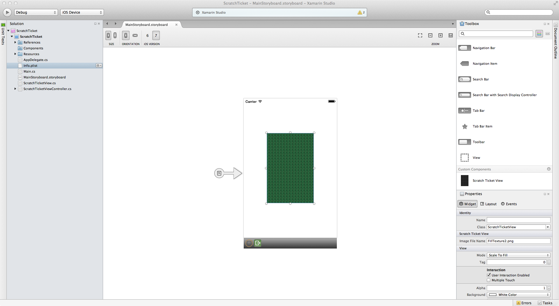
Including an ExportAttribute and a BrowsableAttribute with the argument set to true results in the property being displayed in the designer’s Property panel. Changing the property to another image included with the project, such as FillTexture2.png, results in the control updating at design time, as shown below:
Summary
In this article we walked through how to create a custom control, as well as consume it in an iOS application using the iOS designer. We saw how to create and build the control to make it available to an application in the designer’s Toolbox. Additionally, we looked at how to implement the control such that it renders properly at both design time and runtime, as well as how to expose custom control properties in the designer.


