Xamarin.Android Designer Material Design features
This topic describes Designer features that make it easier for developers to create Material Design-compliant layouts. This section introduces and explains how to use the Material Grid, the Material Color Palette, the Typographic Scale, and the Theme Editor.
Evolve 2016: Everyone Can Create Beautiful Apps with Material Design
Overview
The Xamarin.Android Designer includes features that make it easier for you to create Material-Design-compliant layouts. If you are not familiar with Material Design, see the Material Design introduction.
In this guide, we'll have a look at the following Designer features:
Material Grid – An overlay on the Design Surface that shows a grid, spacing, and keylines to help you place layout widgets according to Material Design guidelines.
Theme Editor – A small color resource editor that lets you set color information for a subset of a theme. For example, you can preview and modify Material colors such as
colorPrimary,colorPrimaryDark, andcolorAccent.
We'll have look at each of these features and provide examples of how to use them.
Material Design Grid
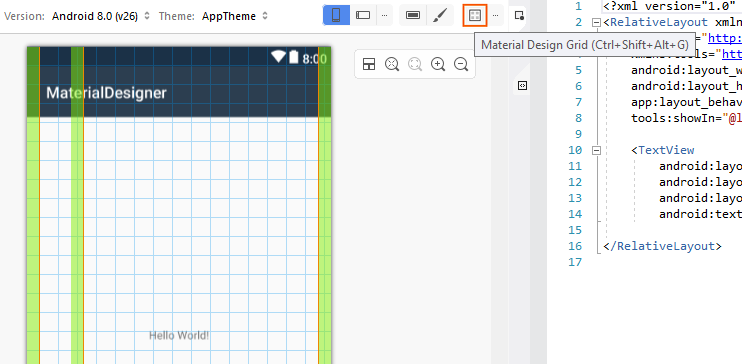
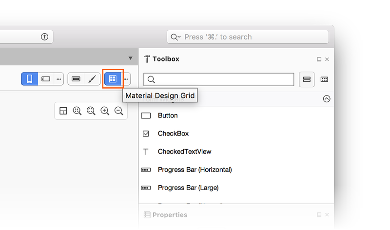
The Material Design Grid menu is available from the toolbar at the top of the Designer:
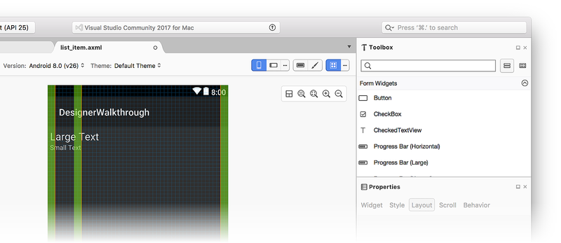
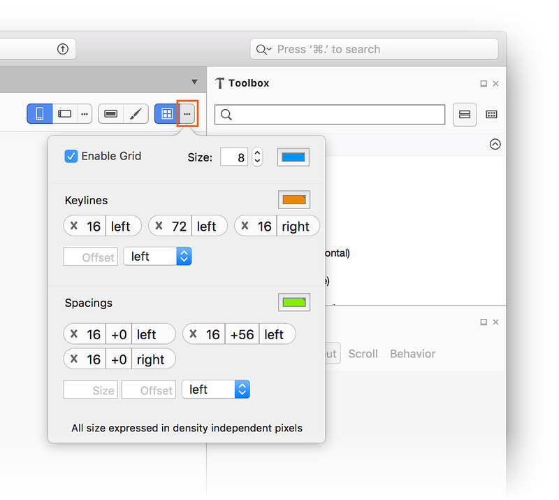
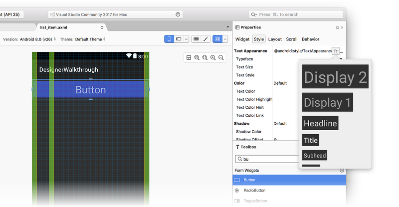
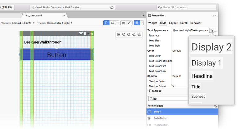
When you click the Material Design Grid icon, the Designer displays an overlay on the Design Surface that includes the following elements:
Keylines (orange lines)
Spacing (green areas)
A grid (blue lines)
These elements can be seen in the previous screenshot. Each of these
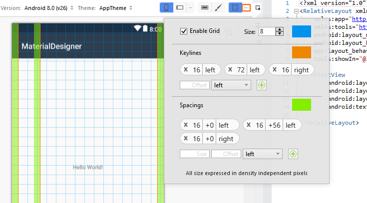
overlay items is configurable. When you click the ellipsis next to the
Material Design Grid menu, a dialog popover opens that allows you to
disable/enable the grid, configure the placement of keylines, and set
spacings. Note that all values are expressed in dp
(density-independent pixels):
To add a new keyline, enter a new offset value in the Offset box, select a location (left, top, right, or bottom) and click the + icon to add the new keyline. Similarly, to add a new spacing, enter the size and offset (in dp) into the Size and Offset boxes, respectively. Select a location (left, top, right, or bottom) and click the + icon to add the new spacing.
When you change these configuration values, they are saved in the layout XML file and reused when you open the layout again.
Theme Editor
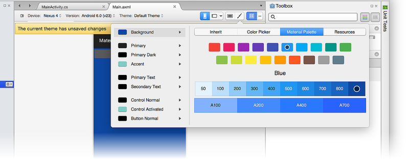
The Theme Editor lets you customize color information for a subset of theme attributes. To open the Theme Editor, click the paintbrush icon on the toolbar:
Although the Theme Editor is accessible from the toolbar for all target Android versions and API levels, only a subset of the capabilities described below are available if the target API level is earlier than API 21 (Android 5.0 Lollipop).
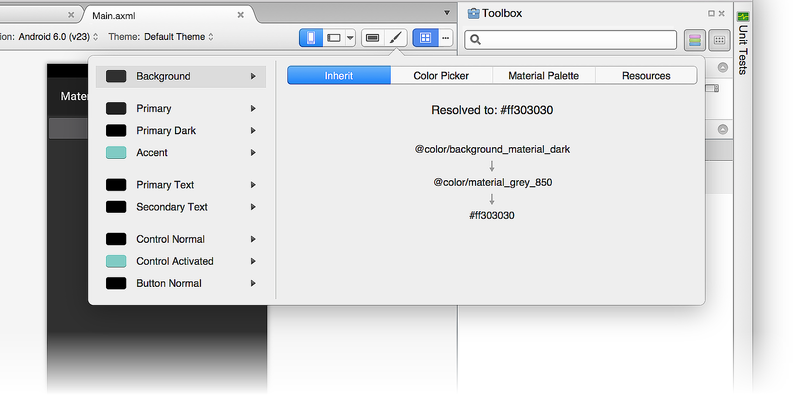
The left-hand panel of the Theme Editor displays the list of
colors that make up the currently selected theme (in this example,
we are using the Default Theme):
When you select a color on the left, the right-hand panel provides the following tabs to help you edit that color:
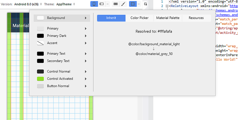
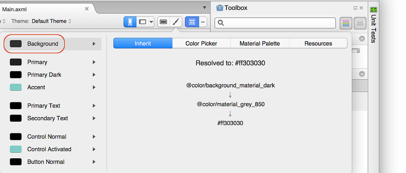
Inherit – Displays a style inheritance diagram for the selected color and lists the resolved color and color code assigned to that theme color.
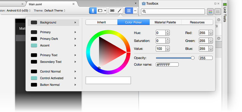
Color Picker – Lets you change the selected color to any arbitrary value.
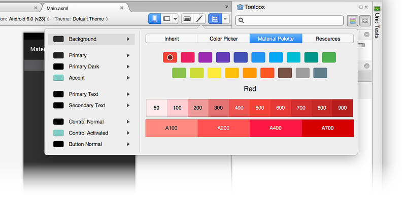
Material Palette – Lets you change the selected color to a value that conforms to Material Design.
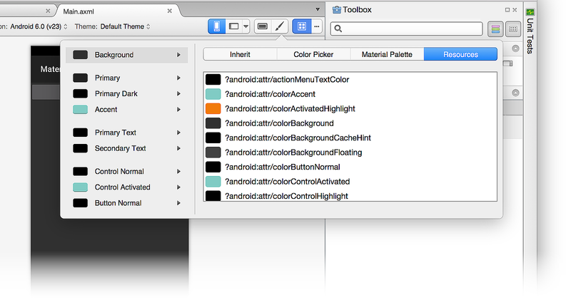
Resources – Lets you change the selected color to one of the other existing color resources in the theme.
Let's look at each one of these tabs in detail.
Inherit tab
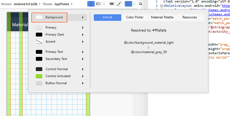
As seen in the following example, the Inherit tab lists the style inheritance for the Background color of the Default Theme:
In this example, the Default Theme inherits from a style that uses
@color/background_material_light but overrides it with
color/material_grey_50, which has a color code value of #fffafafa.
For more information about style inheritance, see
Styles and Themes.
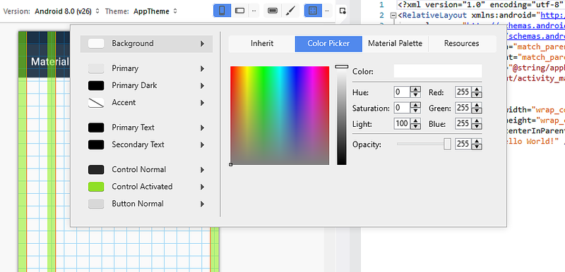
Color Picker
The following screenshot illustrates the Color Picker:
In this example, the Background color can be changed to any value through various means:
- Clicking a color directly.
- Entering hue, saturation, and brightness values.
- Entering RGB (red, green, blue) values in decimal.
- Setting the alpha (opacity) for the selected color.
- Entering the hexadecimal color code directly.
The color you choose in the Color Picker is not restricted to Material Design guidelines or to the set of available color resources.
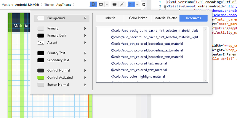
Resources
The Resources tab offers a list of color resources that are already present in the theme:
Using the Resources tab constrains your choices to this list of colors. Keep in mind that if you choose a color resource that is already assigned to another part of the theme, two adjacent elements of the UI may "run together" (because they have the same color) and become difficult for the user to distinguish.
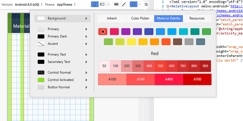
Material Palette
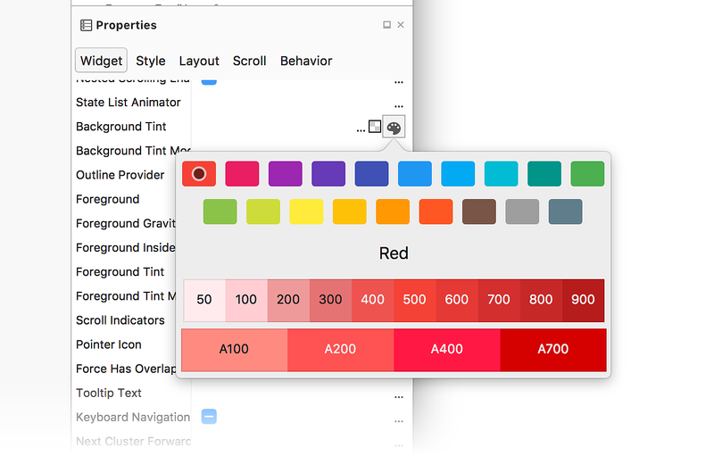
The Material Palette tab opens the Material Design Color Palette. Choosing a color value from this palette constrains your color choice so that it is consistent with Material Design guidelines:
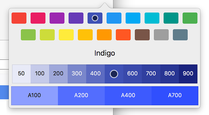
The top of the color palette displays primary Material Design colors
while the bottom of the palette displays a range of hues for the
selected primary color. For example, when you select Indigo, a
collection of Indigo hues is displayed at the bottom of the dialog.
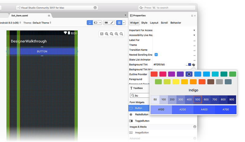
When you select a hue, the color of the property is changed to the
selected hue. In the following example, the Background Tint of the
button is changed to Indigo 500:
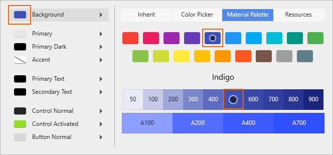
Background Tint is set to the color code for Indigo 500
(#ff3f51b5), and the Designer updates the background color to reflect
this change:
For more information about the Material Design color palette, see the Material Design Color Palette Guide.
Creating a new theme
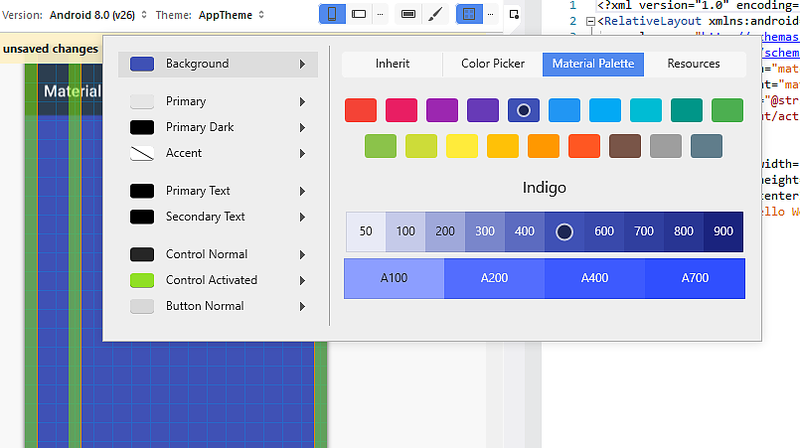
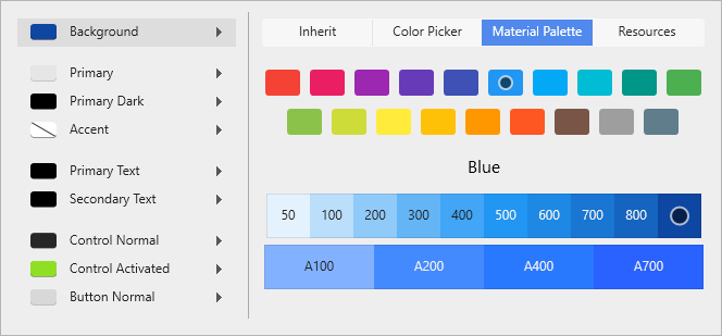
In the following example, we'll use the Material Palette to create a new custom theme. First, we'll change the Background color to Blue 900:
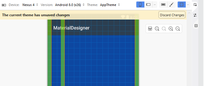
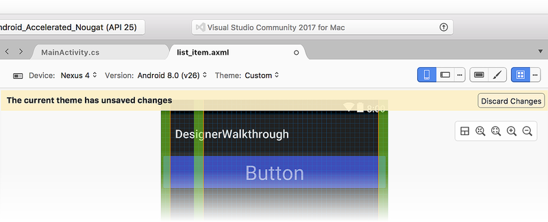
When a color resource is changed, a message pops up with the message, The current theme has unsaved changes:
The Background color in the Designer has changed to the new color selection, but this change has not yet been saved. At this point, you can do one of the following:
Click Discard Changes to discard the new color choice (or choices) and revert the theme to its original state.
Press CTRL+S to save your changes to the currently theme.
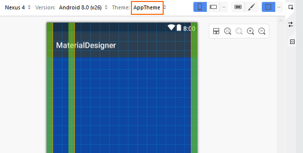
In the following example, CTRL+S was pressed so that the changes were saved to AppTheme:
Summary
This topic described the Material Design features available in the Xamarin.Android Designer. It explained how to enable and configure the Material Design Grid, and it explained how to use the Theme Editor to create new custom themes that conform to Material Design guidelines. For more information about Xamarin.Android support for Material Design, see Material Theme.
