Creating resources for varying screens
Android itself runs on many different devices, each having a wide variety of resolutions, screen sizes, and screen densities. Android will perform scaling and resizing to make your application work on these devices, but this may result in a sub-optimal user experience. For example, images could appear blurry, or they may be positioned as expected on a view.
Concepts
A few terms and concepts are important to understand to support multiple screens.
Screen Size – The amount of physical space for displaying your application
Screen Density – The number of pixels in any given area on the screen. The typical unit of measure is dots per inch (dpi).
Resolution – The total number of pixels on the screen. When developing applications, resolution is not as important as screen size and density.
Density-independent pixel (dp) – A virtual unit of measure to allow layouts to be designed independent of density. This formula is used to convert dp into screen pixels:
px = dp × dpi ÷ 160
Orientation – The screen's orientation is considered to be landscape when it is wider than it is tall. In contrast, portrait orientation is when the screen is taller than it is wide. The orientation can change during the lifetime of an application as the user rotates the device.
Notice that the first three of these concepts are inter-related – increasing the resolution without increasing the density will increase the screen size. However if both the density and resolution are increased, then the screen size can remain unchanged. This relationship between screen size, density, and resolution complicate screen support quickly.
To help deal with this complexity, the Android framework prefers to use density-independent pixels (dp) for screen layouts. By using density independent pixels, UI elements will appear to the user to have the same physical size on screens with different densities.
Supporting various screen sizes and densities
Android handles most of the work to render the layouts properly for each screen configuration. However, there are some actions that can be taken to help the system out.
The use of density-independent pixels instead of actual pixels in layouts is sufficient in most cases to ensure density independence. Android will scale the drawables at runtime to the appropriate size. However, it is possible that scaling will cause bitmaps to appear blurry. To work around this problem, supply alternate resources for the different densities. When designing devices for multiple resolutions and screen densities, it will prove easier to start with the higher resolution or density images and then scale down.
Declare the supported screen size
Declaring the screen size ensures that only supported devices can download the application. This is accomplished by setting the supports-screens element in the AndroidManifest.xml file. This element is used to specify what screen sizes are supported by the application. A given screen is considered to be supported if the application can properly place its layouts to fill screen. By using this manifest element, the application will not show up in Google Play for devices that do not meet the screen specifications. However, the application will still run on devices with unsupported screens, but the layouts may appear blurry and pixelated.
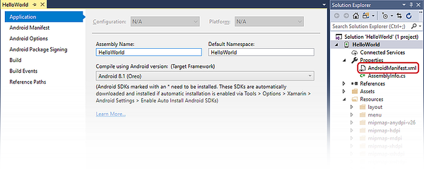
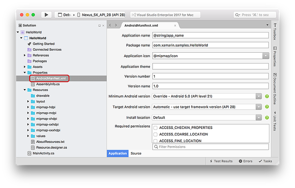
Supported screen sixes are declared in the Properites/AndroidManifest.xml file of the solution:
Edit AndroidManifest.xml to include supports-screens:
<manifest xmlns:android="http://schemas.android.com/apk/res/android"
          android:versionCode="1"
          android:versionName="1.0"
          package="HelloWorld.HelloWorld">
      <uses-sdk android:minSdkVersion="21" android:targetSdkVersion="27" />
      <supports-screens android:resizable="true"
                        android:smallScreens="true"
                        android:normalScreens="true"
                        android:largeScreens="true" />
      <application android:allowBackup="true"
                   android:icon="@mipmap/ic_launcher"
                   android:label="@string/app_name"
                   android:roundIcon="@mipmap/ic_launcher_round"
                   android:supportsRtl="true" android:theme="@style/AppTheme">
  </application>
</manifest>
Provide alternate layouts for different screen sizes
Alternate layouts make it possible to customize a view for a specifc screen size, changing the positioning or size of the component UI elements.
Starting with API Level 13 (Android 3.2), the screen sizes are deprecated in favor of using the swNdp qualifier. This new qualifier declares the amount of space a given layout needs. It is recommended that applications that are meant to run on Android 3.2 or higher should be using these newer qualifiers.
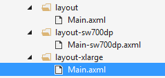
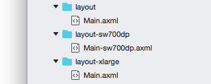
For example, if a layout required a minimum 700 dp of screen width, the alternate layout would go in a folder layout-sw700dp:
As a guideline, here are some numbers for various devices:
Typical phone – 320 dp: a typical phone
A 5" tablet / "tweener" device – 480 dp: such as the Samsung Note
A 7" tablet – 600 dp: such as the Barnes & Noble Nook
A 10" tablet – 720 dp: such as the Motorola Xoom
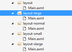
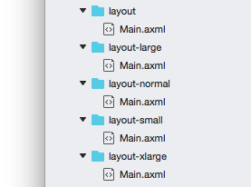
For applications that target API levels up to 12 (Android 3.1), the layouts should go in directories that use the qualifiers small/normal/large/xlarge as generalizations of the various screen sizes that are available in most devices. For example, in the image below, there are alternate resources for the four different screen sizes:
The following is a comparison of how the older pre-API Level 13 screen size qualifiers compare to density-independent pixels:
426 dp x 320 dp is small
470 dp x 320 dp is normal
640 dp x 480 dp is large
960 dp x 720 dp is xlarge
The newer screen size qualifiers in API level 13 and up have a higher precedence than the older screen qualifiers of API levels 12 and lower. For applications that will span the old and the new API levels, it may be necessary to create alternate resources using both sets of qualifiers as shown in the following screenshot:
Provide different bitmaps for different screen densities
Although Android will scale bitmaps as necessary for a device, the bitmaps themselves may not elegantly scale up or down: they may become fuzzy or blurry. Providing bitmaps appropriate for the screen density will mitigate this problem.
For example, the image below is an example of layout and appearance problems that may occur when density-specify resources are not provided.

Compare this to a layout that is designed with density-specific resources:

Create varying density resources with Android Asset Studio
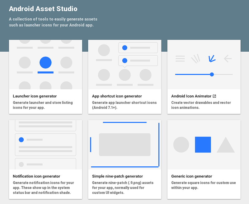
The creation of these bitmaps of various densities can be a bit tedious. As such, Google has created an online utility that can reduce some of the tedium involved with the creation of these bitmaps called the Android Asset Studio.
This website will help with creation of bitmaps that target the four common screen densities by providing one image. Android Asset Studio will then create the bitmaps with some customizations and then allow them to be downloaded as a zip file.
Tips for multiple screens
Android runs on a bewildering number of devices, and the combination of screen sizes and screen densities can seem overwhelming. The following tips can help minimize the effort necessary to support various devices:
Only design and develop for what you need – There are many different devices out there, but some exist in rare form factors that may take significant effort to design and develop for. The Screen Size and Density dashboard is a page provided by Google that provides data on breakdown of the screen size/screen density matrix. This breakdown provides insight on how to development effort on supporting screens.
Use DPs rather than Pixels - Pixels become troublesome as screen density changes. Do not hardcode pixel values. Avoid pixels in favor of dp (density-independent pixels).
Avoid AbsoluteLayout Wherever Possible – it is deprecated in API level 3 (Android 1.5) and will result in brittle layouts. It should not be used. Instead, try to use more flexible layout widgets such as LinearLayout, RelativeLayout, or the new GridLayout.
Pick one layout orientation as your default – For example, instead of providing the alternate resources layout-land and layout-port, put the resources for landscape in layout, and the resources for portrait into layout-port.
Use LayoutParams for Height and Width - When defining UI elements in an XML layout file, an Android application using the wrap_content and fill_parent values will have more success ensure a proper look across different devices than using pixel or density-independent units. These dimension values cause Android to scale bitmap resources as appropriate. For this same reason, density-independent units are best reserved for when specifying the margins and padding of UI elements.
Testing multiple screens
An Android application must be tested against all configurations that will be supported. Ideally devices should be tested on the actual devices themselves but in many cases this is not possible or practical. In this case, the use of the emulator and Android Virtual Devices setup for each device configuration will be useful.
The Android SDK provides some emulator skins may be used to create AVDs will replicate the size, density, and resolution of many devices. Many of the hardware vendors likewise provide skins for their devices.
Another option is to use the services of a third party testing service. These services will take an APK, run it on many different devices, and then provide feedback how the application worked.
