Profit Chart (Analysis Services - Data Mining)
A profit chart displays the estimated profitability associated with using a mining model. For example, let's assume your model predicts which customers a company should contact in a business scenario. In that case, you would add to the profit chart information about the cost of conducting the targeted mailing campaign. Then, in the completed chart, you can see the estimated profit if customers are correctly targeted, as compared to randomly contacting customers.
Build a Profit Chart
A profit chart is similar to a lift chart. You start by creating a lift chart, and then add in the cost and profit information.
To build a profit chart, you must have an existing model.
For this example, we used the Targeted Mailing decision tree model. The model identifies customers who are likely to buy a bike. You can apply the Profit Chart to determine how many of your customers to target to maximize your profit.
If you don't have the sample model, you can create it using the Basic Data Mining Tutorial.
Open the mining accuracy chart builder.
In SQL Server Management Studio, right-click the model, and select View Lift Chart.
In SQL Server Data Tools, open the project in which you created the model, and click the Mining Accuracy Chart tab.
In the Input Selection tab, select the model and choose the predictable attribute value.
For this particular scenario, you are interested only in the profitability of accurately predicting one value: [Bike Buyer] =1.
However, there are other scenarios in which you are equally interested in predicting false values correctly. For example, the cost of a false positive on a medical diagnostic test can be significant and needs to be factored into the profitability of the prediction, as does the cost of false negatives. In such scenarios, you would measure all outcomes.
Select a data set for testing. For this example, select the testing data set.
Now click the Lift Chart tab.
A lift chart is automatically generated.
To change this to a profit chart, select Profit Chart from the Chart type list.
As soon as you choose profit chart as the chart type, the Profit Chart Setting dialog box automatically opens.
This dialog box helps you specify the costs and benefits associated with a targeted mailing campaign. For the chart shown in these examples, we used the following values:
Setting Value Comments Population 20,000 Set the value for the total target population
Your database might contain many customers, but to save on mailing expenses you might choose to target only the 20,000 customers who are most likely to respond. You can get this list by running a prediction query and sorting by the probability output by the predictive model.Fixed cost 500 Enter the one-time cost of setting up a targeted mailing campaign for 20,000 people. This might include printing, or the cost of setting up an e-mail campaign. Individual cost 3 Enter the per-unit cost for the targeted mailing campaign.
This amount will be multiplied by a number equal to or less than 20000, depending on how many customers the model predicts are good prospects.Revenue per individual 400 Enter a value that represents the amount of profit or income that can be expected from a successful result. In this case, we'll assume that mailing a catalog results in purchase of accessories or bikes averaging $400.
This amount will be used to project the total profit associated with high probability cases.After you have set the required parameters, click OK.
The chart updates to show the profit curve.
Understanding the Profit Chart
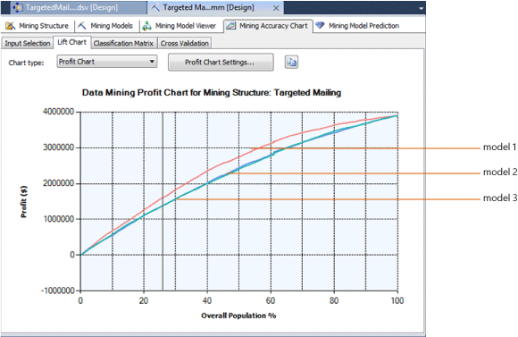
The following diagram shows the chart that was based on these parameters. The Y-axis of the chart represents the profit, while the X-axis represents the percentage of the customers who were contacted by the targeted mailing campaign.
As shown here, you can use a profit chart to compare multiple models, as long as they all predict the same discrete attribute.

Notice the gray vertical line in the chart. As you click and drag the line, the ToolTip display the percentage of the target population that is included under the curve at that point.
The Mining Legend is also updated as you drag the line, to display the percentage value, a profit score, and the predict probability that is associated with the population percentage at the vertical gray line.
For example, if you were using this model to decide who to send your promotional material to, you might decide to target 25% of the population, based on the predict probabilities, However, the area under the profit curve of the chart is greatest between 40 and 70 percent, indicating that by mailing to more people, you can maximize your return, even if a smaller overall percentage responds.
Saving Charts
When you create an accuracy chart or profit chart, no objects are created on the server. Instead, queries are executed against an existing model and the results are rendered in the viewer. If you need to save the results, you must copy either the chart or the results to Excel or another file.
Related Content
The following topics contain more information about how you can build and use accuracy charts.
| Topics | Links |
|---|---|
| Provides a walkthrough of how to create a lift chart for the Targeted Mailing model. | Basic Data Mining Tutorial Testing Accuracy with Lift Charts (Basic Data Mining Tutorial) |
| Explains related chart types. | Lift Chart (Analysis Services - Data Mining) Classification Matrix (Analysis Services - Data Mining) Scatter Plot (Analysis Services - Data Mining) |
| Describes cross-validation for mining models and mining structures. | Cross-Validation (Analysis Services - Data Mining) |
| Describes steps for creating lift charts and other accuracy charts. | Testing and Validation Tasks and How-tos (Data Mining) |
See Also
Testing and Validation (Data Mining)
Testing Accuracy with Lift Charts (Basic Data Mining Tutorial)