Understanding Node List, Heat Map, and Custom Tab Views
The node views provide a starting point for monitoring nodes, drilling down into node details, and managing nodes. In HPC Cluster Manager, you can view cluster nodes in two ways: the List view displays node properties and performance metrics in rows and columns, and the Heat Map view displays node performance metrics graphically. For descriptions of these values, see Understanding Node Metrics and Properties in HPC Cluster Manager. A heat map and a list view are configured by default, and you can configure additional tabs to monitor specific aspects of cluster performance. The node filters that you apply persist across all tabs, and the nodes that you select in one tab are selected when you go to a different tab.
Note
To modify a tab, right-click the tab title and then click Customize Tab.
Node List view
In the List view, each row represents a node, and the columns display node properties and metric values. You can click the column headers to sort the list by specific properties. Customize the List view by choosing which columns to display: in the toolbar, click View, then click Column Chooser. Alternately, right-click the tab title and then click Customize Tab.
When you click a node in the List view, detailed information about that node appears in the Detail Pane. The Detail Pane displays information about the node such as health, properties, operations and provisioning logs. Double-click a node to see this information in a separate window.
Node Heat Map view
In the Heat Map view, every tile represents a cluster node, and values for the tracked metrics are represented by a color gradient. You can choose the performance metrics to track from the Metric drop-down list. The Heat Map displays up to three metrics at a time. To modify a tab, right-click the tab title and then click Customize Tab.
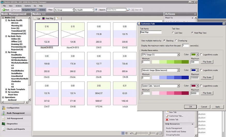
The following screenshot (from HPC 2008 R2 SP1) shows a customized heat map view that displays CPU Usage (%), Network Usage (Bytes/second), and System Calls/second. You can monitor dedicated nodes, workstation nodes, and Azure Nodes. Not all metric values are available for Azure Nodes.

The bottom of the heat map tab includes a zoom bar that lets you increase or decrease the size of the node tiles. You can also click the Fit to window icon to adjust tile size. If you have specified node location information (data center, rack, and chassis), you can organize the heat map view by location by clicking the Group by location icon. Remove the location grouping by clicking the Group by name icon. (You can specify the node location property in the node XML or by selecting a node and clicking Edit.)
The following screen snip shows the buttons to organize and resize the heat map view:
![]()
Double-click a node to see detailed information about the node such as health, properties, operations and provisioning logs.
Heat map view includes the following customization options:
The minimum value for a metric is associated with a color, for example, white, and the maximum value for that metric is associated with another color, for example, blue. In this case, lower values for that metric appear as lighter shades of blue, and higher values appear as darker shades of blue. For each metric, you can customize the maximum and minimum values and associated colors. You can also flip the scale so that the minimum values are darker, and the maximum values are lighter.
The color bands that are used to display metric values can be displayed in linear or logarithmic scales. In a linear scale, the color bands are equally sized across the defined value range. In a logarithmic scale, the color bands are logarithmically sized across the value range. Logarithmic scale is useful when you want to visually distinguish values at one end of the value range.
You can view multiple metrics in Stacking or Overlaying view. Stacking displays a color bar for each metric. Overlaying displays only the most significant metric for each node. Significance is based on the order in which the metrics are defined in the Customize Tab dialog box. The first metric is displayed by default. If a metric value reaches the darkest color band, that is the metric that is displayed. If more than one metric reaches the darkest color band, the first one listed is the one that is displayed.
Aggregate metrics over a short time period by increasing the number of seconds for the metric value display.
Custom tabs
You can create customizable dashboards that allow you to monitor several node metrics for the entire cluster at a glance. To more easily identify outliers and bottlenecks and quickly switch between views, you can create multiple node list or heat map tabs that focus on sets of information such as:
Network view
CPU or disk load
Application trends for large MPI jobs
To create a new tab, click the blank tab in the Node Management view pane.
Additional considerations
The Heat Map view displays the current performance metrics of a node. To view a graph of any of the performance metrics of a node over time, see View Performance Charts.
To add custom performance counters for your cluster, you can create an XML file that describes the metric to add, then import the new metric using the HPC PowerShell cmdlet
Import-HpcMetric. You can also modify an existing metric (for example, you can change the sampling frequency) by overwriting the existing settings. For more information, see Customize Metrics Collection.For information about using HPC Cluster Manager, see Overview of HPC Cluster Manager.