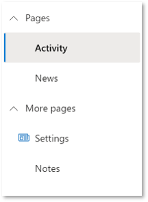
Nav control
A control used to provide navigation.
Note
Full documentation and source code found in the GitHub code components repository.

Description
A navigation pane (Nav) provides links to the main areas of an app or site.
The Nav code component allows using the Fluent UI Nav menu component from inside canvas apps and custom pages.
Note
Component source code and more information in the GitHub code components repository.
Properties
Key properties
| Property | Description |
|---|---|
Selected key |
The key to select. This will be updated via the OnChange event when the user interacts with the control. |
Items |
Required. The data source items table to render. |
Fields |
Required. The fields that are included from the data set. |
Items properties
Each item uses the following schema to visualize data in the component.
| Name | Description |
|---|---|
ItemDisplayName |
The Display Name of the command/tab/menu item |
ItemKey |
The key to use to indicate which item is selected, and when adding sub items. The keys must be unique. |
ItemEnabled |
Set to false if the option is disabled |
ItemVisible |
Set to false if the option is not visible |
ItemIconName |
The Fluent UI icon to use (see Fluent UI icons) |
ItemIconColor |
The color to render the icon as (e.g. named, rgb or hex value) |
ItemIconOnly |
Do not show the text label - only the icon |
ItemParentKey |
Render the option as child item of another option |
ItemExpanded |
Set to false or true if the group should remain collapsed or expanded respectively. |
Example:
Table(
  {
      ItemKey: "1",
      ItemDisplayName: "Home with Icon & Custom color",
      ItemIconName: "Home",
      ItemIconColor: "Green"
  },
  {
      ItemKey: "2",
      ItemDisplayName: "Documents",
      ItemExpanded: true
  },
  {
      ItemKey: "3",
      ItemDisplayName: "Contents"
  },
  {
      ItemKey: "4",
      ItemDisplayName: "Item Invisible",
      ItemVisible: false
  },
  {
      ItemKey: "5",
      ItemDisplayName: "Quick Reference Guide",
      ItemParentKey: "3",
      ItemIconName: "Document"
  }
)
Style properties
| Property | Description |
|---|---|
Theme |
Accepts a JSON string that is generated using Fluent UI Theme Designer (windows.net). Leaving this blank will use the default theme defined by Power Apps. See theming for guidance on how to configure. |
AccessibilityLabel |
Screen reader aria-label |
CollapseByDefault |
Set to True or False(On or Off) for all the group of Nav remain collapsed or expanded respectively. Individual Item level expand property is respected. |
Event properties
| Property | Description |
|---|---|
InputEvent |
An event to send to the control. E.g. SetFocus. See below. |
Behavior
Supports SetFocus as an InputEvent.
Configure "On Select" behavior
Use the Switch() formula in the component's OnSelect property to configure specific actions for each item by referring to the control's selected ItemKey as the switch value.
Replace the false values with appropriate expressions in the Power Fx language.
  Switch( Self.Selected.ItemKey,

    /* Action for ItemKey 1 */
    "1", false,

    /* Action for ItemKey 2 */
    "2", false,

    /* Action for ItemKey 3 */
    "3", false,

    /* Action for ItemKey 4 */
    "4", false,

    /* Action for ItemKey 5 */
    "5", false,

    /* Default action */
        false
  )
Setting Focus on the control
When a new dialog is shown, and the default focus should be on the control, an explicit set focus will be needed.
To make calls to the input event, you can set a context variable that is bound to the Input Event property to a string that starts with SetFocus and followed by a random element to ensure that the app detects it as a change.
E.g.
UpdateContext({ctxResizableTextareaEvent:"SetFocus" & Text(Rand())}));
The context variable ctxResizableTextareaEvent would then be bound to the property Input Event property.
Limitations
This code component can only be used in canvas apps and custom pages.