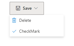
ContextMenu control
A control used to input commands.
Note
Full documentation and source code found in the GitHub code components repository.

Description
A contextual menu (ContextMenu) is a list of commands that are based on the context of selection, mouse hover, or keyboard focus. They're one of the most effective and highly used command surfaces, and can be used in various places.
This code component provides a wrapper around the Fluent UI ContextualMenu control bound to a button for use in canvas apps and custom pages.
Properties
Key Properties
| Property | Description |
|---|---|
Items |
The action items to render. The first item is considered the root item. |
Items Properties
| Name | Description |
|---|---|
ItemDisplayName |
The Display Name of the menu item. |
ItemKey |
The key to use to indicate which item is selected, and when adding sub items. The keys must be unique. |
ItemEnabled |
Set to false if the option is disabled. |
ItemVisible |
Set to false if the option is not visible. |
ItemChecked |
Set to true if the option is checked. |
ItemIconName |
The Fluent UI icon to use (see Fluent UI icons) |
ItemIconColor |
The color to render the icon as (e.g. named, rgb or hex value). |
ItemIconOnly |
Do not show the text label - only the icon. |
ItemHeader |
Render the item as a section header. If there are items that have their ItemParentKey set to the key of this item, then they are added as semantically grouped items under this section. |
ItemTopDivider |
Render a divider at the top of the section. |
ItemDivider |
Render the item as a section divider - or if the item is a header (ItemHeader = true), then controls whether to render a divider at the bottom of the section. |
ItemParentKey |
Render the option as child item of another option. |
Note
ItemIconColorwill override the component's Theme value and ignore other state colors (e.g., disabled).ItemHeaderandItemDividermust be set to true to render as a divider. If set to false, it expects other values and will render blank.- Adding the
ItemCheckedproperty and behavior of submenu items will prevent the submenu from closing on click.
Example
Example Power Fx formula for Items:
  Table(
      {
          ItemKey: "File",
          ItemIconName: "save",
          ItemDisplayName: "Save",
          ItemOverflow:true
      },
       {
          ItemKey: "Delete",
          ItemIconName: "Delete",
          ItemDisplayName: "Delete",
          ItemOverflow:true
      }
  )
Style Properties
| Property | Description |
|---|---|
Theme |
Accepts a JSON string that is generated using Fluent UI Theme Designer (windows.net). Leaving this blank will use the default theme defined by Power Apps. Leaving this blank will use the default theme defined by Power Apps. See theming for guidance on how to configure. |
Chevron |
Show or hide the down chevron on the root button |
IconColor |
Optional. color of the icon on the context menu button. |
HoverIconColor |
Optional. color of the icon when hovered over the context menu button. |
IconSize |
Optional. In pixels, the size of the icon on the context menu button. |
FontSize |
Optional. In pixels, the size of the text on the context menu button. |
FontColor |
Optional. the color of the text on the context menu button. |
HoverFontColor |
Optional. the color of the text when hovered over the context menu button. |
FillColor |
Optional. the background color of the context menu button. |
HoverFillColor |
Optional. the background color when hovered over the context menu button. |
TextAlignment |
The alignment of the button text. Possible values: Center, Left or Right |
AccessibilityLabel |
Screen reader aria-label |
Event Properties
| Property | Description |
|---|---|
InputEvent |
An event to send to the control. E.g. SetFocus. See below. |
Behavior
Supports SetFocus as an InputEvent.
Configure 'On Select' behavior
Use the Switch() formula in the component's OnSelect property to configure specific actions for each item by referring to the control's selected ItemKey as the switch value.
Replace the false values with appropriate expressions in the Power Fx language.
  Switch( Self.Selected.ItemKey,
    /* Action for ItemKey 1 */
    "File", false,

    /* Action for ItemKey 2 */
    "Delete", false,

    /* Default action */
        false
  )
Setting Focus on the control
When a new dialog is shown, and the default focus should be on the control, an explicit set focus will be needed.
To make calls to the input event, you can set a context variable that is bound to the Input Event property to a string that starts with SetFocus and followed by a random element to ensure that the app detects it as a change.
E.g.
UpdateContext({ctxResizableTextareaEvent:"SetFocus" & Text(Rand())}));
The context variable ctxResizableTextareaEvent would then be bound to the property Input Event property.
Limitations
This code component can only be used in canvas apps and custom pages.