Breadcrumb control
A control used to provide navigation.
Note
Full documentation and source code found in the GitHub code components repository.
Description
Breadcrumb controls should be used as a navigational aid in your app or site. They indicate the current page's location within a hierarchy and help the user understand where they are in relation to the rest of that hierarchy. A breadcrumb also provides one-click access to higher levels of that hierarchy.
This code component provides a wrapper around the Fluent UI Breadcrumb control for use in canvas apps and custom pages.
Properties
Key properties
| Property | Description |
|---|---|
SelectedKey |
This denotes the key selected. This will be updated via the OnChange event when the user interacts with the control. |
Items |
The action items to render |
Items properties
Each item uses the following schema to visualize data in the component.
| Name | Description |
|---|---|
ItemDisplayName |
The Display Name of the breadcrumb item |
ItemKey |
The key to use to indicate which item is selected, and when adding sub items. The keys must be unique. |
ItemClickable |
Set to false incase the specific breadcrumb item be non-clickable. |
Example Power Fx formula:
Table(
    {
        ItemKey: "1",
        ItemDisplayName: "General",
        ItemClickable: true
    },
    {
        ItemKey: "2",
        ItemDisplayName: "Document",
        ItemClickable: true
    }
)
Style properties
| Name | Description |
|---|---|
Theme |
Accepts a JSON string that is generated using Fluent UI Theme Designer (windows.net). Leaving this blank will use the default theme defined by Power Apps. See theming for guidance on how to configure. |
AccessibilityLabel |
Screen reader aria-label |
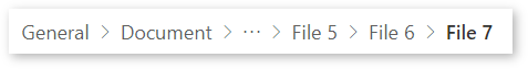
MaxDisplayedItems |
The maximum number of breadcrumbs to display before coalescing. If zero, then all breadcrumbs will be rendered. |
OverflowIndex |
Optional index where overflow items will be collapsed. By default it is set to zero. |
Event properties
| Name | Description |
|---|---|
InputEvent |
An event to send to the control. E.g. SetFocus. See below. |
Behavior
Supports SetFocus as an InputEvent.
Configure "On Select" behavior
Use the Switch() formula in the component's OnSelect property to configure specific actions for each item by referring to the control's selected ItemKey as the switch value.
Replace the false values with appropriate expressions in the Power Fx language.
Because this control is used for navigation, a logical action is to use navigation functions (ideally to a relevant screen with the related data loaded).
  Switch( Self.Selected.ItemKey,
    /* Action for ItemKey 1 */
    "1", false,

    /* Action for ItemKey 2 */
    "2", false,

    /* Default action */
        false
  )
Setting focus on the control
When a new dialog is shown, and the default focus should be on the control, an explicit set focus will be needed.
To make calls to the input event, you can set a context variable that is bound to the Input Event property to a string that starts with SetFocus and followed by a random element to ensure that the app detects it as a change.
Example Power Fx formula:
UpdateContext({ ctxResizableTextareaEvent:"SetFocus" & Text(Rand()) }));
The context variable ctxResizableTextareaEvent would then be bound to the property Input Event property.
Limitations
This code component can only be used in canvas apps and custom pages.