Note
Access to this page requires authorization. You can try signing in or changing directories.
Access to this page requires authorization. You can try changing directories.
Important
This content is archived and is not being updated. For the latest documentation, go to What's new in Power Apps?. For the latest release plans, go to Dynamics 365 and Microsoft Power Platform release plans.
| Enabled for | Public preview | Early access | General availability |
|---|---|---|---|
| Users, automatically | - |  Jan 25, 2021
 |
 Apr 5, 2021
 |
Feature details
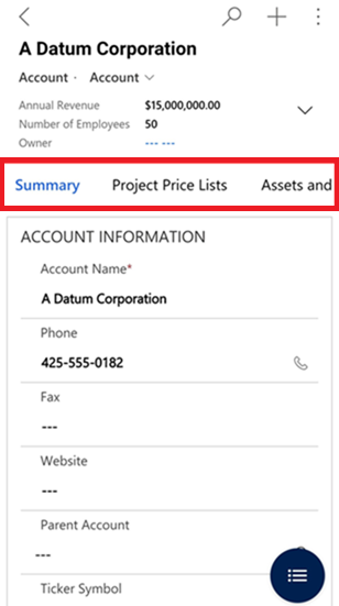
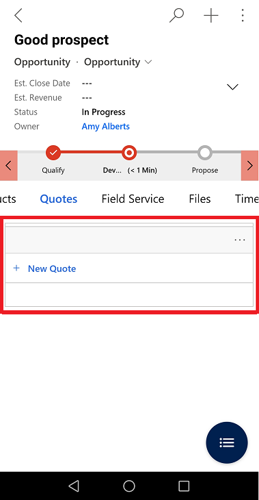
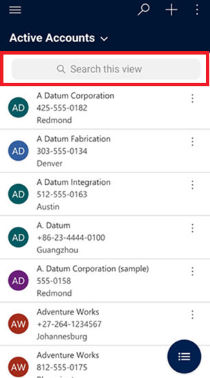
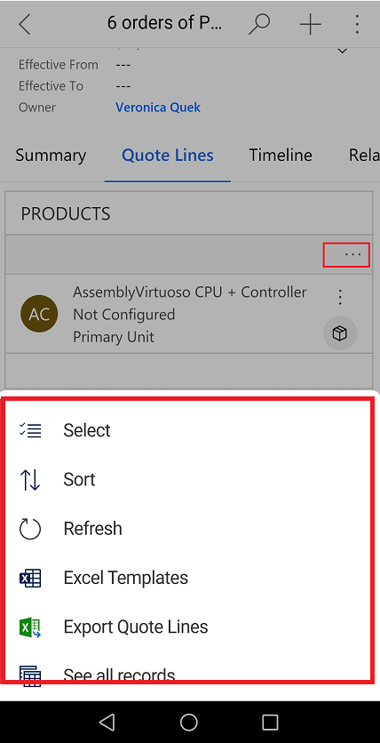
We've made improvements to the usability of how data is presented on a form for model-driven apps on Dynamics 365 for phones and tablets running on iOS and Android.
- Sub grids have a prominent header that separates them from the rest of the sections on the form.
- Form tabs are more discoverable because you can scroll and span horizontally across the screen. When you select a tab, it adjusts the header just enough to reveal the next few tabs.
- Empty sub grids display the option to add a new record inline reducing the number of taps needed to add a record.
- The jump bar (ABC) has been removed from grids, and you can now have the option to Search this View at the top of the grid instead of a command.
- Commands on the sub grid are also updated to show up in a drawer from the bottom of the screen, consistent with the page-level commands.


See also
Basic navigation on Dynamics 365 for phones and tablets (docs)