Create a Q&A visual in a dashboard in Power BI
APPLIES TO:
Power BI Desktop
Power BI service
Sometimes the fastest way to get an answer from your data is to ask a question using natural language. In this article, we look at two different ways of creating the same visualization: first, asking a question with Q&A in a dashboard, and second, building it in a report. We use the Power BI service to build the visual in the report, but the process is almost identical using Power BI Desktop.
Prerequisites
- You just need a Fabric free license to edit dashboards in My Workspace in the Power BI service.
- You need a Power BI Pro license to edit dashboards in other workspaces in the Power BI service. Read about Power BI Pro licenses. You also need at least a Contributor role in that workspace. Read about roles in workspaces.
- To follow along, you must use a report that you can edit, use one of the samples available with Power BI.
Create a Q&A visual in a dashboard
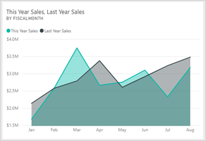
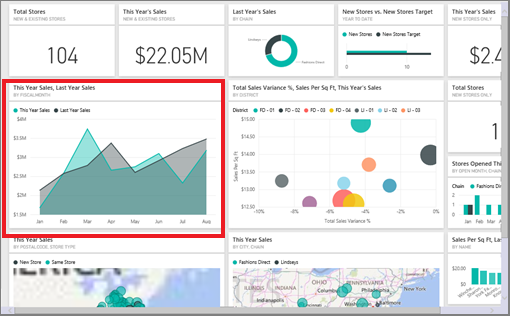
How would we go about creating this line chart using Q&A?
Get the Retail Analysis Sample in the Power BI service.
Open the Retail Analysis Sample dashboard and place your cursor in the Q&A box, Ask a question about your data.

In the Q&A box, type something like this question:
this year sales and last year sales by month as area chart
As you type your question, Q&A picks the best visualization to display your answer. The visualization changes dynamically as you modify the question. Also, Q&A helps you format your question with suggestions, autocomplete, and spelling corrections. Q&A recommends a small wording change: "this year sales and last year sales by time month as area chart".

Select the sentence to accept the suggestion.
When you finish typing your question, the result is the same chart that you see in the dashboard.
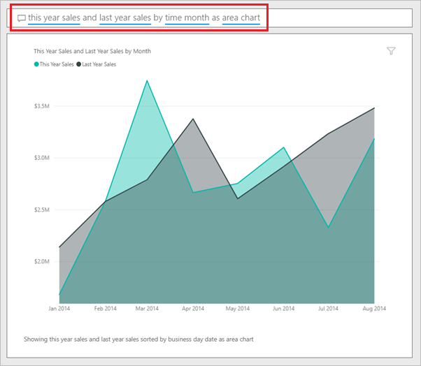
To pin the chart to your dashboard, select Pin visual.
Create the same visual in the report editor
Use the following steps to create the same visual in the report editor:
Power BI Desktop
Download the Retail Analysis Sample .pbix file, and open it in Power BI Desktop.
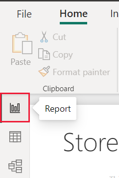
Select the Report icon to open the Reports view.
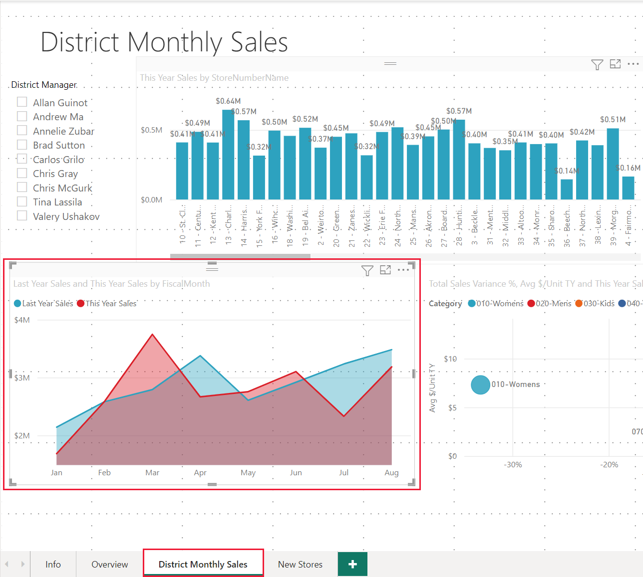
At the bottom of the page, select District Monthly Sales.
Power BI service
Go back to the Retail Analysis Sample dashboard.
The dashboard contains the same area chart tile for "Last Year Sales and This Year Sales." Select this tile. The original area chart tile was created in a report, so the report opens to the page that contains this visualization.
Tip
Don't select the tile you created with Q&A. Selecting it opens Q&A.
Open the report in Editing view by selecting Edit. If you aren't the owner of a report, you can't open the report in Editing view.

Select the area chart and review the settings in the Fields pane. The report creator built this chart by selecting these three values (Last Year Sales and This Year Sales > Value from the Sales table, and FiscalMonth from the Time table) and organizing them in the Axis and Values wells of the Visualizations pane.
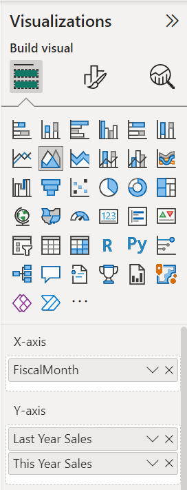
You see they ended up with the same visual. Creating it this way wasn't too complicated, but creating it with Q&A was easier!
Related content
- Use Power BI Q&A to explore your data and create visuals
- Q&A for Power BI business users
- Make Excel data work well with Q&A in Power BI
More questions? Ask the Power BI Community