Explore your data in the Power BI service (preview)
In Power BI, sometimes you just want to do some ad hoc exploration of your data. Maybe you're an analyst who just got access to a new semantic model or data source, and you want to spend time learning about it before you build a report off it. Or maybe you're a business user who needs to answer a specific question about the data to include in a PowerPoint presentation, but the report you’re using doesn’t answer your exact question. Creating a new report from scratch in these cases is a big hurdle, when you just need a quick answer or screenshot for a slide deck.
Introducing the public preview of the new Explore feature, where you have a lightweight and focused experience to explore your data. Similar to exporting your data and building a PivotTable in Excel, now directly within Power BI you can quickly launch Explore to begin creating a pair of a matrix and a visual to get the answers you need without all the extra complexity of reports.
Get started
Create your exploration to find data you’d like to explore.
Begin exploring by building your matrix or PivotTable by adding fields from the data pane.
Note
A matrix is like a PivotTable in Excel.
1. Create your exploration
From an artifact in a list
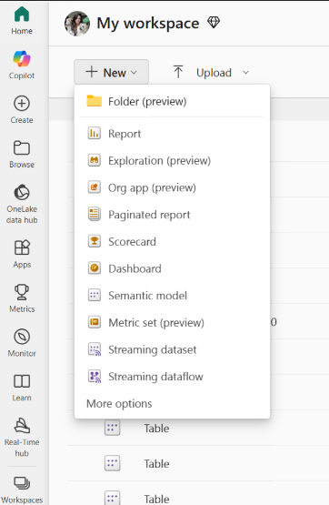
For a given dataset, report, or datamart, begin your exploration by selecting the More options (…) menu from a workspace list or the data hub list view.
From the New button in a workspace
Select the New button at the top of a workspace, then select Exploration.

There are a few ways to create your exploration:
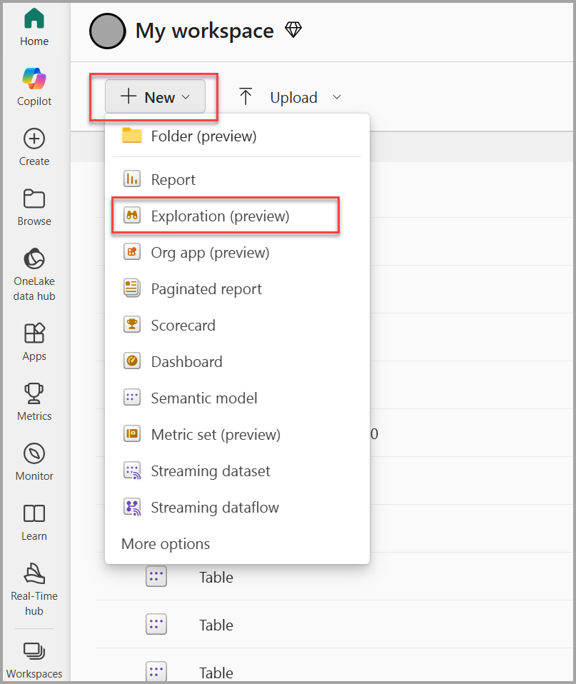
You can select the New button at the top of a workspace, then select Exploration, as shown in the following screenshot.
Or for a given dataset, report, or datamart, you can begin your exploration by selecting the More options (…) menu from a workspace list or the data hub list view, as shown in the following screenshot:

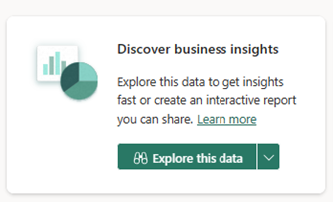
You also see this option in the Data hub details page as part of the Discover business insights action card:
In a report
Or you may want to explore the underlying data behind a report. You can begin exploration from the report More options (…) menu in a workspace list, or the Explore this data option on the report menu bar.

In a datamart
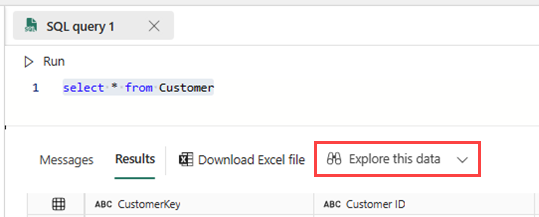
What if while working with a datamart, you’d like to visualize and explore the subset of the data produced from an ad-hoc query you just ran. You have the option to use the new Explore feature to dig into your query results as well.
2. Create an overview of the data with Copilot
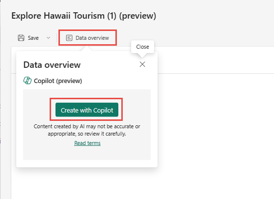
Select Data overview > Create with Copilot.
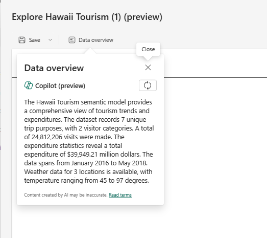
Copilot creates a paragraph describing the data.
3. Begin exploring by building your matrix or visual
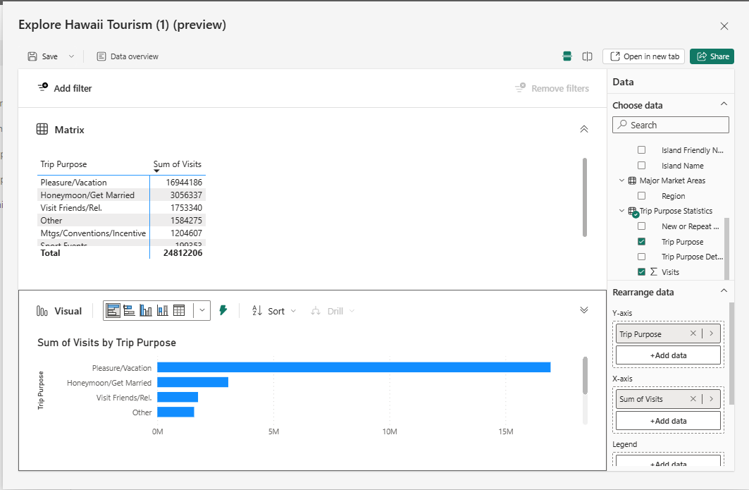
Regardless of where you start from, when you launch the explore experience you land in the new focused view. Your data appears in the data pane, and you can edit, drag and drop, or select fields to start building a matrix or visual.
Note
Some users may see the data pane on the left as we experiment with placement to optimize the experience.
From a dataset, the Explore experience starts with a matrix. That's often a first step, to explore by building out a matrix or PivotTable, to better understand what’s available or get down to the right subset of data before visualizing. On the other hand, if you're coming from a datamart, you’re coming from a grid view of the data already, so you start off with a visual instead.
You can expand the visual representation of the matrix on the lower part of the dialog. This visual maps to the same data as what you show in the matrix. As you modify the fields you're exploring, it automatically updates and selects the best visual for that set of fields.
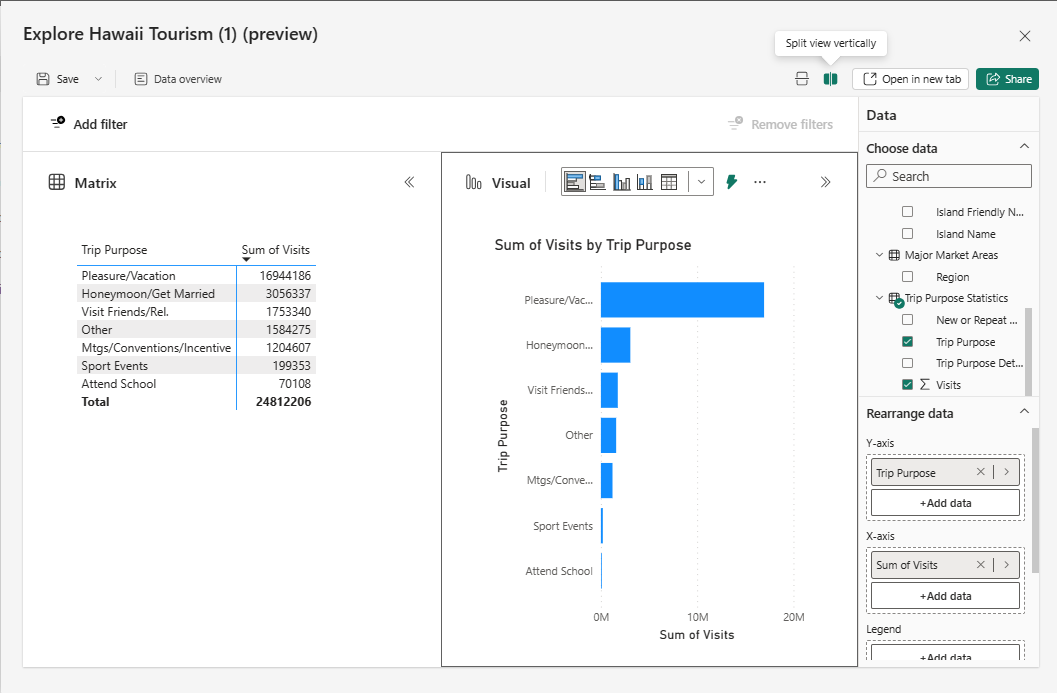
If you prefer, you can swap the layout to show the visual and matrix side by side instead of one on top of the other by using the layout buttons in the top right to adjust the orientation.
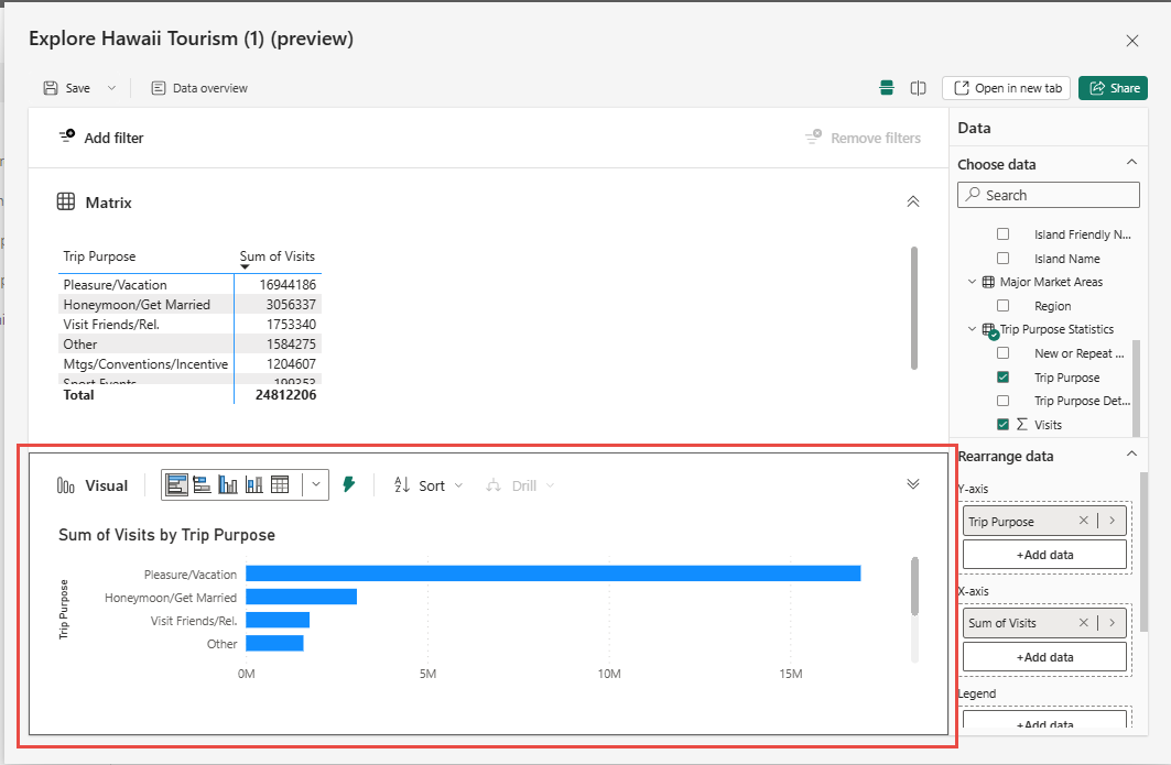
To adjust which fields are located on the rows and columns, use the field wells in the Rearrange data section of the data pane. You only see the field wells of one visual, either the chart or the matrix. To see the other field wells, select the visual you want to edit. You know which one you’re editing by the black outline.
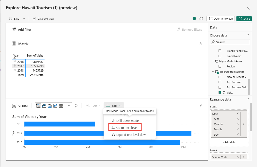
Just as when you were editing the matrix and the visual updated automatically, as you edit the visual, your matrix updates to reflect the same data. This update applies not only to the fields used, but also interactions like sorting and drilling. Assuming the visual can accurately reflect the sort or drill state, it updates appropriately.
For example, these visuals have a date hierarchy and you want to drill down to quarters.
When you do so on the visual, the matrix also updates accordingly.
Note
Certain matrix configurations can't currently be visualized in other chart types. Depending on the situation, a visual may not be rendered or the sort and drill state may not apply. For example, if you expand one specific row in the matrix, that won't apply in the visual, because that interaction within other visual types isn't currently supported.
4. Add filters if you need them
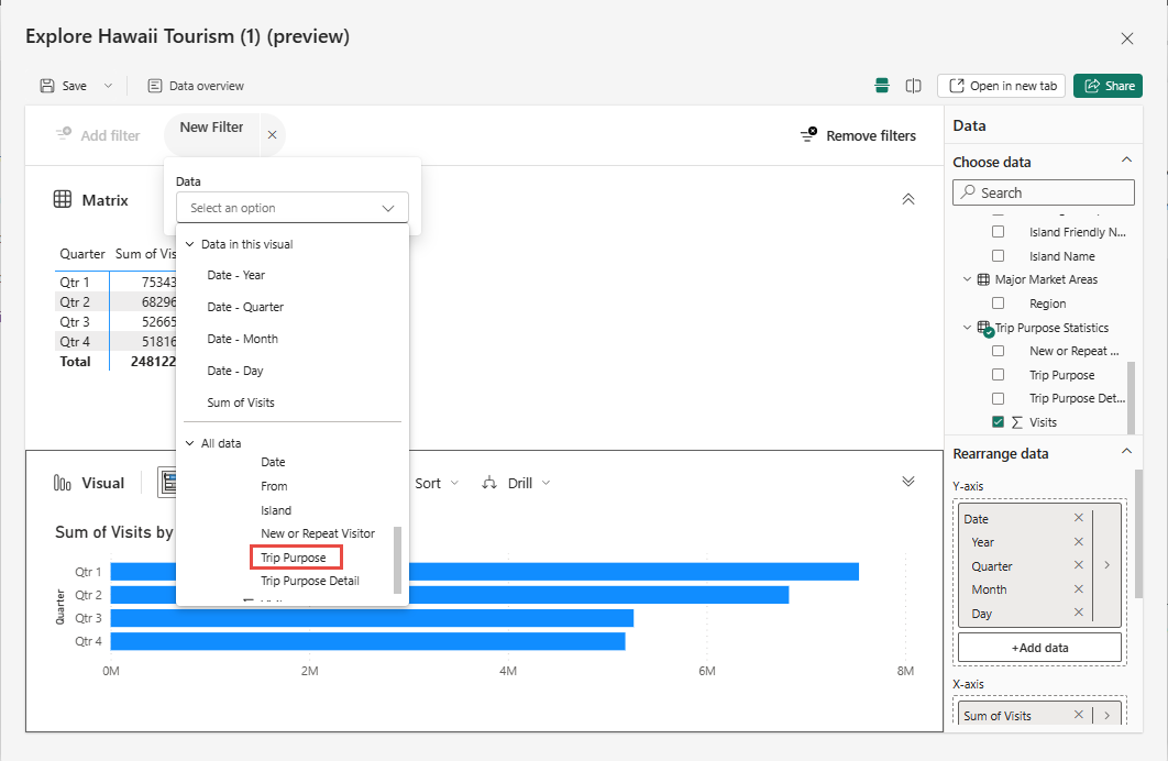
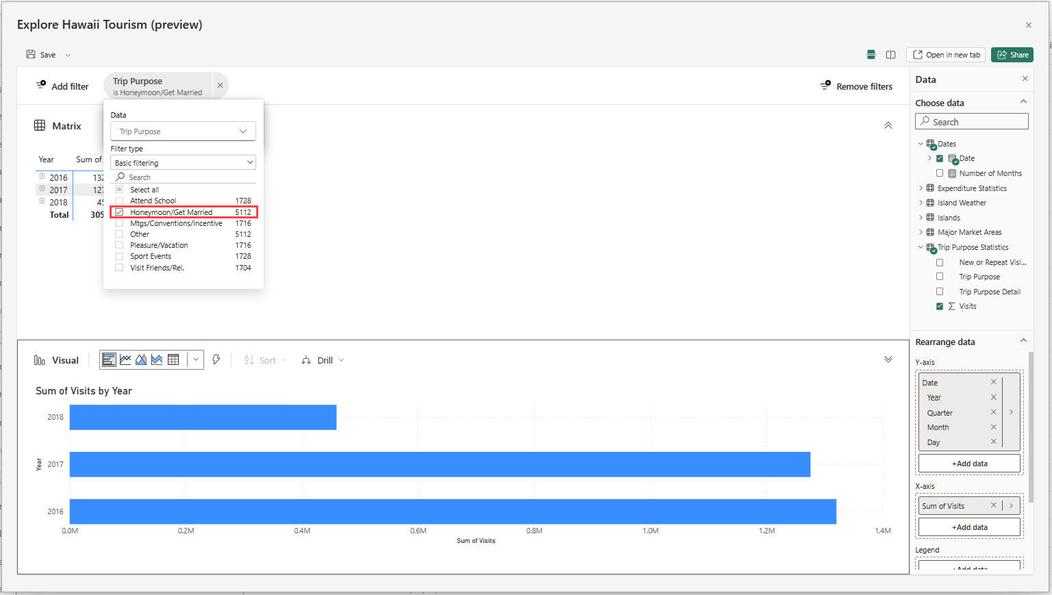
As you build out your exploration, you can also take advantage of a new filtering experience. Select the Add filter button on the top left to quickly add filters on the fields already in your visual or pick from any fields in your dataset in the All data section.
In this exploration experience, the filters are added as pills at the top of view, so you can easily see what the current filter state is and quickly modify it on the fly.
5. Save and share your exploration
Save your exploration
To save and share your exploration, select the Save button in the upper-left corner. In the dialog, you can name the exploration, pick a workspace to save it to, and add a sensitivity label, if applicable. This saves your current canvas layout (horizontal or vertical) of the exploration as well.
Note
You can only save explorations to workspaces in a Premium capacity at this time.
Share your exploration
Now you’re ready to share your exploration with others. Select the Share button in the upper-right corner. Continue to add your recipients' email addresses and share. You should be immediately prompted to share the underlying dataset so the recipients can view the contents of your exploration. If you're not prompted, ensure that you share the dataset with read permissions.
If you'd like to change your audience, select People in your organization can view.
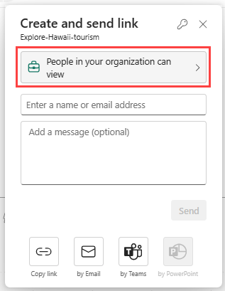
Choose your audience and their permissions, and select Apply. Provide email addresses and a message, then select Send.
Or select Copy link and send it by another means.
Note
Usually for reports, sharing the underlying dataset is done behind the scenes.
You may want to save your exploration as a report instead. You can do so by choosing Save, then Save as report. This saves your exploration as a single page report matching the layout when saved. For example, if you're viewing both the matrix and the visual, you get one page with a matrix on the top half and the visual on the bottom half of the page.
You can share this new report as with other reports by using the Share button.
Considerations and limitations
To create
- Exploration authors need build permissions on the dataset to create an exploration and open the Explore dialog.
- When you save, the destination workspace must be in a Premium capacity.
- Changing a sensitivity label on a dataset doesn't currently propagate down to the exploration that you create for it.
- There's currently a known issue when you attempt to save an exploration from the Datamart SQL editor entry point.
- Explore isn't currently supported for streaming datasets.
- If you save to My workspace, you may need to refresh your page to see the newly saved exploration artifact.
To share
- Exploration users need a Power BI Pro or PPU license to share.
- When you share your exploration, you also need to grant build permissions to the underlying dataset so your recipients can view the exploration. If you skip this second step, your recipients can't see the exploration, and have to request permissions.
- Explorations aren't currently shown in lineage view as related to the dataset.
To open a saved exploration
- Currently, you can't open an exploration on a mobile device in the Power BI mobile app.
Entry points
Explore isn't currently available from datasets and reports on the Power BI service Home or Create pages.
Supported visuals
All native visuals are supported with the exception of these visuals:
- Matrix
- Slicers
- Q&A
- Smart narratives
- Metrics
- Paginated reports
- Power Apps
- Power Automate
