Message boxes actions
You can use message boxes in your desktop flows to interact with users, request input, and provide an output.
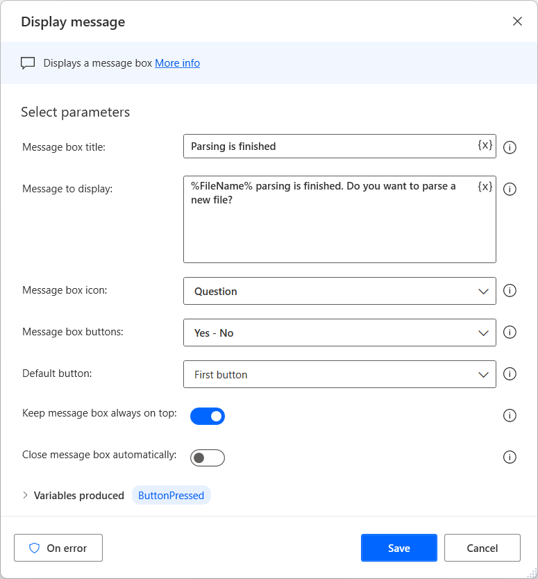
To display a message to the user while a flow runs, use the Display message action. You must specify the title of the message box, its content, the icon and the buttons in the box to be displayed. Moreover, you might set a default button to be preselected as well as to indicate if the message box should always be on top of all other windows on your machine and whether the message box is to be closed automatically after a certain amount of time.
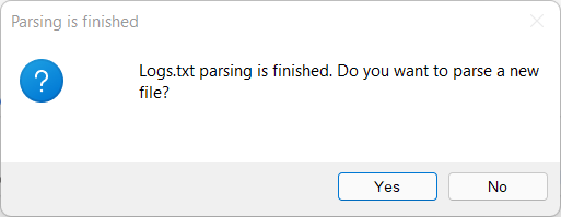
The example here displays a message box that informs the user that parsing is complete and asks whether to parse another file. The message box displays a question icon and always is on top of other windows. The ButtonPressed variable will store the user's selection.
The created message box should look like the following example:
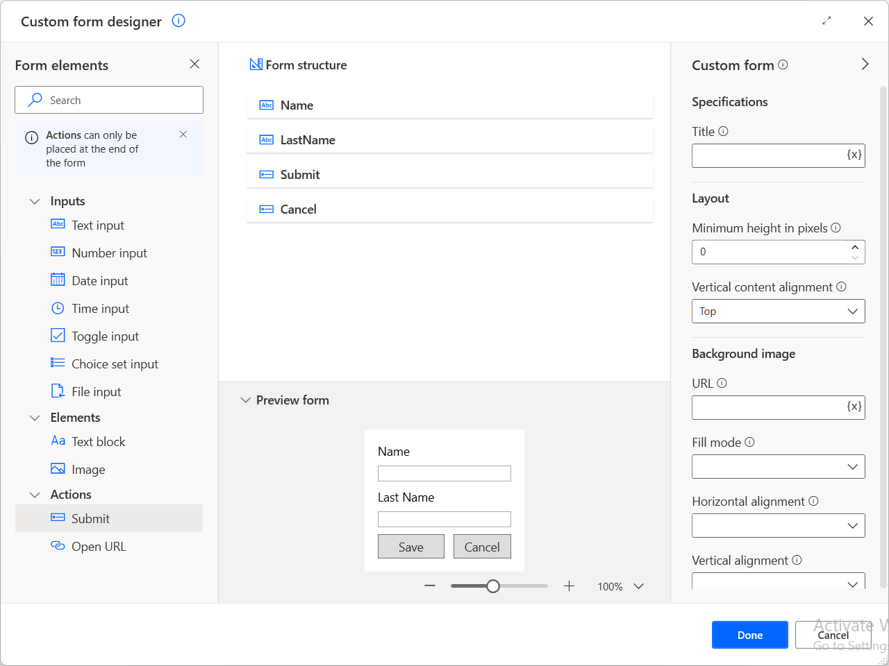
In addition to this, you might create a custom form for displaying a message as part of your flow with the use of the Display custom form action. A custom form accepts multiple elements, and you can create a custom form that contains various input types and buttons. More information: Create custom forms.
To request input data using a dialog, deploy the Display input dialog action. This action requires a title for the dialog and a message as a prompt for the user. Optionally, you can set a default value and an input type (single line, multiline, or password).
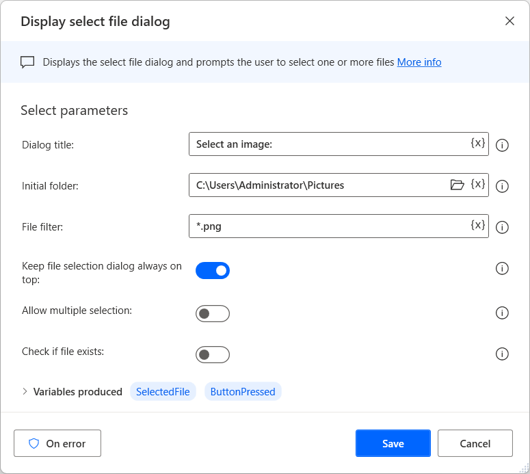
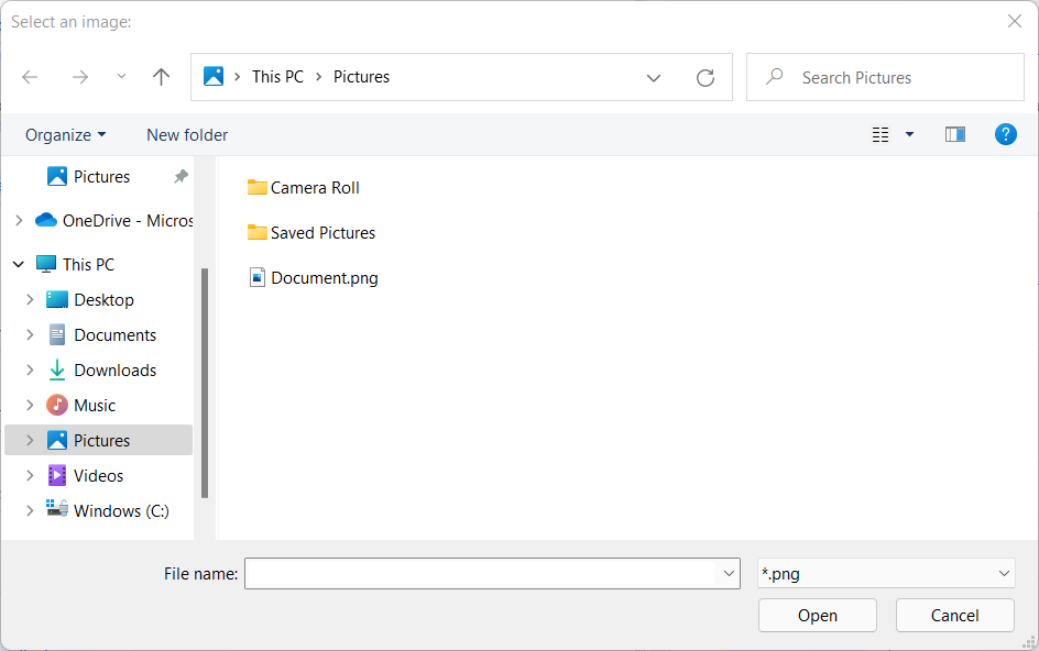
Use the Display select file dialog action to prompt users to browse for a file. The following example prompts you to select an image file. A variable specifies the initial folder, and the file filter limits the available selections to specific file extensions.
The created file dialog should look like the following example. You can see the specified filter in the bottom right corner of the dialog.
Display message
Displays a message box.
Input parameters
| Argument | Optional | Accepts | Default Value | Description |
|---|---|---|---|---|
| Message box title | Yes | Text value | The text to use as the message box title | |
| Message to display | Yes | Text value | The text to display as the actual message | |
| Message box icon | N/A | None, Information, Question, Warning, Error | None | The icon to display with the message box |
| Message box buttons | N/A | OK, OK - Cancel, Yes - No, Yes - No - Cancel, Abort - Retry - Ignore, Retry - Cancel | OK | The buttons to display on the message box |
| Default button | N/A | First button, Second button, Third button | First button | The button to highlight by default. If the user presses Enter, this button will be pressed |
| Keep message box always on top | N/A | Boolean value | False | Specify whether the message box should always remain on top of all other windows |
| Close message box automatically | N/A | Boolean value | False | Specify whether the message box closes automatically after a preset time, as if the default button was pressed. Otherwise, the flow will wait until a button is pressed by the user |
| Timeout | Yes | Numeric value | 3 | The seconds to pause the automation while waiting for input, until continuing automatically |
Variables produced
| Argument | Type | Description |
|---|---|---|
| ButtonPressed | Text value | The text of the button pressed |
Note
The value of the ButtonPressed variable is always in English, regardless of the current locale settings in Power Automate for desktop.
Exceptions
| Exception | Description |
|---|---|
| Failed to display message box | Indicates a problem displaying the message dialog |
| Can't display message box in noninteractive mode | Indicates a problem displaying the message dialog in non-interactive mode |
Display input dialog
Displays a dialog box that prompts the user to enter text.
Input parameters
| Argument | Optional | Accepts | Default Value | Description |
|---|---|---|---|---|
| Input dialog title | Yes | Text value | The dialog title | |
| Input dialog message | Yes | Text value | The dialog message | |
| Default value | Yes | Text value | Specify the text to display by default. If the user wishes to change this text, they can type over it. Otherwise, the default text will be used | |
| Input type | N/A | Single line, Password, Multiline | Single line | The format for the input text. Choose Single line - password to hide the text or multiline so that a larger display box makes visible more than one line of text |
| Keep input dialog always on top | N/A | Boolean value | False | Specify whether the input dialog should always remain on top of all other windows |
Variables produced
| Argument | Type | Description |
|---|---|---|
| UserInput | Text value | The text entered by the user, or the default text |
| ButtonPressed | Text value | The text of the button pressed. The user will automatically be given the choice of OK or Cancel |
Note
The value of the ButtonPressed variable is always in English, regardless of the current locale settings in Power Automate for desktop.
Exceptions
| Exception | Description |
|---|---|
| Failed to display input dialog | Indicates a problem displaying the input dialog |
| Can't display input dialog in non interactive mode | Indicates a problem displaying the input dialog in non-interactive mode |
Display select date dialog
Displays a dialog box that prompts the user to enter a date or date range.
Input parameters
| Argument | Optional | Accepts | Default Value | Description |
|---|---|---|---|---|
| Dialog title | Yes | Text value | The dialog title | |
| Dialog message | Yes | Text value | The dialog message | |
| Dialog type | N/A | Single date, Date range (two Dates) | Single date | Whether the user will enter a single date or two dates as the endpoints of a range of dates |
| Prompt for | N/A | Date only, Date and time | Date only | Specify whether the user will enter the date only or the date and time |
| Default value | Yes | Datetime | The default value for the date | |
| Default value for second date | Yes | Datetime | The default value for the end date in a range | |
| Keep date selection dialog always on top | N/A | Boolean value | False | Specify whether the date selection dialog should always remain on top of all other windows |
Variables produced
| Argument | Type | Description |
|---|---|---|
| SelectedDate | Datetime | The date entered by the user or the default date |
| SecondSelectedDate | Datetime | The second date entered by the user or that default date |
| ButtonPressed | Text value | The text of the button pressed by the user. The user will automatically be given the choice of OK or Cancel |
Note
The value of the ButtonPressed variable is always in English, regardless of the current locale settings in Power Automate for desktop.
Exceptions
| Exception | Description |
|---|---|
| Failed to display select date dialog | Indicates a problem displaying the select date dialog |
| Can't display select date dialog in non interactive mode | Indicates a problem displaying the input dialog in non-interactive mode |
Display select from list dialog
Displays a dialog box with options that lets the user select from a list.
Input parameters
| Argument | Optional | Accepts | Default Value | Description |
|---|---|---|---|---|
| Dialog title | Yes | Text value | The dialog title | |
| Dialog message | Yes | Text value | The dialog message | |
| List to choose from | No | General value | The list to display as a drop-down menu for the user to choose from | |
| Keep select dialog always on top | N/A | Boolean value | False | Specify whether the select dialog should always remain on top of all other windows |
| Limit to list | N/A | Boolean value | True | Whether to allow the user to enter their own answer outside of the list being displayed |
| Allow empty selection | N/A | Boolean value | False | Allow the user to not select anything, creating an empty selected item output |
| Allow multiple selections | N/A | Boolean value | False | Allow the user to select more than one choice. The selected item and selected index variables will hold a list of items |
| Preselect items starting with a + sign | N/A | Boolean value | False | Specify whether the items with a prepended '+' sign will appear automatically preselected |
Variables produced
| Argument | Type | Description |
|---|---|---|
| SelectedItem | Text value | The item selected from the list as text |
| SelectedItems | List of Text values | The items selected from the list as a list of text |
| SelectedIndex | Numeric value | The index number of the item selected from the list. You can use the item number instead of the full text of your choice |
| SelectedIndexes | List of Numeric values | The index number of the items selected from the list. This parameter allows you to use the item number instead of the full text of your choice |
| ButtonPressed | Text value | The name of the button pressed by the user (OK or Cancel) |
Note
The value of the ButtonPressed variable is always in English, regardless of the current locale settings in Power Automate for desktop.
Exceptions
| Exception | Description |
|---|---|
| Failed to display select dialog | Indicates a problem displaying the select dialog |
| Can't display select dialog in noninteractive mode | Indicates a problem displaying the input dialog in non-interactive mode |
Display select file dialog
Displays the select file dialog and prompts the user to select one or more files.
Input parameters
| Argument | Optional | Accepts | Default Value | Description |
|---|---|---|---|---|
| Dialog title | Yes | Text value | The dialog title | |
| Initial folder | Yes | Folder | The initial folder to open when browsing for a file. This folder is where the select file dialog action will start the user looking for the file(s) | |
| File filter | Yes | Text value | A filter to limit the files retrieved. This parameter allows wild cards, for example ".txt" or "document?.doc" (without the quotes). To allow the user to choose from multiple file filters, separate the choices with a semi-colon, for example ".txt;*.exe" | |
| Keep file selection dialog always on top | N/A | Boolean value | False | Whether the file selection dialog should always remain on top of all other windows |
| Allow multiple selections | N/A | Boolean value | False | Whether the user will be able to select more than one file or not |
| Check if file exists | N/A | Boolean value | False | Whether only files that already exist will be accepted |
Variables produced
| Argument | Type | Description |
|---|---|---|
| SelectedFile | File | The file that will be selected through the dialog |
| SelectedFiles | List of Files | The file(s) selected |
| ButtonPressed | Text value | The text of the button pressed. The user will automatically be given the choice of Open or Cancel |
Note
The value of the ButtonPressed variable is always in English, regardless of the current locale settings in Power Automate for desktop.
Exceptions
| Exception | Description |
|---|---|
| Failed to display select file dialog | Indicates a problem displaying the select file dialog |
| Can't display select file dialog in noninteractive mode | Indicates a problem displaying the input dialog in non-interactive mode |
Display select folder dialog
Displays the select folder dialog and prompts the user to select a folder.
Input parameters
| Argument | Optional | Accepts | Default Value | Description |
|---|---|---|---|---|
| Dialog description | Yes | Text value | The description of the select folder dialog For example, "Please select the folder into which you wish to copy the files" | |
| Initial folder | Yes | Folder | The initial folder to open. This folder will be the default folder unless the user picks a new one | |
| Keep folder selection dialog always on top | N/A | Boolean value | False | Whether the folder selection dialog should always remain on top of all other windows |
Variables produced
| Argument | Type | Description |
|---|---|---|
| SelectedFolder | Folder | The selected folder |
| ButtonPressed | Text value | The text of the button pressed. The user will automatically be given the choice of OK or Cancel |
Note
The value of the ButtonPressed variable is always in English, regardless of the current locale settings in Power Automate for desktop.
Exceptions
| Exception | Description |
|---|---|
| Failed to display select folder dialog | Indicates a problem displaying the select folder dialog |
| Can't display select folder dialog in noninteractive mode | Indicates a problem displaying the input dialog in non-interactive mode |
Display custom form
Display a customized form that can include multiple types of elements, like text, number or file inputs etc.
Input parameters
Input parameters are configured through the custom form designer.
Variables produced
| Argument | Type | Description |
|---|---|---|
| CustomFormData | Custom object | A custom object containing the user's input |
| ButtonPressed | Text value | The ID of the button pressed |
Note
The value of the ButtonPressed variable is always in English, regardless of the current locale settings in Power Automate for desktop.
Exceptions
| Exception | Description |
|---|---|
| Failed to display custom form | Indicates a problem displaying the custom form |