Visualize data in a view with Copilot (preview)
[This article is prerelease documentation and is subject to change.]
Copilot enables you to visualize the data in the view in the form of a chart to help you understand trends, patterns and relations in your data easily. The visualization is interactive, based on the visible columns in the view, and can be personalized to support further data exploration.
Prerequisites
- Copilot assistance is available for all model-driven apps on the web where the modern, refreshed look is turned on.
- Your administrator must enable Allow AI to generate charts to visualize the data in a view setting in Power Platform admin center.
Important
- This is a preview feature.
- Preview features aren’t meant for production use and might have restricted functionality. These features are subject to supplemental terms of use, and are available before an official release so that customers can get early access and provide feedback.
Visualize data in a view
To use this Copilot visualization, your administrator must enable it. For more information on how to enable Copilot visualization, see Manage feature settings.
When you navigate to a grid page, you can see the Visualize option on top of the page.
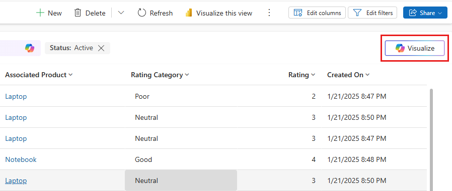
When you select Visualize, Copilot generates a visualization for the view considering the visible columns and the filters. The visualization is a chart aggregating the data in the view, and it appears side by side with the grid, complementing the table of rows.

You can select Explain to view a short AI-generated reasoning for the visualization that Copilot chose for this view. You can hover over the chart to examine data points or select chart elements to drill into the data.
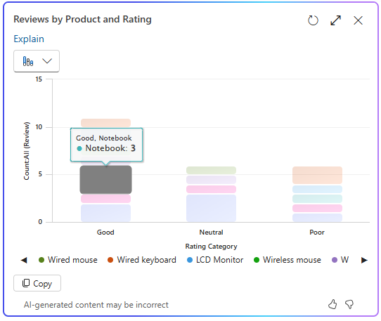
The grid automatically filters the rows to match the selected area of the chart. Selecting the same area of the chart again toggles the selection and removes the filter.
You can personalize the chart generated by Copilot using the drop-down that shows the selected chart and eight other chart types.
If you add or remove columns from the view, Copilot automatically regenerates the chart by considering the updated set of columns for the visualization. If you add or remove filters, Copilot automatically refreshes the chart without changing the visualization.
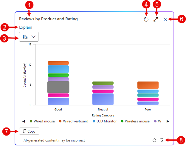
- Chart title: AI-generated title for the chart based on the data and columns visualized.
- Explain: AI-generated reasoning for the visualization that Copilot chose for this view.
- Chart selector: List of nine supported chart types – Pie, Donut, Bar, Column, Clustered Bar, Stacked Bar, Clustered Column, Stacked Column and Line.
- Refresh: Select Refresh to see the latest data behind the chart without changing chart type.
- Expand: Select Expand to expand the chart to full screen for a better view of the chart area.
- Close: Select Close to close the chart pane.
- Copy: Select Copy to copy the chart as a PNG file to the clipboard.
- Feedback: Select Thumbs up or Thumbs Down to provide feedback about the feature.
To provide feedback about the feature, select the thumbs up or down button on the chart pane, and provide detailed comments to help improve the feature.
Related information
Manage feature settings
Responsible AI FAQ about Copilot visualizations on a view