Change screen size and orientation of canvas apps
Customize a canvas app by changing its screen size and orientation.
Change screen size and orientation
Sign in to Power Apps.
Open the app to edit.
Select Settings.
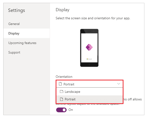
Select Display.
Under Orientation list, select Portrait or Landscape.

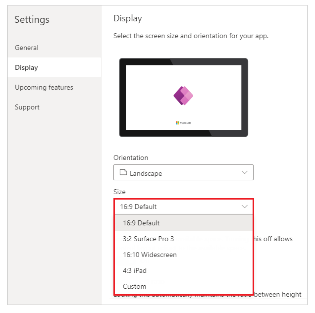
(Tablet apps only) Under Aspect ratio, perform either of these steps:
- Select the ratio that matches the target device for this app.
- Select Custom to set your own size, and then specify a width between 50 - 3840 and a height between 50 - 2160.

Note
Size is only available for apps with Tablet layout.
Under Scale to fit, specify either On or Off.

This setting is on by default so that app screens resize to fit the available space on the device. When this setting is on, the app's Width property matches its DesignWidth, and the app's Height matches its DesignHeight.
If you turn this setting off, the app adjusts to the aspect ratio of the device on which it's running and takes up all of the available space. The app doesn't scale and, as a result, screens can show more information.
When this setting is turned off, Lock aspect ratio is automatically turned off and disabled. In addition, the Width property of all screens is set to
Max(App.Width, App.DesignWidth), and their Height property is set toMax(App.Height, App.DesignHeight)so that they track the dimensions of the window in which the app is running. With this change, you can create apps that respond to different devices and window dimensions. More information: Create responsive layoutUnder Lock aspect ratio, specify either On or Off.

If this setting is on, the app retains the screen orientation and aspect ratio that you specified in steps 2 and 3, no matter the device. For example, a phone app that's running in a web browser retains the ratio for a phone, showing a dark bar on each side instead of filling the window.
If this setting is off, the app adjusts to the aspect ratio of the device on which it's running. We don't recommend this because the app can be distorted to the point of being unusable, depending on the screen size. For example, controls may overlap or text might be clipped.
Note
This setting can't be turned off for certain controls such as Rich text editor and Fluent UI controls. They won't distort according to screen size. Create a responsive layout to specify how these controls should adapt to different screen sizes.
Under Lock orientation, specify either On or Off.

If you lock the app's orientation, the app retains the orientation that you specify. If the app is running on a device for which the screen is in a different orientation, the app displays incorrectly and may show unwanted results. If you unlock the app's orientation, it adjusts to the screen orientation of the device on which it's running.
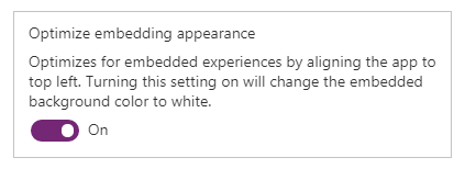
You can also modify the app's orientation by enabling Optimize embedding appearance in Settings > Display. This feature top-left aligns the app when it's embedded and changes the background color of the hosting canvas to white.

Close Settings dialog.
Save and publish your app.
Enumerated app behavior for scale to fit and lock aspect ratio settings
| Scenario | Scale to fit | Lock aspect ratio | App layout behavior on 'screen resize' | Notes to include in docs |
|---|---|---|---|---|
| 1 | Enabled | Enabled | The screen width and height are set by the maker. The screen scales to the window size available. | |
| 2 | Disabled | Enabled | Not applicable. When scale to fit is disabled, lock aspect ratio is also disabled. | |
| 3 | Enabled | Disabled | In Power Apps Studio, the screen scales to the window size available. In the end-user experience, Power Apps scales to the smallest edge (width or height), and then fills the UI for the larger edge. | For apps built for mobile, we recommend makers use lock orientation with this setting. |
| 4 | Disabled | Disabled | App experiences can be responsive. Makers can manulipate control locations using Power Fx to set X and Y values as well as width and height. | For more information, see Responsive layout documentation and consider using auto-layout containers. |
Next steps
- Create responsive layouts in canvas apps.
- Check common issues and resolutions if you're running into any problems.