Components supported by the UI kit
[This article is pre-release documentation and is subject to change.]
The Create Apps from Figma UI Kit supports certain components. In this article, you'll learn about these components.
For the latest information about the supported components and to view detailed examples, you can visit the Supported components page inside the Create Apps from Figma UI Kit.
Important
Don't rename components or change layers. Otherwise, the components won't convert property in Power Apps.
Scrollable sections
A scrollable section is a section on a screen. If content extends beyond the section, it will still be accessible when the user scrolls.
The scrollable sections inside the UI kit are available in two different formats: Phone, and Tablet.
Form
Use a Form section when you want to have users fill out fields and submit data.
In Power Apps, this section will be scrollable.
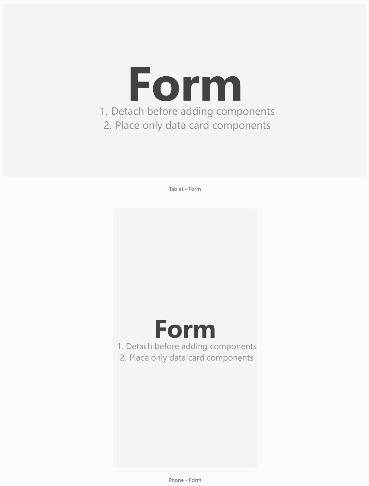
- Place only vertical or horizontal data card components in form section.
- Don't mix and match vertical and horizontal data cards.
- Don't use base components in form frames.
Container (vertical)
Use the Container (vertical) sections when you want the content to scroll. For example, if you need a section of lengthy explanatory content.
Tip
You can also add a small form inside a Container (vertical) section.
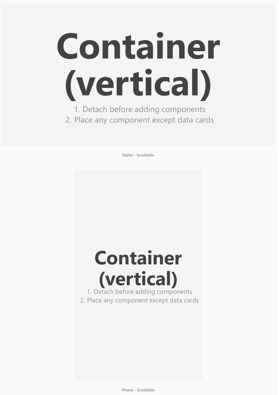
- Use base components and forms in container frames.
- Don't place vertical or horizontal card components in Container (vertical) section.
Vertical and horizontal data cards
Vertical and horizontal data cards are components that arrange themselves automatically on a form.
Note
Ensure all data cards are placed directly inside a form component. Data cards can't be used outside of a form.
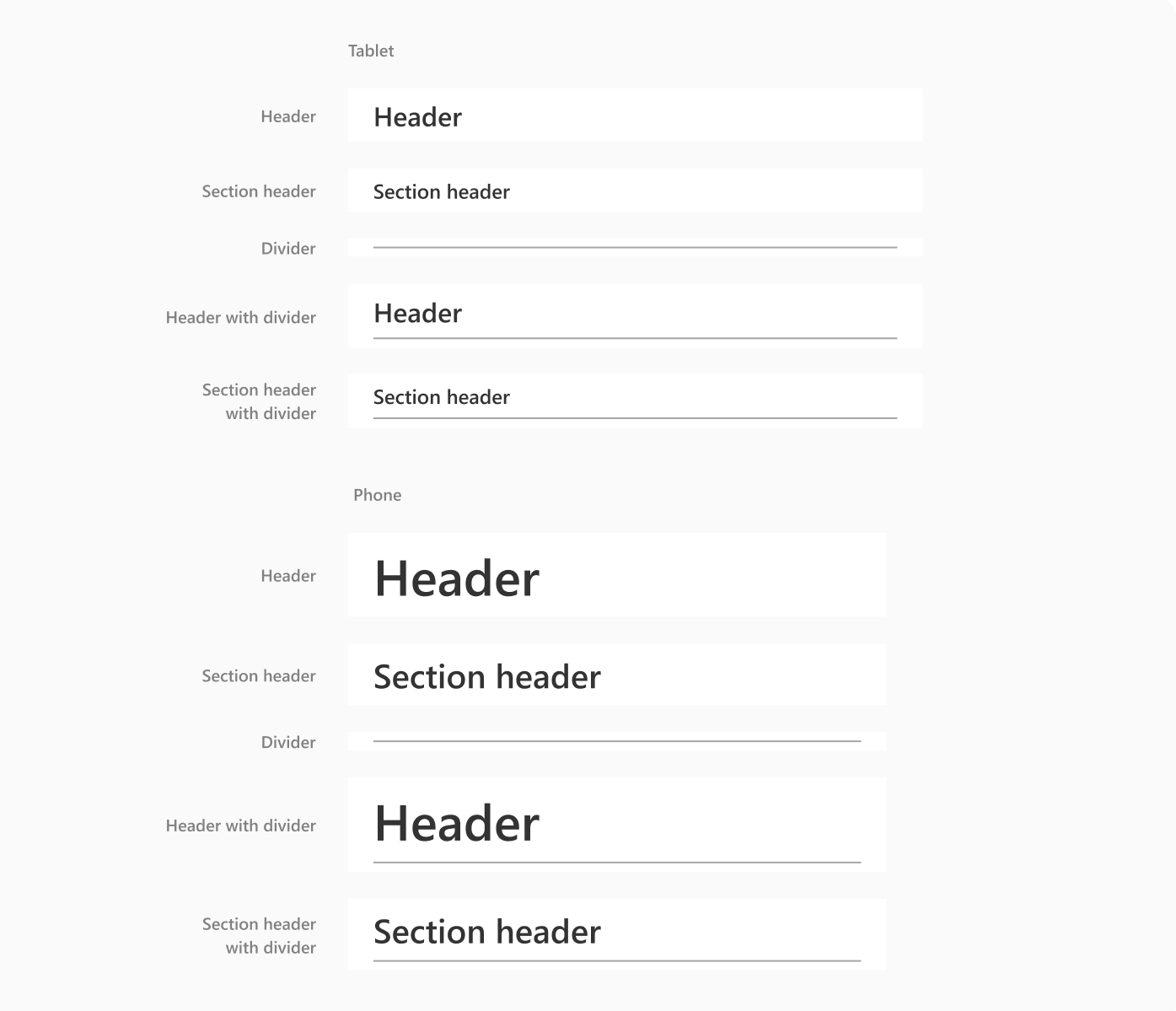
Headers and dividers
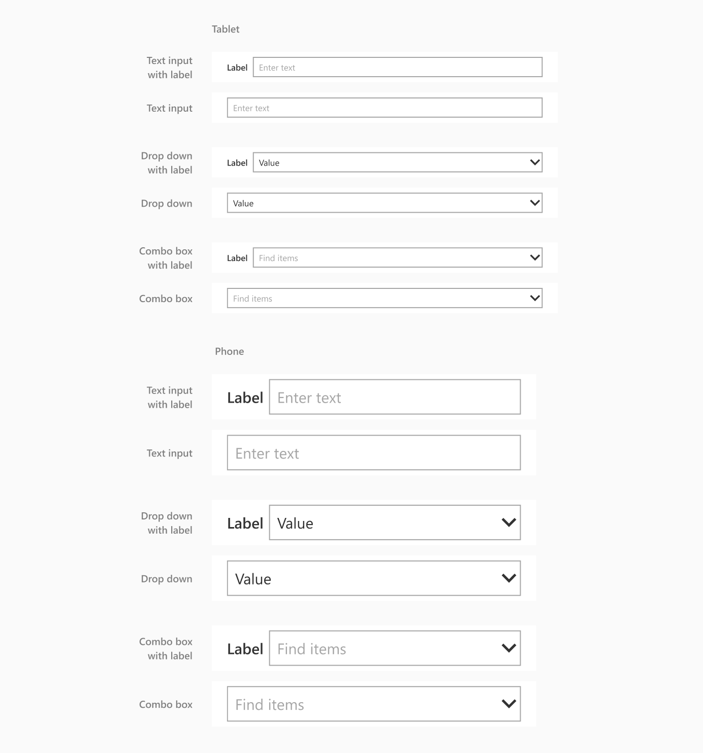
Text input, drop down, and combo box
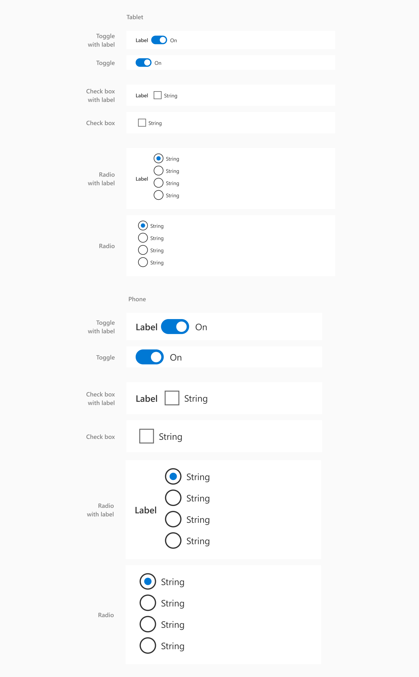
Toggle, check box, and radio
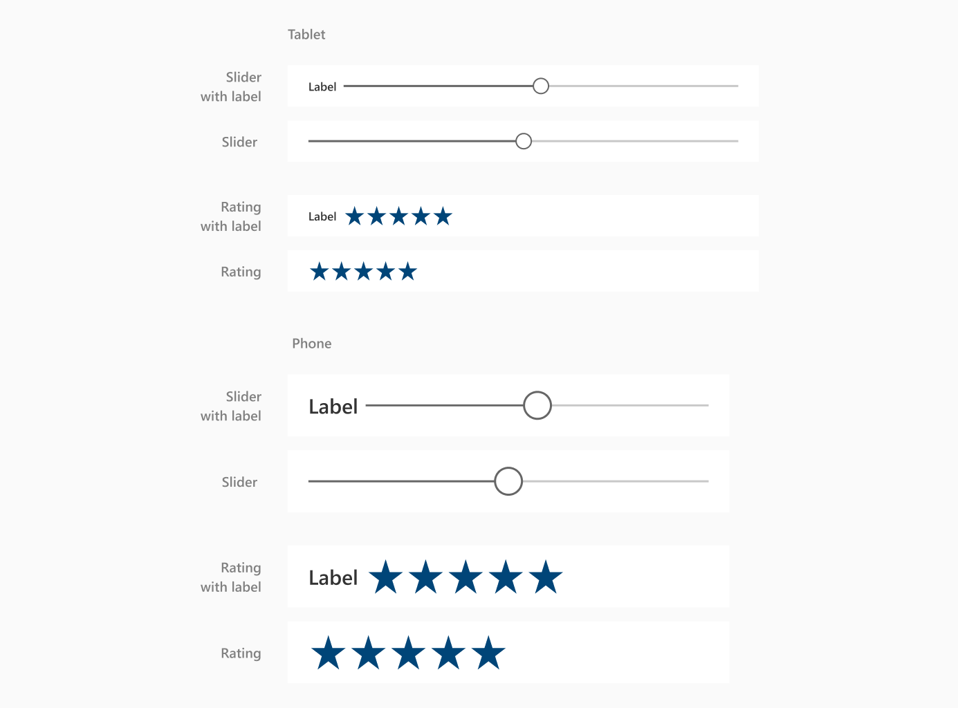
Slider, rating
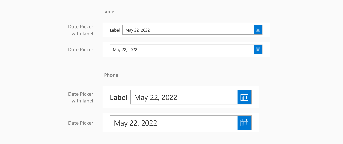
Date picker
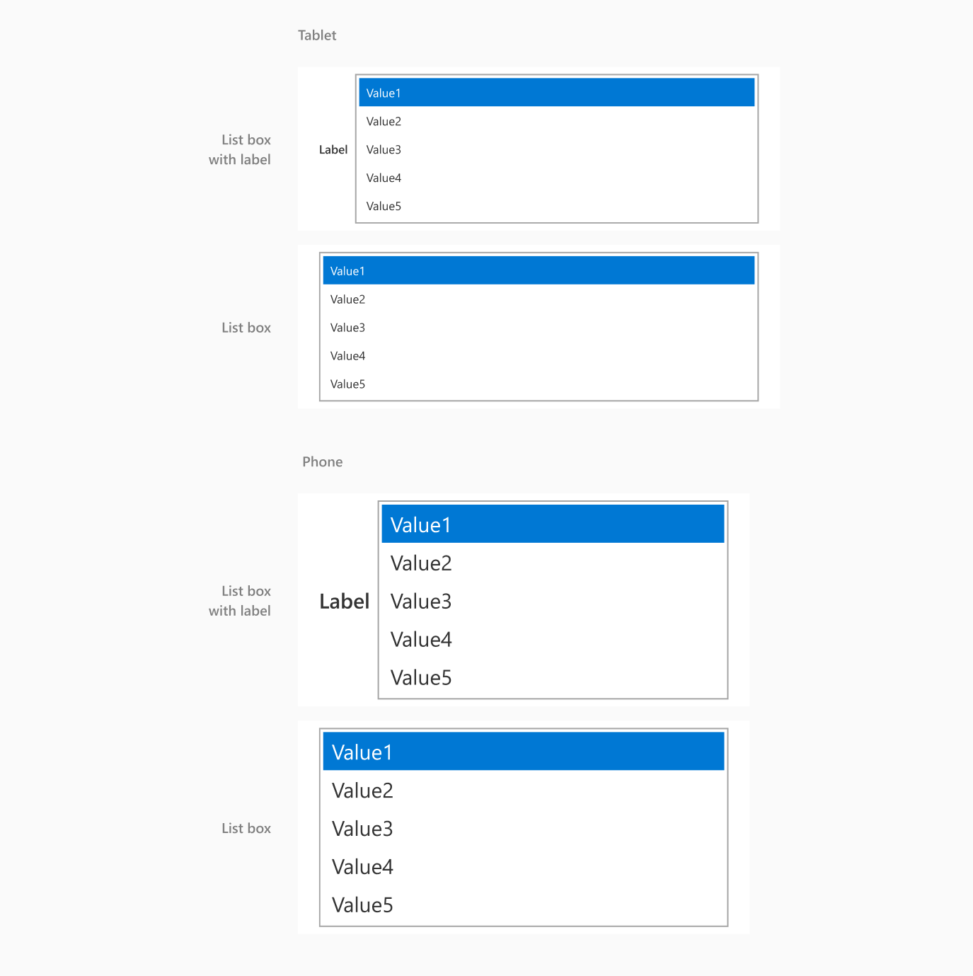
List box
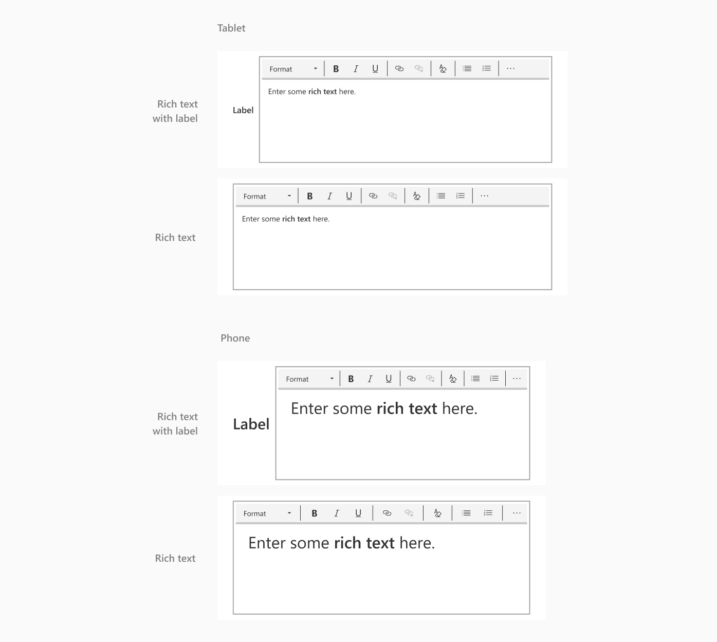
Rich text
Timer
Component sizes, states and types
Button sizes

Button states

- If you want an outlined button with a stroke, set the stroke to Center in Figma since Power Apps only converts centered strokes.
Labels sizes

Note
Use only one font and font size within a text label. If you want to use more than one font or font size within a text label, then make separate labels with those variations. Also, ensure that the text for the label doesn't extend beyond the bounding box, or it won't convert properly.
Text input sizes

Text input states
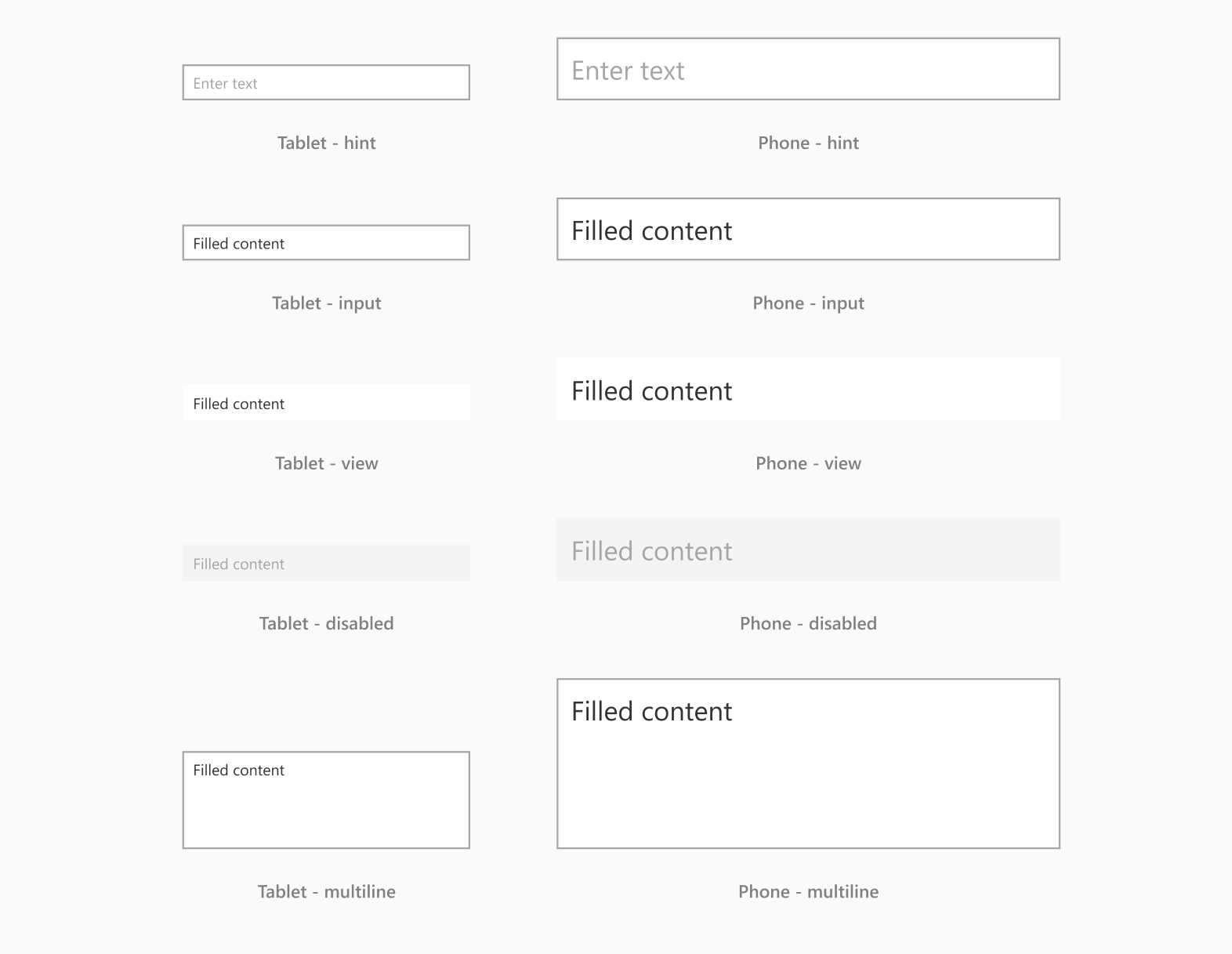
Text input types

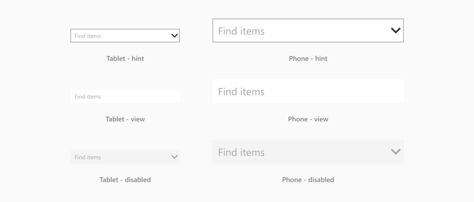
Combo box sizes

Combo box states
Drop down sizes

Drop down states
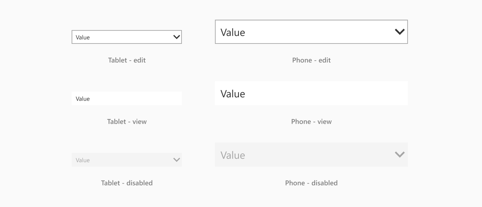
Check box sizes

Check box states

Radio button sizes

Radio button states
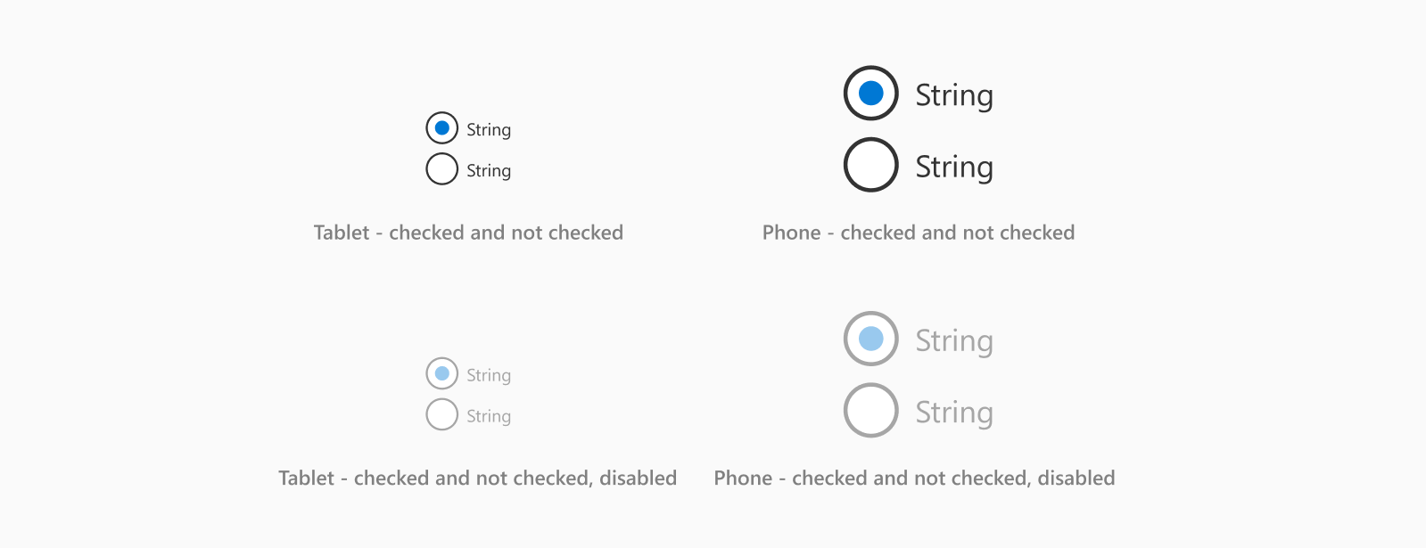
Radio button types

- Keep all radio buttons and text the same color. When converting into an app, Power Apps will use the color of the first radio button for all the remaining buttons. It won't recognize any other colors you may have used.
Toggle sizes

Toggle states
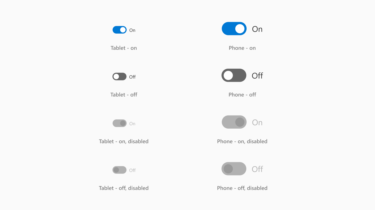
Toggle types

Date picker sizes

Date picker states
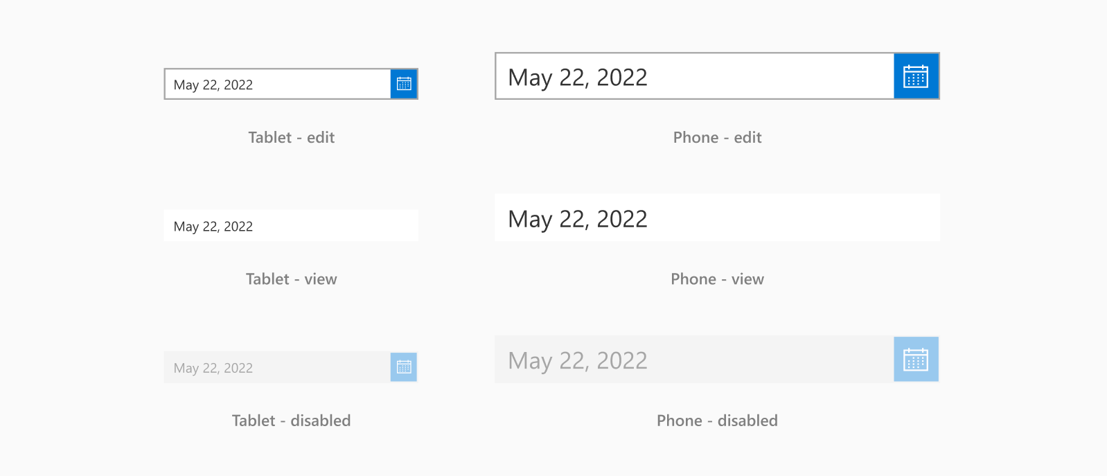
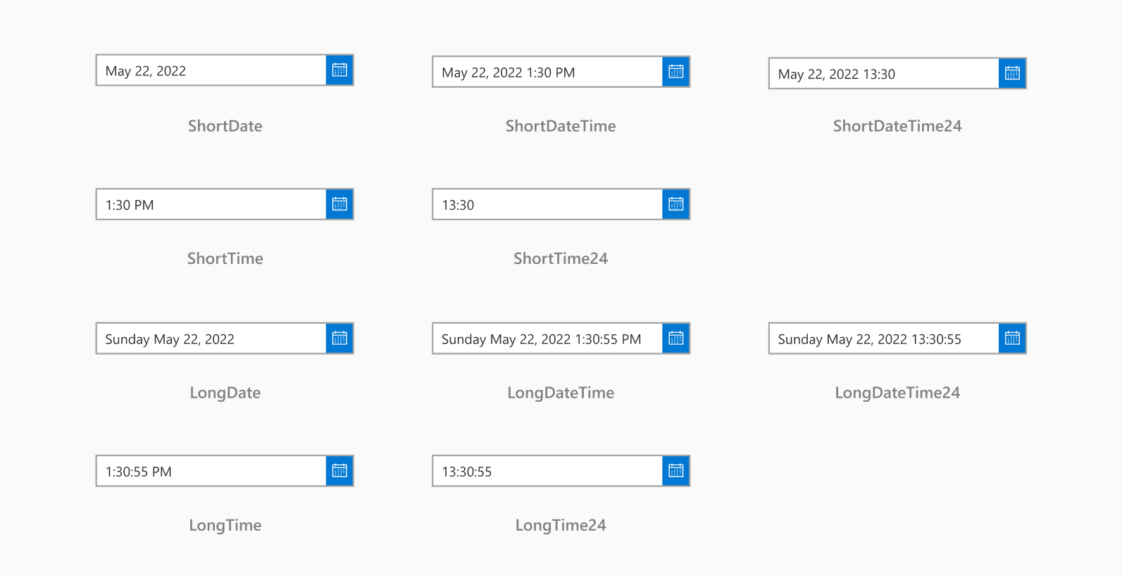
Date picker types
Slider sizes

Slider states

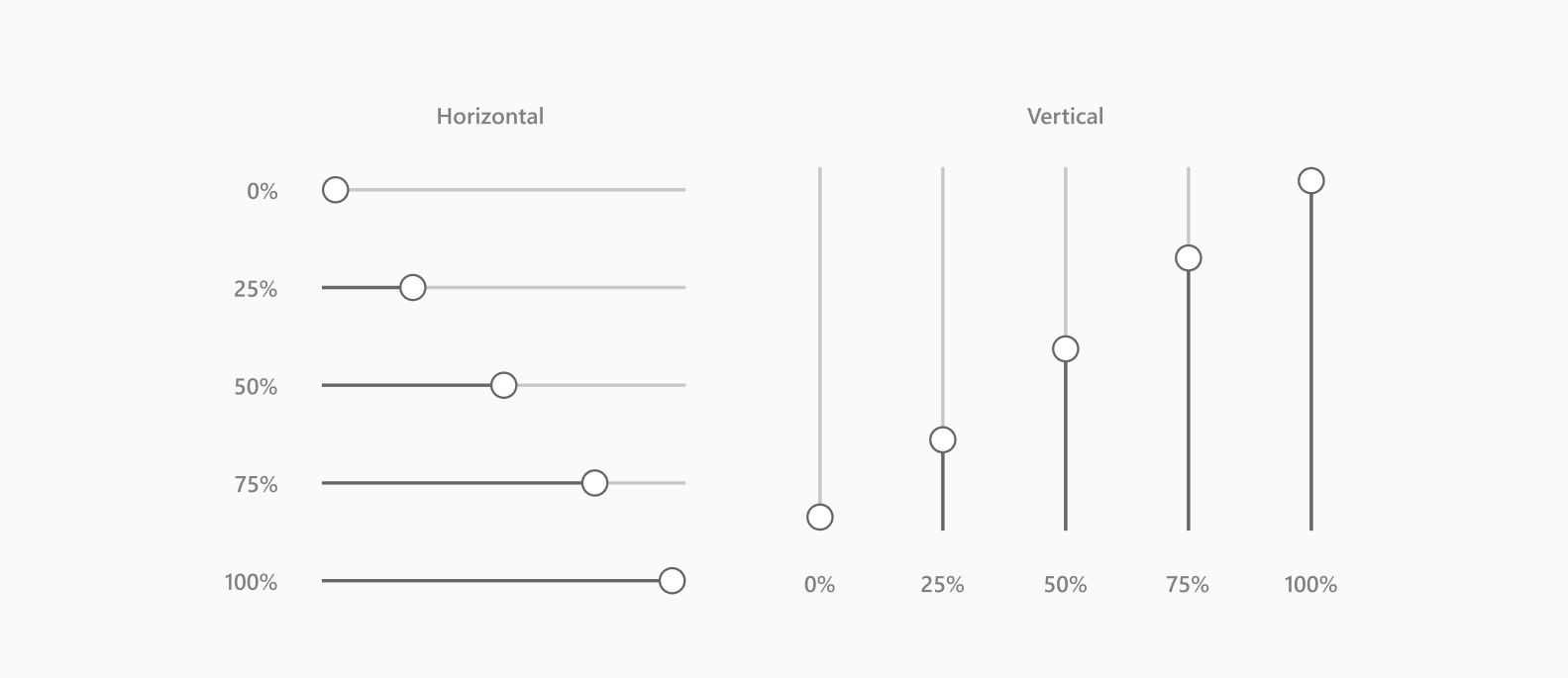
Slider types
Rating sizes

Rating states
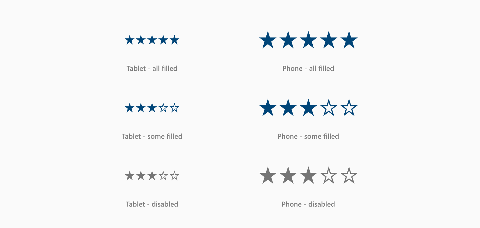
Rating types

- Keep all stars the same color while designing in Figma. When converting into an app, Power Apps will use the color of the first star for all the remaining stars. It won't recognize any other colors you may have used.
List box sizes

List box states
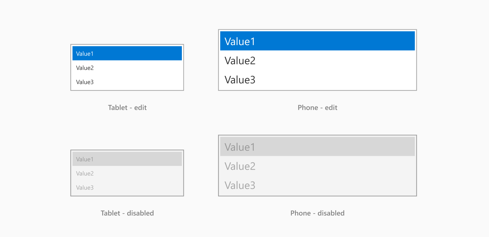
List box types

Rich text sizes

Rich text states
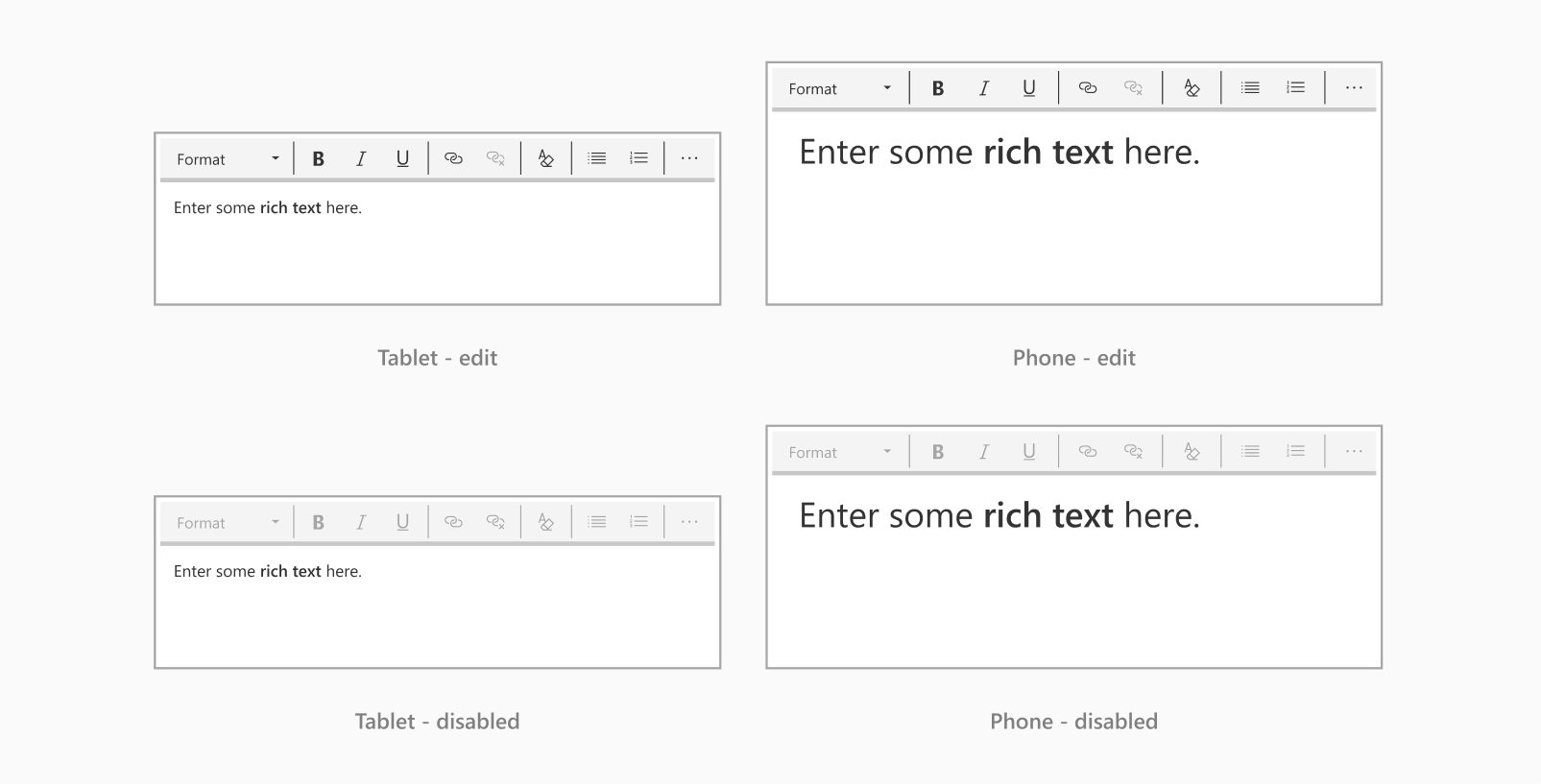
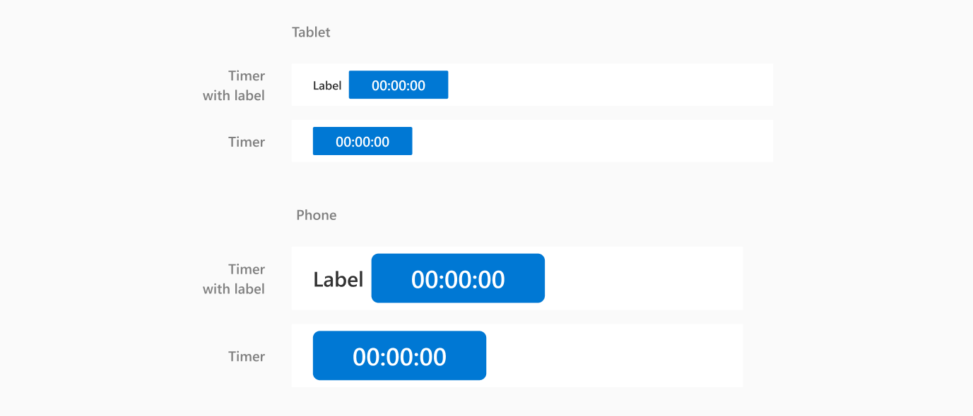
Timer sizes

Timer states

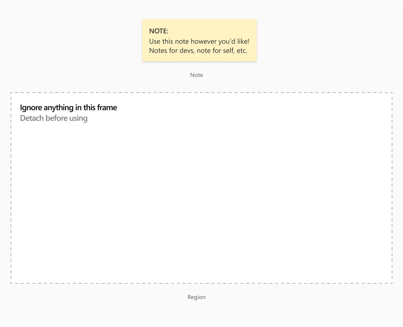
Content to ignore
Use these components to make notes, comments, or miscellaneous content that doesn't need to render in the final app. The content will then be ignored when you convert the design in Power Apps.
Images and rectangles
Images and rectangles will render as-is when the design is converted into an app.
Images

Rectangles

- Only use rectangles with squared corners since Power Apps can only convert rectangles with squared corners. In Figma, this means the corner radius must be set to zero.