Create effective listings in Microsoft AppSource and Microsoft 365 app stores
The information and images you submit to Partner Center become the Microsoft AppSource and in-product listing for your solution. This information is the first thing prospective users see, and creates their first impression. Make sure that the information you submit—including your name, description, icons, and images—clearly communicates the benefits and functionality that your solution provides.
Apply the following when you create your name, description, and images.
- Describe what your solution can do for customers. Answer the question: What problem does this solution solve?
- Use unique icons for each solution.
- Include images that show off your UI. Be sure to remove any personal information from your images.
- If you update your functionality, update your description too.
- Use a customer-friendly voice. Be concise and use natural language.
- Avoid marketing speak and buzz words.
- Check the spelling and grammar in your names and descriptions.
Use a succinct and descriptive name
Create a simple and direct name. The shorter the name the better. Remember, the length of the name that's displayed can depend on how the user sizes the window. Include your brand or company name if users are likely to use it to search for your solution.
In your name:
- Make the purpose or benefits of your solution clear. Don't rely on your brand to communicate what your solution does.
- Use the following naming pattern: Function + for + brand or company name (optional). For example, Small Business Invoicing for Contoso.
- Use title case. Capitalize the first letter of each word, except articles and prepositions. For example, Apartment Search for Contoso.
- Don't include the Microsoft product name because it already appears on your landing page, and in Microsoft AppSource and in-product Store search results.
- Avoid acronyms that might be unfamiliar to potential users.
- Don't use all uppercase letters, unless your brand name is all uppercase.
- Don't use the words "free" or "sale" or include exclamation points.
Use a consistent add-in name
You specify your add-in name in two places, so be sure to use the same name in both:
- Your add-in manifest; specifically, the DisplayName (Office Add-in), or Title (SharePoint Add-in) element. This element specifies the name that's displayed after the user installs the add-in.
- The name you reserve in Partner Center. This name is displayed in Microsoft AppSource and the in-product Store.
Write compelling descriptions
A good description makes your solution stand out. Your summary should entice potential users to learn more. Your description, which appears on the Microsoft AppSource landing page, should provide more detail about your solution and its value.
Effective summaries
The summary you supply with your submission is the text shown to users in Microsoft AppSource and in-product search results. You want it to be original, engaging, and directed at your target audience. Describe your solution and its value to your target customer, in one or two sentences:
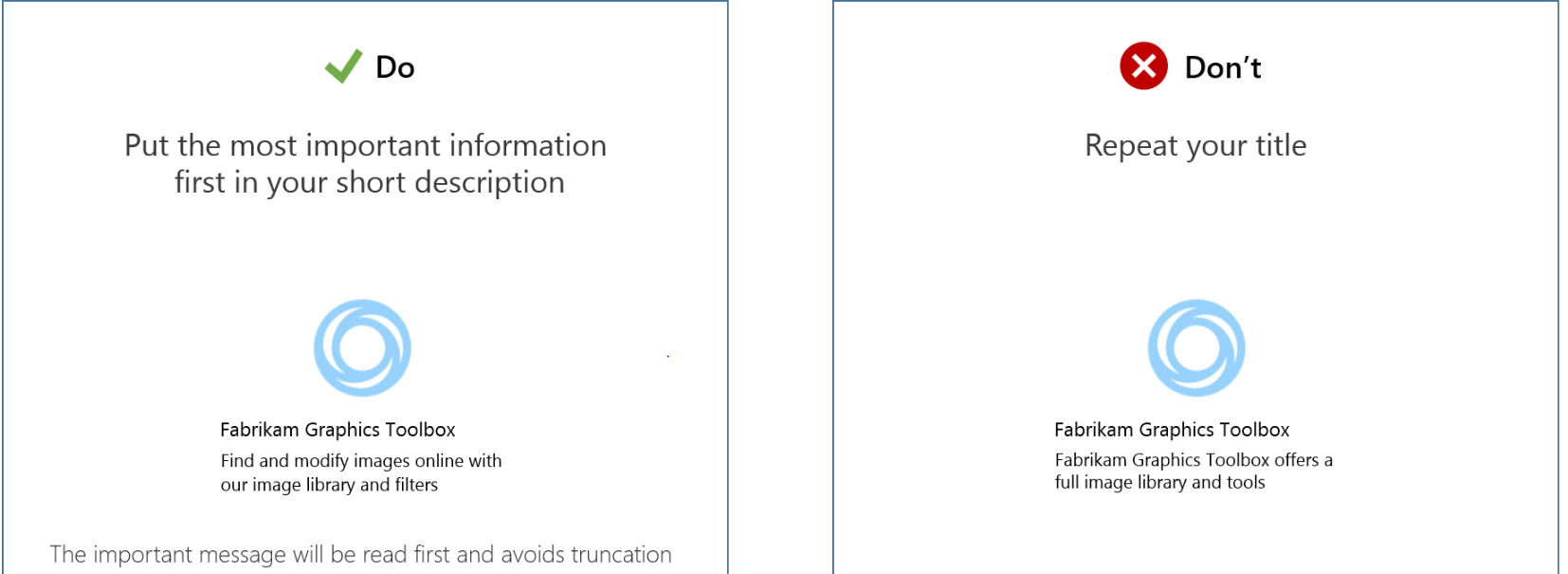
- Put the most important information first.
- Don't repeat the name.
- Avoid using jargon or specialized terminology; don't assume that users know what they're looking for.
- Include keywords that customers might search for.
The following figure shows a good summary next to one that relies on the brand name.
Effective descriptions
The description is displayed on your landing page in Microsoft AppSource and within Office. It should match the description in your manifest as closely as possible. You have room for a more detailed description, including the main features, the problems it solves, and the target audience for your solution. Be sure to include popular search keywords. The Office.com search engine will pick these up in search query return sets.
In your description, answer the following questions.
- How does your solution benefit its user?
- What's special about it?
- What are different ways someone could use it?
- What industries or specialists would use it?
Most users read between 300 and 500 words. The maximum length for descriptions is 4,000 characters.
Apply guidelines for name and description length
| Item | Maximum length | Recommended length | Include key message in the... |
|---|---|---|---|
| Name | 50 characters | 30 characters | First 30 characters |
| Summary | 100 characters | 70 characters | First 30 characters |
| Description | 10,000 characters | 300-500 words | First 300 words |
Create a consistent visual identity
Your name and description can be powerful tools to draw in potential customers. You also want to present a unified visual identity for your solution. The logo you use is important. Two files represent your logo. To present a consistent logo, both images should be of the same logo or icon. This way, the user sees the same logo in Microsoft AppSource and when the solution is displayed in Office or SharePoint. The two images have different formatting requirements.
Your logo should:
- Convey how your solution helps the customer get work done.
- Use simple imagery. Don't clutter or complicate your image.
- Communicate the problem that the solution solves. Don't rely on your company logo for your image.
The following figure shows a clear logo with an Excel chart next to an unclear Fabrikam logo.
When you submit Office Add-ins, specify an image in your manifest file, and upload an image on the Marketplace listings page in Partner Center.
For SharePoint Add-ins, include an image in your add-in package, and upload an image on the Marketplace listings page in Partner Center. These two images have to match for your add-in to validate.
Create an icon for your add-in
For Office Add-ins that you're submitting to Microsoft AppSource, you have to provide in the manifest a full URL to an image. This image represents your add-in within an Office application. The place where you specify the full URL depends on the type of manifest your add-in uses:
- unified manifest for Microsoft 365: Specify the URL as the value of the "extensions.alternates.alternateIcons.icon.url" property.
- add-in only manifest: Specify the URL as the value of the IconUrl element.
The formatting requirements for this image differ depending on the add-in type. The following table lists the requirements for the icon image, by add-in type.
| Outlook add-ins | Task pane and content add-ins | |
|---|---|---|
| Accepted formats | .bmp, .gif, .exif, .jpg, .png, and .tiff | .bmp, .gif, .exif, .jpg, .png, and .tiff |
| Source location | The image specified must be secured with HTTPS. | The image specified doesn't have to be secured with HTTPS. |
| Size | Must be 64 x 64 pixels. | Must be 32 x 32 pixels. |
| Display location | Exchange Administration Center | Office client interface. The Insertion dialog, most recently used (MRU) list, or context box. |
| Localization | For the unified manifest, see Localize strings in your app manifest. For the add-in only manifest, the IconUrl element supports culture-specific images. | Same for Outlook. |
You should also include the URL of a version of your icon that can be used on high DPI screens. For Outlook add-ins, this image must be 128 x 128 pixels. For task pane and content add-ins, the image must be 64 x 64 pixels. All other formatting requirements are the same as those listed in the previous table. The place where you specify the full URL depends on the type of manifest your add-in uses:
- unified manifest for Microsoft 365: Specify the URL as the value of the "extensions.alternates.alternateIcons.highResolutionIcon.url" property.
- add-in only manifest: Specify the URL as the value of the HighResolutionIconUrl element.
For SharePoint Add-ins, you have to include an icon in the add-in's package. The image must be 96 x 96 pixels. You must also specify this image on the Marketplace listings page in Partner Center when you submit your add-in.
Use images effectively
Make your store images rich and informative. Help customers understand how your solution solves problems. Make it clear at a glance. Follow our best practices for crafting effective store images. Remember to communicate only the essential information in your images, and apply the following best practices.
- Keep images legible.
- Show real content rather than an empty document.
- Focus on your solution.
- Use captions to describe features and value.
- Reinforce your brand.
Note
Be sure to remove any personal information from your images that you don't want customers to see.
Use ratings and reviews
Users will receive an email soon after acquiring your add-in that will provide them a link to leave a review on Microsoft AppSource.
Good ratings and reviews lead to better store placement and improved customer perception of your product. Customers also use reviews as a forum to offer feedback and suggestions, particularly if feedback and support options aren't available within the app or add-in. Be sure to:
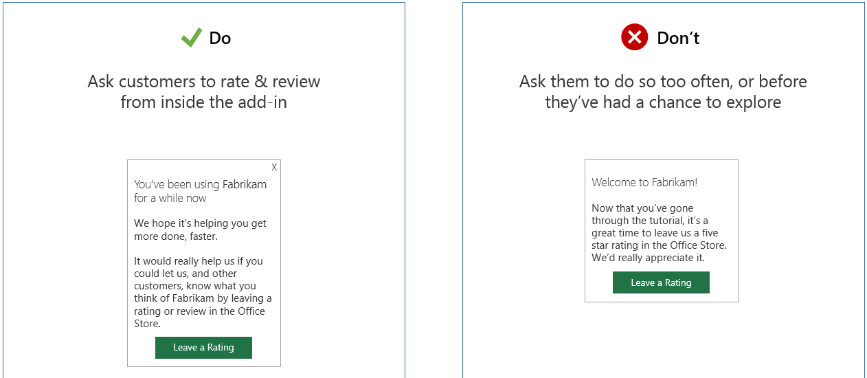
- Ask customers to rate and review from within your add-in. Make sure that they've had a chance to explore the add-in first, and don't ask for feedback too often.
- Offer help and support from within your add-in, so customers don't have to leave feedback in Microsoft AppSource reviews.
The following figure shows a request to rate within an add-in next to a request to rate following a tutorial.
Create effective ad-supported apps and add-ins
If you're creating ad-supported apps or add-ins, apply the following guidelines.
- Consider user experience versus revenue. Many businesses don't accept ads and pay for the apps they use. Smaller businesses and individuals might be willing to install ad-supported apps or add-ins.
- Ads shouldn't obstruct content or functionality. Don't use ads that overlay content, pop up new windows, or push functionality off-screen on a 1024 x 768 pixel browser window size.
- Avoid sound-based and video-based ads.
- Differentiate ads from content and functionality. For example:
- Display small print in the region of the screen that shows the ad.
- Use a different background color or font style for the ad content.
- Use special border treatments around the ad.
- Use a layout placement away from regular content.
- Don't include ads with inappropriate content. Ads are subject to the same policies that the content in apps and add-ins is.
- Use a standard size and location for ads.


