Verify that a page is usable by people with color blindness
To check that a webpage is usable by people with color blindness, in the Rendering tool, use the Emulate vision deficiencies dropdown list.
On the accessibility-testing demo webpage, the different donation states use color as the only means of differentiation:
- Green means a high amount of donations have been received.
- Yellow means a medium amount of donations have been received.
- Red means a low amount of donations have been received.
But you can't expect all of your users to experience these colors as intended. By using the Emulate vision deficiencies feature of the Rendering tool, you can find out that this design isn't good enough, by simulating how people with different vision would perceive your design.
To check whether a webpage is usable by people with color blindness:
Open the webpage in a new window or tab, such as the accessibility-testing demo webpage.
Right-click anywhere in the webpage and then select Inspect. Or, press F12. DevTools opens next to the webpage. By default, the Quick View panel is open at the bottom of DevTools.
If the Quick View panel isn't open already, press Esc to open the Quick View panel (when focus is on DevTools). In the Quick View panel, click the More tools (+) button, and then select the Rendering tool.
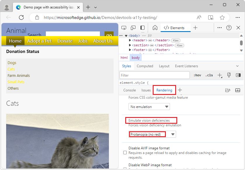
Scroll down to the Emulate vision deficiencies dropdown list, and then select Protanopia (no red). Protanopia is reduced sensitivity to red light, making it hard to differentiate green, red, and yellow:

To remove the simulation, in the Emulate vision deficiencies dropdown list, select No emulation.
See also
- Emulate vision deficiencies - Defines the items in the Emulate vision deficiencies dropdown list, including Protanopia, Deuteranopia, Tritanopia, and Achromatopsia.