Real-Time Dashboard-specific visuals
All visualizations that are created in the context of the render operator are available in dashboard visualizations. However, the following visualizations are only available in Real-Time Dashboards, and not with the render operator.
To learn how to customize any dashboard visuals, see Customize dashboard visuals
For general information on Real-Time Dashboards, see Visualize data with Real-Time Dashboards.
Funnel chart
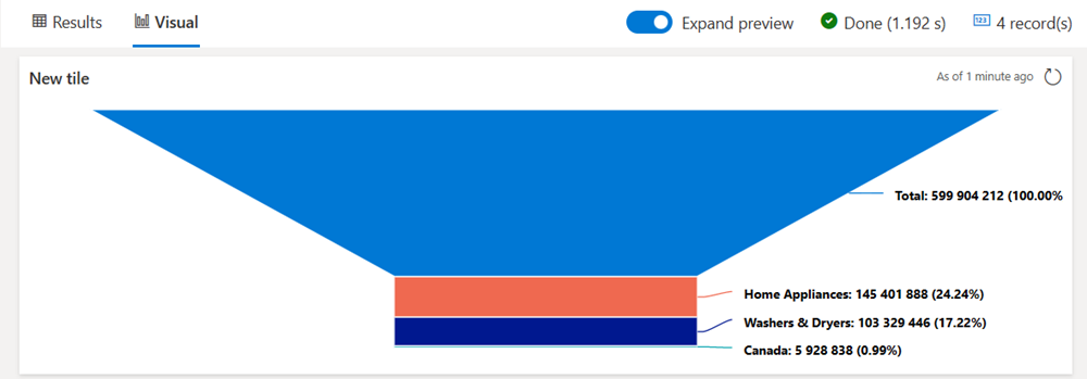
A funnel chart visualizes a linear process that has sequential, connected stages. Each funnel stage represents a percentage of the total. So, in most cases, a funnel chart is shaped like a funnel, with the first stage being the largest, and each subsequent stage smaller than its predecessor.
The following example uses data from the ContosoSales database from the publicly available help cluster to show the number of sales for washers and dryers in Canada out of the total sum of sales in 2007.
Example query
let interestingSales = SalesTable
| where DateKey between (datetime(2007) .. datetime(2008))
| join kind=inner Products on ProductKey;
let totalSales = interestingSales
| summarize sum(SalesAmount)
| extend Name="Total";
//totalSales
let homeAppliancesSales = interestingSales
| where ProductCategoryName == "Home Appliances"
| summarize sum(SalesAmount)
| extend Name="Home Appliances";
//homeAppliancesSales
let washersAndDryersSales = interestingSales
| where ProductCategoryName == "Home Appliances"
| where ProductSubcategoryName == "Washers & Dryers"
| summarize sum(SalesAmount)
| extend Name="Washers & Dryers";
//washersAndDryersSales
let canadaSales = interestingSales
| where ProductCategoryName == "Home Appliances"
| where ProductSubcategoryName == "Washers & Dryers"
| where Country == "Canada"
| summarize sum(SalesAmount)
| extend Name="Canada";
//canadaSales
totalSales
| union homeAppliancesSales
| union washersAndDryersSales
| union canadaSales
| project Name, SalesAmount=sum_SalesAmount
| sort by SalesAmount desc

Heatmap
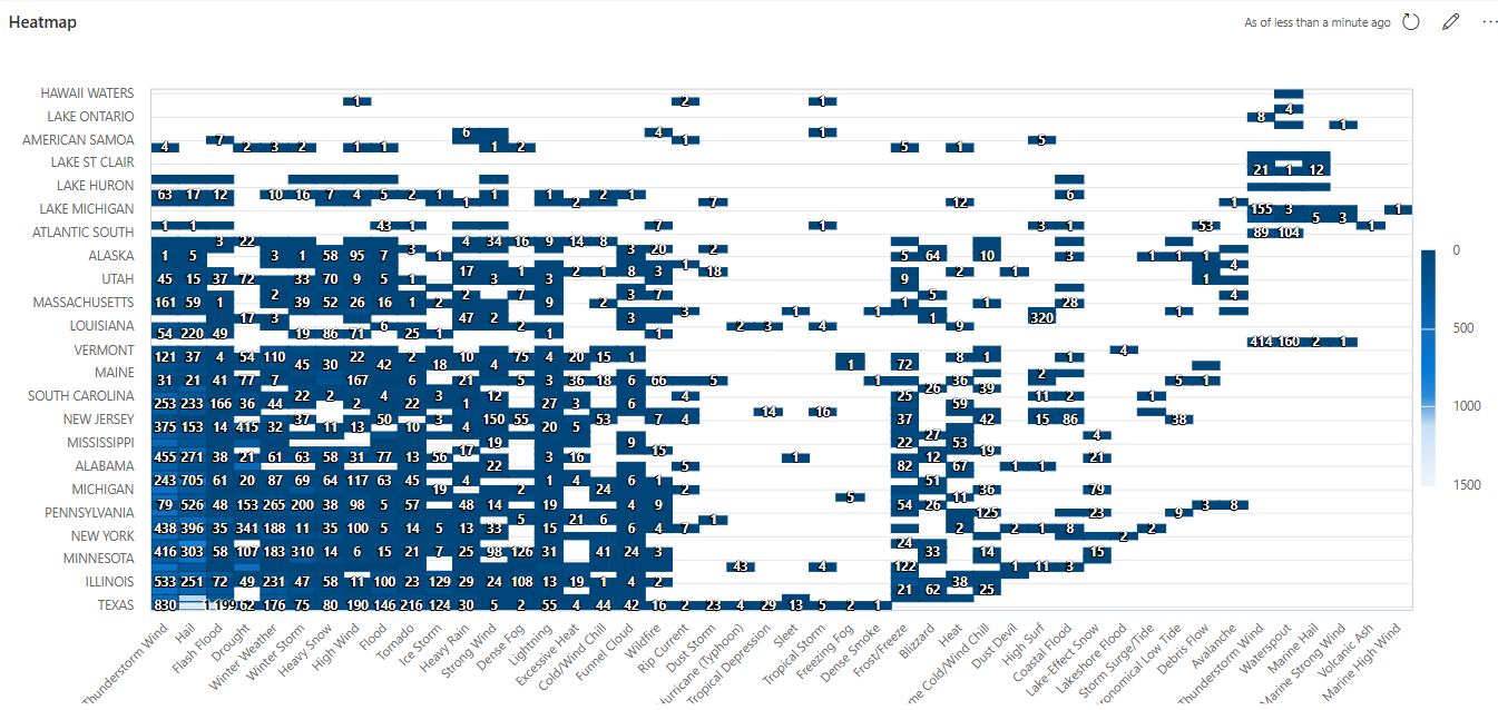
A heatmap shows values for a main variable of interest across two axis variables as a grid of colored squares.
To render a heatmap, the query must generate a table with three columns. The data used for the value field must be numeric. The columns that will be used for x and y values use the following rules:
- If the values in column x are in the
stringformat, the values in column y must be in thestringformat. - If the values in column x are in the
datetimeformat, the values in column y must be numeric.
Note
We recommend specifying each data field, instead of letting the tool infer the data source.
Example query
StormEvents
| summarize count(EventId) by State, EventType
