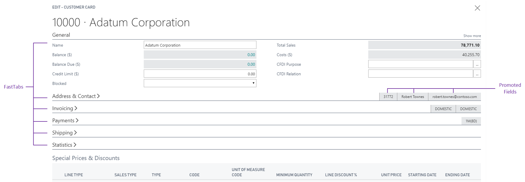
Field arrangement on FastTabs
FastTabs in Business Central allow users to find key information on a page by displaying the data in separate groups. This article describes how individual fields are arranged on a FastTab and ways that you can change the layout.
Organizing data using FastTabs helps users to find key information quickly, while at the same time giving an overview of areas that otherwise would remain hidden. For example, the customer card page displays customer information in the following categories: General, Address & Contact, Invoicing, Payments, Shipping, and Statistics. Each category is a separate FastTab that can be expanded or collapsed, making it easier for users to focus on one subject at a time. On task pages, a FastTab typically represents a single step in a task.
How fields are arranged on a FastTab of a page
By default, a FastTab is divided into two columns for containing fields. Fields are automatically distributed between the left and right columns based on their order in the layout section of the page. Starting with the first field in the Page Layout and working downward, fields are positioned in the left column and then in the right column. The area that is occupied by the fields in each column is as equal as possible. Field captions are positioned to the left of fields.

Pages automatically adjust to the available space on the screen. If horizontal space is reduced, a FastTab will adapt and distribute fields into a single column. Similarly, a FastTab will automatically distribute fields into more than two columns to take advantage of wider screens.
FastTab example
Creating a FastTab is easy. A FastTab is a group control directly within the content area of a card, document, or task page. The following example shows how you can create a FastTab that contains a couple of fields.
page 50101 SimpleCustomerCard
{
    PageType = Card;
    SourceTable = Customer;

    layout
    {
        area(content)
        {
            group(GeneralFastTab)
            {
                CaptionML = ENU = 'General';

                field(Name; Name)
                {
                    ApplicationArea = All;
                }
                field(Address; Address)
                {
                    ApplicationArea = All;
                }
            }
        }
    }
}
Collapsed or Expanded FastTabs
Business Central automatically determines whether FastTabs are initially displayed as expanded or collapsed. For example, when a document page is opened the first time, the first two parts or FastTabs are automatically expanded. All other parts or FastTabs are shown as collapsed to provide an optimal starting experience. Users can change the state of a FastTab to be expanded or collapsed directly within the user interface, but developers can't specify the starting state.
Choosing how to show fields in a FastTab
If a FastTab is expanded, you see all the fields. If it's collapsed, you just see the summary line. The summary line is the header that displays a name for the group, such as 'Communication'. It can also include important fields such as 'E-mail'. Promoting fields to the summary line enables you to present key information to the user, even if the FastTab is collapsed. You can also specify fields that only appear when the users select the Show more action on the FastTab. You promote a field or display it only when Show more is selected by setting the Importance property of the field.
Note
If a group doesn't specify the CaptionML property or this is set to an empty value, it's considered to be a group used only for structural purposes. This includes FastTabs. Structural FastTabs look and behave differently, for example, they can't be collapsed by users unless they include the Show more action.
Organizing compound content in a FastTab
By using a Group control in a FastTab, you can group fields by similarity. This pattern also gives you control over how fields are distributed between the left and right columns. When you group fields on a FastTab, the groups are distributed evenly between the left and right columns. Fields aren't.
Similarly, page parts placed within a FastTab are distributed evenly between the columns. For example, a FastTab containing two ListParts may be used to display two lists side by side for easier comparison. Learn more about Page parts.
Manually arranging fields in multiple rows and columns
Using the GridLayout or FixedLayout controls, you can arrange fields in multiple rows and columns in a grid-like format. These controls define a static layout that doesn't automatically adapt to the available space on the screen. It's recommended to use these controls only when you're sure your users access them on larger screens. Learn more in Arranging fields using grid and fixed controls.
Related information
Arranging fields using grid and fixed controls
Pages overview
Use Designer
Table in Business Central