Improved accessibility for low-vision users
Important
This content is archived and is not being updated. For the latest documentation, see Microsoft Dynamics 365 product documentation. For the latest release plans, see Dynamics 365 and Microsoft Power Platform release plans.
| Enabled for | Public preview | General availability |
|---|---|---|
| Users, automatically |  Jul 31, 2020
 |
 Oct 1, 2020
 |
Feature details
In 2020 release wave 2, we continue our commitment to accessibility with improvements for low-vision users in the following areas:
Operating with limited screen space
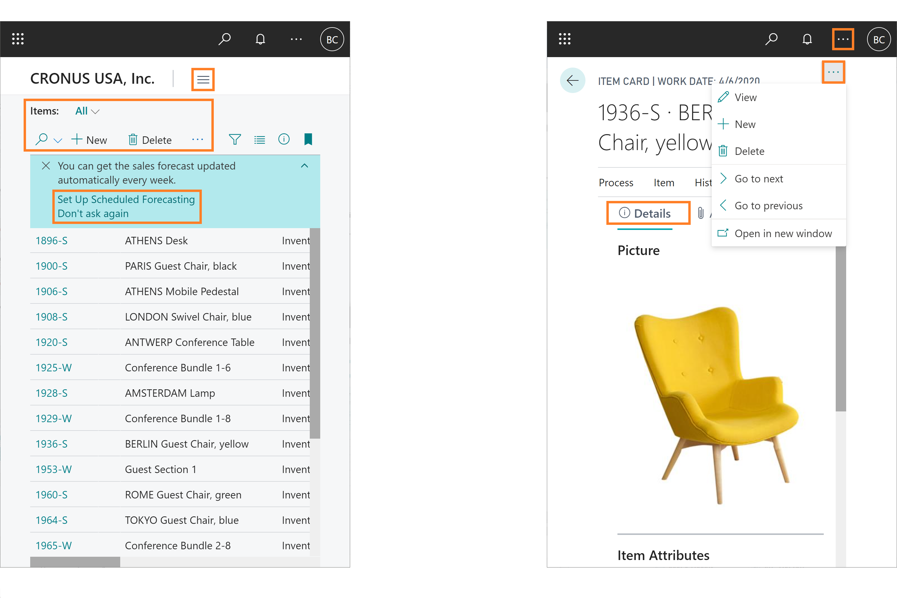
More pages and page content can be presented without loss of information or functionality on small form factors or high-zoom browser settings, where a maximum of 400% browser zoom or browser width of 320 pixels are supported. At these screen sizes:
The navigation menu is more responsive to reduced screen width. At the minimum width, only the link to the Role Explorer is shown.
The FactBox pane and Filter pane remain accessible and functional, snapping to an overlaid pane when screen width is reduced, or taking up all available horizontal space at the minimum width. When screen space is reduced, only one of the two panes can be shown at any given time.
The action bar on various page types is more responsive to the reduced screen width, ensuring that all actions are reachable. Specifically for list pages that include additional system actions, the Search box remains accessible and overlays the list so that users can view or refine their search terms while still displaying search results.
Contextual notifications are more responsive to reduced screen widths and ensure the notification text and action hyperlinks remain reachable.
System actions displayed in the outer chrome of a page, such as the edit toggle or navigating to next record on card and document pages, are more responsive to reduced screen widths and are displayed within a drop-down menu at minimum width.

Improved color contrast
The difference in color contrast between adjacent colors now meets accessibility guidelines, improving readability of non-text elements in the browser, such as charts, tiles, context menu items, and row selection.
With these changes, Business Central is on track to meet new WCAG 2.1 recommendations for accessibility on the web.
Try it now
Experience working at reduced screen space by signing in to Business Central and navigating to any card or list page, such as the Items list at https://YourBusinessCentralServer/?page=31. You can then gradually reduce the width of your browser window or use browser zoom to see the interface respond progressively.
Tell us what you think
Help us improve Dynamics 365 Business Central by discussing ideas, providing suggestions, and giving feedback. Use the forum at https://aka.ms/bcideas.