Theme an app
.NET Multi-platform App UI (.NET MAUI) apps can respond to style changes dynamically at runtime by using the DynamicResource markup extension. This markup extension is similar to the StaticResource markup extension, in that both use a dictionary key to fetch a value from a ResourceDictionary. However, while the StaticResource markup extension performs a single dictionary lookup, the DynamicResource markup extension maintains a link to the dictionary key. Therefore, if the value associated with the key is replaced, the change is applied to the VisualElement. This enables runtime theming to be implemented in .NET MAUI apps.
The process for implementing runtime theming in a .NET MAUI app is as follows:
- Define the resources for each theme in a ResourceDictionary. For more information, see Define themes.
- Set a default theme in the app's App.xaml file. For more information, see Set a default theme.
- Consume theme resources in the app, using the
DynamicResourcemarkup extension. For more information, see Consume theme resources. - Add code to load a theme at runtime. For more information, see Load a theme at runtime.
Important
Use the StaticResource markup extension if your app doesn’t need to change themes dynamically at runtime. If you anticipate switching themes while the app is running, use the DynamicResource markup extension, which enables resources to be updated at runtime.
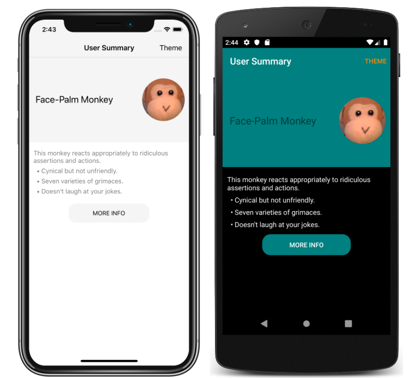
The following screenshot shows themed pages, with the iOS app using a light theme and the Android app using a dark theme:

Note
Changing a theme at runtime requires the use of XAML or C# style definitions, and isn't possible using CSS.
.NET MAUI also has the ability to respond to system theme changes. The system theme may change for a variety of reasons, depending on the device configuration. This includes the system theme being explicitly changed by the user, it changing due to the time of day, and it changing due to environmental factors such as low light. For more information, see Respond to system theme changes.
Define themes
A theme is defined as a collection of resource objects stored in a ResourceDictionary.
The following example shows a ResourceDictionary for a light theme named LightTheme:
<ResourceDictionary xmlns="http://schemas.microsoft.com/dotnet/2021/maui"
                    xmlns:x="http://schemas.microsoft.com/winfx/2009/xaml"
                    x:Class="ThemingDemo.LightTheme">
    <Color x:Key="PageBackgroundColor">White</Color>
    <Color x:Key="NavigationBarColor">WhiteSmoke</Color>
    <Color x:Key="PrimaryColor">WhiteSmoke</Color>
    <Color x:Key="SecondaryColor">Black</Color>
    <Color x:Key="PrimaryTextColor">Black</Color>
    <Color x:Key="SecondaryTextColor">White</Color>
    <Color x:Key="TertiaryTextColor">Gray</Color>
    <Color x:Key="TransparentColor">Transparent</Color>
</ResourceDictionary>
The following example shows a ResourceDictionary for a dark theme named DarkTheme:
<ResourceDictionary xmlns="http://schemas.microsoft.com/dotnet/2021/maui"
                    xmlns:x="http://schemas.microsoft.com/winfx/2009/xaml"
                    x:Class="ThemingDemo.DarkTheme">
    <Color x:Key="PageBackgroundColor">Black</Color>
    <Color x:Key="NavigationBarColor">Teal</Color>
    <Color x:Key="PrimaryColor">Teal</Color>
    <Color x:Key="SecondaryColor">White</Color>
    <Color x:Key="PrimaryTextColor">White</Color>
    <Color x:Key="SecondaryTextColor">White</Color>
    <Color x:Key="TertiaryTextColor">WhiteSmoke</Color>
    <Color x:Key="TransparentColor">Transparent</Color>
</ResourceDictionary>
Each ResourceDictionary contains Color resources that define their respective themes, with each ResourceDictionary using identical key values. For more information about resource dictionaries, see Resource Dictionaries.
Important
A code behind file is required for each ResourceDictionary, which calls the InitializeComponent method. This is necessary so that a CLR object representing the chosen theme can be created at runtime.
Set a default theme
An app requires a default theme, so that controls have values for the resources they consume. A default theme can be set by merging the theme's ResourceDictionary into the app-level ResourceDictionary that's defined in App.xaml:
<Application xmlns="http://schemas.microsoft.com/dotnet/2021/maui"
             xmlns:x="http://schemas.microsoft.com/winfx/2009/xaml"
             x:Class="ThemingDemo.App">
    <Application.Resources>
        <ResourceDictionary Source="Themes/LightTheme.xaml" />
    </Application.Resources>
</Application>
For more information about merging resource dictionaries, see Merged resource dictionaries.
Consume theme resources
When an app wants to consume a resource that's stored in a ResourceDictionary that represents a theme, it should do so with the DynamicResource markup extension. This ensures that if a different theme is selected at runtime, the values from the new theme will be applied.
The following example shows three styles from that can be applied to all Label objects in app:
<Application xmlns="http://schemas.microsoft.com/dotnet/2021/maui"
             xmlns:x="http://schemas.microsoft.com/winfx/2009/xaml"
             x:Class="ThemingDemo.App">
    <Application.Resources>

        <Style x:Key="LargeLabelStyle"
               TargetType="Label">
            <Setter Property="TextColor"
                    Value="{DynamicResource SecondaryTextColor}" />
            <Setter Property="FontSize"
                    Value="30" />
        </Style>

        <Style x:Key="MediumLabelStyle"
               TargetType="Label">
            <Setter Property="TextColor"
                    Value="{DynamicResource PrimaryTextColor}" />
            <Setter Property="FontSize"
                    Value="25" />
        </Style>

        <Style x:Key="SmallLabelStyle"
               TargetType="Label">
            <Setter Property="TextColor"
                    Value="{DynamicResource TertiaryTextColor}" />
            <Setter Property="FontSize"
                    Value="15" />
        </Style>

    </Application.Resources>
</Application>
These styles are defined in the app-level resource dictionary, so that they can be consumed by multiple pages. Each style consumes theme resources with the DynamicResource markup extension.
These styles are then consumed by pages:
<ContentPage xmlns="http://schemas.microsoft.com/dotnet/2021/maui"
xmlns:x="http://schemas.microsoft.com/winfx/2009/xaml"
xmlns:local="clr-namespace:ThemingDemo"
x:Class="ThemingDemo.UserSummaryPage"
Title="User Summary"
BackgroundColor="{DynamicResource PageBackgroundColor}">
...
<ScrollView>
<Grid>
<Grid.RowDefinitions>
<RowDefinition Height="200" />
<RowDefinition Height="120" />
<RowDefinition Height="70" />
</Grid.RowDefinitions>
<Grid BackgroundColor="{DynamicResource PrimaryColor}">
<Label Text="Face-Palm Monkey"
VerticalOptions="Center"
Margin="15"
Style="{StaticResource MediumLabelStyle}" />
...
</Grid>
<StackLayout Grid.Row="1"
Margin="10">
<Label Text="This monkey reacts appropriately to ridiculous assertions and actions."
Style="{StaticResource SmallLabelStyle}" />
<Label Text=" • Cynical but not unfriendly."
Style="{StaticResource SmallLabelStyle}" />
<Label Text=" • Seven varieties of grimaces."
Style="{StaticResource SmallLabelStyle}" />
<Label Text=" • Doesn't laugh at your jokes."
Style="{StaticResource SmallLabelStyle}" />
</StackLayout>
...
</Grid>
</ScrollView>
</ContentPage>
When a theme resource is consumed directly, it should be consumed with the DynamicResource markup extension. However, when a style that uses the DynamicResource markup extension is consumed, it should be consumed with the StaticResource markup extension.
For more information about styling, see Style apps using XAML. For more information about the DynamicResource markup extension, see Dynamic styles.
Load a theme at runtime
When a theme is selected at runtime, an app should:
- Remove the current theme from the app. This is achieved by clearing the
MergedDictionariesproperty of the app-level ResourceDictionary. - Load the selected theme. This is achieved by adding an instance of the selected theme to the
MergedDictionariesproperty of the app-level ResourceDictionary.
Any VisualElement objects that set properties with the DynamicResource markup extension will then apply the new theme values. This occurs because the DynamicResource markup extension maintains a link to dictionary keys. Therefore, when the values associated with keys are replaced, the changes are applied to the VisualElement objects.
In the sample application, a theme is selected via a modal page that contains a Picker. The following code shows the OnPickerSelectionChanged method, which is executed when the selected theme changes:
The following example shows removing the current theme and loading a new theme:
ICollection<ResourceDictionary> mergedDictionaries = Application.Current.Resources.MergedDictionaries;
if (mergedDictionaries != null)
{
    mergedDictionaries.Clear();
    mergedDictionaries.Add(new DarkTheme());
}
 Browse the sample