Specify CollectionView layout
The .NET Multi-platform App UI (.NET MAUI) CollectionView defines the following properties that control layout:
ItemsLayout, of typeIItemsLayout, specifies the layout to be used.ItemSizingStrategy, of typeItemSizingStrategy, specifies the item measure strategy to be used.
These properties are backed by BindableProperty objects, which means that the properties can be targets of data bindings.
By default, a CollectionView will display its items in a vertical list. However, any of the following layouts can be used:
- Vertical list – a single column list that grows vertically as new items are added.
- Horizontal list – a single row list that grows horizontally as new items are added.
- Vertical grid – a multi-column grid that grows vertically as new items are added.
- Horizontal grid – a multi-row grid that grows horizontally as new items are added.
These layouts can be specified by setting the ItemsLayout property to class that derives from the ItemsLayout class. This class defines the following properties:
Orientation, of typeItemsLayoutOrientation, specifies the direction in which the CollectionView expands as items are added.SnapPointsAlignment, of typeSnapPointsAlignment, specifies how snap points are aligned with items.SnapPointsType, of typeSnapPointsType, specifies the behavior of snap points when scrolling.
These properties are backed by BindableProperty objects, which means that the properties can be targets of data bindings. For more information about snap points, see Snap points in Control scrolling in a CollectionView.
The ItemsLayoutOrientation enumeration defines the following members:
Verticalindicates that the CollectionView will expand vertically as items are added.Horizontalindicates that the CollectionView will expand horizontally as items are added.
The LinearItemsLayout class inherits from the ItemsLayout class, and defines an ItemSpacing property, of type double, that represents the empty space around each item. The default value of this property is 0, and its value must always be greater than or equal to 0. The LinearItemsLayout class also defines static Vertical and Horizontal members. These members can be used to create vertical or horizontal lists, respectively. Alternatively, a LinearItemsLayout object can be created, specifying an ItemsLayoutOrientation enumeration member as an argument.
The GridItemsLayout class inherits from the ItemsLayout class, and defines the following properties:
VerticalItemSpacing, of typedouble, that represents the vertical empty space around each item. The default value of this property is 0, and its value must always be greater than or equal to 0.HorizontalItemSpacing, of typedouble, that represents the horizontal empty space around each item. The default value of this property is 0, and its value must always be greater than or equal to 0.Span, of typeint, that represents the number of columns or rows to display in the grid. The default value of this property is 1, and its value must always be greater than or equal to 1.
These properties are backed by BindableProperty objects, which means that the properties can be targets of data bindings.
Note
CollectionView uses the native layout engines to perform layout.
Vertical list
By default, CollectionView will display its items in a vertical list layout. Therefore, it's not necessary to set the ItemsLayout property to use this layout:
<CollectionView ItemsSource="{Binding Monkeys}">
    <CollectionView.ItemTemplate>
        <DataTemplate>
            <Grid Padding="10">
                <Grid.RowDefinitions>
                    <RowDefinition Height="Auto" />
                    <RowDefinition Height="Auto" />
                </Grid.RowDefinitions>
                <Grid.ColumnDefinitions>
                    <ColumnDefinition Width="Auto" />
                    <ColumnDefinition Width="Auto" />
                </Grid.ColumnDefinitions>
                <Image Grid.RowSpan="2"
                       Source="{Binding ImageUrl}"
                       Aspect="AspectFill"
                       HeightRequest="60"
                       WidthRequest="60" />
                <Label Grid.Column="1"
                       Text="{Binding Name}"
                       FontAttributes="Bold" />
                <Label Grid.Row="1"
                       Grid.Column="1"
                       Text="{Binding Location}"
                       FontAttributes="Italic"
                       VerticalOptions="End" />
            </Grid>
        </DataTemplate>
    </CollectionView.ItemTemplate>
</CollectionView>
However, for completeness, in XAML a CollectionView can be set to display its items in a vertical list by setting its ItemsLayout property to VerticalList:
<CollectionView ItemsSource="{Binding Monkeys}"
                ItemsLayout="VerticalList">
    ...
</CollectionView>
Alternatively, this can also be accomplished by setting the ItemsLayout property to a LinearItemsLayout object, specifying the Vertical ItemsLayoutOrientation enumeration member as the Orientation property value:
<CollectionView ItemsSource="{Binding Monkeys}">
    <CollectionView.ItemsLayout>
        <LinearItemsLayout Orientation="Vertical" />
    </CollectionView.ItemsLayout>
    ...
</CollectionView>
The equivalent C# code is:
CollectionView collectionView = new CollectionView
{
    ...
    ItemsLayout = LinearItemsLayout.Vertical
};
This results in a single column list, which grows vertically as new items are added:

Tip
Placing a CollectionView inside a VerticalStackLayout can stop the CollectionView scrolling, and can limit the number of items that are displayed. In this situation, replace the VerticalStackLayout with a Grid.
Horizontal list
In XAML, a CollectionView can display its items in a horizontal list by setting its ItemsLayout property to HorizontalList:
<CollectionView ItemsSource="{Binding Monkeys}"
                ItemsLayout="HorizontalList">
    <CollectionView.ItemTemplate>
        <DataTemplate>
            <Grid Padding="10">
                <Grid.RowDefinitions>
                    <RowDefinition Height="35" />
                    <RowDefinition Height="35" />
                </Grid.RowDefinitions>
                <Grid.ColumnDefinitions>
                    <ColumnDefinition Width="70" />
                    <ColumnDefinition Width="140" />
                </Grid.ColumnDefinitions>
                <Image Grid.RowSpan="2"
                       Source="{Binding ImageUrl}"
                       Aspect="AspectFill"
                       HeightRequest="60"
                       WidthRequest="60" />
                <Label Grid.Column="1"
                       Text="{Binding Name}"
                       FontAttributes="Bold"
                       LineBreakMode="TailTruncation" />
                <Label Grid.Row="1"
                       Grid.Column="1"
                       Text="{Binding Location}"
                       LineBreakMode="TailTruncation"
                       FontAttributes="Italic"
                       VerticalOptions="End" />
            </Grid>
        </DataTemplate>
    </CollectionView.ItemTemplate>
</CollectionView>
Alternatively, this layout can also be accomplished by setting the ItemsLayout property to a LinearItemsLayout object, specifying the Horizontal ItemsLayoutOrientation enumeration member as the Orientation property value:
<CollectionView ItemsSource="{Binding Monkeys}">
    <CollectionView.ItemsLayout>
        <LinearItemsLayout Orientation="Horizontal" />
    </CollectionView.ItemsLayout>
    ...
</CollectionView>
The equivalent C# code is:
CollectionView collectionView = new CollectionView
{
    ...
    ItemsLayout = LinearItemsLayout.Horizontal
};
This results in a single row list, which grows horizontally as new items are added:

Vertical grid
In XAML, a CollectionView can display its items in a vertical grid by setting its ItemsLayout property to VerticalGrid:
<CollectionView ItemsSource="{Binding Monkeys}"
                ItemsLayout="VerticalGrid, 2">
    <CollectionView.ItemTemplate>
        <DataTemplate>
            <Grid Padding="10">
                <Grid.RowDefinitions>
                    <RowDefinition Height="35" />
                    <RowDefinition Height="35" />
                </Grid.RowDefinitions>
                <Grid.ColumnDefinitions>
                    <ColumnDefinition Width="70" />
                    <ColumnDefinition Width="80" />
                </Grid.ColumnDefinitions>
                <Image Grid.RowSpan="2"
                       Source="{Binding ImageUrl}"
                       Aspect="AspectFill"
                       HeightRequest="60"
                       WidthRequest="60" />
                <Label Grid.Column="1"
                       Text="{Binding Name}"
                       FontAttributes="Bold"
                       LineBreakMode="TailTruncation" />
                <Label Grid.Row="1"
                       Grid.Column="1"
                       Text="{Binding Location}"
                       LineBreakMode="TailTruncation"
                       FontAttributes="Italic"
                       VerticalOptions="End" />
            </Grid>
        </DataTemplate>
    </CollectionView.ItemTemplate>
</CollectionView>
Alternatively, this layout can also be accomplished by setting the ItemsLayout property to a GridItemsLayout object whose Orientation property is set to Vertical:
<CollectionView ItemsSource="{Binding Monkeys}">
    <CollectionView.ItemsLayout>
       <GridItemsLayout Orientation="Vertical"
                        Span="2" />
    </CollectionView.ItemsLayout>
    ...
</CollectionView>
The equivalent C# code is:
CollectionView collectionView = new CollectionView
{
    ...
    ItemsLayout = new GridItemsLayout(2, ItemsLayoutOrientation.Vertical)
};
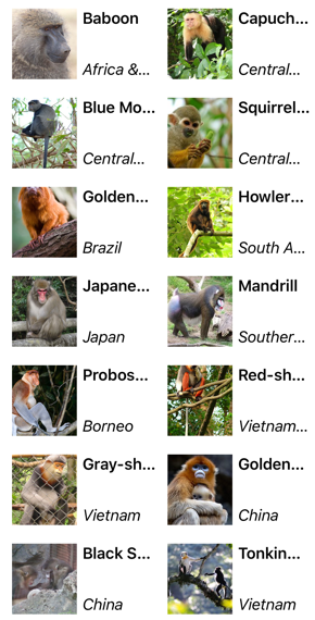
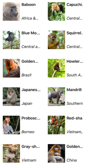
By default, a vertical GridItemsLayout will display items in a single column. However, this example sets the GridItemsLayout.Span property to 2. This results in a two-column grid, which grows vertically as new items are added:
Horizontal grid
In XAML, a CollectionView can display its items in a horizontal grid by setting its ItemsLayout property to HorizontalGrid:
<CollectionView ItemsSource="{Binding Monkeys}"
                ItemsLayout="HorizontalGrid, 4">
    <CollectionView.ItemTemplate>
        <DataTemplate>
            <Grid Padding="10">
                <Grid.RowDefinitions>
                    <RowDefinition Height="35" />
                    <RowDefinition Height="35" />
                </Grid.RowDefinitions>
                <Grid.ColumnDefinitions>
                    <ColumnDefinition Width="70" />
                    <ColumnDefinition Width="140" />
                </Grid.ColumnDefinitions>
                <Image Grid.RowSpan="2"
                       Source="{Binding ImageUrl}"
                       Aspect="AspectFill"
                       HeightRequest="60"
                       WidthRequest="60" />
                <Label Grid.Column="1"
                       Text="{Binding Name}"
                       FontAttributes="Bold"
                       LineBreakMode="TailTruncation" />
                <Label Grid.Row="1"
                       Grid.Column="1"
                       Text="{Binding Location}"
                       LineBreakMode="TailTruncation"
                       FontAttributes="Italic"
                       VerticalOptions="End" />
            </Grid>
        </DataTemplate>
    </CollectionView.ItemTemplate>
</CollectionView>
Alternatively, this layout can also be accomplished by setting the ItemsLayout property to a GridItemsLayout object whose Orientation property is set to Horizontal:
<CollectionView ItemsSource="{Binding Monkeys}">
    <CollectionView.ItemsLayout>
       <GridItemsLayout Orientation="Horizontal"
                        Span="4" />
    </CollectionView.ItemsLayout>
    ...
</CollectionView>
The equivalent C# code is:
CollectionView collectionView = new CollectionView
{
    ...
    ItemsLayout = new GridItemsLayout(4, ItemsLayoutOrientation.Horizontal)
};
By default, a horizontal GridItemsLayout will display items in a single row. However, this example sets the GridItemsLayout.Span property to 4. This results in a four-row grid, which grows horizontally as new items are added:

Headers and footers
CollectionView can present a header and footer that scroll with the items in the list. The header and footer can be strings, views, or DataTemplate objects.
CollectionView defines the following properties for specifying the header and footer:
Header, of typeobject, specifies the string, binding, or view that will be displayed at the start of the list.HeaderTemplate, of type DataTemplate, specifies the DataTemplate to use to format theHeader.Footer, of typeobject, specifies the string, binding, or view that will be displayed at the end of the list.FooterTemplate, of type DataTemplate, specifies the DataTemplate to use to format theFooter.
These properties are backed by BindableProperty objects, which means that the properties can be targets of data bindings.
When a header is added to a layout that grows horizontally, from left to right, the header is displayed to the left of the list. Similarly, when a footer is added to a layout that grows horizontally, from left to right, the footer is displayed to the right of the list.
Display strings in the header and footer
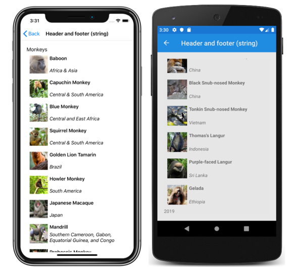
The Header and Footer properties can be set to string values, as shown in the following example:
<CollectionView ItemsSource="{Binding Monkeys}"
                Header="Monkeys"
                Footer="2019">
    ...
</CollectionView>
The equivalent C# code is:
CollectionView collectionView = new CollectionView
{
    Header = "Monkeys",
    Footer = "2019"
};
collectionView.SetBinding(ItemsView.ItemsSourceProperty, "Monkeys");
This code results in the following screenshots, with the header shown in the iOS screenshot, and the footer shown in the Android screenshot:
Display views in the header and footer
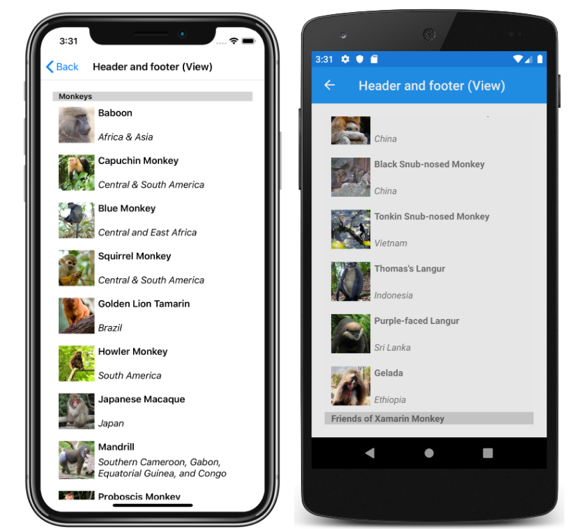
The Header and Footer properties can each be set to a view. This can be a single view, or a view that contains multiple child views. The following example shows the Header and Footer properties each set to a StackLayout object that contains a Label object:
<CollectionView ItemsSource="{Binding Monkeys}">
    <CollectionView.Header>
        <StackLayout BackgroundColor="LightGray">
            <Label Margin="10,0,0,0"
                   Text="Monkeys"
                   FontSize="12"
                   FontAttributes="Bold" />
        </StackLayout>
    </CollectionView.Header>
    <CollectionView.Footer>
        <StackLayout BackgroundColor="LightGray">
            <Label Margin="10,0,0,0"
                   Text="Friends of Xamarin Monkey"
                   FontSize="12"
                   FontAttributes="Bold" />
        </StackLayout>
    </CollectionView.Footer>
    ...
</CollectionView>
The equivalent C# code is:
StackLayout headerStackLayout = new StackLayout();
header.StackLayout.Add(new Label { Text = "Monkeys", ... } );
StackLayout footerStackLayout = new StackLayout();
footerStackLayout.Add(new Label { Text = "Friends of Xamarin Monkey", ... } );

CollectionView collectionView = new CollectionView
{
    Header = headerStackLayout,
    Footer = footerStackLayout
};
collectionView.SetBinding(ItemsView.ItemsSourceProperty, "Monkeys");
This code results in the following screenshots, with the header shown in the iOS screenshot, and the footer shown in the Android screenshot:
Display a templated header and footer
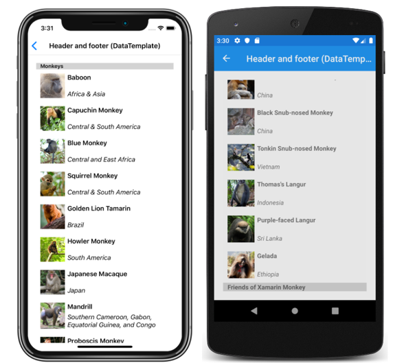
The HeaderTemplate and FooterTemplate properties can be set to DataTemplate objects that are used to format the header and footer. In this scenario, the Header and Footer properties must bind to the current source for the templates to be applied, as shown in the following example:
<CollectionView ItemsSource="{Binding Monkeys}"
                Header="{Binding .}"
                Footer="{Binding .}">
    <CollectionView.HeaderTemplate>
        <DataTemplate>
            <StackLayout BackgroundColor="LightGray">
                <Label Margin="10,0,0,0"
                       Text="Monkeys"
                       FontSize="12"
                       FontAttributes="Bold" />
            </StackLayout>
        </DataTemplate>
    </CollectionView.HeaderTemplate>
    <CollectionView.FooterTemplate>
        <DataTemplate>
            <StackLayout BackgroundColor="LightGray">
                <Label Margin="10,0,0,0"
                       Text="Friends of Xamarin Monkey"
                       FontSize="12"
                       FontAttributes="Bold" />
            </StackLayout>
        </DataTemplate>
    </CollectionView.FooterTemplate>
    ...
</CollectionView>
The equivalent C# code is:
CollectionView collectionView = new CollectionView
{
    HeaderTemplate = new DataTemplate(() =>
    {
        return new StackLayout { };
    }),
    FooterTemplate = new DataTemplate(() =>
    {
        return new StackLayout { };
    })
};
collectionView.SetBinding(ItemsView.HeaderProperty, ".");
collectionView.SetBinding(ItemsView.FooterProperty, ".");
collectionView.SetBinding(ItemsView.ItemsSourceProperty, "Monkeys");
This code results in the following screenshots, with the header shown in the iOS screenshot, and the footer shown in the Android screenshot:
Item spacing
By default, there is no space between each item in a CollectionView. This behavior can be changed by setting properties on the items layout used by the CollectionView.
When a CollectionView sets its ItemsLayout property to a LinearItemsLayout object, the LinearItemsLayout.ItemSpacing property can be set to a double value that represents the space between items:
<CollectionView ItemsSource="{Binding Monkeys}">
    <CollectionView.ItemsLayout>
        <LinearItemsLayout Orientation="Vertical"
                           ItemSpacing="20" />
    </CollectionView.ItemsLayout>
    ...
</CollectionView>
Note
The LinearItemsLayout.ItemSpacing property has a validation callback set, which ensures that the value of the property is always greater than or equal to 0.
The equivalent C# code is:
CollectionView collectionView = new CollectionView
{
    ...
    ItemsLayout = new LinearItemsLayout(ItemsLayoutOrientation.Vertical)
    {
        ItemSpacing = 20
    }
};
This code results in a vertical single column list that has a spacing of 20 between items:

When a CollectionView sets its ItemsLayout property to a GridItemsLayout object, the GridItemsLayout.VerticalItemSpacing and GridItemsLayout.HorizontalItemSpacing properties can be set to double values that represent the empty space vertically and horizontally between items:
<CollectionView ItemsSource="{Binding Monkeys}">
    <CollectionView.ItemsLayout>
       <GridItemsLayout Orientation="Vertical"
                        Span="2"
                        VerticalItemSpacing="20"
                        HorizontalItemSpacing="30" />
    </CollectionView.ItemsLayout>
    ...
</CollectionView>
Note
The GridItemsLayout.VerticalItemSpacing and GridItemsLayout.HorizontalItemSpacing properties have validation callbacks set, which ensures that the values of the properties are always greater than or equal to 0.
The equivalent C# code is:
CollectionView collectionView = new CollectionView
{
    ...
    ItemsLayout = new GridItemsLayout(2, ItemsLayoutOrientation.Vertical)
    {
        VerticalItemSpacing = 20,
        HorizontalItemSpacing = 30
    }
};
This code results in a vertical two-column grid that has a vertical spacing of 20 between items and a horizontal spacing of 30 between items:
Item sizing
By default, each item in a CollectionView is individually measured and sized, provided that the UI elements in the DataTemplate don't specify fixed sizes. This behavior, which can be changed, is specified by the CollectionView.ItemSizingStrategy property value. This property value can be set to one of the ItemSizingStrategy enumeration members:
MeasureAllItems– each item is individually measured. This is the default value.MeasureFirstItem– only the first item is measured, with all subsequent items being given the same size as the first item.
Important
The MeasureFirstItem sizing strategy will result in increased performance when used in situations where the item size is intended to be uniform across all items.
The following code example shows setting the ItemSizingStrategy property:
<CollectionView ...
                ItemSizingStrategy="MeasureFirstItem">
    ...
</CollectionView>
The equivalent C# code is:
CollectionView collectionView = new CollectionView
{
    ...
    ItemSizingStrategy = ItemSizingStrategy.MeasureFirstItem
};
Dynamic resizing of items
Items in a CollectionView can be dynamically resized at runtime by changing layout related properties of elements within the DataTemplate. For example, the following code example changes the HeightRequest and WidthRequest properties of an Image object:
void OnImageTapped(object sender, EventArgs e)
{
    Image image = sender as Image;
    image.HeightRequest = image.WidthRequest = image.HeightRequest.Equals(60) ? 100 : 60;
}
The OnImageTapped event handler is executed in response to an Image object being tapped, and changes the dimensions of the image so that it's more easily viewed:

Right-to-left layout
CollectionView can layout its content in a right-to-left flow direction by setting its FlowDirection property to RightToLeft. However, the FlowDirection property should ideally be set on a page or root layout, which causes all the elements within the page, or root layout, to respond to the flow direction:
<ContentPage xmlns="http://schemas.microsoft.com/dotnet/2021/maui"
             xmlns:x="http://schemas.microsoft.com/winfx/2009/xaml"
             x:Class="CollectionViewDemos.Views.VerticalListFlowDirectionPage"
             Title="Vertical list (RTL FlowDirection)"
             FlowDirection="RightToLeft">
    <Grid Margin="20">
        <CollectionView ItemsSource="{Binding Monkeys}">
            ...
        </CollectionView>
    </Grid>
</ContentPage>
The default FlowDirection for an element with a parent is MatchParent. Therefore, the CollectionView inherits the FlowDirection property value from the Grid, which in turn inherits the FlowDirection property value from the ContentPage. This results in the right-to-left layout shown in the following screenshot:

For more information about flow direction, see Right to left localization.
 Browse the sample