DatePicker
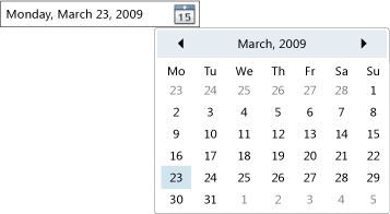
The DatePicker control allows the user to select a date by either typing it into a text field or by using a drop-down Calendar control.
The following illustration shows a DatePicker.

DatePicker Control
Many of a DatePicker control's properties are for managing its built-in Calendar, and function identically to the equivalent property in Calendar. In particular, the DatePicker.IsTodayHighlighted, DatePicker.FirstDayOfWeek, DatePicker.BlackoutDates, DatePicker.DisplayDateStart, DatePicker.DisplayDateEnd, DatePicker.DisplayDate, and DatePicker.SelectedDate properties function identically to their Calendar counterparts. For more information, see Calendar.
Users can type a date directly into a text field, which sets the Text property. If the DatePicker cannot convert the entered string to a valid date, the DateValidationError event will be raised. By default, this causes an exception, but an event handler for DateValidationError can set the ThrowException property to false and prevent an exception from being raised.
See also
.NET Desktop feedback
