Messing Around With Power BI Bookmarks - Part 1
Intro
Hello Data Fighters!!
In this three-part article series, we will explore Power BI bookmarks and how we can use them to provide better User Experience (UX), especially when the reports refer to Business Viewers or in general, Report Consumers that do not have technical knowledge and simply want to view the reports and get some insights out of them in order to make business decisions.
To provide a little bit of context – before diving into the technical stuff – bookmarks actually save and capture the current state of a report page (filters, slicers, order, visibility, drill location) so when someone views the report they can refer always back to the selected bookmark and see exactly what they want.
For our example, we will use data from Kaggle and in particular the FiveThirtyEight Comic Characters Dataset.
Let’s begin!
The Problem
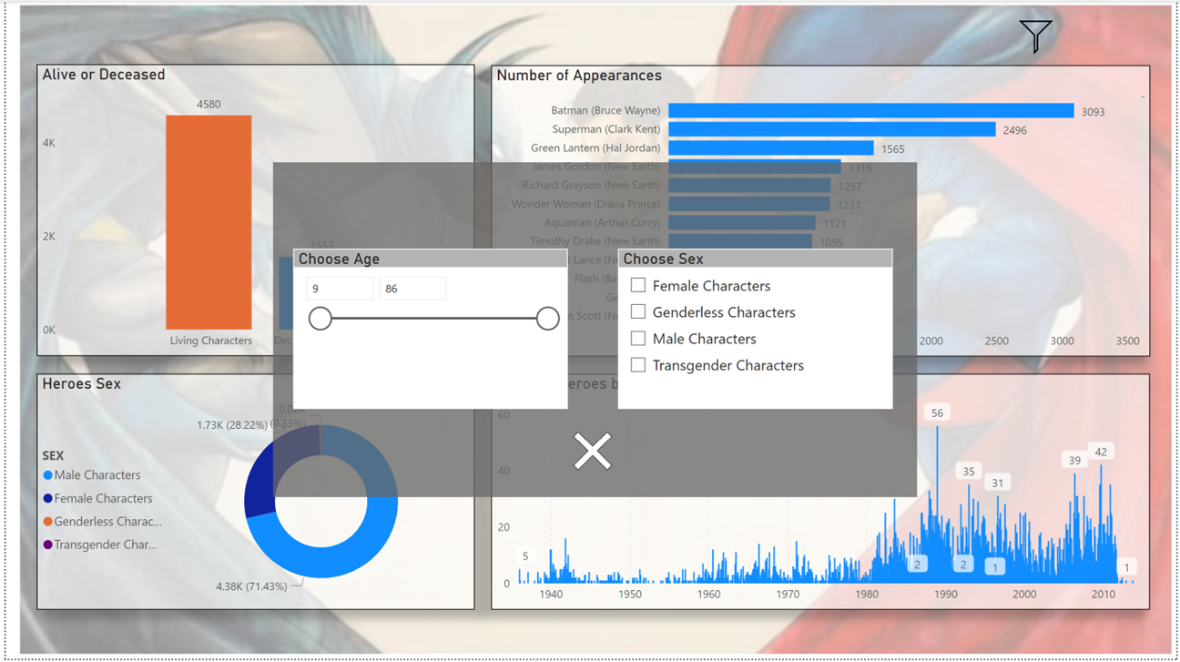
In this article we will see, how we can make a filter pane which we can appear and disappear to our liking. This is highly effective because we save way more space, in order to develop our visuals and not to be distracted from filters all over the place.
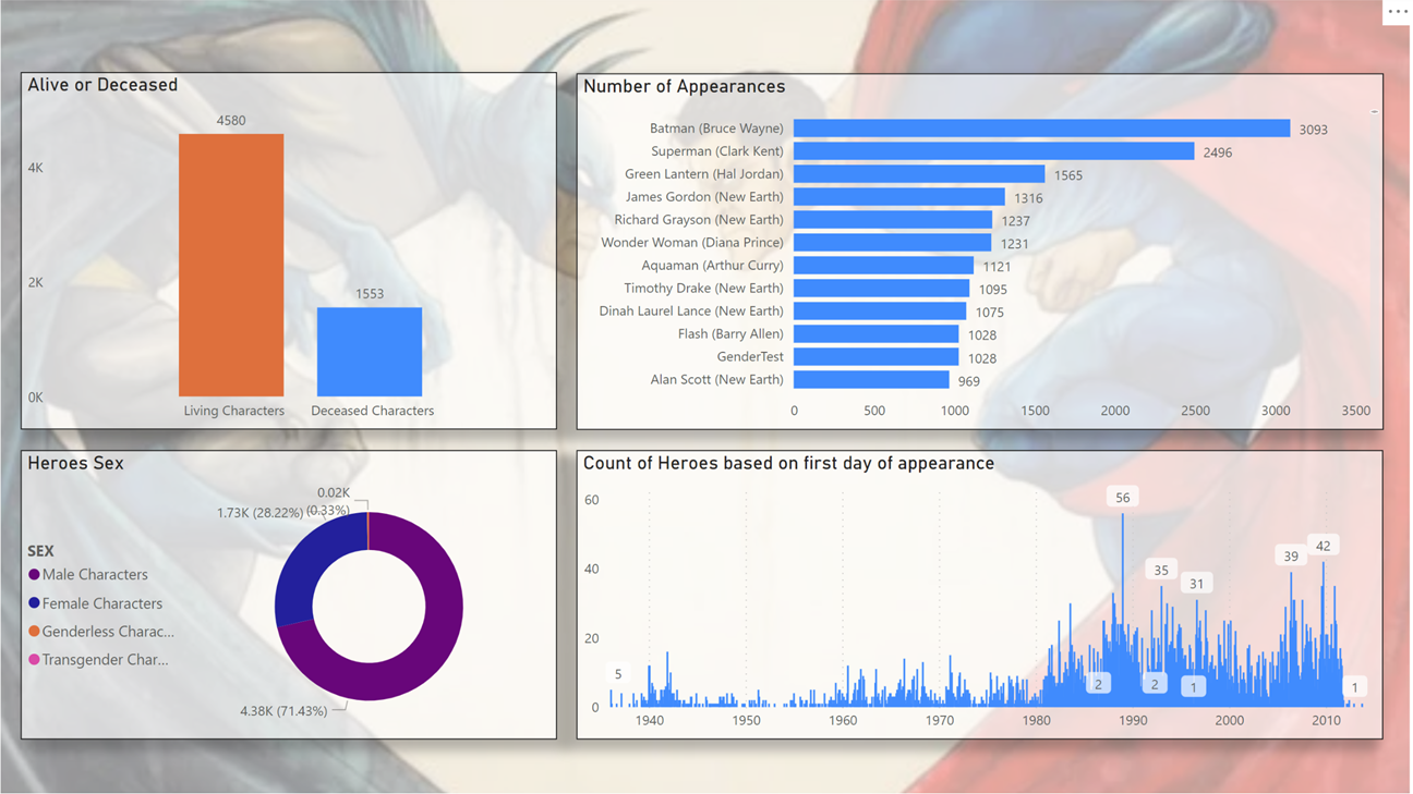
Let’s say that we have constructed something like below and now we want to put some filters in so that we can be able to filter the report.
Approach - Steps Followed
As you can see, the visualizations are quite clear, and it would be a pity to sacrifice space for the sake of filtering. What we are going to do, is to make a bookmark that will let us appear the filter pane whenever we want.
Steps Description:
We insert a filter like icon (In Power Bi Desktop we select Insert -> Image from the ribbon)
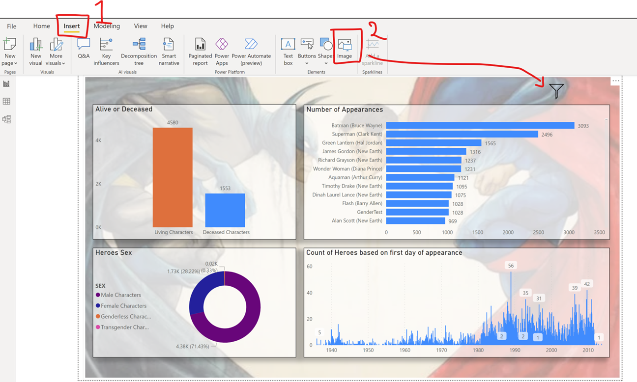
Then we construct a Filter Pane. This can be done easily by using the combination of a blank button or a shape and one or more slicers and an icon for a close button.
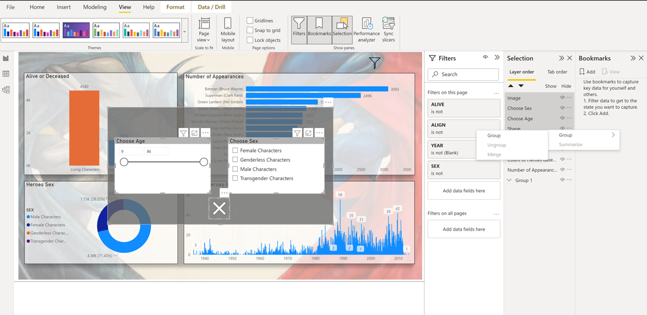
Now we are ready to use Power BI Bookmarks to make a hidable filter pane. We go to View and we select both Bookmarks and Selection. Also, a good idea is to group the visuals regarding the filter pane. This can be done by going to Selection and Ctrl + Select the components that make the filter pane.
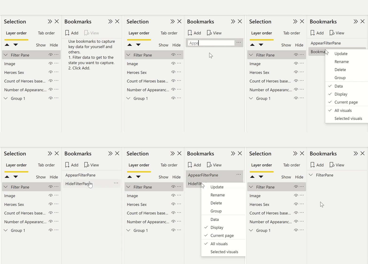
Next, we go to Bookmarks, and we make two bookmarks – one we will use to appear the filter pane and one will use to hide the filter pane.
Tip Remember to name accordingly the bookmarks so that you can know directly from the naming what is the use of the respective bookmark. So having that in mind, we will name one AppearFilterPane and the other HideFilterPane. Also, we can group them so that we can know that these specific bookmarks refer to the Filter Pane.
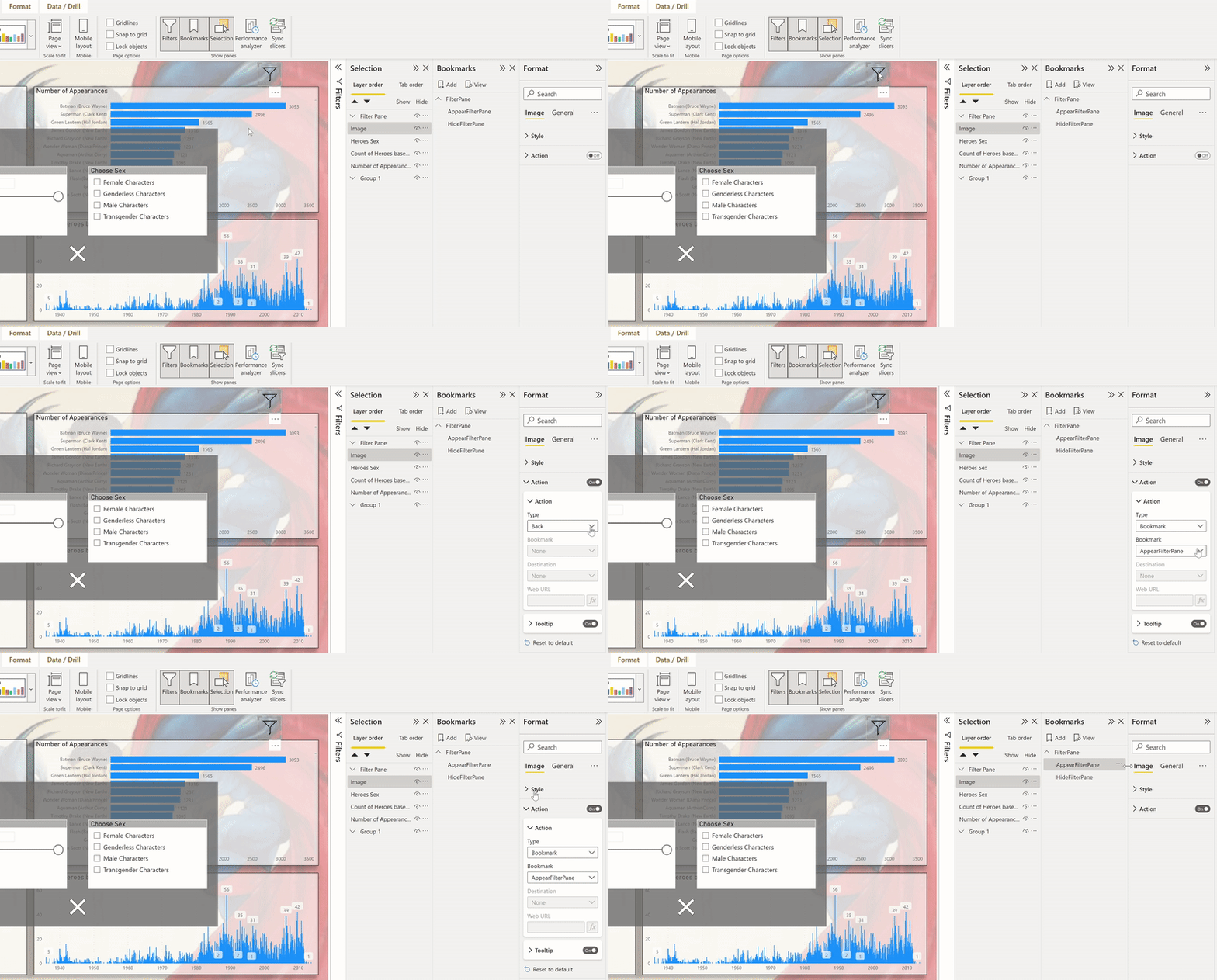
Next, we have to save the states of the report to the respective bookmarks. The states for now will be two: One state will be with the Filter Pane opened and one with the Filter Pane closed. Of course we should link the buttons we have made to the appropriate bookmarks as well.
So, we begin with the AppearFilterPane bookmark. Here the functionality, we want is that when we hit the filter button to appear the Filter Pane.
After setting up how to appear the Filter Pane, we move on setting up the bookmark on how to hide the filter pane.
Tips!
- Remember that each bookmark holds the state that we have defined. That is why after every change do not forget to update each bookmark accordingly so that you can have the state that you want.
- As you have noticed we have set up two buttons in the HideFilterPane bookmark. Sometimes the user won’t spot the X button on the bottom and will hit anywhere in the filter pane area. In order to optimize the user experience we gave the option the filter pane to close whether the user selects the button or clicks anywhere in the Filter Pane area.
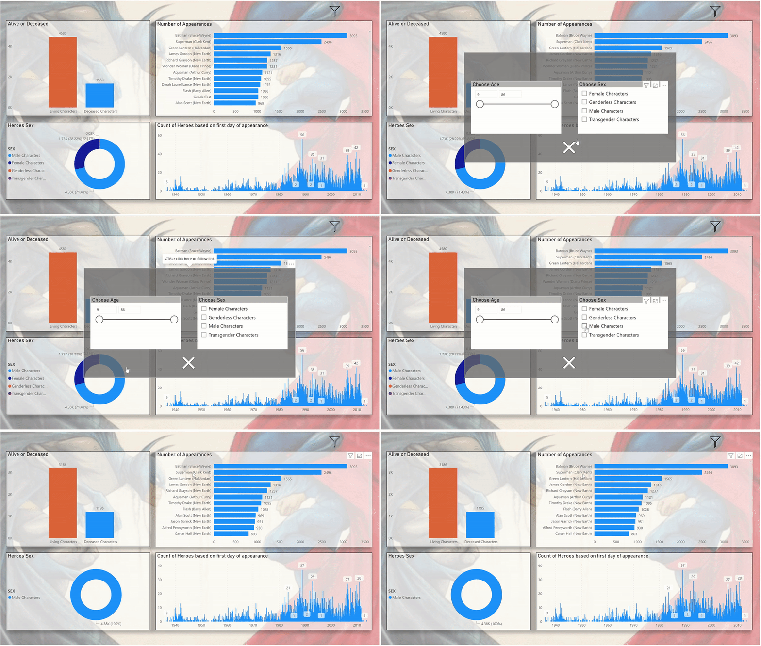
Now that we have finished building our pop up filter pane let’s try it out!!! (Note: In Power BI desktop in order to click a button we use ctrl + click)
Perfect! All work! See you soon in part 2!!
