Power BI: Getting started with Q & A Visualization
Introduction
Power BI introduced a new visual called the Q&A Visualization in October 2019. It allows the users to ask natural language questions and get answers in the form of a visual.
Note
Q&A Visualization is a new feature that was introduced in October 2019 and has few features which are still in preview stage
A briefing of what we are going to achieve through this article is captured below :
https://github.com/PriyaranjanKS/PowerBI/blob/master/QA%201.gif?raw=true
The Q&A visual consists of four core components :
- The question box. This is where users type in their question and are shown suggestions to help them complete their question.
- A pre-populated list of suggested questions.
- Icon to convert the Q&A visual into a standard visual.
- Icon to open Q&A tooling which allows designers to configure the underlying natural language engine.
In this article, We will see how to work with Power BI Q&A Visualization. We will be working with the Sales & Marketing sample PBIX file which you can download from here
Note
Sales and Marketing Sample PBIX file can be downloaded from here
Create Q & A Visual
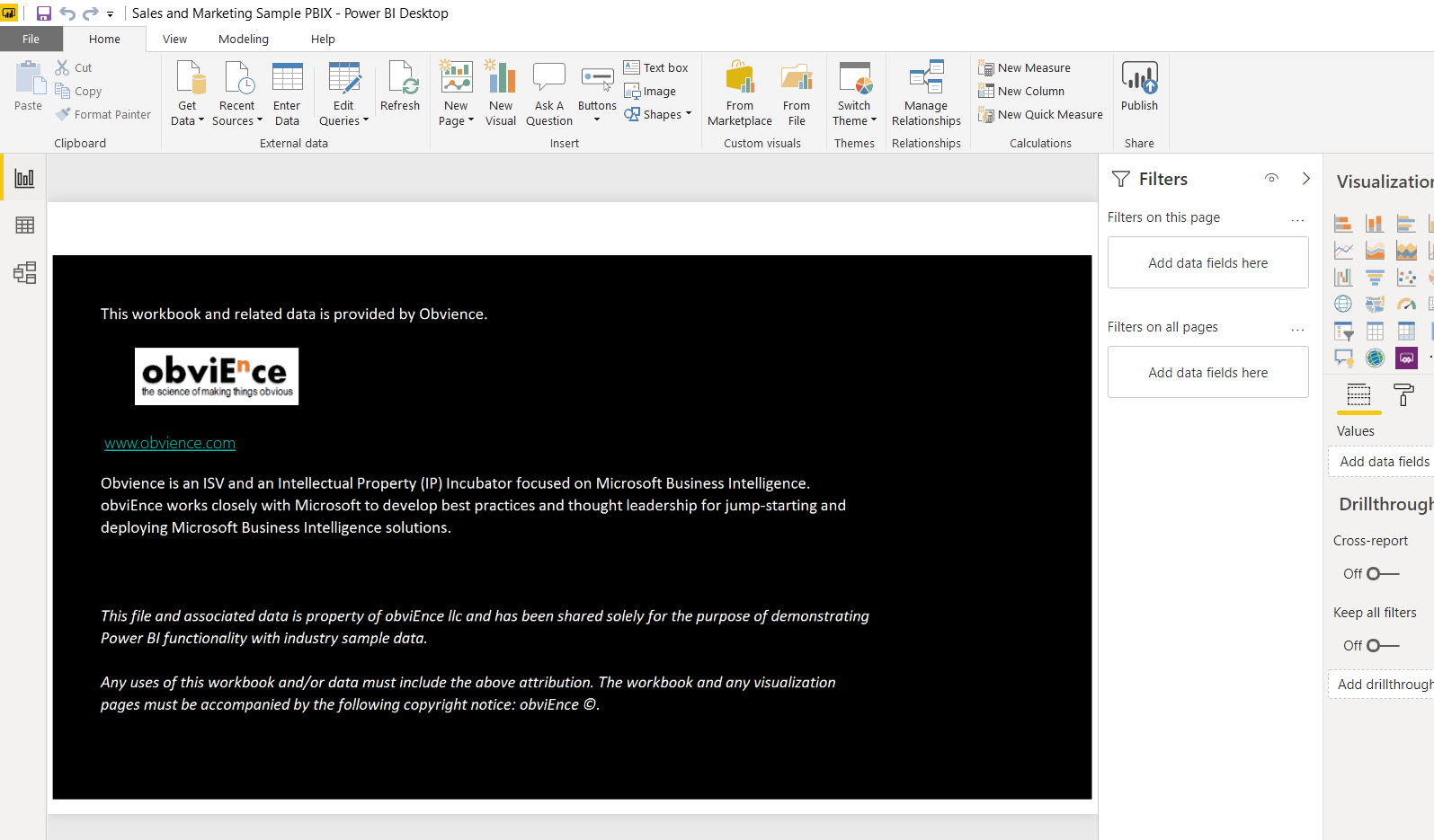
Open the downloaded PBIX file and clear the content area.
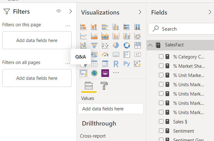
From the Visualization section, select the Q&A option.
This will open up the Q&A Visual in the report section .It will by default prepopulate few suggested questions. We can either select one of them or type in a new question in the text box to create a visual out of the data.
On Selecting the Suggested question, it will spin up the chart that shows the answer to the question
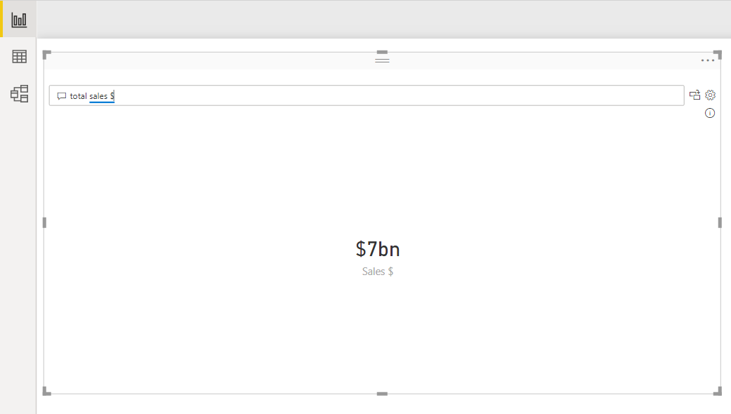
We can also type in natural language questions in the text box, say *What is the total sales ?
However we can see that there is a red underline below sales as it cannot understand what sales means or to which column sales keyword maps to. If we click on sales, we can see suggestions that makes sense to the reporting engine.
Clicking on Sales$ completes the question and the engine analyses the data and shows us the answer to the question.
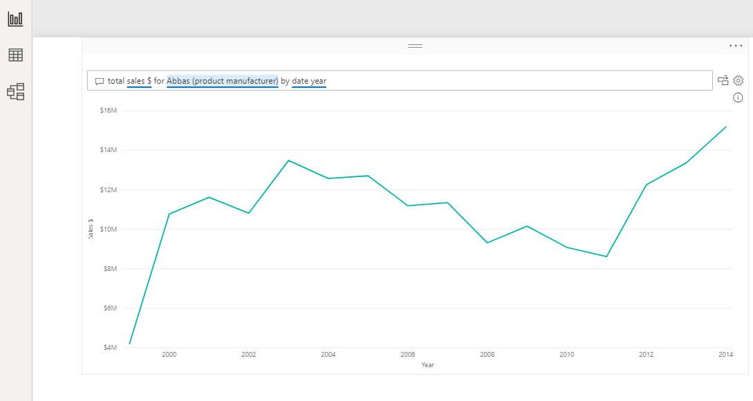
We can also ask more detailed questions that will in turn give us more detailed analytical data as charts : *total sales $ for Abbas (product manufacturer) by date year
If we want to change the chart representation, we can add that as well in the query : total sales $ for Abbas (product manufacturer) by date year as Pie
Convert to Standard Visual
If we click on the icon next to the text box, it will stop rendering as a Q&A and will get converted to a standard visual, in this case a pie chart.
Configure the underlying natural language engine
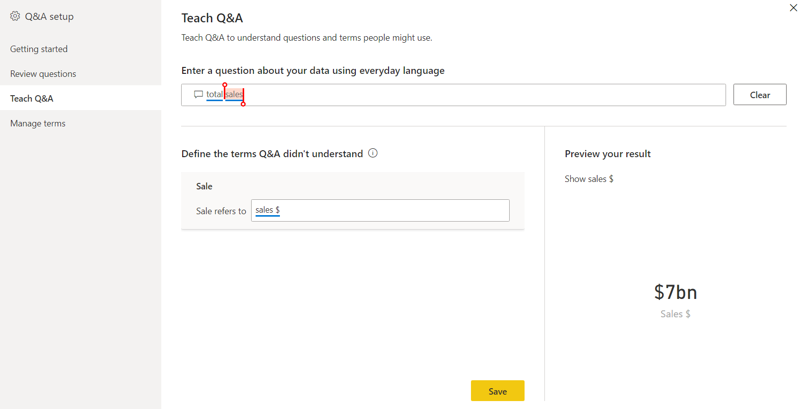
This helps us to configure the Q & A tooling engine which is still in preview. It will open the following pop up with the three options.
Note
These features are still in preview stage at the time of writing this article
These options let you define what a term would mean when asked as a question and lets you teach the engine to answer the user questions. In previous section, When we asked the question Total Sales, it couldn’t understand the term sale or to which column in maps to. Lets try to map it
Now If we search for Total Sales in the report section, the engine will be able to give you the right answer as it knows that we asking for data from Sales $ .
Summary
Thus we explored the new Q&A Visual in Power BI and saw how we can configure and use it with the Sales PBIX file
References
See Also
Note
Download the data source and Power BI PBIX file from GitHub.

