WPF/C# Setting visibility of controls based off another control
Introduction
This is a demonstration on how to selectively set specific controls in a container as disabled while other controls are left enabled along with using Triggers to bind to container, in this case a GroupBox.
Fictitious business requirement
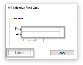
A customer registers for a service by providing personal information e.g. first and last name then submits this information to the company who owns the application. In turn, the customer is sent an email to verify who they say they are given a pin (numeric code) to submit. The screenshot below validates the pin, when a pin is recognized the submit button is enabled and a checkbox is placed next to the pin code TextBox.
Initial window.
Same window after a valid pin has been entered.

Walkthrough
In a new Window add a GroupBox, set IsEnabled to False, add two TextBox controls (first and last name), since the GroupBox is not enabled the TextBox controls will not be either as they inherit IsEnabled property of the GroupBox.
<GroupBox x:Name="GroupGrid"
          Header="New user"
          HorizontalAlignment="Left"
          Margin="13,17,0,0"
          VerticalAlignment="Top"
          Height="125" Width="258"
          Grid.ColumnSpan="2"
          IsEnabled="False">
Next add the following custom TextBox from this page (control is included in this articles source code) which will not become disabled as a normal TextBox.
 |
Important When you set IsEnabled to false in a panel, all child elements in that panel are disabled. You cannot selectively enabled child elements in the panel. You may, however, want to selectively enable child elements in a panel. (E.g. Disable entire panel, then set IsEnabled=True, IsReadOnly=True on TextBox controls so that you can copy text). |
using System.Windows;
using System.Windows.Controls;

namespace WpfAppExample1.Controls
{
    public class  CanEnableTextBox : TextBox
    {

        static CanEnableTextBox()
        {
            IsEnabledProperty.OverrideMetadata(typeof(CanEnableTextBox),
                new UIPropertyMetadata(true,
                    IsEnabledPropertyChanged,
                    CoerceIsEnabled));

        }

        private static  void IsEnabledPropertyChanged(DependencyObject source, DependencyPropertyChangedEventArgs args)
        {
            // Overriding PropertyChanged results in merged metadata, which is what we want--
            // the PropertyChanged logic in UIElement.IsEnabled will still get invoked.
        }

        private static  object CoerceIsEnabled(DependencyObject source, object  value)
        {
            return value;
        }
    }
}
Back to the window, this TextBox name is set to InviteCodeButton and then subscribe to TextChanged event. A restriction on entering a pin is numbers only where is done using NumberOnlyBehavior class.
public static  class NumberOnlyBehaviour
{
    public static  readonly DependencyProperty IsEnabledProperty =
            DependencyProperty.RegisterAttached("IsEnabled", typeof(bool),
            typeof(NumberOnlyBehaviour), new  UIPropertyMetadata(false, OnValueChanged));

    public static  bool GetIsEnabled(Control o) { return (bool)o.GetValue(IsEnabledProperty); }
    public static  void SetIsEnabled(Control o, bool value) { o.SetValue(IsEnabledProperty, value); }
    private static  void OnValueChanged(DependencyObject dependencyObject,DependencyPropertyChangedEventArgs e)
    {
        if (!(dependencyObject is Control uiElement)) return;
        if (e.NewValue is bool  value && value)
        {
            uiElement.PreviewTextInput += OnTextInput;
            uiElement.PreviewKeyDown += OnPreviewKeyDown;
            DataObject.AddPastingHandler(uiElement, OnPaste);
        }

        else
        {
            uiElement.PreviewTextInput -= OnTextInput;
            uiElement.PreviewKeyDown -= OnPreviewKeyDown;
            DataObject.RemovePastingHandler(uiElement, OnPaste);
        }
    }
    private static  void OnTextInput(object sender, TextCompositionEventArgs e)
    {
        if (e.Text.Any(c => !char.IsDigit(c))) { e.Handled = true; }
    }
    private static  void OnPreviewKeyDown(object sender, KeyEventArgs e)
    {
        if (e.Key == Key.Space)e.Handled = true;
    }
    private static  void OnPaste(object sender, DataObjectPastingEventArgs e)
    {
        if (e.DataObject.GetDataPresent(DataFormats.Text))
        {
            var text = Convert.ToString(e.DataObject.GetData(DataFormats.Text)).Trim();
            if (text.Any(c => !char.IsDigit(c))) { e.CancelCommand(); }
        }
        else
        {
            e.CancelCommand();
        }
    }
}
Back to the XAML

In the code behind a data source is needed to validate a pin, in this case a mocked data source is used.
using System.Collections.Generic;
using System.Linq;

namespace WpfAppExample1.Classes
{
    public class  MockedData
    {
        public List<Person> PeopleList()
        {
            return new  List<Person>()
            {
                new Person() {Id = 1,FirstName = "Karen",LastName = "Payne"},
                new Person() {Id = 2,FirstName = "Mary",LastName = "Jones"},
                new Person() {Id = 3,FirstName = "Jack",LastName = "Lebow"}
            };
        }

        public Person FindPerson(int code)
        {
            var person = new  Person() {Id = -1};

            var result = NewUsers.SystemCodes().ContainsKey(code);
            if (result)
            {
                person = PeopleList().First(user => user.Id == NewUsers.SystemCodes()[code]);
            }

            return person;
        }
    }
}
When in text changed event for the TextBox the only assertion required is to test if the TextBox Text property has a value. Once determined there is a value search the mock data source. If a match is found the person's first and last name are entered into the first two TextBoxes.
Triggers
To show/hide the image next to the pin TextBox the following trigger is used where a setter is used to change visibility of the image based on the IsEnabled property of the GroupBox.
<Image.Style>
    <Style TargetType="{x:Type Image}">
        <Setter Property="Visibility" Value="Hidden" />
        <Style.Triggers>
            <DataTrigger Binding="{Binding IsEnabled, ElementName=GroupGrid}" Value="True">
                <Setter Property="Visibility" Value="Visible" />
            </DataTrigger>
        </Style.Triggers>
    </Style>
</Image.Style>
For first and last name TextBox controls binding is against the TextBox enabled property, if disabled then the Text property is set to empty via x:NULL while if the enabled text appears from the mocked data.
<TextBox.Style>
    <Style TargetType="{x:Type TextBox}">
        <Setter Property="Text" Value="{Binding ElementName=IsEnabledProperty, Path=DefaultMetadata}" />

        <Style.Triggers>
            <Trigger Property="IsEnabled" Value="False">
                <Setter Property="Text" Value="{x:Null}" />
            </Trigger>
        </Style.Triggers>

    </Style>
</TextBox.Style>
The submit button is outside of the GroupBox, a triggered is used here bound to the GroupBox IsEnabled property.
<Button.Style>
    <Style>
        <Style.Triggers>
            <DataTrigger Binding="{Binding ElementName=GroupGrid, Path=IsEnabled}" Value="False">
                <Setter Property="Button.IsEnabled" Value="False" />
            </DataTrigger>
        </Style.Triggers>
    </Style>
</Button.Style>
All triggers will toggle from a disabled condition with a incorrect pin to a editable window, it's important to pay attention to details, do the most possible in the XAML and support classes rather then write all code in the code behind which makes the application more maintainable.
Summary
This article has provided insight on how to use triggers to enable and disable controls based off a parent container
See also
Event handling in am MVVM WPF application
WPF/MVVM: Binding the IsChecked Property of a CheckBox to Several Other CheckBoxes
Adaptive trigger for XAML
Source code
https://github.com/karenpayneoregon/FindChildrenWpf/tree/master/WpfAppExample1