Power BI:Exploring Sunburst Visual
Introduction
In this article, we are going to explore the Sunburst Visual features in Power BI.
https://gallery.technet.microsoft.com//site/view/file/225086/1/explore%20the%20Sunburst%20Visual%20features%20in%20Power%20BI.gif
What's the Sunburst Visual
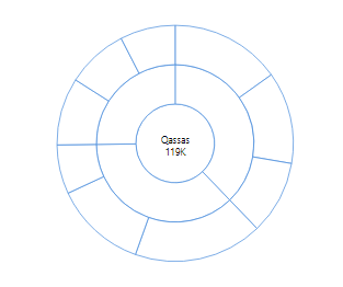
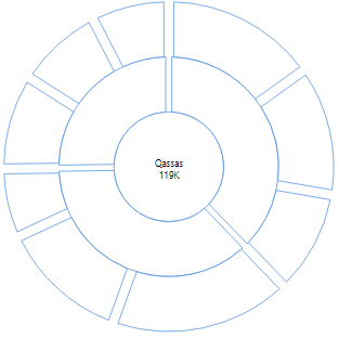
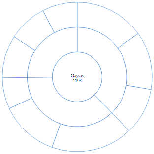
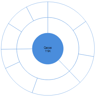
The Sunburst Chart Visual has been introduced by MAQ software to display a hierarchical data as a set of nested rings as shown below:

- It’s similar to a donut chart visual, but Sunburst chart visual has the capability of displaying a nested hierarchy levels through the category and subcategory option.
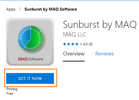
Download Sunburst chart visual
- Open the MAQ software Apps in Microsoft AppSource.
- In the left side, Click on Get it Now button.
- It will ask you to sign in or sign up with work or school email to can download the visual.
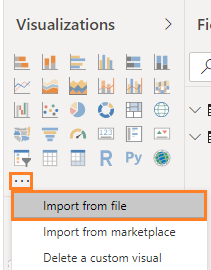
Import the Sunburst Chart Visual
- By default, the sunburst chart visual is not available in the visualization toolbox!

- To add new visual, you should click on the ... eclipse button, and select import from a file as shown below:
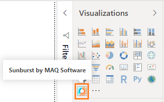
- Browse the downloaded file, then press Ok, you will note that the new visual is imported in the visualization toolbox as shown below:
Explore the Sunburst Format Elements
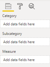
Category, Subcategory
The Sunburst chart has three mandatory fields as the following:
- Category.
- Sub Category. you can add multiple sub category (Max limit is 10)
- Measure.
Total
- By default the total option is disabled, you can enable it to the show the total value of the measure in the chart middle.
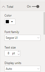
- You can also change the word of total as you prefer.
Configuration
In the configuration option, you can specify
- Radius: will take a value from 5 to the maximum size of view-port radius.
- Corner Radius: to adjust the corner decoration of radius.

- Padding between Arcs: to adjust the padding between Arcs.
- Stroke color: to set the color between radius as you prefer.
- Center circle fill: to set the color of the center circle as you prefer.
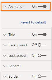
Animation
By default, the animation option is disabled, and you can enable it drill down to each category and subcategory.
Output:
https://gallery.technet.microsoft.com//site/view/file/225086/1/explore%20the%20Sunburst%20Visual%20features%20in%20Power%20BI.gif
What are the Missing Features in Sunburst chart?
- Can't add additional fields as tool-tip.

- Once you add the visual, you can't move it in a flexible manner, you must specify the X and Y value in the General settings.

- No custom data color for subcategory, it's only available for category.

- If you lose the visual focus, you will not be able to select the Sunburst chart again to adjust its format.
- In this case, you mush click on the eclipse of the visual and select spotlight.

Conclusion
In this article, we have exploring an attractive sunburst chart in Power BI.
We also have learned
- How to import a new visual in Power BI.
- How to adjust the sunburst visual format.
- The missing features that we hope to be available in the Sunburst chart visual.