Blazor: Creating A Reusable Grid Component
Introduction
In this article, we will create a reusable grid component for Blazor called BlazorGrid. It will display the user data in a grid and will support the client-side pagination.
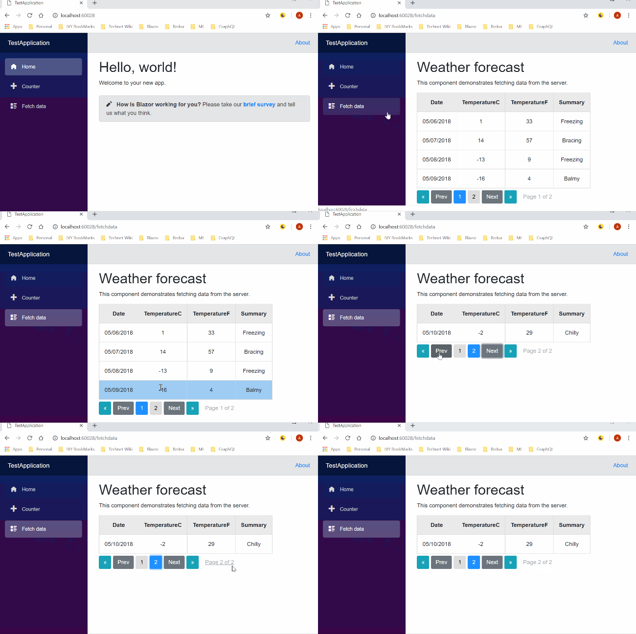
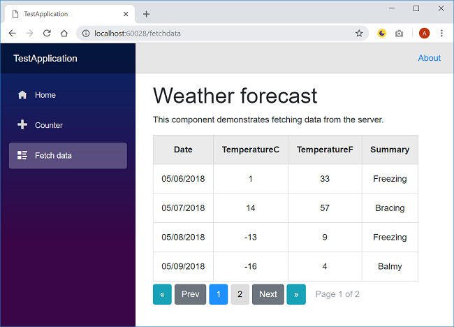
Take a look at the final application.
Prerequisites
- Install the .NET Core 2.1 or above SDK from here
- Install the latest version of Visual Studio 2017 from here
- Install ASP.NET Core Blazor Language Services extension from here
- Install Blazor templates on the command-line using the following command.
dotnet new -i Microsoft.AspNetCore.Blazor.Templates
Creating Blazor Library project
To create a Blazor library project, follow the steps mentioned below:
- Navigate to the folder where you want to create your project.
- Open command prompt or Windows PowerShell as administrator.
- Run the following command:
dotnet new blazorlib -o BlazorGridComponent
It will create a Blazor library project with the name BlazorGridComponent.
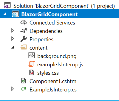
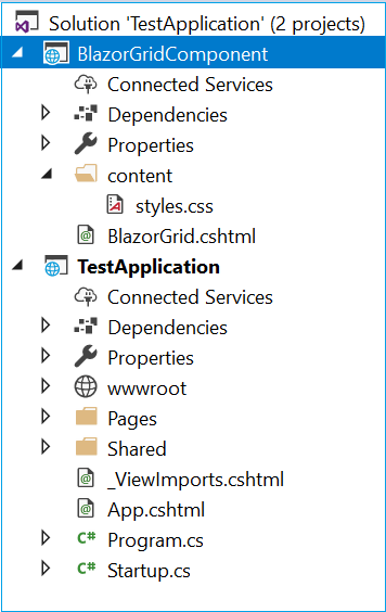
Open this project using Visual Studio. You will see a folder structure as shown in the image below.
There are some predefined files provided in this project. We will delete Component1.cshtml, ExampleJsInterop.cs, exampleJsInterop.js, and background.png files to make our solution clean. Do not delete styles.css as we will put the CSS definitions for our custom component in this file.
Creating BlazorGrid component
Now, we will add the component view page to our project.
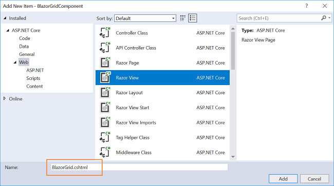
Right-click on the BlazorGridComponent project and then select Add >> New Item. An “Add New Item” dialog box will open; select “Web” from the left panel, then select “Razor View” from templates panel, and name it BlazorGrid.cshtml. Click Add. Refer to the image below.
Open the BlazorGrid.cshtml file and put the following code into it.
@typeparam TableItem

<table>
    <thead>
        <tr class="jsgrid-grid-header">@GridHeader</tr>
    </thead>
    <tbody>
        @foreach (var item in ItemList)
        {
            <tr class="jsgrid-row-item">@GridRow(item)</tr>
        }
    </tbody>
</table>
<div class="pagination">

    <button class="btn pagebutton btn-info" onclick=@(async () => SetPagerSize("back"))>«</button>
    <button class="btn pagebutton btn-secondary" onclick=@(async () => NavigateToPage("previous"))>Prev</button>

    @for (int i = startPage; i <= endPage; i++)
    {
        var currentPage = i;
        <button class="btn pagebutton @(currentPage==curPage?"currentpage":"")" onclick=@(async () => updateList(currentPage))>
            @currentPage
        </button>
    }

    <button class="btn pagebutton btn-secondary" onclick=@(async () => NavigateToPage("next"))>Next</button>
    <button class="btn pagebutton btn-info" onclick=@(async () => SetPagerSize("forward"))>»</button>

    <span class="pagebutton btn btn-link disabled">Page @curPage of @totalPages</span>

</div>

@functions {
int totalPages;
int curPage;
int pagerSize;
int startPage;
int endPage;

[Parameter]
RenderFragment GridHeader { get; set; }
[Parameter]
RenderFragment<TableItem> GridRow { get; set; }
[Parameter]
IEnumerable<TableItem> Items { get; set; }
[Parameter]
int PageSize { get; set; }

IEnumerable<TableItem> ItemList { get; set; }

protected override  async Task OnInitAsync()
{
    pagerSize = 5;
    curPage = 1;

    ItemList = Items.Skip((curPage - 1) * PageSize).Take(PageSize);
    totalPages = (int)Math.Ceiling(Items.Count() / (decimal)PageSize);

    SetPagerSize("forward");
}

public void  updateList(int  currentPage)
{
    ItemList = Items.Skip((currentPage - 1) * PageSize).Take(PageSize);
    curPage = currentPage;
    this.StateHasChanged();
}

public void  SetPagerSize(string  direction)
{
    if (direction == "forward" && endPage < totalPages)
    {
        startPage = endPage + 1;
        if (endPage + pagerSize < totalPages)
        {
            endPage = startPage + pagerSize - 1;
        }
        else
        {
            endPage = totalPages;
        }
        this.StateHasChanged();
    }
    else if  (direction == "back"  && startPage > 1)
    {
        endPage = startPage - 1;
        startPage = startPage - pagerSize;
    }
}

public void  NavigateToPage(string direction)
{
    if (direction == "next")
    {
        if (curPage < totalPages)
        {
            if (curPage == endPage)
            {
                SetPagerSize("forward");
            }
            curPage += 1;
        }
    }
    else if  (direction == "previous")
    {
        if (curPage > 1)
        {
            if (curPage == startPage)
            {
                SetPagerSize("back");
            }
            curPage -= 1;
        }
    }
    updateList(curPage);
}
}
Let’s understand this code.
In the HTML section of the code, we have defined a table. The <thead> section of the table will display the header of the grid as defined in GridHeader parameter. Similarly, the <tbody> section will iterate through the content of GridRow parameter to display the data in rows.
We have also defined the HTML of pagination section. It contains Next and Prev buttons to move through the pages. We have also defined the buttons to navigate to the next set of pages. The default pager size is set to five. This means the page buttons will be displayed in a set of five buttons.
In the functions section, we have defined four parameters for BlazorGrid component:
- Items: The list of items supplied to the BlazorGrid.
- PageSize: Size of each page of BlazorGrid.
- GridHeader: Header for BlazorGrid.
- GridRow: Rows for BlazorGrid.
Inside the OnInitAsync method, we are initializing the pagerSize to five and setting the curPage to one. We will calculate the total number of pages and bind the data to the first page of the grid.
The updateList method will be invoked when we click on a page button. It will bind the data to the current page of the grid.
The SetPagerSize method will set the page number in every pager set. The page buttons will be displayed in a set of five buttons and if the number of pages is more than five, the page button will be displayed in the next pager set. This method will accept a string parameter and based on the value it will set the page buttons for next or previous set of five buttons. A demo of pager set is shown below.
The NavigateToPage method will be invoked on clicking the Next or Prev button. It will navigate the user to immediate next or immediate previous page in the grid.
Adding CSS for BlazorGrid component
Open "/content/styles.css" file and put the following code into it.
.jsgrid-grid-header {
    text-align: center;
    border-collapse: collapse;
    background: #ebebeb;
}

.jsgrid-row-item:hover {
    background: #9fcdf4;
}

th, td {
    padding: 15px;
    border: 1px solid #d1d1d1;
    text-align: center;
}

.pagebutton {
    margin-right: 5px;
    margin-top: 5px;
}

.currentpage {
    background-color: dodgerblue;
    color: white;
}
In this file, we have defined styling for BlazorGrid component. Now, we will use this component in a Blazor project.
Create Blazor Web Application
Open Visual Studio and select File >> New >> Project.
After selecting the project, a “New Project” dialog will open. Select .NET Core inside the Visual C# menu from the left panel. Then, select “ASP.NET Core Web Application” from available project types. Put the name of the project as TestApplication and press OK.
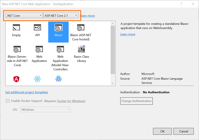
After clicking on OK, a new dialog will open asking you to select the project template. You can observe two drop-down menus at the top left of the template window. Select “.NET Core” and “ASP.NET Core 2.1” from these dropdowns. Then, select “Blazor” template and press OK. Refer to the image below:
Adding the BlazorGrid component to the Blazor project
To include the BlazorGridComponent project in this Blazor project, follow the steps mentioned below:
- Right-click on the solution and select Add >> Existing item.
- Browse to the BlazorGridComponent library, select the BlazorGridComponent.csproj file, and click Add.
This will include the BlazorGridComponent project in the current solution. Refer to the image below.
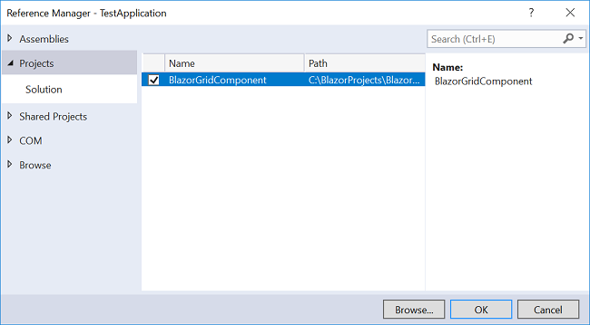
The next step is to add the reference to the shared component. Right-click “TestApplication\Dependencies”. Select "Add Reference..." Then, select BlazorGridComponent project and click OK. Refer to the image below:
The final step is to add the following line to "TestApplication\ _ViewImports.cshtml" file.
@addTagHelper *,BlazorGridComponent
This will allow us to use the shared BlazorGridComponent in our TestApplication project.
Using BlazorGrid component
Open "TestApplication\Pages\FetchData.cshtml" file. In the HTML section of the code put the following lines inside the else section.
<BlazorGrid Items="@forecasts" PageSize="4">
    <GridHeader>
        <th>Date</th>
        <th>TemperatureC</th>
        <th>TemperatureF</th>
        <th>Summary</th>
    </GridHeader>
    <GridRow>
        <td>@context.Date.ToShortDateString()</td>
        <td>@context.TemperatureC</td>
        <td>@context.TemperatureF</td>
        <td>@context.Summary</td>
    </GridRow>
</BlazorGrid>
The name of HTML tag will be the same as the file name of our component, which is <BlazorGrid> in this case. We are setting the value of Items parameter to forecasts. We have set the PageSize to 4 which means the grid will display four items in each page. The headers for the Grid are defined in <GridHeader>.
Inside the <GridRow> we have declared the row items for our grid using the implicit parameter “context”. The Blazor framework provides this and we need to use it to initialize the arguments of type RenderFragment<T>, which is GridRow in this case.
Execution Demo
Run the application and navigate to the Fetch data page. You will see the data is being displayed in a Grid fashion as shown in the image below:
Conclusion
We have created a shared Blazor component – BlazorGrid. It displays the user data in a grid. This component also provides client-side pagination. We learned how to reference and use the shared component in a Blazor application.
Download the attached source code and play around to get a better understanding.
Source Code
Download the source code from here.
See Also
- Understanding Server-Side Blazor
- Blazor: Single Page Application Using Server-Side Blazor
- Blazor: Understanding JavaScript Interop
- Blazor: Deploying An Application On Azure
- Blazor: CRUD Using MongoDB
- Angular 6: Using Animation in modern web apps
- ASP.NET Core: Expense Manager Using EF Core And Highcharts
