How to: Consistent modal message dialogs with C# and jQuery
Introduction
This article’s intent is to provide methods to display modal dialogs for asking questions, displaying information for alerts, warnings, and errors that are written in a class which may be used throughout an application rather writing these dialogs when needed with minor changes. They will be presented for web applications, WPF and Windows Forms.
Common code examples
Example of how a question may be asked in Windows Form or WPF applications. Both are long and unsightly along with introducing confusion when attempting to maintain or debug an application.
Windows forms:
if (MessageBox.Show("Continue with updates?", "Question", MessageBoxButtons.YesNo, MessageBoxIcon.Question) == DialogResult.Yes)
{
    // perform a positive action
}
else
{
    // no actions performed or reverting changes actions
}
WPF
if (System.Windows.MessageBox.Show("Continue with updates?", "Question", MessageBoxButton.YesNo, MessageBoxImage.Question) == MessageBoxResult.Yes)
{
    // perform a positive action
}
else
{
    // no actions performed or reverting changes actions
}
In both Windows forms and WPF a smarter idea!
if (Question("Do you like coffee?"))
{
    Alert("Let's go to Starbucks!!");
}
else
{
    Alert("Tea drinker");
}
Desktop common dialogs
Both C# for Windows forms and WPF are relatively the same other than namespaces and enumerations used which means write one for Windows Forms, copy the class methods to WPF and resolve the differences (which have been done for you in the provided source code).
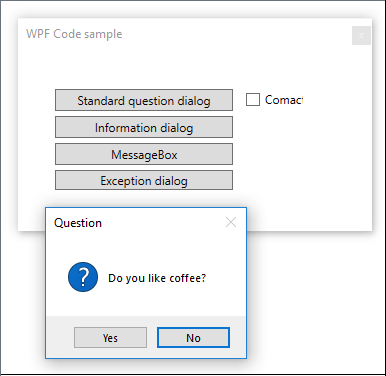
Caveat: The default style for WPF MessageBox dialog may appear un-styled, to remedy this add a new application manifest file. Once added find the following.
<!--
  <dependency>
    <dependentAssembly>
      <assemblyIdentity
          type="win32"
          name="Microsoft.Windows.Common-Controls"
          version="6.0.0.0"
          processorArchitecture="*"
          publicKeyToken="6595b64144ccf1df"
          language="*"
        />
    </dependentAssembly>
  </dependency>
  -->
Uncomment
<dependency>
  <dependentAssembly>
    <assemblyIdentity
        type="win32"
        name="Microsoft.Windows.Common-Controls"
        version="6.0.0.0"
        processorArchitecture="*"
        publicKeyToken="6595b64144ccf1df"
        language="*"
      />
  </dependentAssembly>
</dependency>
Rebuild the project, now you will have modern styling for the dialogs.
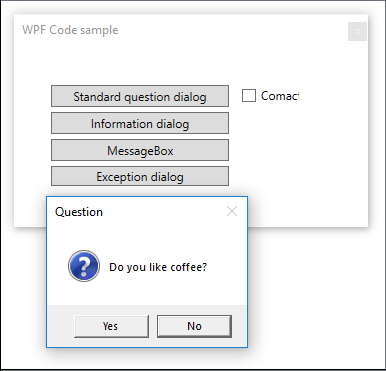
Example of unstyled and styled.
Question
In the following class, there are methods for asking users for a Yes or No response. The default is to provide a question and the title defaults to Question. As setup, this method sets the No button as default which means the user must press, click or tab to the Yes button to confirm a positive outcome. Why is this even a consideration? Users make mistakes by not reading a question followed by pressing the default which is 99.99 percent done with the Yes button e.g. Would you like to remove all records from the order table? (and there are no backups).
To be flexible an override exists which requires the default button to be passed into the method.
Alert/Information
Also, there are several methods to present dialogs to provide feedback to the current user. Many users don’t like to hear a beep/sound heard when a dialog is displayed, for this reason, there is an alert which does not beep as there is no icon. The choice of an icon will cause a beep or no beep to be heard.
Errors
Finally, there are dialogs that target errors/exceptions. For presenting an exception the first dialog takes a title, a message, and the actual Exception object. The icon is Error which will cause the computer to beep to grab their attention. The remaining method is for debugging and is a language extension method for type Exception. For those developers who like to use dialogs rather than trace through code with breakpoint and write to a log, IDE console etc. this is an easy way to display an exception.
Web common dialogs
All major web browsers have an alert and confirm dialog which may be alright for personal use web solutions but not for corporate or applications where customers pay for the right to use.
The next idea would be to search for a free widget user interface library yet there can be issues with even the best libraries out there which means a developer must report a bug/issue and wait for a resolution as large libraries the average developer not familiar with this code may break other parts of the library. Which brings up the point to not simply use a library but also when possible traverse the code, learn from the code before using the library for current and future issues e.g. dependent on a single version of jQuery.
Rolling your own (as presented in the source code for this article) provides an advantage in that when written for only what is needed allows for easier transition to newer versions of jQuery/jQuery UI or bootstrap.
These dialogs should be placed in a Javascript class as shown below: The first line creates the class when needed on the first usage while farther usage has commonDialog in memory and will reuse the class. In the return statement, on the left of the semi-colon is public access and on the right of the semi-colon is an internal/private name.
var $comonDialogs = $comonDialogs || {};
$comonDialogs = function  () {

    // code goes here

    return {
        confirmation: dialogConfirmtion,
        alert: dialogAlertCustom,
        dialogWarning: dialogWarning
    };
}();
The following is an example for creating an alert/information dialog using jQuery
var $comonDialogs = $comonDialogs || {};
$comonDialogs = function  () {
    /**
    * Description.     Provides a modal dialog for informing the user of something.
    * @pTitle          title for dialog
    * @pText           plain or rich text for dialog
    * @pButtonText     e.g. OK
    */
    var dialogAlert = function (pTitle, pText, pButtonText) {
        var def = $.Deferred();
        $('<div />').html(pText).dialog({
            modal: true,
            title: pTitle,
            buttons: [
                {
                    text: !pButtonText ? "OK" : pButtonText,
                    "id": "btnOk",
                    click: function  () {
                        $(this).dialog("close");
                        def.resolve("Yes");
                    }
                }
            ],
            fluid: true,
            resizable: false,
            height: 'auto',
            width: 'auto',
            closeOnEscape: false,
            open: function  (event, ui) {
                $(".ui-dialog-titlebar-close", ui.dialog | ui).hide();
            }
        });

        return def.promise();

    };

    return {
        alert: dialogAlert
    };
}();
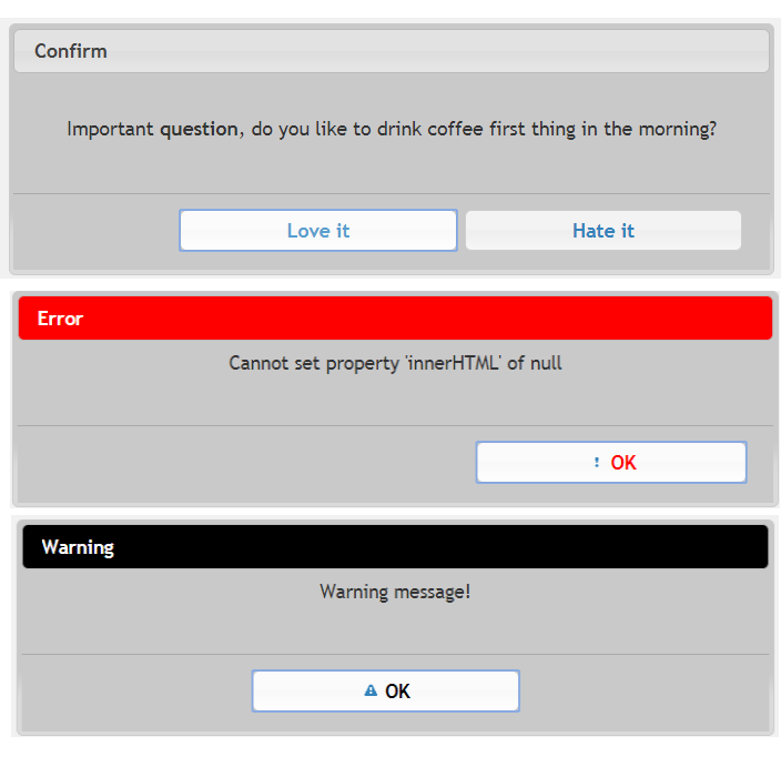
Parameters, title of dialog, message to display (may be plain text or styled) followed by button name (e.g. OK, Okay or perhaps Okay in another language). Styling is obtained by a .css file, in these examples the style was created via themeroller excluding several widgets.
Usage where the code is in for this code sample main.js which is for the index page.
$("#btnAlert").click(function () {

    $.when($comonDialogs.alert()).then(
        function (status) {/* perform action(s) */ }
    );

});
Partial main.js
$(document).ready(function () {

    $("#btnAlert").click(function () {

        $.when($comonDialogs.Alert()).then(
            function (status) {/* perform action(s) */ }
        );

    });

});
In the above sample, the single button is placed as per jQuery UI (bottom right) , if a developer wants to center the button currently the CSS needs to be changed to center the button in the div buttonpane.
$("#warning-dialog").dialog("widget").find(".ui-dialog-buttonpane").css({ "text-align":  "center" });
$("#warning-dialog").dialog("widget").find(".ui-dialog-buttonset").css({ "float":  "none" });
The following example displays a centered OK button.
var dialogAlertCustom = function (pText) {

    var def = $.Deferred();

    $('<div id="warning-dialog" />').html(pText).dialog({
        modal: true,
        title: 'Error',
        dialogClass: 'alertTitleClass',
        buttons: [{
            text: 'OK',
            icon: "ui-icon-notice",
            "id": "btnOk",
            class: "btn-error-dialog-ok",
            click: function  () {
                $(this).dialog("close");
                def.resolve("Yes");
            }
        }],
        fluid: true, //new option
        resizable: false,
        height: 'auto',
        width: '700px',
        // prevent X button in title
        closeOnEscape: false,
        open: function  (event, ui) {
            $(".ui-dialog-titlebar-close", ui.dialog | ui).hide();
        }
    });


    // override default style for dialog buttons to be on right, here the single button is centered.
    // If we were to set this up in a style it will affect other dialogs.
    $("#warning-dialog").dialog("widget").find(".ui-dialog-buttonpane").css({ "text-align":  "center" });
    $("#warning-dialog").dialog("widget").find(".ui-dialog-buttonset").css({ "float":  "none" });

    return def.promise();
};
Note there are many options being set which will not be gone over but instead refer to the documentation for jQuery UI dialog. A safe place to experiment is with JSFiddle such as the following rough code sample.
To be consistent with the other project types the following methods have been included for web applications which provide a solid foundation to build on.
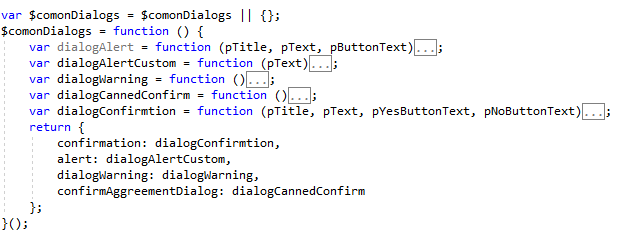
Each modal dialog in commonDialogs is wrapped in .when which provides a way to execute callbacks, in these cases deferred objects which .then handles the resolved deferred return value, true/false (Yes, No) in all methods.
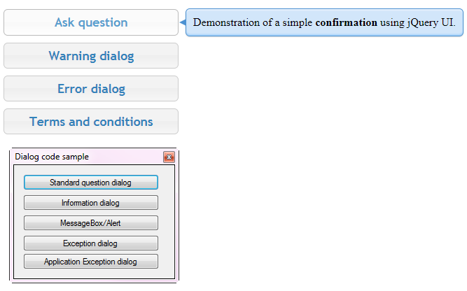
To use the modal dialogs they need to have a control such as a button or link. The following from the attached code sample is the page to try out these dialogs. Notice there is little going on here, several buttons with the id attribute and text to display.
<!DOCTYPE html>
<html>
<head>
    <meta charset="utf-8" />
    <title>demonstration for replacement to browser confirm</title>

    <link href="includes/css/jquery-ui.min.css" rel="stylesheet" />
    <link href="includes/css/jquery-ui.theme.css" rel="stylesheet" />
    <link href="includes/css/main.css" rel="stylesheet" />
    <link href="includes/css/powerTips/jquery.powertip-blue.css" rel="stylesheet" />

    <script src="includes/js/jquery-3.3.1.min.js"></script>
    <script src="includes/js/jquery-ui.js"></script>
    <script src="includes/js/jquery-ui.min.js"></script>
    <script src="includes/js/jquery.powertip.min.js"></script>
    <script src="includes/js/comonDialogs.js"></script>
    <script src="includes/js/main.js"></script>

</head>
<body>

    <h1>jQuery custom dialogs</h1>

    <div class="container">
        <button id="btnConfirm">Ask question</button>
        <label  id="lblAsk"></label>
        <button id="btnWarning">Warning dialog</button>
        <button id="btnAlertCustom">Error dialog</button>
        <button id="btnTermsConditions">Terms and conditions</button>
        <label  id="lblTerms"></label>
    </div>

</body>
</html>
Besides subscribing to events for each button there is code in main.js to initialize the buttons, setup tool-tips. All styling is done via the jQuery UI custom style sheets generated via their themeroller and with a personal .css file to modify default behavior of standard elements and jQuery UI style overrides. A rule of thumb is to keep your code in the HTML files as clean as possible. Once you master working with templates, see the following extremely template. Progress Kendo UI supports very flexible templates as shown here.
var inlineTemplate = kendo.template("Hello, #= firstName # #= lastName #");
var inlineData = { firstName: "John", lastName: "Doe" };
$("#inline").html(inlineTemplate(inlineData));
Side note: The author has used Kendo UI templates were the only thing that resides in the main page is one div where templates dynamically create rich and complex pages in SPA (Single Page Applications) mobile/desktop solutions with web api architecture.
Summary
In this article, code has been presented to create modal dialog classes for the three most populate solutions types, web windows forms and Windows Presentation Foundation.
