How to create LightSwitch Theme (C#)
** Jamil Milhem | System Development**
Step 1: Create an LightSwitch Extension Library project
- Fileà New Project.

- select the LightSwitch node, àLightSwitch Extension Library (C#).
- type ThemeApp the name for your extension

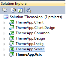
ThemeApp solution contains the seven projects that are required for the extension.
Step 2 : Create lightSwitch Theme extension
- ThemeApp.Lspkg project à right clickàAdd New Item
- select LightSwitch Theme. And type the name for your theme extension.
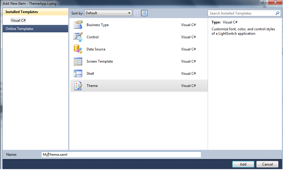
- after press OK button. Some Files will be added to several projects in ThemeApp solution.
Step 3: define the theme
Note: the default values and styles define the appearance of the Blue Theme (Default). You define your own theme by add your modifications on the values of ( colors ,fonts, borders , shell color font color …) .
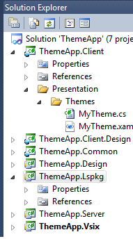
choose the ThemeApp.Client project.
- Presentation à Themes à open the MyTheme.xaml.
- ** Strat modify the theme step by step.**
Themes Details :
Control |
description |
Status |
Example |
Text Styles |
Can be displayed on ScreenBackground, if not use FontBackgroundBrush |
FontFamily, FontStyle, FontSize, FontWeight, FontBrush, FontBackgroundBrush |
<FontFamily x:Key="NormalFontFamily">Segoe UI, Arial</FontFamily> <sys:Double x:Key="NormalFontSize">11</sys:Double> <FontWeight x:Key="NormalFontWeight">Normal</FontWeight> <FontStyle x:Key="NormalFontStyle">Normal</FontStyle> <SolidColorBrush x:Key="NormalFontBrush" Color="#FF404040"/> <SolidColorBrush x:Key="NormalFontBackgroundBrush" Color="White"/> |
Screen
|
The normal brush for Screen The background of the screen The background of a control that is loading The border of a control that is not based on another control already defined |
color |
<SolidColorBrush x:Key="ScreenControlBorderBrush" Color="#FFA5ACB5"/> |
Button
|
Change Button Border. Button Inner Border Button Background Button Text |
NormalBrush, FocusedBrush, MouseOverBrush, DisabledBrush, PressedBrush |
<SolidColorBrush x:Key="ButtonGlyphBrush" Color="#FF424242"/> |
TextBox
|
The selected state is used for the color of selected text in the textbox |
NormalBrush, FocusedBrush, MouseOverBrush, DisabledBrush, ReadOnlyBrush, SelectedBrush |
<SolidColorBrush x:Key="TextBoxBorderBrush" Color="#FFCCCCCC"/> |
ComboBox/TextBox Button
|
In this case the 'Normal' state is displayed when the TextBox has focus or if another area of the TextBox is MouseOver |
NormalBrush, FocusedBrush, MouseOverBrush, PressedBrush |
<SolidColorBrush x:Key="TextBoxButtonBorderFocusedBrush" Color="#FF3C7FB1"/> <SolidColorBrush x:Key="TextBoxButtonBorderMouseOverBrush" Color="#FF3C7FB1"/> <SolidColorBrush x:Key="TextBoxButtonBorderPressedBrush" Color="#FF68B3DB"/> |
Link
|
Edit link text coor and Link Focus Border - Some themes may display a rectangle around the link to indicate it has keyboard focus |
NormalBrush, FocusedBrush |
<SolidColorBrush x:Key="LinkFocusBorderFocusedBrush" Color="#FFA5ACB5"/> |
Label |
Edit label text color |
NormalBrush, DisabledBrush |
<SolidColorBrush x:Key="LabelTextBrush" Color="#FF404040"/> |
CheckBox |
Edit the The square that contains the check glyph and CheckBoxBackground |
NormalBrush, FocusedBrush, MouseOverBrush, DisabledBrush |
<SolidColorBrush x:Key="CheckBoxGlyphBrush" Color="#FF404040"/ |
TabControl
|
|
NormalBrush, FocusedBrush, MouseOverBrush, DisabledBrush, ActiveBrush |
<SolidColorBrush x:Key="TabControlTabFocusBorderFocusedBrush" Color="#FFFB9141"/> |
Toolbar
|
A toolbar can be used in any control that needs additional buttons or a header, like a List, Grid or future control |
NormalBrush, FocusedBrush, MouseOverBrush, DisabledBrush, PressedBrush |
<SolidColorBrush x:Key="ToolbarBackgroundBrush" Color="#FFE9EDF1"/> |
ScrollBar
|
ScrollBarBackground ScrollBarButtonBorder - The directional buttons, up, down, left ,right ScrollBarButtonBackground ScrollBarButtonGlyph ScrollBarThumbBorder - The thumb bar that displays/adjusts the current position. |
NormalBrush, MouseOverBrush, DisabledBrush, PressedBrush |
<SolidColorBrush x:Key="ScrollBarBackgroundBrush" Color="#FFEDEDED"/> |
All other controls Modified in the same way |
|||
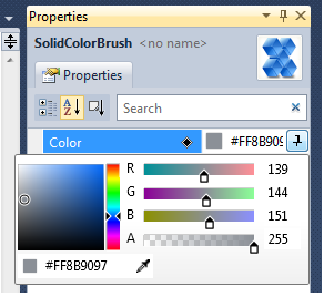
- Press on control attribute and press F4 , the properties screen will appear

- Use the color attribute to modify the control brush
Note :
- You can also open the .xaml file in Microsoft Expression Blend 4 and change the colors in a visual designer.
- Note that the color values can be entered as either a System.Drawing.Color value or a hexadecimal color value.
Step 4: See what you do..
- Press F5 to Start Debugging. An experimental instance of Visual Studio opens.
Note : make sure of the experimental instance is enabled. By select ThemeApp.Vsix à Properties.On the Debug tab, under Start Actionà select Start external program. And enter the path of the Visual Studio executable, devenv.exe. In the Command line arguments field, type /rootsuffix Exp as the command-line argument.
- Open any existing project to test the theme on it .
- On solution properties go to the Extensions tab, check the ThemeApp check box. And Go to General Properties tab, and in the Theme list, choose My Theme.

And Go to General Properties tab, and in the Theme list, choose My Theme.

- Press F5 and enjoy with your theme J