Universal Windows App: How to create a custom progress indicator?
Introduction
When we execute a query or a web service, the application may take time to retrieve and display data.
In order to avoid empty screen and indicate that an operation is ongoing, we can insert a progress control as a busy indicator in the page of the application. It provides feedback to the user that a long-running operation is underway.
Universal Windows App contains two progress controls: ProgressRing and ProgressBar.
But what if we want to create our own progress indicator?
That's why in this Wiki, we will see how to create a custom progress indicator?
We will use Visual Studio 2017 Community and Windows 10 Creators Update
Create a custom progress indicator
Create a new Universal Windows App project
- Open Visual Studio and create a new Universal Windows App: MyProgressIndicatorApp
Declare Dependencies Properties
- Add a new class to the project and name it BusyIndicator. BusyIndicator will be the name of the custom progress control.
- Insert the following code in the BusyIndicator class:
/// <summary>
    ///     Custom control used to display a busy indication
    /// </summary>
    [TemplateVisualState(Name = "IsBusyState", GroupName = "BusyStatesGroup")]
    [TemplateVisualState(Name = "NormalState", GroupName = "BusyStatesGroup")]
    public class  BusyIndicator : Control
    {
        #region Fields

        //Data
        private Boolean _isLoaded;

        #endregion

        #region DPs

        /// <summary>
        ///     DP definition for BusyProgressValue property
        /// </summary>
        public static  readonly DependencyProperty BusyMessageProperty = DependencyProperty.Register("BusyMessage",
                                                                                                    typeof(String),
                                                                                                    typeof(BusyIndicator),
                                                                                                    new PropertyMetadata(String.Empty));

        /// <summary>
        ///     DP definition for BusyProgressValue property
        /// </summary>
        public static  readonly DependencyProperty IsBusyProperty = DependencyProperty.Register("IsBusy",
                                                                                               typeof(Boolean),
                                                                                               typeof(BusyIndicator),
                                                                                               new PropertyMetadata(false,
                                                                                                                    OnIsBusyPropertyChanged));

        #endregion

        #region Constructors

        /// <summary>
        ///     Initialize a new instance of <see cref="BusyIndicator" />
        /// </summary>
        public BusyIndicator()
        {
            Loaded += OnLoaded;
            Unloaded += OnUnloaded;
        }

        #endregion

        #region Properties


        /// <summary>
        ///     Gets or sets if we are busy or not
        /// </summary>
        public Boolean IsBusy
        {
            get
            {
                return (Boolean)GetValue(IsBusyProperty);
            }
            set
            {
                SetValue(IsBusyProperty,
                         value);
            }
        }

        /// <summary>
        ///     Gets or sets the current busy message to display
        /// </summary>
        public String BusyMessage
        {
            get
            {
                return (String)GetValue(BusyMessageProperty);
            }
            set
            {
                SetValue(BusyMessageProperty,
                         value);
            }
        }

        #endregion

        #region Handlers

        private static  void OnIsBusyPropertyChanged(DependencyObject d,
                                                    DependencyPropertyChangedEventArgs e)
        {
            var indicator = d as  BusyIndicator;

            if ((indicator != null) && (indicator._isLoaded))
            {
                VisualStateManager.GoToState(indicator,
                                             indicator.IsBusy
                                                 ? "IsBusyState"
                                                 : "NormalState",
                                             true);
            }
        }

        private void  OnLoaded(object  sender,
                              RoutedEventArgs e)
        {
            _isLoaded = true;
            VisualStateManager.GoToState(this,
                                         IsBusy
                                             ? "IsBusyState"
                                             : "NormalState",
                                         true);
        }

        private void  OnUnloaded(object  sender,
                                RoutedEventArgs e)
        {
            VisualStateManager.GoToState(this,
                                         "NormalState",
                                         false);
        }

        #endregion
    }
The BusyIndicator inherits from Control.
As we can see we defined two properties BusyMessage and IsBusy
**
**
The BusyMessage contains the message will be displayed in the custom progress indicator BusyIndicator.
The IsBusy property contains the state (IsActive value) of the custom progress indicator BusyIndicator.
Now, let’s define the template of our custom progress indicator BusyIndicator.
Define the Template
- Open the App.xaml and insert the following code:
<Application
    x:Class="MyProgressIndicatorApp.App"
    xmlns="http://schemas.microsoft.com/winfx/2006/xaml/presentation"
    xmlns:x="http://schemas.microsoft.com/winfx/2006/xaml"
    xmlns:local="using:MyProgressIndicatorApp"
    RequestedTheme="Light">
    <Application.Resources>
        <ResourceDictionary>

            <!--COLORS-->
            <Color x:Key="DarkBlue">#3B5998</Color>

            <!--BRUSHES-->
            <SolidColorBrush x:Key="DarkBlueBrush"
                             Color="{StaticResource DarkBlue}" />

            <Style x:Key="ProgressIndicatorStyle"
                   TargetType="local:BusyIndicator">
                <Setter Property="RequestedTheme"
                        Value="Light" />
                <Setter Property="Template">
                    <Setter.Value>
                        <ControlTemplate TargetType="local:BusyIndicator">
                            <StackPanel VerticalAlignment="Center"
                                        HorizontalAlignment="Center"
                                       >
                                <ProgressRing IsActive="{TemplateBinding IsBusy}"
                                              Foreground="{StaticResource DarkBlueBrush}"
                                              Height="70"
                                              Width="70" />

                                <TextBlock Text="{TemplateBinding BusyMessage}"
                                           Foreground="{StaticResource DarkBlueBrush}"
                                           HorizontalAlignment="Center"
                                           Margin="0 10 0 0" />
                            </StackPanel>

                        </ControlTemplate>
                    </Setter.Value>
                </Setter>
            </Style>
        </ResourceDictionary>
    </Application.Resources>
</Application>
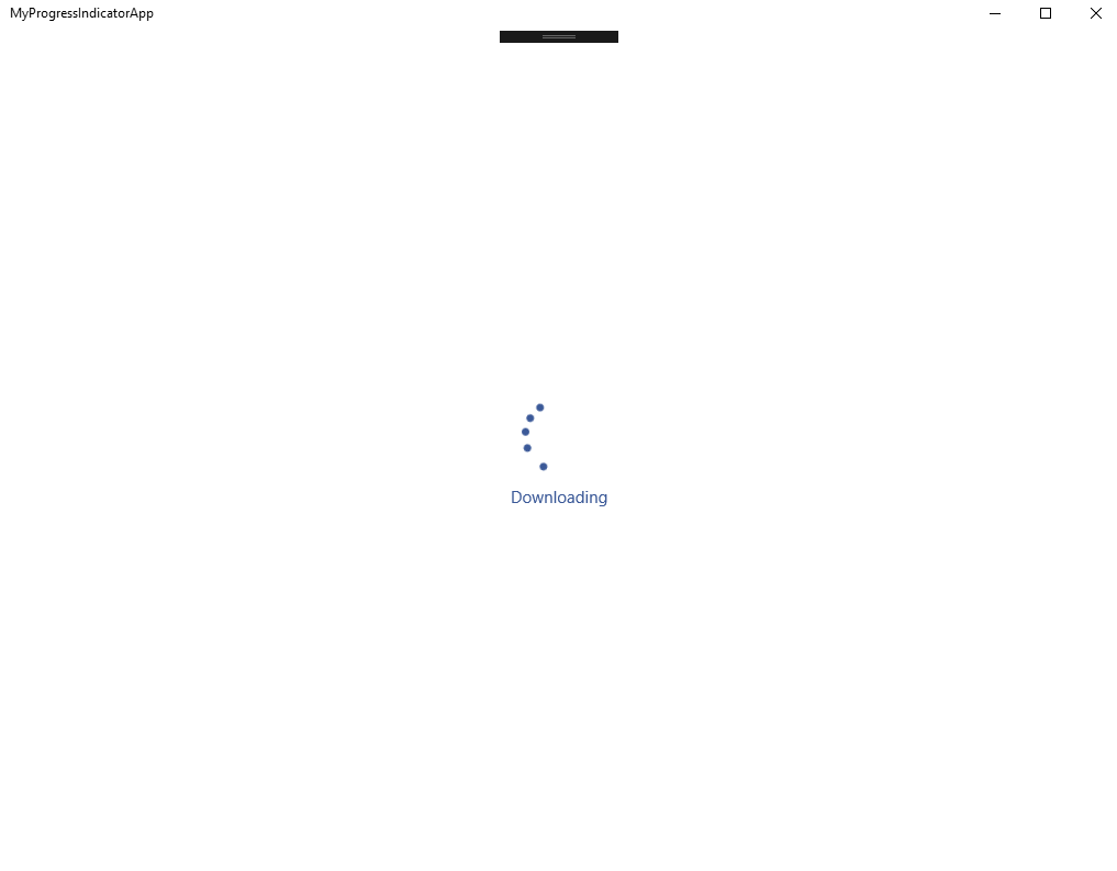
Our template contains a ProgressRing and a TextBlock.
Therefore we can custom as we like our template inside the ControlTemplate.
Use the custom progress indicator
- Open the MainPage.xaml and insert the following code:
<Grid Background="{ThemeResource ApplicationPageBackgroundThemeBrush}">
        <local:BusyIndicator IsBusy="True"
                             Style="{StaticResource ProgressIndicatorStyle}"
                             BusyMessage="Downloading"
                             Height="300"
                             Width="300" />
    </Grid>
· Launch the application MyProgressIndicatorApp, we can use the Visual Studio shortcut F5.
Conclusion
In this Wiki, we saw how it is easy to create a custom progress indicator for your Universal Windows App.
Download
You can download all project in this link: https://gallery.technet.microsoft.com/UWP-Custom-progress-control-6f75c51a

