SharePoint 2016: How to Implement Responsive UI
Introduction
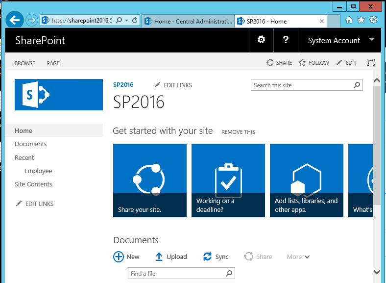
SharePoint UI branding to bring responsiveness for tablet and mobile view can be at times complex. Though SharePoint ribbon is responsive, other content areas including navigation, search box and content pages are not responsive. SharePoint 2016 desktop view works as expected at screen size greater than 768px.
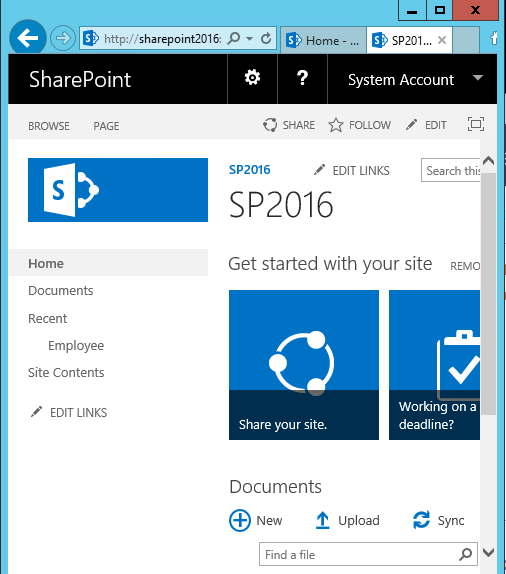
However, as the screen size reduces the screen elements are not re ordered and re aligned with the width causing the content area to be trimmed.
In the Pre-SharePoint 2016 days one of the commonly used Responsive UI package was the Twitter Bootstrap Responsive package that was tweaked for SharePoint On premise use. This was a project managed by Eric Overfied. You can find the Twitter Bootstrap Responsive Package here .
However, PnP has brought out a GitHub package that changes the Out of the Box behavior of SharePoint 2016/Online by providing three different rendering options depending on the view port size – Desktop, Tablet and Mobile View. PnP stands for Practices and Patterns which is a community driven open source project, where Microsoft and community members have created an implementation pattern for Office 365 and SharePoint on-premises. As part of the PnP initiative, Responsive package for SharePoint 2016/online has been introduced.
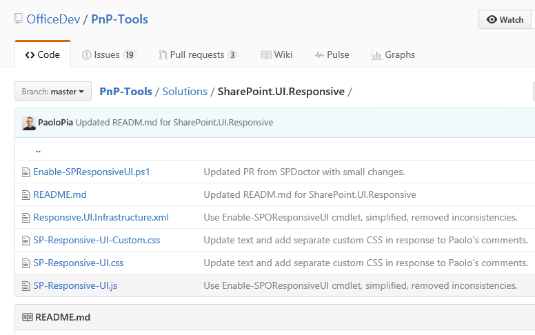
The GitHub Responsive UI package project location for SharePoint 2016 can be found here
The branch contains PowerShell scripts, XML, CSS and JS files that facilitate the Responsive package implementation. This responsive package can be deployed to SharePoint2016/Online by using the PowerShell cmdlet ‘Enable-SPOResponsiveUI ‘. This implementation does not make use of any custom master page, instead the required JavaScript and CSS files are embedded using JavaScript embed pattern. Thus, we really don’t have to use a custom master page, we can still use the Out of the Box master page to implement responsiveness (This was one of the drawbacks that existed in Twitter Bootstrap responsive package).
Responsive Package Implementation
The responsive package can be implemented for a site collection as a 3-step process.
- Download the Github project file
- Install PnP Powershell
- Run Enable-SPOResponsiveUI cmdlet
This would make the site collection responsive for mobile and tablet views. Let’s see each of them in detail.
Download the GitHub project file
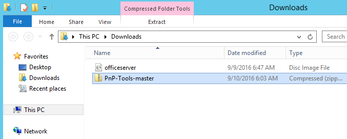
The required files for implementing the responsive package can be downloaded as a zip file from here . This would download the ‘PnP-Tools-master’ zip file to the local machine.
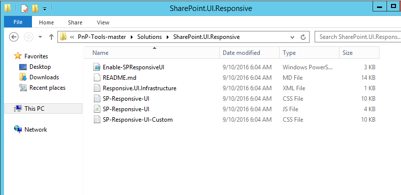
Upon Unzipping the package and we can see the contents of the package at the relative location – “Solutions\SharePoint.UI.Responsive”. SP-Responsive-UI CSS and JS files are the main files that provide the responsive rendering behavior for SharePoint depending on the view port size. You can customize the branding by making the changes to the CSS and JS file as per the requirement. This will be reflected in the Responsive UI upon the running of the Enable-SPOResponsiveUI cmdlet.
Setup PnP PowerShell
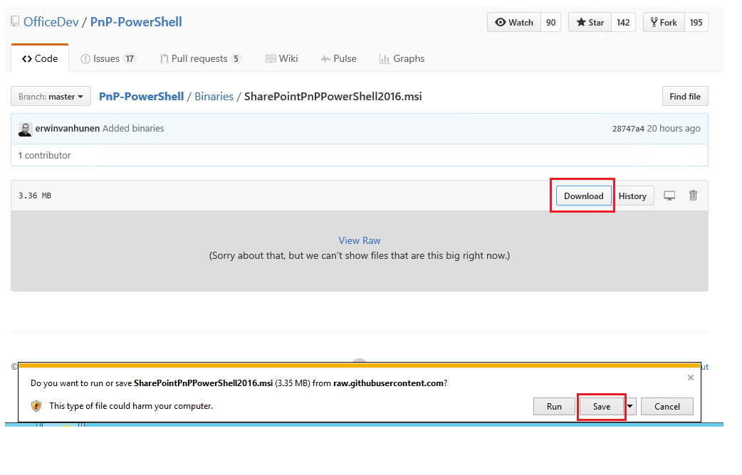
In order to run the ‘Enable-SPOResponsiveUI’ cmdlet we have to make sure that SharePointPnP.PowerShell commands are installed in the machine. You can download the executable from here . Click on Download button and subsequently run the msi file.
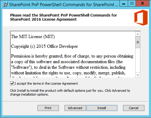
Accept the agreement and click on Install.
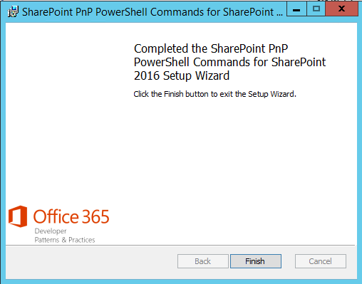
This will complete the installation of PnP PowerShell Commands for SharePoint 2016 in the machine.
Run the Enable-SPOResponsiveUI cmdlet
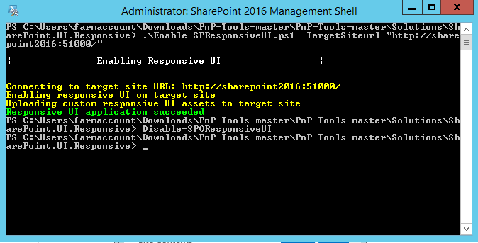
Now spin up SharePoint 2016 Management Shell as administrator.
Run the below command in the Power shell console.
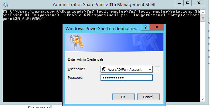
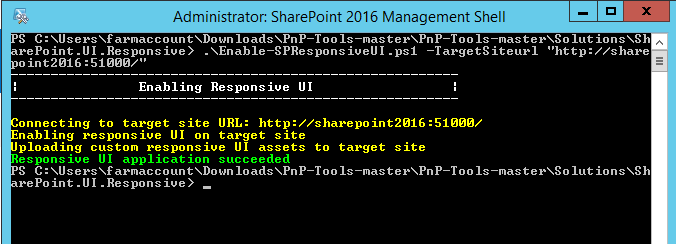
.\Enable-SPResponsiveUI.ps 1 -TargetSiteurl http://sharepoint2016:51000/
TargetSiteurl - is the site collection where the responsive package will be implemented.
Upon running the script, it will ask for user authentication, Enter the user name and password and click on OK.
This will enable Responsive UI in the specified site collection.
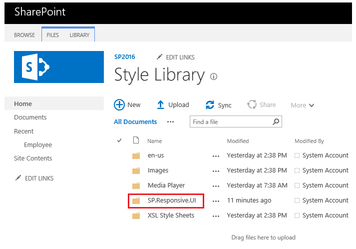
Once the responsive UI activation success message comes up in the screen, we can go to the style library of the site collection where Responsive UI was enabled. Here we can see a new folder by the name ‘SP.Responsive.UI’ added. This folder will host the required CSS and JS files responsible for the responsiveness of the site collection.
We can also run a variation of the script as shown below:
 $creds = Get-Credential

.\Enable-SPResponsiveUI.ps1 -TargetSiteUrl "http://sharepoint2016:51000/" -InfrastructureSiteUrl "http://sharepoint2016:51000/sites/ReUsable" -Credentials $creds
- TargetSiteURL – This is the site collection where the responsive package will be implemented.
- InfrastructureSiteUrl – This site collection is used for hosting the JavaScript and CSS files
Here the Responsive UI supporting files will be added to a central site collection as specified in the ‘InfrastructureSiteUrl’ parameter. Unless this parameter is specified, the files will be added to the same target URL where responsiveness is enabled.
Caveat
In order to implement the responsive UI package for SharePoint 2016 we have to ensure that the native ‘Mobile Browser View’ feature is not enabled in the site collection. So, when the Responsive UI enabling PowerShell script (Enable-SPOResponsiveUI) is run, the ‘Mobile browser View’ feature will be disabled in the root site of the site collection.
End Result: Responsive UI for SharePoint 2016
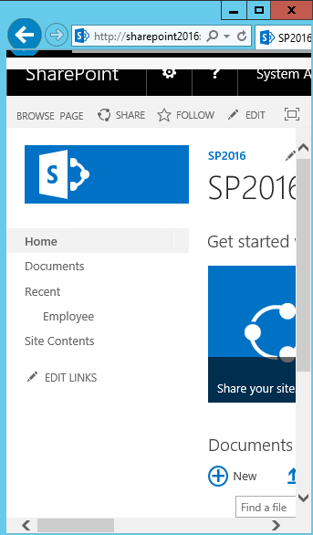
When the view port reduces to between 481 and 768px – tablet view, the left navigation becomes a collapsed hamburger menu and the search bar realigns to accommodate itself within the viewport.
Upon expanding the left navigation hamburger menu, it shows the entire quick launch navigation items.
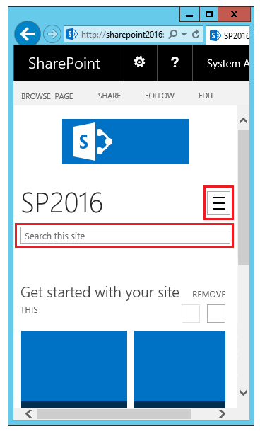
When the view port is yet again reduced to mobile view where the viewport size is less than 480px, the hamburger menu and search box realigns further with respect to the view port.
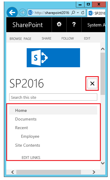
Expanding the hamburger menu shows the quick launch items as a vertical drop down.
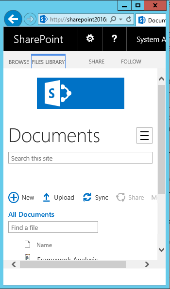
Clicking on ‘Documents’ will take us to inside the document library. The contents and the ribbon areas are responsive within the lists/libraries as well.
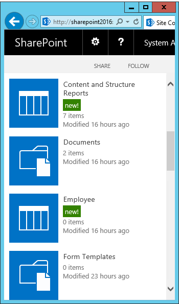
Now let’s take a look at the Site Contents page, here also the Out of the box and custom add-ins appears to be responsive in a vertical tile fashion.
The site assets page has also carried over the responsiveness of the SharePoint 2016 Responsive UI package making the entire site collection responsive with respect to the view port of the viewing device.
Disable Responsive UI
In order to disable the responsive UI in SharePoint 2016 we can run the command Disable-SPOResponsiveUI in the PowerShell console.
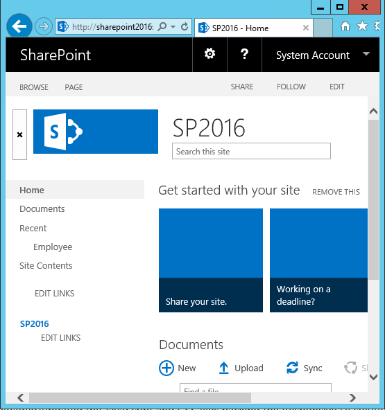
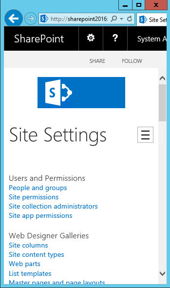
This will remove the responsive package and will reinstate the Out of the Box behavior for SharePoint 2016 as shown below. In order to re enable responsive behavior we can run the Enable-SPOResponsiveUI cmdlet*.*
Summary
Thus, we saw how to implement responsive UI in SharePoint 2016 so as to reorder and realign the web content with respect to mobile and tablet view port.
See Also
More information on this article can be viewed from the below link as well :
