WPF: Layout Lab
This article walks the reader through a number of pieces of XAML markup. These and practical experiments thereon are used to introduce the reader to WPF layout.
Introduction
Many aspects of layout are best understood by practising in Visual Studio and seeing the effect first hand. The reader will gain most by opening the sample and following the explanation through control by control with the sample project.
Target Audience.
This is an introductory article and hence aimed at beginner through intermediate developers. On the other hand, there are quite a few things presented and XAML has a myriad subtleties. All but the very experienced might possibly find something in here they haven't come across.
Level of Difficulty
No markup ( or code ) in this is really advanced. Some is perhaps a little odd, but nothing should be totally beyond the reach of a beginner. Having said that, the level of difficulty does ramp up somewhat as the article progresses.
Practicalities
If the reader only has one regular sized monitor or a laptop to work with then it will be difficult to read and follow along. Perhaps consider reading this page on a tablet with Visual Studio running on your development computer.
Separating out exactly what is purely "Layout" from anything else would be very difficult and clarity would likely suffer in such a "pure" approach. Rather than risk confusion this article occasionally digresses from Layout into other related areas when this is considered useful.
The principles here will also be useful to any XAML based development and will be of some use to developers working with any flavour of XAML including Windows App store, Silverlight, Windows Phone 8 etc. Each flavour of XAML is different and sometimes in quite subtle and surprising ways but at this sort of introductory level there is still value in reading on even if you don't wish to develop in WPF.
The Goggles do Nothing
You really need to download the sample to get the most out of this article - do so by clicking here. Opening the sample you will see in Solution Explorer that there are two Windows and a UserControl. This article is going to focus on just one of the Windows.
Before you look at it, brace yourself, this can be a shock to the unwary!
Click on Layout1.xaml to open it in the designer, and you will see.
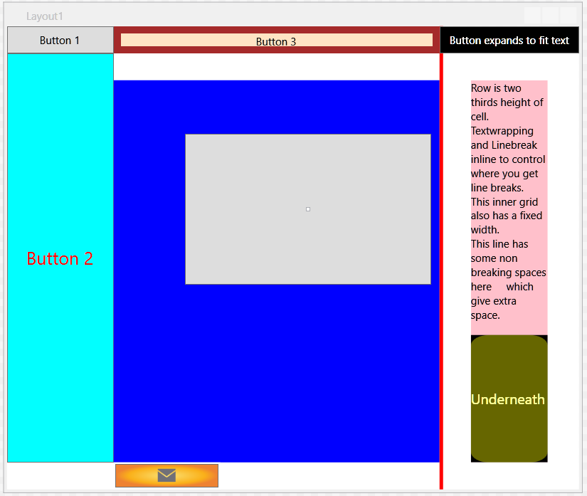
The purpose of this window is to show you many things all in the one window so the different colours are there for clarity rather than aesthetics. It looks awful by design. It's a feature.
You will see a window rather more suitable for live systems later, honest.
If you are looking at just the design of the window, drag the "split" panel with the xaml up so you can see both the designer and mark-up.
If you have two monitors ( recommended for development machines ), drag this page onto one of them and Visual Studio onto the other.
Most readers will probably have a "wide" rectangular monitor so let's make best use of that width so you can easily see the effect as you experiment.
Over on the right of the split bar there are three little squares. Click the button with the vertical bar on it so the designer and xaml are side by side.

Drag the solution explorer narrower so you maximise the space for designer and xaml. Use the sliders to centralise the design view of Layout1.xaml. You should now be in a better position to see XAML markup and designer side by side.
If you use the map mode for the scroll bar like in the above picture and still feel short of space you could turn that off. The setting is in Options > Text Editor > All Languages > Scroll Bars. Set the Behavior to "Use bar mode for vertical scroll bar"
XAML is XML rather like XHTML and even if you are very new to XAML you may well be familiar with the concept of tags from either of these technologies and this should look reasonably familiar.
Article Structure
This article takes you through explanation, background and experiments via the XAML markup in the sample. You start out from the parent grid and read on down through the XAML.
Arranging Things
As you look at the XAML of the sample, if you pass over the Window orientated tags at the top, the next you find is a Grid. A Window is actually a type of ContentControl. In that it is a control which has something in it. The Grid is what this window has as content and everything else goes inside that Grid.
In other Windows technologies such as VB6 or Winforms developers will be used to absolute positioning. Readers who have worked with these will know that there can be issues when such an application is used on different resolution monitors.
Like HTML, WPF layout is intended to flow and can cope much better with different screen resolutions so long as you work with it's strengths. The key is using proportional measures and "*". More on this particular aspect will follow.
Since this is different it takes a while for a developer to learn. It is a mistake to try and shoe-horn a familiar approach from other technologies onto XAML. Just go with the flow. Somewhat more planning is required but you will quickly come to appreciate the benefits once you get past the fact that it's different.
In other technologies you might be used to dragging and dropping controls onto a design surface. With WPF, this tends to produce bad markup. You are best advised to work in the XAML and type in "<Button" rather than drag one over out the toolbox. If you drag controls on, you will notice they are absolutely positioned using a Margin property. You then lose a lot of your flexibility. You're best experimenting with that later since we only just started but you could add a new window to the project and drag a Button onto that, move it about and watch that margin change in the xaml if you're curious.
Our Grid (broadly speaking) controls where everything goes.
<Grid>
<Grid.RowDefinitions>
    <RowDefinition Height="30"/>
    <RowDefinition Height="30"/>
    <RowDefinition Height="*"/>
    <RowDefinition Height="30px"/>
</Grid.RowDefinitions>
<Grid.ColumnDefinitions>
    <ColumnDefinition MaxWidth="120" />
    <ColumnDefinition Width="120" />
    <ColumnDefinition Width="*" MinWidth="200" />
    <ColumnDefinition Width="Auto" />
</Grid.ColumnDefinitions>
....
</Grid>
Many examples out there on the net or in books will instead use Stackpanel to layout several controls. Those authors are using that approach because it's quicker to write. More convenient for them when throwing a quick sample together, but potentially misleading for the newbie.
As a simple rule, always use a Grid as the main container and maybe Stackpanels or other panels within that.
Our Grid illustrates how to declare the rows and columns which will in turn create a matrix of "cells" in our grid. Looking at the RowDefinitions, 3 of these are absolute numbers. They will be set to height of 30 somethings. Technically this can be a double followed by a qualifier string and the last one shows this. px is the default = pixels. You are probably best just pushing that to the back of your mind. Leave reading into this in more detail for later but the MSDN page on FrameworkElement.Height provides a lot more detail on the subject. The third Row has it's height defined as "*" which means whatever space is left in the parent container. You can also use multiples of * like 2*.
Cells?
Note that the mention of grid cell is more a turn of phrase and a convenient way of thinking about where you put things in a Grid. There is no actual control in the visual tree which corresponds to a cell. The Grid arranges it's contents rather like there is, but you can't say bind to the width of a cell or manipulate it's background.
Let's Start Experimenting
Press f5 and spin the application up.
Re-size from the bottom right corner. Hover your mouse over the corner until you see a diagonal arrow cursor. Click and hold the mouse button down. Drag that corner towards the top left and then back out.
Notice how the central fixed width column stays the same width and that top row stays the same height. A lot of other things inside them change but that row stays at 30 pixels height.
Stop the debugger by hitting the x in the window or the red square in the Visual Studio toolbar.
Row Heights
Change all four row heights to "*".
Notice how the rows in the designer are now all equal.
Change the third RowDefinition height to 12* The window looks pretty similar to what it started out in the designer. Maybe this is the way to design a Window which will cope with different sized screens automatically?
Spin the application up again.
Repeat the first experiment by dragging the corner in and out. Notice how Button1 quickly becomes too small to read the text.
That sort of thing could cause a bit of a problem!
Completely proportional based layout clearly has potential for issues - a mix of fixed and proportional are usually best.
Change the Heights back to 30,30,*, 30
Column Widths
After the rows are the ColumnDefinitions. These again have a mix of Fixed and proportional widths. The last column has "auto" width - it will size itself to what it's contents require.
Auto is one way to get things to fit around your content rather than your content fit to it's container.
The second column has a MinWidth set. Let's take a look at what that does.
Spin the solution up and resize using one of the vertical sides of the window. Drag narrower and wider.
- Notice Column 0 has MaxWidth but no Width. As a result this is the first to get too narrow for it's contents and then disappear.
- Column 1 has a MinWidth set as well as Width. It is the last to run out of space.
- Only column 2 expands as you drag the window wider.
Copy the xaml out the ColumnDefinitions to Notepad so it's easy to paste back.
Change the last ColumnDefinition to remove Width="Auto" giving.
<ColumnDefinition />
When you try that you will notice there is no appreciable difference. The default is Auto.
The next step is some free form experimentation. Try different permutations of Width, MinWidth and MaxWidth in the columns until you are confident you have seen the effect of each of them.
Finally, paste the original ColumnDefinitions back in from Notepad.
Height, MinHeight and MaxHeight are similar measures we can apply to UI Elements in general and RowDefinitions are one type of element you will be using these on in practice.
Bear in mind that you can easily get a bit carried away setting all these properties when you design a real application. As you add more and more settings it can get quite confusing. The interactions can be quite subtle, once you have a lot of settings then working out what's going on can be challenging. The best approach is to keep it simple. Start with the minimum which achieve your main requirements. Try it out and make sure it works as expected. Only add to that when you see a problem.
You could repeat your experiments similar to ColumnDefinition Widths on RowDefinition Heights. On the other hand, they work in a very similar way as Widths so you might prefer to move on. There is a lot to cover.
Controls
All that and we've not even seen a control so far. Next up is a Button. Woo Hoo!
First Button
Up at the top left of your window in the designer is a grey "Button 1". This seems pretty boring at first - but we're just getting started and you have to start somewhere so the bottom step is pretty low.
The first thing to consider about the button is that it fills it's parent - that top left cell. There is nothing setting it's size or explicitly makes it fill:
<Button>Button 1</Button>
There is very little mark up there is for that button. The string "Button 1" is one way to set the content property. Replace what you have there with:
<Button Content="Button 1"/>
And you will see... exactly the same in the designer. Which approach you prefer is down to personal preference and the sophistication of your buttons.
The button has no particular identifier - no name.
We're going to sidetrack slightly now from our main subject of WPF layout. Let's drag that solution explorer back out a moment and double click the code behind file Layout.xaml.cs. There's a button click event in there. Don't worry about which control uses that for now. Underneath the Message Box line insert a new one and start typing: Button btn = this. Stop there and take a look at all that stuff you have in the intellisense list. There's no "Button 1" in there You could programmatically go find the particular button which is a child of the grid in the window and has content "Button 1". That's a bit tricky so how about an easier way. Go back to the Layout1.xaml and, well look at the xaml again. Just after <Button type space and the following x:Name="Button1" giving
<Button x:Name="Button1" Content="Button 1"/>
Now go back to the code behind and select that stop after this, type full stop again. As the intellisense pops up you should see Button1 there above Button_Click.
Layout1.xaml and Layout1.xaml.cs are both partial classes which compile together to make the Window. Remove the line you just added out the code behind file. Close the tab with the Layout1.xaml.cs file in it. Drag the Solution explorer back narrow so you have more space.
Second Button
Go back to Lauout1. Xaml and find the next Button;
<Button Grid.Column="0"
        Grid.Row="1"
        Grid.RowSpan="2"
        Content="Button 2" FontSize="20"
        Foreground="Red"   Background="Aqua"
        >
This is the tall light blue control over on the left in your designer. Click on an empty part of the designer outside Layout1. Next, click on the <Button tag in your editor.
Notice how the button is selected in the designer. The reverse also works. You can select a control another control in markup and then when you click the that light blue button you can see the <Button tag gets a light grey background.
Take another look at that button in the designer. Notice there's a line goes across it near the top - this is the bottom of row 1. Grid.Row is used to position this button in Row 1 and Grid.RowSpan says it also crosses into Row 2. As well as RowsSpan there is also ( wait for it ) ColumnSpan, which works similarly but with columns. Add a property setting Grid.ColumnSpan="2".
You should see the light blue (Aqua) button now extends into column 1.
Something odd is happening there though. We will return to this later but our button is behind whatever that dark blue thing is. That happens because our Button is below the next control. If you are used to this sort of thing in other technologies - it has a lower Z-Order.
Remove that Grid.ColumnSpan you just added and see it spring back into Column 0.
Change the RowSpan to 1. Watch it contract back into just Row 1. Consider how this button is positioned. It's set to Grid.Row="1" and Grid.Column="0". This is a bit of a strange way to set properties if you are new to this approach. Row and Column are somehow something to do with the Grid. How about that first Button - that didn't have these properties set yet it's in that top left cell. This is because the defaults are zero.
Those Grid.Column and Grid.Row properties are Attached Properties which have meaning to their parent control - the Grid.
Two Instances of Visual Studio
Copy the Button xaml to your clipboard.
Open another instance of Visual Studio.
Create a new WPF project.
Open MainWindow.xaml
You will see between the window tags, all it has is a <Grid></Grid> in there.
You can only have one root UIELement in a Window because what you're setting is Content and all controls which have Content want just one thing.
You can put a lot inside that one thing but at the root it just wants the one.
Change the top Grid tag to <StackPanel> and the bottom one will also change to become a closing tag </StackPanel>
Pretty clever stuff, Visual Studio.
Paste the button between these.
It still has that Grid.Row and Grid.Column stuff in there but there is now no Grid.
All is fine in the designer and you can spin it up - no errors.
Those Attached Properties are just interpreted by a control's parent . A Grid takes a look at any controls which are made it's children. If Grid.Row and or Grid.Column are set on it then the Grid interprets them. If you apply them to a control then there is no check beyond checking there is such an attached property exists.
Since our experiment gave no errors or warning or any sign at all that the compiler was unhappy we can see that these fail gracefully. Perhaps surprisingly gracefully.
Close that new instance of visual studio. Go back to Layout1.xaml and our Button with (no name but) content "Button 2".
Change Grid.Column to 9.
The button will whizz over to the right hand side of the Window and underneath the things in there already.
No errors though.
There are nowhere near 9 columns. What happens is that the Grid can't find a 9th column so it puts the control in the highest one it has. This behaviour can catch you out if you're not careful and have a complicated layout because you can put a control in the "last" column/row but it's actually in a lower numbered one than you thought. Something to watch out for, that.
Change the column back to 0. You will be using Attached properties a lot in layout but adding any yourself to a control is an advanced topic and best left until you are confident with WPF.
Consider next the Foreground and Background properties set to Red and Aqua.
There is something subtle going on here.
Brushes
Button inherits from Contentcontrol and if you were to follow that link you can see that Control.Background is a Brush dependency property which defaults to Brushes.Transparent. In the XAML it's set to the color Aqua - but a color isn't a Brush. Same for Foreground.
What is happening here is the XAML parser is converting that color to a SolidColorBrush. This might not be a huge surprise because there's some commented out mark up within the button - the green part. Select that and hit the uncomment button on the edit menu. You get some blue squiggly lines of course since Foreground is already set.
Grab that Foreground="Red" with Ctrl+X and the squigglies disappear, the designer is happy and you have black text now. Inside the Button.Foreground tags you can see an explicit SolidColorBrush with it's color property set. This is effectively just long hand for the previous approach. Technically this different syntax with the extra xml nodes is called Property element sytax. Comment this back out and Ctrl+V the old color back in.
Third Button
The next Button with content "Button 3" is set to span 2 columns. The main area of interest is the border - there's a brush and Thickness to add a little more style to this button.
<Button Content="Button 3"
        Grid.Row="0"
        Grid.Column="1"
        Grid.ColumnSpan="2"
        Background="Bisque"

        BorderBrush="Brown"
        BorderThickness="3"
        />
You probably think of the border as just a line, but that's a brush used there and you could make it fancier by using one of the various Brush options such as the LinearGradientBrush or even maybe TileBrush.
Paste the following over the button:
<Button Content="Button 3"
        Grid.Row="0"
        Grid.Column="1"
        Grid.ColumnSpan="2"
        Background="Bisque"

        BorderThickness="8"
       >
    <Button.BorderBrush>
        <LinearGradientBrush StartPoint="0,0.5" EndPoint="1.0,0.5">
            <GradientStop Color="DarkBlue" Offset="0.0"/>
            <GradientStop Color="SkyBlue" Offset="1.0"/>
        </LinearGradientBrush>
    </Button.BorderBrush>
</Button>
Maybe not something you'll want to use on every button, but you can actually animate stops on a Gradient so you have a moving effect on a border. Probably a bit advanced to explain that there but you can see the animation technique used here.
Either paste the original markup back in, or hit the undo arrow ( Ctrl+Z) and back the changes out.
Rectangle
The next control isn't a Button, it's a rectangle. This is the that central big Blue thing that Button 2 disappeared behind. It is in a higher z-order to Button 2 because it appears later in the XAML. That's the way default Z-Order is defined. Top to bottom as your read down the markup, low to high.
There's an explicit way of setting this with an attached property Panel.ZIndex In the deigner click on Button 2, set it's Panel.ZIndex to 999 and ColumnSpan 2. It will now be above that Blue rectangle. Note that you always use Panel.ZIndex, even if the thing a control goes in might not really seem to be a panel.
Change those back.
Another Button - Surprise!
In the designer, see that Grey rectangle on top of the blue one you were just looking at? That's another button. Click that in the designer and the <Button gets a grey ish sort of background in the xaml markup.
<Button  Grid.Row="2" Grid.Column="1" Grid.ColumnSpan="2"
         Margin="80, 60, 10, 200" Click="Button_Click" >
You will also notice boxes appear on all 4 sides of that button. These are the Margin values set for each side. They work clockwise from the left. Thus 80 is the left margin, 60 the top, 10 right and 200 bottom. If you want just the one number for all (say 20) you can instead set Margin="20". Try that. Notice how the Grey button nearly covers the Blue rectangle. Now press Ctrl+Z to undo.
Select and drag the button xaml above the rectangle xaml.
It disappears in the designer as it's X-Order is now lower that then rectangle.
Drag the xaml back so it's below the rectangle again.
Developers used to non XAML development might have noticed there is something decidedly odd about this button.
<Button  Grid.Row="2" Grid.Column="1" Grid.ColumnSpan="2"
         Margin="80, 60, 10, 200" Click="Button_Click" >
    <ListView ItemsSource="{Binding Items}">
    </ListView>
</Button>
It's content is a ListView.
Wait a minute - you can do that? Yes you can.
WPF controls are lookless.
You can put pretty much anything inside anything, one way or another and a Button is a ContentControl so it's designed to be able to take content just like the Window.
This is very different from VB6, Winforms or Web development where controls are a fixed thing.
You can't see the ListView in the designer because it has no data to chew on. If you wanted to see data at design time you can put code in the parameterless constructor of the Window to give it some data. Put that to the back of your mind for now since this and it's implications are an advanced topic best covered at a later stage. If you wanted to read more right now then google on "blendability".
Lets see that ListView do it's thing. Spin the solution up with an f5.
You can now see some text in there. Click anywhere in that List, where the text is. Nothing much happens.
Click the grey part of the button. You will see a message box appear saying "Hey - You clicked my button". The ListView is handling the click event and eats it before the button gets it. You could write code which over-rode that behaviour but with the great power of lookless controls comes the need to consider just what will happen.
Note - click handlers for buttons are not the usual way of working, you will want to learn MVVM and bind a Command for commercial applications.
The ListView is visible at run time because it is given some data. In the mark up that ItemsSource= is something you will be using a lot for binding. It binds to a collection. Binding is another subject really but if you are particularly curious, this is provided by Layout1ViewModel which is in the Distractions folder. The Layout1 constructor news up an instance of LayoutViewmodel and set's it's Datacontext to that. That folder is called Distractions for a reason though.
GridSplitter
The next control is that red vertical line you can see in the designer. The GridSplitter allows the user to grab it and resize the UI to left and right ( or above and below ). This one here is vertical so it's left and right.
Spin her up again.
Put your cursor over that red line so it changes to a double headed arrow. Click, hold and drag to left and right to see what happens. The GridSplitter is the brute force approach to flexible UI and arguably rather less useful than other controls such as the expander. Also somewhat fiddly for your user to use but very flexible. Some users act like they're intent on breaking any system you give them so bear in mind some people will drag that thing and then immediately forget they did that so they have no idea how to drag it back again.
Take a look at that black button in the top right corner. The one with the white "Button expands to fit test" on it. That button is on top of the GridSplitter and you can't grab the GridSplitter where it's under it. That GridSplitter goes in a column, the HorizontalAlignment makes it up against the left boundary of that column. You need to leave some space if you place controls in the same column (cells). The simplest way to approach that is to give all the controls a Margin - or put them in a panel and give that a margin.
Click on the Black button to find it in markup.
<!--Margin="6,0,0,0"-->
<Button Grid.Column="3" Background="Black" Foreground="White"

        Padding="10, 0, 10, 0"
        >
        Button expands to fit text
</Button>
Drag the commented margin mark up into that space under the line starting the Button. Notice how Visual Studio doesn't like this. You get a bunch of blue squiggly lines. Commented mark up needs to be outside any control tags. Uncomment the Margin line and Visual Studio is happy again.
Spin it up and you can now grab that GridSplitter anywhere along it's length. Stop debugging and return to the XAML. This Button has a property set which we've not discussed yet.
Padding is space which is applied inside a control and offsets the control's content. Sort of a way to apply a margin to any content of a control. Temporarily remove that and you will see the Button is now asking for less width so there is less space around the Text in it and Column 3 narrows. Replace the Padding and the button looks a bit nicer because there's a bit of space on either side of it's text. Column 3 Width is set to Auto and hence as the Button width reduces or increases, so does Column 3.
Later on ( if you've not already ) read up on measure arrange.
Grid
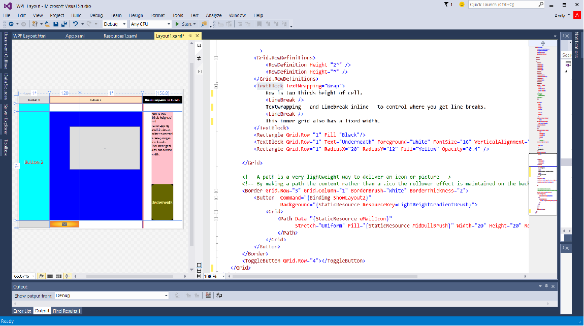
Below is another Grid. This Grid goes inside the main one - in a cell. This is a common way to sub divide space and perhaps more intuitive than spanning rows and columns for the "bigger" pieces of an unequal layout.
Remember that proportional * measure? The heights of these rows are proportional. The top rows has 2* and the bottom * so they take 2/3 and a 1/3 of the available height.
Grid.Column and Grid.Row are used to define which cell it goes in. When using attached properties a child control refers to it's immediate parent.
TextBlock
The first control within the inner grid is a Textblock. Hey - that's another new control, you'll get spoiled at this rate.
<TextBlock TextWrapping="Wrap">
    Row is two thirds height of cell.
    <LineBreak />
    Textwrapping   and Linebreak inline   to control where  you get line breaks.
    <LineBreak />
    This inner grid also has a fixed width.
    <LineBreak />
    This line has some non breaking spaces here     which give extra space.
</TextBlock>
The TextBlock goes in Row 0 because that's the default. It is multi line because it has TextWrapping set to Wrap and those LineBreaks are one way you add a newline. There are others. Note that there is a lot of white space in the text of this control which is ignored when rendered - in a similar way to HTML. The rather strange looking is the equivalent to html non breaking space should you feel the need. Since XAML is actually a sort of XML it is entirely logical that it uses the same approach to escaping characters which would otherwise be interpreted as XML/XAML.
Three In One
Next up are three controls all in the same cell.
<Rectangle Grid.Row="1" Fill="Black"/>
<TextBlock Grid.Row="1" Text="Underneath" Foreground="White" FontSize="16" VerticalAlignment="Center"/>
<Rectangle Grid.Row="1" RadiusX="20" RadiusY="12" Fill="Yellow" Opacity="0.4" />
As you will now know these go on top of each other as you read down. The end result isn't Yellow and only a bit of it is black.
You can see the corners of the black bottom rectangle. A White TextBlock goes on top of this. Last is a Rectangle with rounded corners. You will notice that there is a RadiusX and RadiusY - rounded corners don't have to be even. Temporarily change the RadiusY to 32 to see a rather more oval effect before changing it back to 12. The colour of a Rectangle is set by Fill (brush) which is yellow for our top one. That rather military green colour is produced because this rectangle has an Opacity set. Opacity can vary between 0 ( transparent ) and 1 ( opaque ). The TextBlock forecolor is white so if you look closely at the text you can see there is a subtle yellow layer over it. Change opacity to 1 temporarily to prove to yourself it's definitely yellow.
A low opacity can be useful for a subtle highlight effect like for alternating rows of a datagrid. Animating opacity can be used to fade a control or text in or out. Handy for subtly calling the user's attention to messages or state changes.
Fancy Button
The last control in the markup for this window is a fancy looking Button. The Orange sort of button with a letter/mail Icon on it.
<!-- A path is a very lightweight way to deliver an icon or picture -->
<!-- By making a path the content rather than a .ico the rollover effect is maintained on the background -->
<Border Grid.Row="3" Grid.Column="1" BorderBrush="White" BorderThickness="2">
    <Button  Command="{Binding ShowLayout2}"
             Background="{StaticResource ResourceKey=LightBrightGradientBrush}">
        <Grid>
            <Path Data="{StaticResource eMailIcon}"
                  Stretch="Uniform" Fill="{StaticResource MidDullBrush}" Width="20" Height="20" RenderTransformOrigin="0.5,0.5">
            </Path>
        </Grid>
    </Button>
</Border>
A previous button used code behind to show it's message box. Code behind is usually minimised or avoided by XAML developers who instead use the MVVM pattern. MVVM is a different subject and outside the scope of this article really. For now, be aware that Binding commands to buttons is recommended over writing click events.
The fancy background for this Button comes from a Resource. This is also a subject of itself but using Resources is the recommended approach for standardising brushes, colors and icons in a way which has a parallel to CSS for HTML applications but is probably rather new for Winforms developers.
The envelope "icon" is actually a path held as a string. Again this is tucked away in a Resource Dictionary. Take a quick look at Resources1.xaml and you will see that picture isn't actually a picture at all - it's a Geometry which is loosely speaking a set of co-ordinates defined in a string. One of the best resources for these Windows 8/Modern UI style geometries is a free piece of software called Syncfusion Metro Studio. As the comment in the XAML explains, using a geometry in this way rather than an icon means the templated background of the button is still visible round it and the rollover effect still works.
Spin the application up. Mouse over some of the buttons and notice how their background changes light blue on mouseover. Including the mail button.
Click the mail button.
Another Window
A new window appears - Layout2.
Joy of joys, this is much easier on the eye and much more like you would use in a "real" application as opposed to the Laboratory experiment that is Layout1.
Click the "Light me up" button.
The background of both Windows is now red. These are both bound to a Brush in Applications.Current.Resources which is where you should store common settings, data, brushes or any resource used throughout an application.
<Window x:Class="WPF_Layout.Layout2"
        xmlns="http://schemas.microsoft.com/winfx/2006/xaml/presentation"
        xmlns:x="http://schemas.microsoft.com/winfx/2006/xaml"
        xmlns:local="clr-namespace:WPF_Layout"
        Background="{DynamicResource PossibleErrorBrush}"
That DynamicResource markup tells the Window to use a resource with a x:Key of "PossibleErrorBrush" as it's background brush. Because it's DynamicResource rather than StaticResource, when that brush changes the Window will pick up the new value and use that.
Glossing over exactly how the command is wired up to the viewmodel, the code which acts is in Layout2ViewModel.
private void  ShowErrorExecute(string ignored)
{
    Application.Current.Resources["PossibleErrorBrush"] = Application.Current.Resources["PossibleErrorBadBrush"];
    ShowOnError = Visibility.Visible;
}
If you're familiar with dictionaries then a Resource Dictionary is obviously very similar to a dictionary and you can set a "value" on a resource using it's key,
This technique is a useful approach for highlighting something throughout a system or even just changing theme. You could remove an entire resource dictionary of brushes and replace them with another set of colours used throughout a system.
Is That All?
We've only touched on Layout2 in this article, another is planned which will discuss it in more detail.