Visual Studio 2015: Debugging tools (Part 2)
Introduction
In the previous article, tools for debugging in Visual Studio 2015, was made an overview of all the tools made available to developers. We started analyzing the Diagnostic tool, or the ability to perform a complete analysis of the consumption of memory and CPU resources that our application requires to run. In this article we will explore what is new, the Timeline tool.
Timeline Tool
It is a real novelty, very useful especially for a designer, as it is all entirely dedicated to the graphical interface of our application. Until the RC version of Visual Studio 2015 was supported only for WPF and Windows Application Store. This tool unlike the Diagnostic Tool is not running in Debug. Once it started, while running the application stores different types of information including:
- Use user interface thread in a time sequence
- Through visual elements (frames per second)
- Details timeline
- Summary UI thread
Start Timeline Tool
The procedure is very simple: we start Visual Studio 2015, and open a WPF project or Windows Store. In my case, start a simple WPF project with a single Window. From the Debug menu of Visual Studio, select the command start diagnostic tools without Debug, and we will be led to the next screen.
Click the Start button and will start our application; meanwhile the Timeline tool will record a series of data that we will see and will later.
From the figure above we see that is ongoing data collection, when we believe we have done enough evidence, we can stop the application or by the command with blue writing "Arrestare la raccolta", or in the classic way, with the button at the top right of the screen. At this point will generate a report with file type diagsession which was the practice diagnostic tool, but with completely different data, as shown in the following pictures.
In the image above, we can see a preview of the data in the final report. Let's analyze now one by one.
Use user interface thread in a time sequence
Includes: "Code Analysis", which is the amount of time it took to perform a general analysis of our application, "Layout", the time taken for the composition of the graphical interface, rendering, the time it takes to display it and adapt content on the screen and in different resolutions, I/O, checking the time taken if our application accesses the disk or charge and discharge data from the network, app code, time taken for the analysis of XAML, and finally "Other XAML", if our application makes use for example of a template within another file.
As the diagnostic tool, select a time frame, and will be automatically selected data for the period of time chosen by us.
Through visual elements (frames per second)
It's divided into two sections, threads and thread composition user interface, with a numerical value indicating the amount of frames per second that are displayed.
In the image above, we see that we have 60 frames for the thread of composition and 30 to the UI thread per second.
Details timeline.
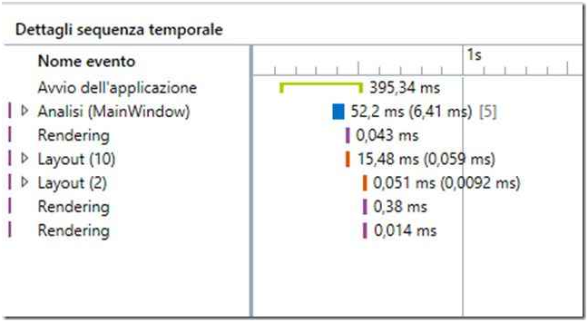
It's part of most interest. View in a text and detailed in a time sequence, as explained in the "Using thread user interface." The default display is set to "start time"; this means a combo box, where we can also select a display for "Total duration". We can still make additional customizations for data visualization, eg "Group the top-level events based on the frame", command post immediately after the combobox "Sort by". Another customization is possible to display tasks in the Background, disk activity and network activity of the user interface and scenarios in the "Configure the events displayed on the timeline." We can still see the data for "Life Event" with two possible settings, all or more than 1 ms. And there's more: we still have four modes of customization to the data display, in the "Display Settings", including: "Show the indicator of the thread," which does nothing more than display or hide the rectangular bars placed in window "Details timeline", "Show the qualifier in the name of event", which correspond to the objects involved in the layout that we will see in the next image, "Show duration (Auto) in the timeline", which is the value placed immediately after the total run time. Finally we have "Show hint text in temporal sequence", i.e. the numerical value in brackets indicating the total number of elements for the portion of layout affected.
In the image above, we have the data on the startup time of the application, in milliseconds with green stripe, the analysis time of MainWindow, with a blue rectangle, 6.41 ms. and the amount of affected items, the rendering and layout. We can, if we choose, expand the visual tree, to see in detail all the data on it, as shown in the following figure.
As mentioned above, we can see data also for the total duration, starting from the execution time greater execution time less.
For what concerns the customization of data, we can interact with the commands shown in figure.
Starting from the left we have:
- Display for now or for the total length with a special combobox
- Grouping of top-level events based on the frame
- Setup events appear in the timeline
- Display settings
Summary UI thread
It is a classic chart where are displayed with the value in percentage of the objects mentioned earlier.
Conclusion
In this second article, we explored a new tool released with Visual Studio 2015, suitable for displaying data of the graphical interface of our application. It should run without debugging and we can see the whole thing through a file diagsession we can then save and compare it with other as we develop our application. In the next article, we will explore other new features, the PerfTips and improvements carried out on BreakPoint.


