SharePoint 2013: Creating a Composed Look
Introduction
SharePoint 2013 introduces a number of new features such as Device Channels, Cross Site Publishing, App Model, JS Link and many more. Among these many cool new features Composed Look revolutionises the previous concept of themes.
Before we dive deep into the Theming engine and explain Composed Look, let us understand what themes actually are.
As quoted from MSDN “Themes give you a quick and easy way to change the look and feel of any site in SharePoint 2013. They are predesigned collections of web page elements, such as fonts, color schemes, layout, and background pictures that come with SharePoint 2013.”
From an end user perspective, this is a very powerful feature as the users can select an OOTB available design and change the color, font, background image and layout etc. as well as create a new design altogether. We will cover how to achieve this later.
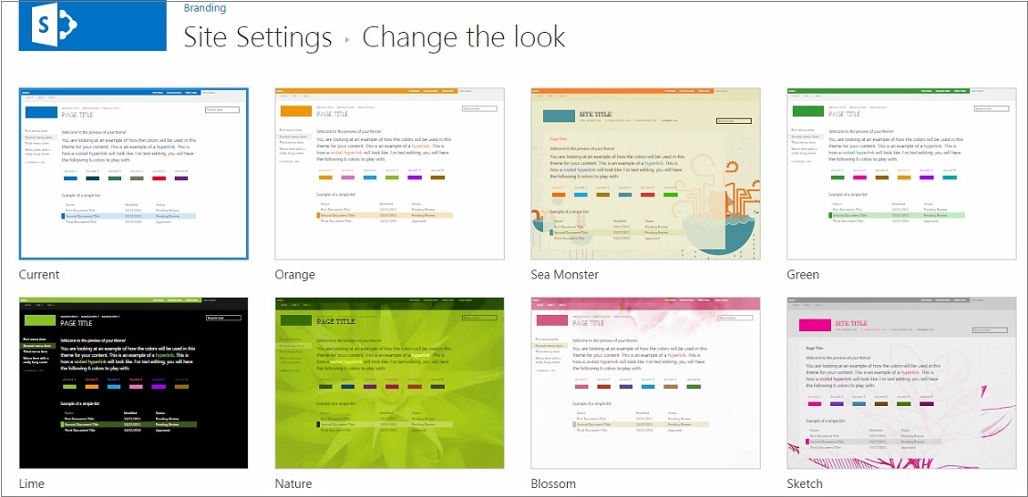
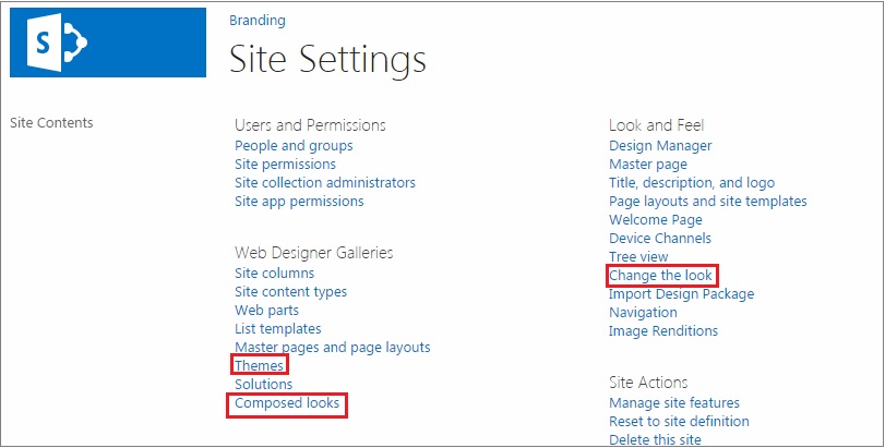
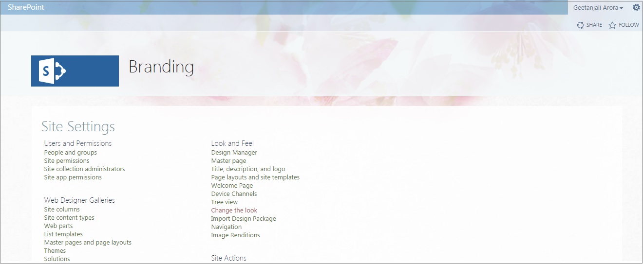
With the advent of SharePoint 2013, there has been great improvement around the Theming Engine. Now we are not required to make themes in the Office client any more. A new feature has been introduced by Microsoft named Composed Looks. If you browse to the Site Settings > Look and Feel there you can see a link to Change the Look. Clicking on this link will land you on a page where you can see all the available composed looks that you can select from.
In the image above, you can see the link “Change the look” under the “Look and Feel” section.
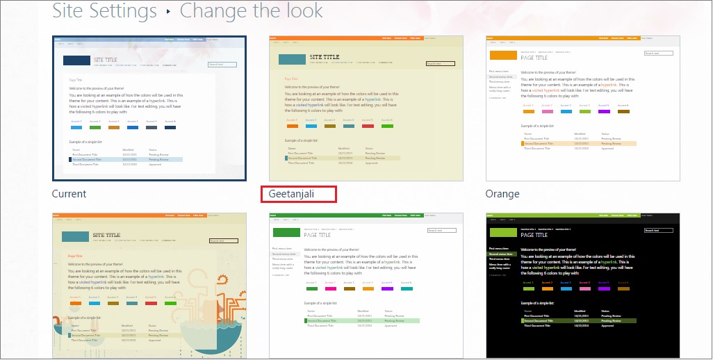
If you click on this link, you will land on the below screen which shows available OOTB composed look designs. As you can see in the image below, there is a selected template named "Current" which shows the active composed look.
Why were Composed Looks introduced?
In SharePoint 2013 the theming engine has been revamped so that power users can easily make their site conform to corporate branding standards. No technical expertise is necessary to set color, fonts etc. This saving on training and freeing technical staff from minor changes This is a very powerful feature for the Enterprise.
With composed looks, you can offer your Power Users a list of branded looks for pre defined changes. They also have them the flexibility to then customise these for ayout, color, fonts and images.
What is a Composed Look?
Before creating one we need to first understand what a composed look is.
A composed look is a new feature introduced in SharePoint 2013, comprises:
- Master Page
- Color Palette
- Font Scheme
- Background Image
In SharePoint 2013, there is a new list available called Composed Looks that holds all the available composed looks. This list is available in Site Settings > Web Designer Galleries section.
In the image above, you can see the link “Composed looks” under the Web Designer Galleries. This is a link to the Composed Looks list. When you click on the link, you will land on the below list.
Each individual row in this list is a composed look.
If you try to correlate what you saw on the “Change the look” screen and the list above, you will clearly understand the significance. Every individual composed look in the above list is shown in the Change the look screen.
The below image is an overlap of both the screens just for a pictorial representation of what we are trying to explain here.
We have already mentioned that the composed look is comprises master page, color palette, font scheme and image. If you have a look at the columns of the Composed Looks list, you can see all these properties being captured.
Name: This is the name of the composed look that gets displayed to the user for the composed look.
Master Page URL: This is the name of the master page that gets applied to the site.
Theme URL: This is the URL pointing to the color palette to be used with this composed look. This has the extension of “.spcolor”.
Image URL: This holds the URL of the background image.
Font Scheme URL: This is the URL pointing to the font scheme file. This has the extension of “.spfont”.
Display Order: This defines the position of the composed look when browsing the available composed looks. The sort order is ascending.
Change the composed look
Before we create a new composed look, let us consider how we can modify the existing look.
Let us go back to the Change the look screen and select a different design and see what happens. For our demo, we will select the “Blossom” look.
After clicking on the design you will get the following screen.
In the above image you can see there is an option to change the background image. Besides that there is an option to change the colors, site layout and the fonts as well.
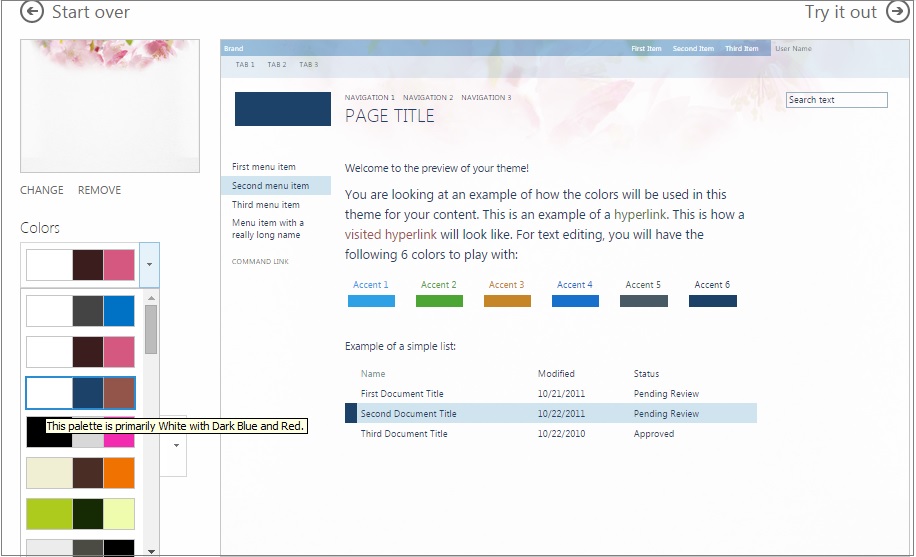
Change the color and see what happens.
In the above image you can see different color options available and what happens to the preview when we select a different color from the palette.
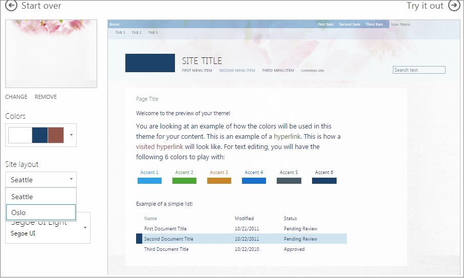
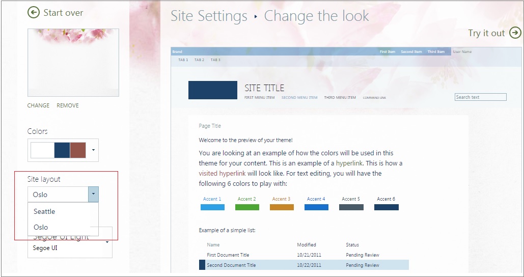
Let us change the site layout and see what happens.
When we expand the Site layout, we will see the available master pages here. It is very important to note here that only the master pages which have the .preview file will be available in this dropdown.
Let us select “Oslo” as the option and see what happens. You will observe in the preview that the left navigation has disappeared now. This is how the site layout option has an impact on the look and feel.
Now to have a final preview of this composed look, click on the "Try it out" link at the top.
We will be navigated to below screen.
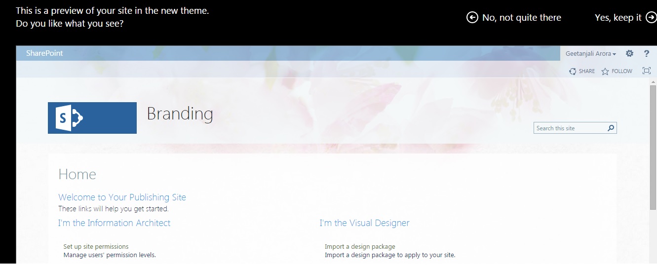
Now if we feel that this is not what we wanted then we can simply click on the “No, not quite there” link at the top which will take us back to the “Change the look” screen. Otherwise, if we are confident that this is what we wanted to achieve, we can click on “Yes, keep it” link.
The above image shows how the site will look after applying the composed look.
See how easy it was to change the design from an end users perspective.
Now, let us actually create one composed look rather than modifying an existing one and see what happens.
Steps to create a Composed Look
Create Master Page
You can either create a custom master page or you can use an existing master page.
It is very important to note here that you need to create the .preview file as well, which has the same name as the master page, otherwise it will not appear in the Site Layout section when modifying a composed look.
To keep things simple, let us copy oslo.master to create a new master page. Let us do this using SharePoint designer 2013.
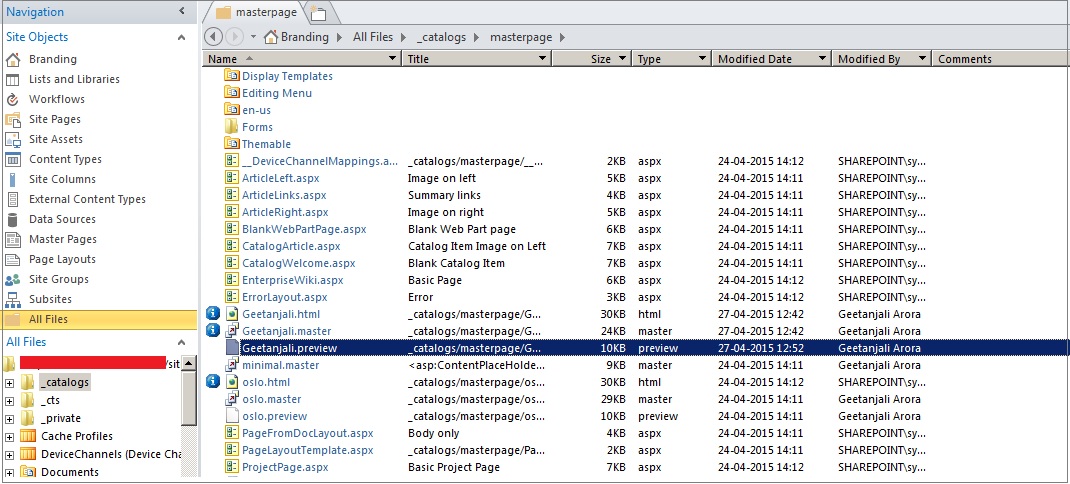
Open your site in SharePoint Designer and navigate to master page gallery. Once you are there, copy oslo.master and rename it. You don’t need to rename the copied .master file as it is linked to the .html file and renaming .html will simply rename your .master file.
You will see something like above. It is important to note here that we have not copied any .preview file here.
Now, let us go back to Change the look screen and see if we can see our newly created master page in the Site layout option.
Let us select the Current composed look and see if we can see the layout.
We will get the below screen.
As you can see in the above image, the Site layout dropdown does not show our newly created custom master page. The reason for the same is that we have not added .preview file. Let us go back to SharePoint designer and try to create the .preview file as well.
Simply copy oslo.preview file and rename the copied .preview file to the same name as that of the master page.
Now, navigate back to the screen and see if you can see the option of your custom master page in the Site Layout dropdown.
In the above image you can see that we have the option of our custom master page there. This is the significance of creating the .preview file.
Now that we have created the custom master page and have seen how we can apply that let us now move on to the next step.
Color Palette
The next thing of significant importance while creating your custom composed look is the color palette. You can use the existing color palette or create a new one.
Before we actually create one, let us first understand what a color palette actually means.
As per MSDN, “A color palette, or color scheme, defines the combination of colors that are used in a site. Thirty-two color palettes are installed with SharePoint 2013. They are available to users when they choose to modify a design in the design gallery. Color palettes are XML files (.spcolor files). They are stored in the Theme Gallery of the root site of the site collection in the 15 folder (http://SiteCollectionName/_catalogs/theme/15/)”.
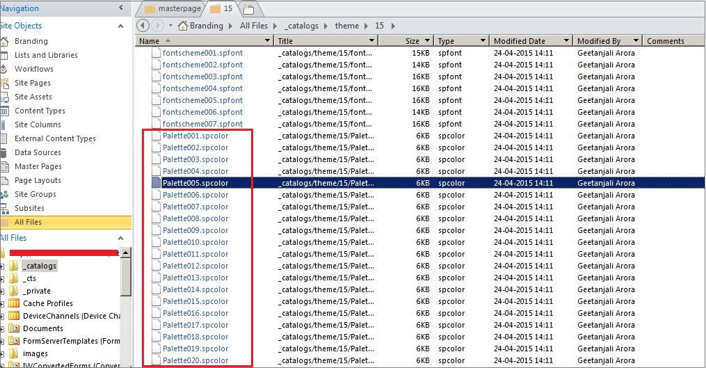
Let us open SharePoint Designer and navigate to the Theme Gallery. In the below image, you can see that there are lot of .spcolor files. These are the default color palette options available OOTB.
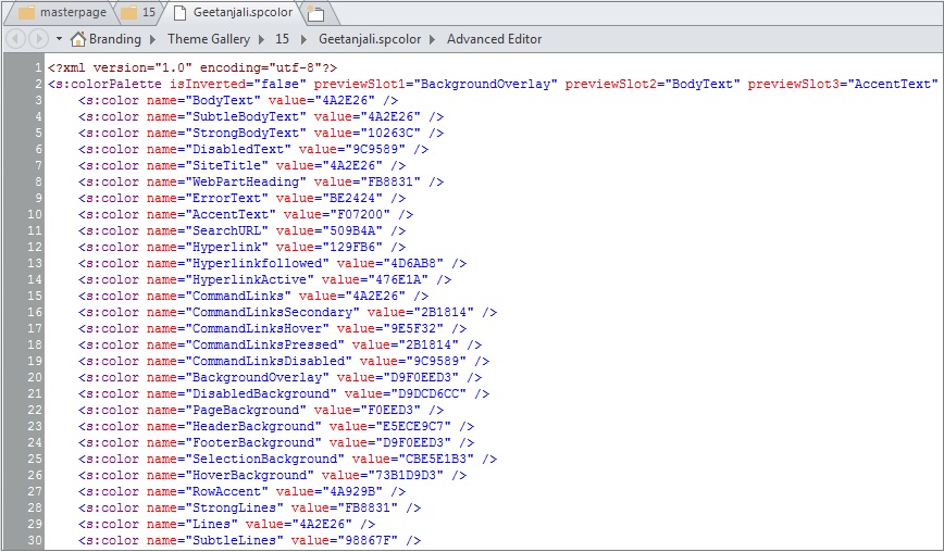
Let us now try to open one .spcolor file and see the information that it holds. In order to achieve the same simply open your file in Advanced Editor inside your SharePoint Designer.
Having a look at the spcolor file shows that it is a simple XML file having color value in hexadecimal for each available slot.
Now, let us create our custom palette spcolor file. The simplest way to do the same is to copy paste an existing file and rename the newly added file.
Let us copy and rename Palette005.spcolor file to Geetanjali.spcolor.
Now open our custom palette file in advanced editor and do some modification to the same.
Let us try to modify the BodyText and see what happens.
Note that we have changed the BodyText value in the XML.
Let us go back to our "Change the Look" screen and modify the composed look. We see our custom color palette in the Colors dropdown. Since we have named our color palette as Geetanjali and all other color palette’s starts with P so our custom color palette will appear first in the list.
Observe the change in the Body text when we select our custom color palette.
In this way you can simply create a new color palette and change the design of your SharePoint site.
Font Palette
On similar grounds you can create a new .spfont file. This file is also located in the themes folder.
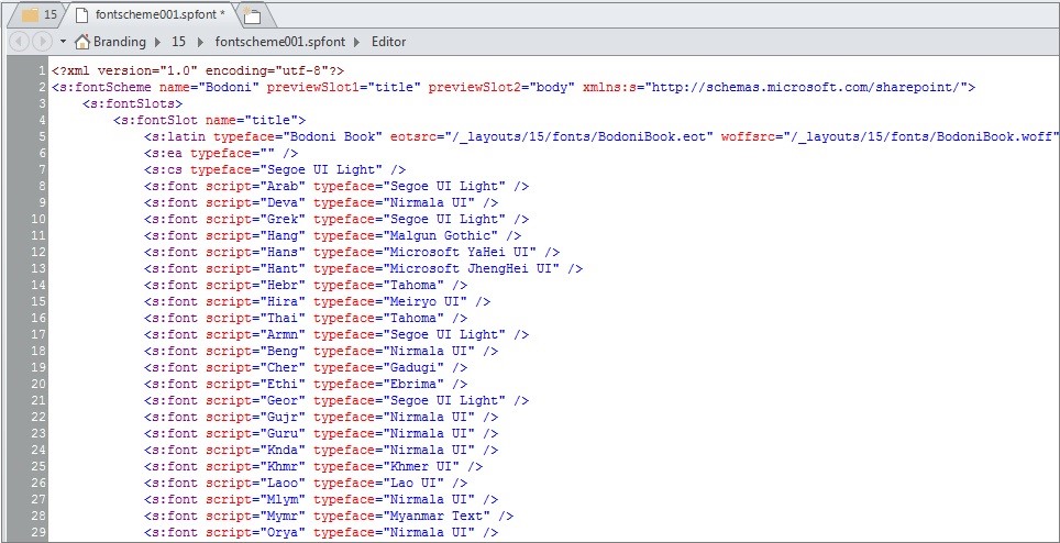
Let us try to open one font file and see how it looks.
We can create a custom .spfont file similarly the way we created .spcolor file. For the sake of keeping things simple let us use default OOTB .spfont file.
Now the next step that is left is to create a new composed look out of the files that we created above.
In order to do the same, let us navigate to Site Settings > Web Designer Galleries and click on Composed looks link.
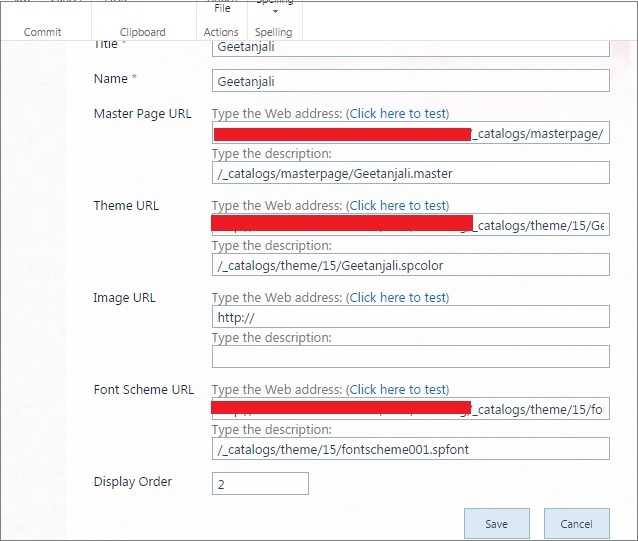
Click on new item to create a new composed look and provide the necessary values.
Now navigate back to the "Change the look" screen and you will observe your custom composed look there.
In this way you can create a custom composed look using the User Interface. You also can package the same using Visual Studio.
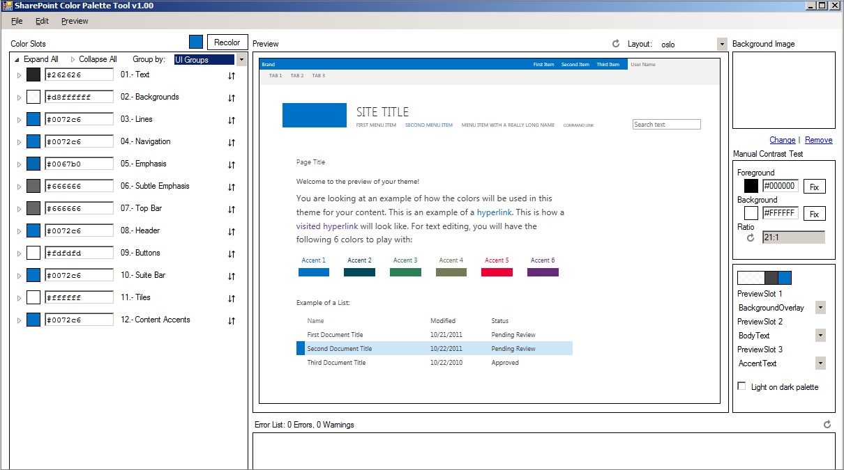
SharePoint Color Palette Tool
Before diving into the Visual Studio stuff, there is another interesting thing that we should talk about. It is the new SharePoint Color Palette Tool.
Microsoft has created this tool to help us build the spcolor file.
The above screenshot shows how the SharePoint Color palette tool looks like. It is very convenient way to edit colors and preview them side by side.
If you have a look at this tool, it is quite straightforward. Let us say we want to do some modification to the Suite Bar, then simply group by UI Groups and then expand the Suite Bar.
Let us change the Suite Bar Background and see the preview.
In the above image you can see how the change in the background impacted the suite bar in the preview.
You can download this tool from SharePoint Color Palette Tool and explore other features.
Create Composed Look Using Visual Studio
You can create a composed look using code and package and deploy the same using Visual Studio.
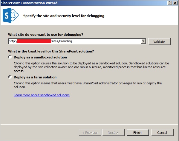
Firstly, create a Farm Solution using Visual Studio 2012.
We have already discussed the major things required to create a composed look.
- Master Page
- Color Palette
- Font Palette
- Background Image
In our Visual Studio deployment we also need to cover these aspects.
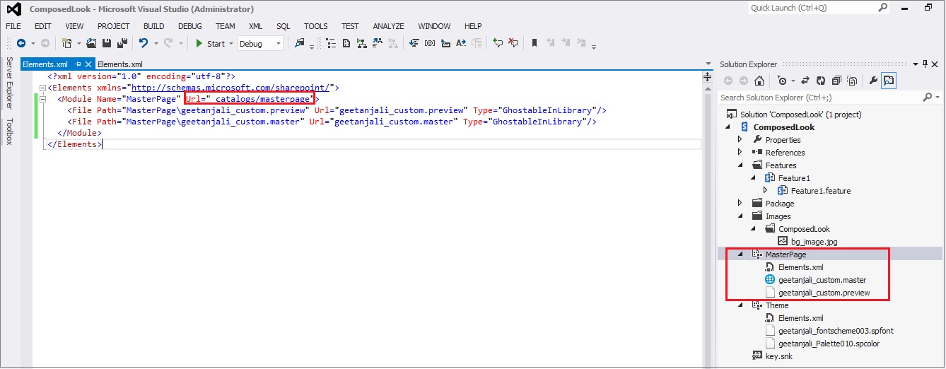
Start by creating a mapped folder for Images and add our background image to this mapped folder. We will be using this image as the background image for our composed look.
Once the background image is in place, add modules to deploy our custom master page, theme and font scheme.
Like previously, copy the existing OOB spcolor and spfont file and rename the same and add it to our module.
Similarly copy the master page and the preview file and rename the same and add it to the module.
The next thing that we are required to do is to create a composed look using these custom files. In order to achieve the same, we need to create a list entry inside the “Composed Looks” list.
We can achieve the same programmatically using the feature receiver.
First let us rename our “Feature1” to “DeployTheme” and make it a site collection level feature. This will deploy our modules.
Then we will add another feature to the solution and name it “ComposedLook”. This feature will be a site feature that will create an entry for the composed look.
Now we have to write the code inside the feature receiver to insert a list item in the Composed Looks list.
public override  void FeatureActivated(SPFeatureReceiverProperties properties)
        {
            var web = properties.Feature.Parent as  SPWeb;

            SPList designGallery = web.GetCatalog(SPListTemplateType.DesignCatalog);
            if (null == designGallery)
            {
                return;
            }

            var item = designGallery.AddItem();
            item["Title"] = "My Custom Composed Look";
            item["Name"] = "My Custom Composed Look";
            item["DisplayOrder"] = 5;

            var masterPageUrl = new  SPFieldUrlValue();
            masterPageUrl.Url = web.ServerRelativeUrl + "/_catalogs/masterpage/geetanjali_custom.master";
            masterPageUrl.Description = web.ServerRelativeUrl + "/_catalogs/masterpage/geetanjali_custom.master";
            item["MasterPageUrl"] = masterPageUrl;

            var themeUrl = new  SPFieldUrlValue();
            themeUrl.Url = web.ServerRelativeUrl + "/_catalogs/theme/15/geetanjali_Palette010.spcolor";
            themeUrl.Description = web.ServerRelativeUrl + "/_catalogs/theme/15/geetanjali_Palette010.spcolor";
            item["ThemeUrl"] = themeUrl;

            var fontSchemeUrl = new  SPFieldUrlValue();
            fontSchemeUrl.Url = web.ServerRelativeUrl + "/_catalogs/theme/15/geetanjali_fontscheme003.spfont";
            fontSchemeUrl.Description = web.ServerRelativeUrl + "/_catalogs/theme/15/geetanjali_fontscheme003.spfont";
            item["FontSchemeUrl"] = fontSchemeUrl;

            var imageUrl = new  SPFieldUrlValue();
            imageUrl.Url = "/_layouts/15/images/ComposedLook/bg_image.jpg";
            imageUrl.Description = "/_layouts/15/images/ComposedLook/bg_image.jpg";
            item["ImageUrl"] = imageUrl;

            web.AllowUnsafeUpdates = true;
            item.Update();
            web.AllowUnsafeUpdates = false;
        }
In the above piece of code, we are simply adding an item to the Composed looks list and populating it with values for color, font scheme, background image url, master page url and the display order.
The next step is to apply this composed look to the site. This can also be done programmatically using a feature receiver. Let us create another feature named “ApplyTheme” at site scope and add a feature receiver to the same. Also, when a user applies a theme in the "Change the look" wizard, the wizard also updates a theme named Current in the Composed Looks list and the design gallery. When you apply a theme programmatically, you have to update the Current theme manually.
Below code snippet explains how this can be done.
public override  void FeatureActivated(SPFeatureReceiverProperties properties)
        {
            var web = properties.Feature.Parent as  SPWeb;
            SPList designGallery = web.GetCatalog(SPListTemplateType.DesignCatalog);

            string serverRelativeUrl = web.ServerRelativeUrl;

            if (null == designGallery)
            {
                return;
            }

            SPQuery query = new  SPQuery();
            query.Query = "<Where><Eq><FieldRef Name='Name' /><Value Type='Text'>My Custom Composed Look</Value></Eq></Where>";
            query.ViewFields = "<FieldRef Name='ThemeUrl' /><FieldRef Name='FontSchemeUrl' /><FieldRef Name='ImageUrl' />";

            SPListItemCollection listItemCollection = designGallery.GetItems(query);

            if (listItemCollection.Count > 0)
            {
                SPListItem item = listItemCollection[0];
                var theme = new  SPFieldUrlValue();
                var font = new  SPFieldUrlValue();
                var image = new  SPFieldUrlValue();

                if (item["ThemeUrl"] != null)
                {
                    theme = new  SPFieldUrlValue(item["ThemeUrl"].ToString());
                }
                if (item["FontSchemeUrl"] != null)
                {
                    font = new  SPFieldUrlValue(item["FontSchemeUrl"].ToString());
                }
                if (item["ImageUrl"] != null)
                {
                    image = new  SPFieldUrlValue(item["ImageUrl"].ToString());
                }

                if (theme != null && font != null && image != null)
                {
                    var themeUrl = (new Uri(theme.Url)).AbsolutePath;
                    var fontSchemeUrl = (new Uri(font.Url)).AbsolutePath;
                    var imageUrl = (new Uri(image.Url)).AbsolutePath;

                    web.ApplyTheme(themeUrl, fontSchemeUrl, imageUrl, true);
                }

            }

            UpdateCurrentItem(designGallery,serverRelativeUrl);
        }

        private void  UpdateCurrentItem(SPList designGallery, string serverRelativeUrl)
        {
            SPQuery query = new  SPQuery();
            query.RowLimit = 1;
            query.Query = "<Where><Eq><FieldRef Name='DisplayOrder'/><Value Type='Number'>0</Value></Eq></Where>";
            query.ViewFields = "<FieldRef Name='DisplayOrder'/>";
            query.ViewFieldsOnly = true;

            SPListItemCollection currentItems = designGallery.GetItems(query);

            if (currentItems.Count == 1)
            {
                // Remove the old Current item.
                currentItems[0].Delete();
            }

            SPListItem currentItem = designGallery.AddItem();

            currentItem["Name"] = SPResource.GetString(CultureInfo.CurrentUICulture, Strings.DesignGalleryCurrentItemName);
            currentItem["Title"] = SPResource.GetString(CultureInfo.CurrentUICulture, Strings.DesignGalleryCurrentItemName);

            currentItem["MasterPageUrl"] = serverRelativeUrl + "/_catalogs/masterpage/geetanjali_custom.master";

            currentItem["ThemeUrl"] = serverRelativeUrl + "/_catalogs/theme/15/geetanjali_Palette010.spcolor";

            // Delete the following line if you do not have a background image. Otherwise, replace with the path to
            // the background image.
            currentItem["ImageUrl"] = "/_layouts/15/images/ComposedLook/bg_image.jpg";

            // Replace with the path to your SPFont file. Or, you can delete this line if you want to use
            // the default font scheme of the selected master page.
            currentItem["FontSchemeUrl"] = serverRelativeUrl + "/_catalogs/theme/15/geetanjali_fontscheme003.spfont";

            currentItem["DisplayOrder"] = 0;
            currentItem.Update();
        }
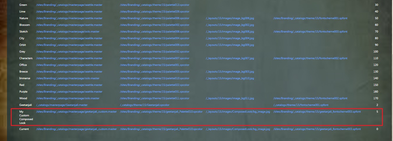
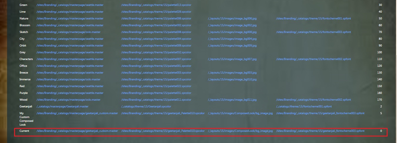
In the above code snippet, firstly we fetch the listitem corresponding to our newly added composed look and then using that theme and font we are applying the new theme to the site. Also we need to update the Current design to reflect the newly applied design. For that we have written a function called "UpdateCurrentListItem". The Current design has the Display Order of 0. Based on this fact, we are fetching the listitem depicting Current and updating it to reflect the newly added composed look.
Now deploy the solution and navigate to the site. You should be able to see the newly deployed theme applied to the SharePoint site.
In the above image you can see the changed theme and your custom background image.
Now navigate to the Site Settings > Web Designer Galleries and click on Composed looks. Here you should be able to see a list item corresponding to your recently deployed composed look.
There you can see the values set as per what you have provided in the code.
Next step is to validate if the current look is updated or not. This also you can validate from the Composed Looks list.
Also if you navigate to the Change the look screen, the current should seem to be updated.
In this way you can create a composed look using Visual Studio.
Conclusion
As you have seen in this article, the “Composed Looks” feature is very useful for Power Users.
With composed looks, you can offer your Power Users a list of branded looks and also give them the flexibility to do some modifications around the layout, color, fonts and images.
The major things that you need to keep in mind while creating a composed look are
- Add the desired files like background image, .spfont, .spcolor etc to the desired location.
- Add the custom master page if required. Also include .preview file.
- In the Composed Look Gallery, create a new item that references your above files. This will be your new composed look.
- Apply the newly created composed look to the site.
- Update the current composed look item.
References
- https://msdn.microsoft.com/en-us/library/office/jj927174.aspx
- https://msdn.microsoft.com/en-us/library/office/jj927175.aspx
- http://www.microsoft.com/en-us/download/details.aspx?id=38182
- http://www.eliostruyf.com/themes-and-composed-looks-in-sharepoint-2013/
- http://www.eliostruyf.com/creating-a-new-color-palette-for-a-sharepoint-2013-composed-look/
- http://www.eliostruyf.com/creating-a-new-font-scheme-for-sharepoint-2013-composed-look/
- http://en.share-gate.com/blog/create-sharepoint2013-theme-using-color-palette-tool
You can download the entire solution from TechNet Gallery at https://gallery.technet.microsoft.com/SharePoint-2013-Create-a-7a2b3bbb

