Note
Access to this page requires authorization. You can try signing in or changing directories.
Access to this page requires authorization. You can try changing directories.
Getting Started with Forecasting and Hindcasting in Power View:
This article helps to understand how one can start with Forecasting/Hindcasting in Power View from the scratch. i.e., from building Data Model to Forecast/Hindcast in HTML5 or Power BI App.
Before we forecast the data, let’s try to build our data model.
Steps to build a data model using Power Query:
Open a new Excel file
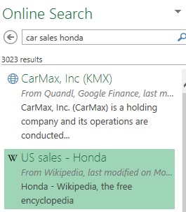
Click on PowerQuery -> Online Search and type “Car Sales Honda” and select the data source “US Sales - Honda”
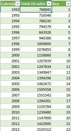
Now the data will be loaded in Excel workbook like below
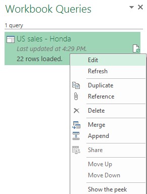
Save the file and then right click on the “US Sales – Honda” listed under workbook queries and click on Edit
On the Query Editor, please make sure that Load to Data model alone is selected, as we don’t need this data in the work book and just interested in forecasting using the data model. Click on Apply & Close from the top menu.
Now the Excel workbook (sheet) will not contain the data we loaded earlier. Just to verify whether the same data is loaded in the data model properly, do the following.
- Click on PowerPivot -> Manage Data Model
Now the data model is ready.
Steps to Create a Power View Line Chart (which will be used for forecasting Later):
Please make sure that the data type of Calendar year column is whole number. Click on Home tab of PowerPivot and change the data type to whole number for that column.
Also change the format of Total US Sales column to currency for better look and feel. Click on Home tab of PowerPivot and change the format.
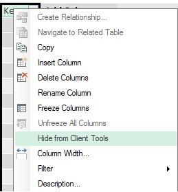
Since we are just interested in YOY sales of United States, there is no use of key column in power view. So we can hide that column from user. Right Click on “Key” column and select Hide from Client Tools.
- Now Save and Close the PowerPivot. Go to the original excel.
- Click on Insert -> Power View
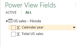
New Power View sheet will be inserted. On the right side of the Power View sheet, you could be able to see the Power View Fields.
If you notice the above screenshot, both the calendar year and Total US Sales are being treated as a measure. By default PowerPivot treats all numeric columns as measures. But year is not a measure.
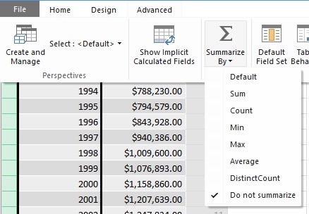
To fix this issue, Go back to PowerPivot (Click on PowerPivot -> Manage Data Model),Click on Calendar year column and go to “Advanced” tab of PowerPivot, Change Summarize By value to “Do not summarize”
Go back to the Power View report. The following popup will appear. Click on OK. Whenever you do changes to the data model, Power view will be refreshed automatically.
Now you could see that Calendar Year appear as a non-measure (No sigma sign) under the Power View Fields.
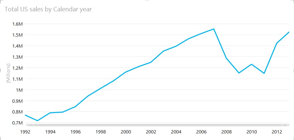
Select Calendar Year and Total US Sales from Power View Fields and change the visualization to Line Chart in Power View.
Now we are all set to start the forecasting. Before using the forecasting feature we should keep in mind the following:
Forecasting is supported only in HTML5 version and Power BI app.
Forecasting can be done only on a single line chart.
The x-axis value needs to have a date/time format or be a uniformly increasing whole number. It cannot contain text or decimal numbers, and the interval between values has to be at least one day.
Since forecasting is supported only in HTML5 version/Power BI App, upload this excel to Office 365 site and follow the below steps:
Once the Power View Excel is uploaded to Office 365, click on it and open the same.
Click on Try new html 5 icon
 located on the bottom right corner of the file.
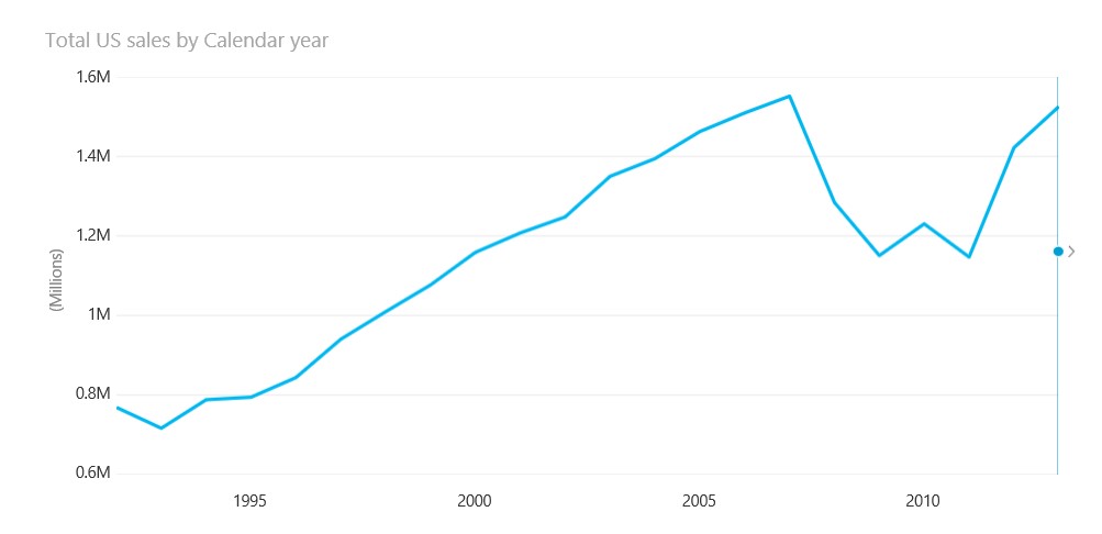
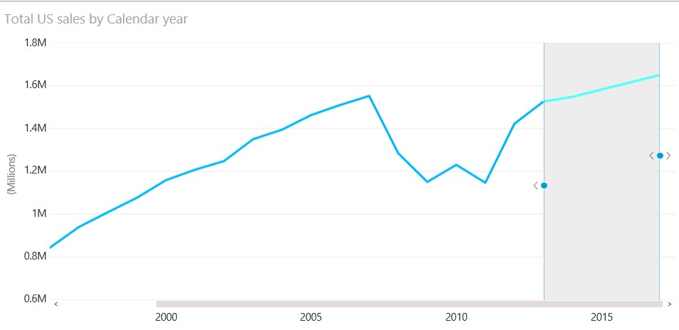
In the HTML5 version, you would be able to see the dot with the arrow on the line chart which allows to forecast your data.
Just click on the arrow or drag the dot. It will show the forecast data. Also you would be able to see the seasonality and confidence interval. (if you can’t see it, Look for Analysis in the upper-right corner)
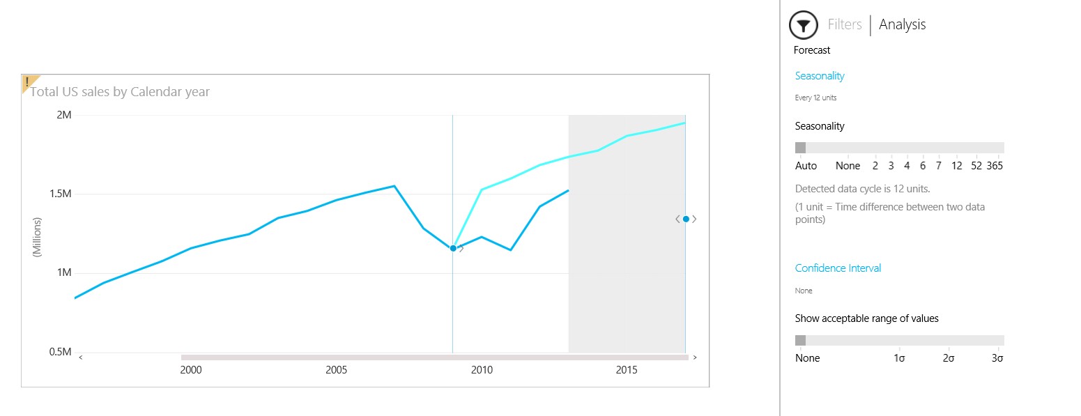
Now that you've got a forecast, you also see an arrow pointing left, at the beginning of the forecast. That’s the hindcast arrow. Hindcasting shows how the forecast would've predicted the recent past, from the vantage point of the past.
Click the hindcast arrow or drag the hindcast dot to the left to see how it would've predicted current values, if you had asked in the past. Lighter line in the below image represents forecast/hindcast data.
-
-
-
- To undo forecasting, click the arrow to the left of the forecast dot
- In the above screenshot, the darker line represents the actual values whereas the lighter line represents the hindcast and forecast values.
- Power View automatically detects what appears to be the seasonality of the data – in other words, a complete cycle of peaks and dips. For example, if you have sales year over year, and you have daily data points, then the seasonality may be 365 - 365 data points in the one-year data cycle.
- You can override automatic seasonality detection. In our example we have monthly data points. Hence the seasonality must be set to 12.In this case Power View has automatically detected the seasonality to be 12 which is correct. If not we have to change it manually.
-
-
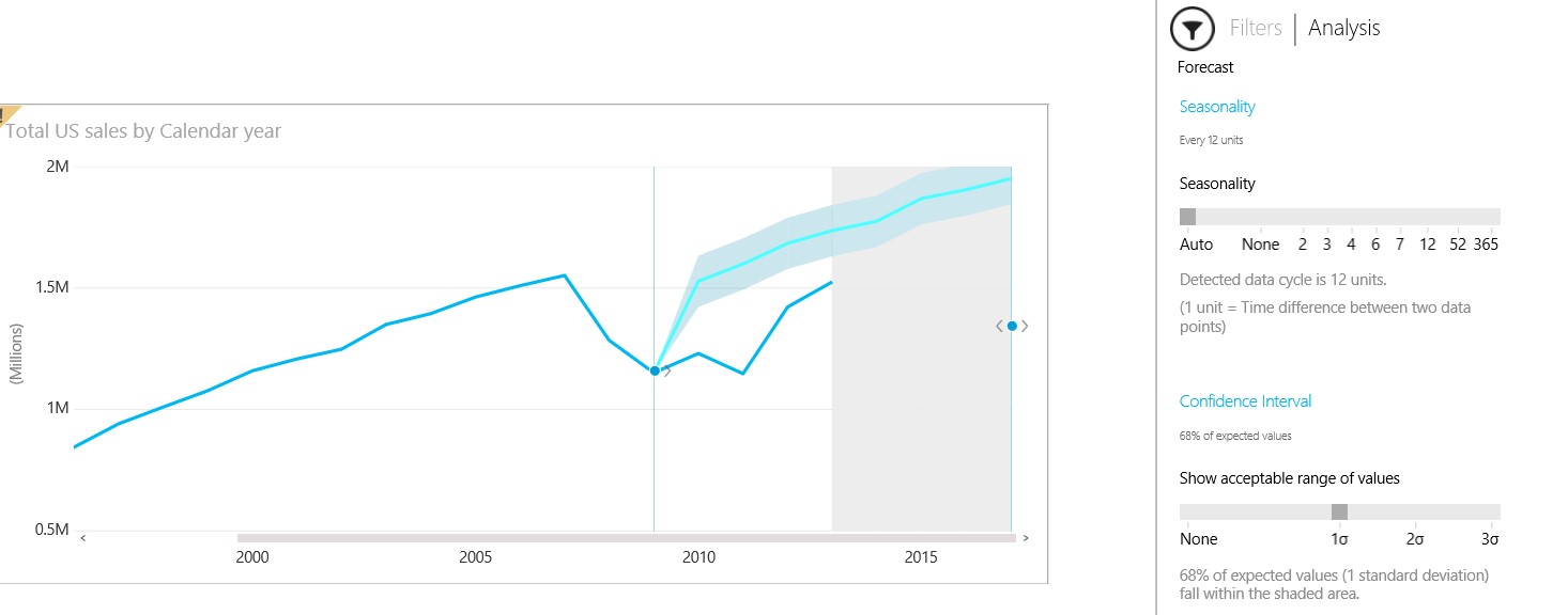
Vary the confidence interval to understand expected variance in future forecast results. Try to change the confidence interval to 1. The below view represents a line chart with one standard deviation.
What if Analysis:
What-if analysis currently works only in Power View HTML5, and not in the Power BI app.
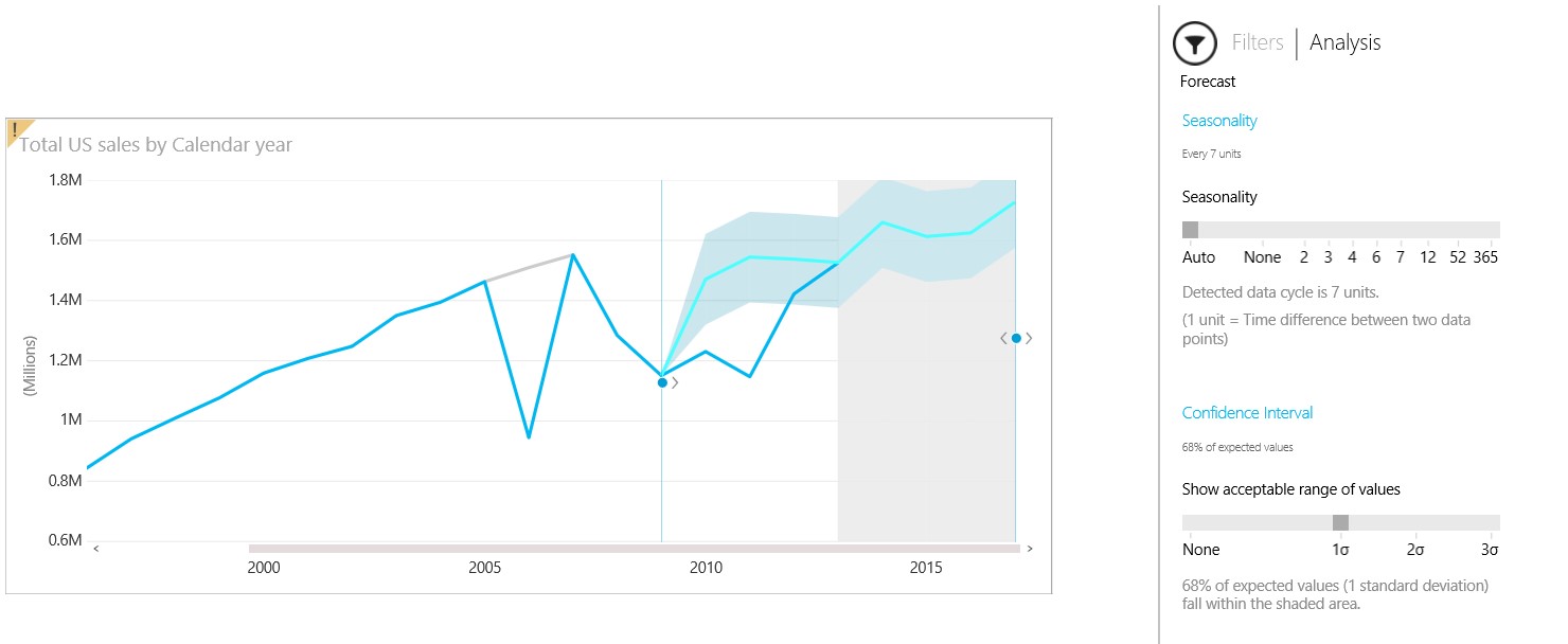
If you are interested in What-if Analysis, you can change the data points and Power View automatically changes the Forecast data with respect to new data points.
Note: When you change data points in a line chart, the forecast changes based on the new values. You’re not changing the underlying data in the workbook or data source.
For e.g. I have dragged the data point for the year 2006 down, with the same set of settings as above. If you notice the below screenshot, the forecast and hindcast line changed automatically and the underlying data in the work book or data source remains the same. To undo the change, double-click the data point dot.
Once you follow all the steps you are ready to play with Forecasting/Hindcasting data.
Note: All the above steps are applicable for Power BI app as well. But you have to enter the Office 365 site URL and browse the demo excel and follow the above steps. Only the What If Analysis is not supported in Power BI App.
Things to keep in mind about Forecasting/Hindcasting
Forecast is available for line charts only.
The x-axis value needs to have a date/time format or be a uniformly increasing whole number.
It can’t contain text or decimal numbers.
Sometimes x-axis values appear to be dates, but they’re actually formatted as text. They won’t work for forecasting.
The chart has to have only one line. Multiple-line charts don’t work, even if all but one line is filtered out.
The interval between values has to be at least one day.
For hindcasting to work, the line chart needs a minimum of seasonality periods.
Filtering can impact hindcasting.
Hindcasting is really a new and separate forecast, with its own seasonality and values in the Analysis area.
Undo (Ctrl-Z) doesn't work.
Please reference MSDN Power BI blog here to know more about Forecasting feature and its limitations.
