Create Silverlight Master – Detail UI Using Data Sources Window Object DataSource
 This article has a corresponding video that can be viewed here.
Master – Detail layouts are the bread and butter of Line of Business (LOB) applications. This walkthrough will show you how to drag & drop from the Data Sources Window to create the UI that is sourced from an Object DataSource.
This article has a single download that contains C# and VB.NET completed solutions and starter solutions. The starter solution includes the data entity classes and a static (Shared) data source class.
This walk through assumes that you'll be starting with the starter solution.
Table of Contents
- Completed Application
- Starter Solution
- Adding a Title to the Form
- Adding the ComboBox Used for Record Selection
- Adding the Details Form
- Adding the DataGrid
- How does it Work?
- Links
- Comments
Completed Application
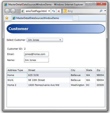
Figure 1 Completed Application
Starter Solution
Open the accompanying (C# or VB.NET) starter solution.
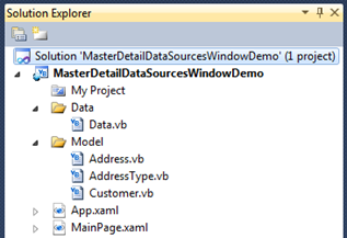
Figure 2 Starter Solution
The Data class provides two static (Shared) properties that expose an ObserveableCollection that are the application data sources. The Data class takes the place of a data layer that would be used to populate CLR classes from a database.
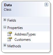
Figure 3 Data Class Diagram
The Customer class can contain one or more Addresses. Each Address has an associated AddressType.
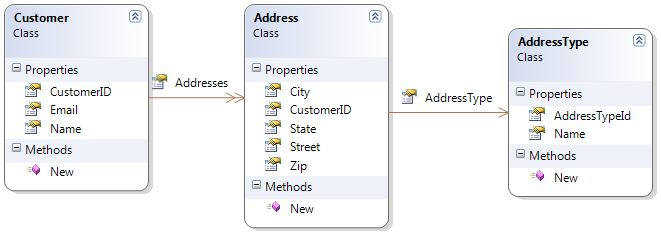
Figure 4 Entity Class Diagram
Adding a Title to the Form
Step One

Figure 5 Draw Top Border
- Open MainPage.xaml
- Select the root Grid by clicking inside the Window
- Create a new Grid Row that takes up about 25% of the Window
- Click the Grid rail on the left to create a new row
- Draw a Border control inside the new row
- Select the Border control in the Toolbox then draw the Border as pictured in Figure 5 above.
Step Two
Draw a TextBlock control inside the Border
Using the Document Outline, multi-select the TextBlock and Border controls.
Reset the Layout Properties (see Figure 6 below)
- Right click on the selected controls, select Reset Layout, All.

Figure 6 Resetting Values
After the properties are reset the layout should look like Figure 7 below:

Figure 7 Title Step Two
Step Three
Using the Document Outline, select the Border control
Using the Properties Window, set the following properties:
- CornerRadius to 30
- Margin to 11
- Padding to 7
- BorderThickness to 2
- Background to formTitleBackgroundBrush
- Use Resource Picker, see Figure 8 below
- BorderBrush to formTitleBorderBrush
- Use Resource Picker, see Figure 8 below

Figure 8 Applying Resource
Using the Document Outline, select the TextBlock
Using the properties Window set the following properties
- Text to Customer
- VerticalAlignment to Center
- FontSize to 18
- FontWeight to Bold
- Foreground to formTitleForegroundBrush
- Use Resource Picker
Using the Document Outline, select the Grid
Hover cursor over the left Grid rail for the top row. Set top row to Auto sizing as in Figure 9 below.
The bottom image in Figure 9 shows the completed form title.
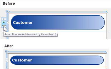
Figure 9 Auto Sizing Row
Adding the ComboBox Used for Record Selection
Step One
- Select the root Grid by clicking inside the Window
- Create a new Grid Row that takes up about 25% of the Window
- Click the Grid rail on the left to create a new row
- Draw a StackPanel inside the new row
- Add a TextBlock to the StackPanel by double clicking the TextBlock icon in the Toolbox
- Add a ComboBox to the StackPanel by double clicking the ComboBox icon in the Toolbox
- Form should now look like Figure 10 below

Figure 10 Record Selector Step One
Step Two
Select the StackPanel
Reset the Layout Properties for the StackPanel
- Right click on the StackPanel, select Reset Layout, All
Using the Properties Window, set the following properties:
- Margin to 11
- Orientation to Horizontal
Using the Document Outline, multi-select the TextBlock and ComboBox
- Right click on the selected controls, select Reset Layout, All
Using the Properties Window, set the following property:
- VerticalAlignment to Center
Form should now look like Figure 11 below
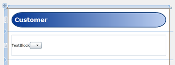
Figure 11 Record Selector Step Two
Step Three
Using the Document Outline, select the TextBlock
Using the Properties Window, change the Text property to Select Customer
Using the Document Outline, select the ComboBox
Using the Properties Window, set the following properties:
- Margin to 7, 0
- Width to 175
Change the Grid Row size that the StackPanel is a child of to Auto.
Form should now look like Figure 12 below
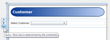
Figure 12 Record Selector Completed
Step Four
From the Data menu, select Show Data Sources.
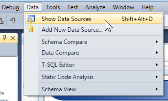
Figure 13 Data Menu
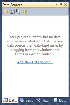
Figure 14 Data Sources Window
- Add a new Data Source by clicking on the "Add New Data Source…" link pictured in Figure 14 above.
- When the Data Source Configuration Wizard is displayed select the Object icon and click the Next button.
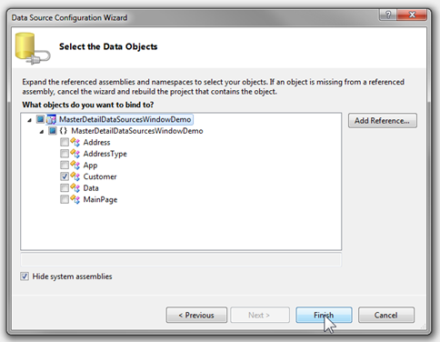
Figure 15 Select Data Objects
- Drill down to the Customer object and select it, then press the Finish button.
- Figure 16 below shows the newly created Object Data Source
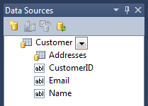
Figure 16 New Data Source
Step Five
The ComboBox will provide Customer record selection. To wire up the ComboBox drag the Customer object and drop it on the ComboBox as pictured in Figure 17.
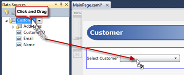
Figure 17 Binding ComboBox
- Select the ComboBox
- Using the Properties Window, set the DisplayMemberPath to Name
Providing Run-Time Data to the CollectionViewSource
- When the Customer object was dragged onto the ComboBox, a CollectionViewSource was added to the XAML, the StackPanel that holds the ComboBox had its DataContext set to that same CollectionViewSource.
- At this point, we need to write a very small amount of code to provide data to the CollectionViewSource.
- Open the MainPage.xaml.vb or MainPage.xaml.cs file and edit the code that was added to the Loaded event handler when the Customer object was dragged onto the ComboBox. When your editing is completed, your source code will look like the examples below.
VB.NET
 Imports System.Windows.Data
Imports System.ComponentModel

Partial Public Class MainPage
    Inherits UserControl

    Public Sub New()
        InitializeComponent()
    End Sub

    Private Sub UserControl_Loaded(
                ByVal sender As System.Object,
                ByVal e As System.Windows.RoutedEventArgs) Handles MyBase.Loaded

        If Not (DesignerProperties.GetIsInDesignMode(Me)) Then

            Dim cvs As CollectionViewSource =
                CType(Me.Resources("CustomerViewSource"), CollectionViewSource)

            cvs.Source = Data.Customers

        End If
    End Sub

End Class
C#
 using System.ComponentModel;
using System.Windows;
using System.Windows.Controls;
using System.Windows.Data;

namespace MasterDetailDataSourcesWindowDemo {

  public partial class MainPage : UserControl {
    public MainPage() {
      InitializeComponent();
      Loaded += new RoutedEventHandler(MainPage_Loaded);
    }

    void MainPage_Loaded(object sender, RoutedEventArgs e) {
      if (!DesignerProperties.GetIsInDesignMode(this)) {
        CollectionViewSource cvs = (CollectionViewSource)this.Resources["CustomerViewSource"];

        cvs.Source = Data.Customers;
      }
    }
  }
}
- In the above code we are getting a reference to the CustomerViewSource CollectionViewSource and assigning Data.Customers collection to the Source property.
- In an application that loads data from a database or web service when the form is loaded, you would not want the data to load at design time. The call to GetIsInDesignMode provides this check to allow you to prevent loading data at design time.
- Run application. You should be able to view data as pictured in Figure 19 below.
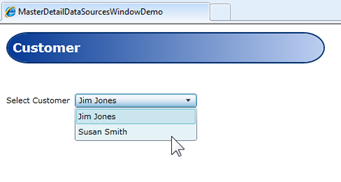
Figure 18 Run Application
Adding the Details Form
The details form in this application plays the role of the Master in our Master-Details application.
Step One
Customize the Customer object output.
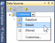
Figure 19 Change Customer Layout Type
- Change the Customer object layout to Details as pictured in Figure 19 above
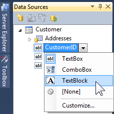
Figure 20 Change CustomerID Layout Control
- Change the CustomerID property to use the TextBlock control when rendered as pictured in Figure 20 above
Step Two
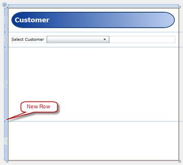
Figure 21 Adding New Row
- Select the Grid and add a new row as pictured in Figure 21 above
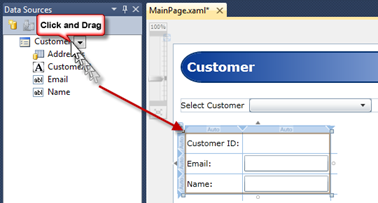
Figure 22 Details Form Generation
Drag and drop the Customer object to the Grid Row below the ComboBox
With the Details Grid selected, right click, select Reset Layout, All
Using the Properties Window, set the following properties:
- VerticalAlignment to Top
- Margin to 11
Select the outer Grid and change the Details Form row to use Auto sizing
Using the Document Outline, select the TextBlock for the CustomerID
Using the Properties Window, set the following properties:
- VerticalAlignment to Center
- HorizontalAlignment to Stretch
- Height – use property marker to reset
The application should now look like Figure 23 below
Run the application and select different Customers
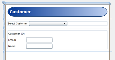
Figure 23 Details Form Completed
Adding the DataGrid
Step One
Customize the Addresses object output
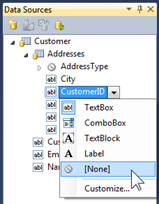
Figure 24 Configure CustomerID Layout Control
- Set the CustomerID field control to None. When the Addresses object is dragged to the design surface, no control will be emitted for the CustomerID property.
Step Two
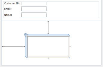
Figure 25 Add Grid to Bottom Row
Add a Grid control to the bottom row
With Grid selected, right click and select Reset Layout, All
Using the Properties Window, set the following property:
- Margin to 11
| Information |
The reason we have added the Grid is to provide a surrounding container for the DataGrid we will add in the next step. The Grid container will have its DataContext property set in the next step when we drag and drop the Addresses DataGrid onto the design surface. If we didn't add this Grid container, the Data Sources Window would look up the tree of elements trying to locate a container to set the DataContext on. In the case of this application, the DataContext would be set on the top level Grid control. While this would work, it would make the XAML harder to read and understand where the DataGrid's DataContext was set. By placing the DataGrid inside its own surrounding Grid control, it's very easy to understand where the DataGrid's DataContext is when reading the XAML. |
Step Three
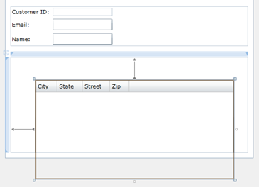
Figure 26 Drag and Drop Addresses DataGrid
- Drag and drop the Addresses object from the Data Sources Window to the Grid control added in Step Two above
- With DataGrid selected, right click and select Reset Layout, All
- The DataGrid should now look like Figure 27 below
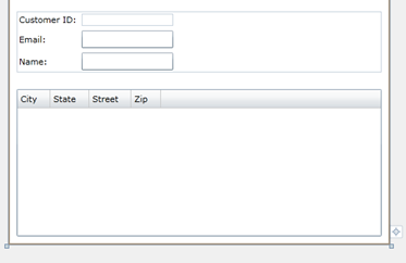
Figure 27 Data Grid Resized
Step Four
We now need to add an AddressType ComboBox column and wire it up to data source.
Change MainPage.xmal to XAML view
Near the top of the file, add the following to the UserControl.Resources section:
<local:Data x:Key="data" />
- Adding the Data class as a resource allows elements within scope to data bind to properties exposed by the Data class.
Near the bottom of the file, nested inside the DataGrid locate the follow XAML:
<sdk:DataGrid.Columns>
Copy and Paste the below XAML just below the above Columns tag XAML. This will make the Address Type, the DataGrid's first column.
| Information |
The WPF & Silverlight Designer currently does not support the editing DataTemplates so you'll need to edit the XAML in the XAML Editor. However, when editing in the XAML Editor, if you have loaded the Designer, you can use still use the Properties Window to set property values on the selected object. |
 <sdk:DataGridTemplateColumn
    x:Name="AddressTypeColumn"
    Header="Address Type" Width="100">
    <sdk:DataGridTemplateColumn.CellTemplate>
        <DataTemplate>
            <TextBlock
                Margin="3,0,0,0" VerticalAlignment="Center"
                Text="{Binding Path=AddressType.Name}" />
        </DataTemplate>
    </sdk:DataGridTemplateColumn.CellTemplate>
    <sdk:DataGridTemplateColumn.CellEditingTemplate>
        <DataTemplate>
            <ComboBox
                DisplayMemberPath="Name"
                ItemsSource="{Binding Path=AddressTypes, Source={StaticResource data}}"
                SelectedItem="{Binding Path=AddressType, Mode=TwoWay}" />
        </DataTemplate>
    </sdk:DataGridTemplateColumn.CellEditingTemplate>
</sdk:DataGridTemplateColumn>
- Change MainPage.xmal to Design view, the DataGrid should now look like Figure 28 below
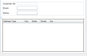
Figure 28 After Pasting Address Type Column
- Select the DataGrid
- In the Properties Window, click the ellipsis button for the Columns property. This will open the Collection Editor for the DataGrid Columns.
- Change the Collection Editor Properties to Alpha view
- In the Properties Search Box enter: width
- The Collection Editor should now look like Figure 29 below
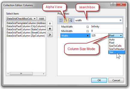
Figure 29 DataGrid Column Collection Editor
| Information |
The DataGridColumn Width property is of type DataGridLength. Star sizing for the Silverlight DataGrid is a new feature in Silverlight 4. You can read about the DataGridLength in this MSDN topic: https://msdn.microsoft.com/en-us/library/system.windows.controls.datagridlength(VS.95).aspx |
- Set AddressTypeColumn width to 100, Pixel
- Set CityColumn width to SizeToCells
- Set StateColumn width to SizeToHeader
- Set StreetColumn width to 1, Star
- Set ZipColumn width to SizeToCells
- Reorder the columns by moving the StreetColumn to come after the AddressTypeColumn as in Figure 30 below
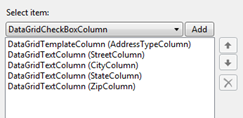
Figure 30 DataGrid Column Reordering
- Close the Collection Editor by clicking the OK button
- The DataGrid should now look like Figure 31 below
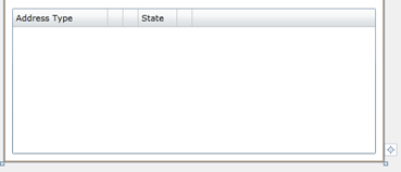
Figure 31 DataGrid After Column Resizing
-
Run your application
  - You can edit rows in the DataGrid
  - Notice that the ComboBox in the DataGrid provides selection for the Address, AddressType.
How does it Work?
The CollectionViewSource is a powerful class that provides a wrapper around a data source, adding sorting, grouping and filtering functionality without changing the source data.
The CollectionViewSource is a proxy class to the underlying CollectionView that provides navigation of collection items.
| Information |
MSDN CollectionViewSource documentation can be viewed here: https://msdn.microsoft.com/en-us/library/system.windows.data.collectionviewsource(VS.95).aspx |
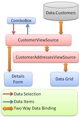
Figure 32 Data Object Relationships
- The Data.Customers ObservableCollection is the source for the CustomerViewSource. This data is wired up in the MainPage.Loaded event.
- When the ComboBox selection changes it sets the CurrentItem on the underlying CollectionView.
- The Details Form is bound to the CurrentItem. When selection changes, the Details Form DataContext changes and the selected Customer is displayed.
- The CustomerAddressesViewSource is bound to the CurrentItem (current Customer) Addresses property.
- The DataGrid is bound to the CustomerAddressesViewSource and displays all items in this collection.
DataGrid ComboBox
Silverlight does not ship with a DataGridComboBoxColumn class. Instead, it provides the flexible DataGridTemplateColumn class. This column exposes two template properties, CellTemplate and CellEditingTemplate that enable developers to author DataTemplates when the cell is in read or edit mode.
 <sdk:DataGridTemplateColumn
    x:Name="AddressTypeColumn"
    Header="Address Type" Width="100">
    <sdk:DataGridTemplateColumn.CellTemplate>
        <DataTemplate>
            <TextBlock
                Margin="3,0,0,0" VerticalAlignment="Center"
                Text="{Binding Path=AddressType.Name}" />
        </DataTemplate>
    </sdk:DataGridTemplateColumn.CellTemplate>
    <sdk:DataGridTemplateColumn.CellEditingTemplate>
        <DataTemplate>
            <ComboBox
                DisplayMemberPath="Name"
                ItemsSource="{Binding Path=AddressTypes, Source={StaticResource data}}"
                SelectedItem="{Binding Path=AddressType, Mode=TwoWay}" />
        </DataTemplate>
    </sdk:DataGridTemplateColumn.CellEditingTemplate>
</sdk:DataGridTemplateColumn>
- AddressType.Name displays in the Address Type cell when not editing
- When editing the Address Type, the cell displays a ComboBox that provides selection of an AddressType.
- SelectedItem property gets and sets the AddressType for the Address in the row
- ItemsSource is set to the static resource data, which exposes the Data class for data binding. Data.AddressTypes is a collection of AddressType which is what the ComboBox uses for its ItemsSource.
- DisplayMemberPath is the Name property of the AddressType
| Information |
MSDN DataGridTemplateColumn documentation can be viewed here: https://msdn.microsoft.com/en-us/library/system.windows.controls.datagridtemplatecolumn(VS.95).aspx |
Links
Now that you have a built a simple Silverlight application can we suggest that you view Scott Morrison's MIX10 presentation, building Silverlight Business Applications.
Presentation: https://live.visitmix.com/MIX10/Sessions/CL08
Blog post with source code: https://blogs.msdn.com/scmorris/archive/2010/03/17/mix-10-silverlight-4-business-applications.aspx
Comments
Microsoft values your opinion about our products and documentation. In addition to your general feedback it is very helpful to understand:
- How the above features enable your workflow
- What is missing from the above features that would be helpful to you
Thank you for your feedback and have a great day,
Karl Shifflett
Expression Team
SLMasterDetailDataSourcesWindowSouce.zip
Comments
Anonymous
June 08, 2010
After reading this article and other series related to Visual Studio 2010 I'm finally convinced that I could install VS2010 and using wpf instead of WinFormfor my next project at work. Thanks, keep new articles like this (WPF and how easy VS2010 helps developers) coming.Anonymous
June 08, 2010
Thank you very much for your kind words of encouragement. Have a great day, Karl ShifflettAnonymous
June 18, 2010
hello, in my Data Sources Panel, i lost DataGrid in my tables and i only have Details, how to retrieve DataGrid ? thksAnonymous
June 18, 2010
Is your Designer visible? If not, the Data Sources Window changes its mode. Let me know if this does not correct you issue. Cheers, KarlAnonymous
July 01, 2010
Hi, I have also lost the DataGrid from the data sources. I have the designer open. I only have the options of Details and DataForm. If I go to customise DataGrid is not available enywhere. If I drag a DataGrid from the toolbox, then deag my datacontext onto it, it all populates but I dont get to control which items are included.Anonymous
July 02, 2010
Visual Stuiod 2010 & Nigel, Question: have you installed the latest Silverlight Tools from here: www.microsoft.com/.../details.aspx Please email me a screen shot what you are seeing and your project to: kashiffl AT microsoft dot com We'll get this sorted out for you, KarlAnonymous
July 30, 2010
How to add navigation cabaplties .add ,save To this sampleAnonymous
August 04, 2010
Mohd, Thank you for your feedback. To help with the "add and save" features, it would be helpful to know if you are using WPF or Silverlight? Have a great day, Karl