Customizing the accessibility of my XAML and WinJS Windows 8 apps – Part 3: The WinJS app
Customizing the accessibility of my XAML and WinJS Windows 8 apps – Part 3: The WinJS app
Guy Barker
Say I’m fairly familiar with HTML, css and javascript, so it’s quick for me to build my new app in WinJS. I’ve found that I can use the app fine when only using the keyboard, and by pointing the Inspect SDK tool at the UI I can see all sorts of accessibility-related properties exposed by the app. I’ve also found that there are four places in my app’s accessibility story where there are gaps which I need to fill in. The blog describes what I need to do in order to deliver an app that’s fully accessible to all the customers I want to reach.
Accessible names
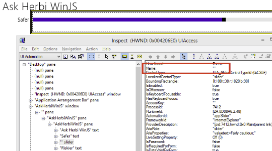
As I point the Inspect SDK tool to my UI, I can see an accessible name for the button and for the various text elements, but not for the slider or the image. This means as a customer uses the Narrator screen reader to examine the slider, they won’t hear a useful name describing what the slider relates to. (This will be case regardless of whether they’re using the physical keyboard or touch to interact with my app.) If the meaning of my slider is not made clear, then this significantly impacts the usefulness of my app.
The image below shows no accessible name being exposed by the slider UI.
So I need at add a helpful accessible name to the slider. I could do this by simply adding an “aria-label” property to the slider tag that defines my slider. An aria-label is a way to specify an accessible name for some element, and is one of a set of properties you can add to UI, as listed at https://msdn.microsoft.com/en-us/library/windows/apps/hh767301.aspx.
However, I must assign a localizable aria-label to the UI in order for the slider to have a useful name in all the geographical regions in which the app ships. So given that I’d not yet taken the steps to add localizable strings to my app, I’ll do that now.
- Add a new “Resources File (.resjson)” item to my project.
- Create a “strings\en-us” folder in my project and move the new resjson file into there.
- Add an WinJS.Application.onloaded() function in default.js which gets called when the page is loaded.
- Near the top of the onloaded() function, add a call to WinJS.Resources.ProcessAll().
Now that localizable strings are available in my app, I’ll insert the following in my slider’s markup.
data-win-res="{attributes: {'aria-label' : 'appSliderName'}}"
And I’ll then add the localizable string to my new string resource file.
"appSliderName" : "Risk level"
So having done that, when I run the app and point the Inspect tool at the UI, I can now see the localizable friendly name.
This means that when a customer uses a screen reader to access the slider, they’ll hear “Risk level” and immediately know what the slider relates to.
Now, a customer using a screen reader can examine UI regardless of whether the UI can get keyboard focus. For example, they may use touch to learn what UI is beneath their finger. So it’s important that all UI that’s not purely decorative has an accessible name. As such, I want the image that fills up most of the UI to have a useful, localized name.
This is where things get interesting. When I originally added the image to the app, I decided to make the image a background-image property on a div. When I did this this, I was interested in some of the css styling that’s possible with background images. Having built the app, I expect I didn’t need to have used a background image and I could have used a regular Img tag. But I’m going to stick with a background image here anyway, as it introduces a few interesting topics on accessibility.
By the way, when building your UI in HTML, don’t forget to add explicit closing tags to elements where you can, rather than doing “/>” to close it. Without the explicit closing tag on some elements, your layout won’t following the grid rules you try to set up in css. I forgot this when building the app, and so got some unexpected layout for a while.
So anyway, I added the image resource to my app, added the div in HTML and the related styling in css.
<div id="appImage">
</div>
#appImage {
background-image:url(/images/Herbi.png);
background-size: contain;
background-position: center;
background-repeat: no-repeat;
…
}
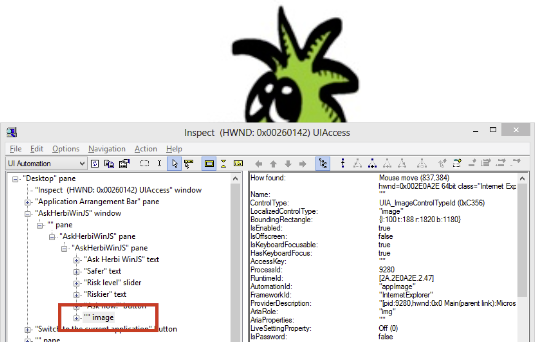
And sure enough, when I ran the app, the image appeared. However, when I point the Inspect tool at the image, it couldn’t see the image at all. The image was nowhere to be found in the UIA tree of elements. This means a screen reader won’t be able to find it either. The image below shows the slider, the button and the text controls in the UIA element hierarchy, but not the image.
So this is a critical problem from an accessibility perspective, and I need to take action to get the image added to the UIA tree. The problem is triggered by the fact that I used a div to create the UI. By default a div is not an accessible element, and isn’t exposed to a screen reader user. Other elements, such as a Button or Input are added to the UIA tree. A description of how HTML maps by default to UIA can be found at https://msdn.microsoft.com/en-us/library/windows/apps/hh452708.aspx.
I can make a div element appear in the UIA tree by giving it some accessible role. It’s most appropriate in this case to give it a role of “img”, because it’s displaying an image. Once I’ve done that, I can point Inspect to the image, and I now see the element appear the UIA tree.
However, I can now see that the element has no accessible name, so I need to fix that next. This is easy to do in the same way I added an accessible name to the slider earlier. I’ll add a localizable string to my string resources, and update my HTML to have the elements aria-label property set to that accessible name.
data-win-res="{attributes: {'aria-label' : 'appImageName'}}">
"appImageName" : "Herbi",
Note that I don’t make the name something like “Picture of Herbi”, because including “picture” or “image” is redundant. When I gave the element a role of “img”, its control type was exposed as an Image control type, so screen readers can already inform my customers that the element is an image. The Name property should be constrained to making it clear exactly what it’s an image of.
One additional note on the onLoaded() function that I added earlier; this is a good moment to stop and think about any other action that might be useful when the app starts. For example, where’s the most useful place for keyboard focus to be? For my customers who only use the keyboard, if it’s likely that the button is going to be the element that they’ll want to interact with first, then I’ll set focus to the button in the following way.
appAskButton.focus();
Descriptive Slider values
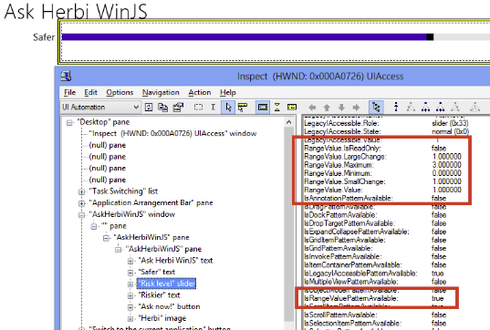
By default, my slider supports the UIA RangeValue pattern. This makes sense, as is it has a minimum, a maximum and a current value, and all this is reported by the Inspect SDK tool.
When the Narrator screen reader examines slider UI that supports the RangeValue pattern, but which doesn’t support the Selection pattern or Value pattern, it reports the current value as a percentage of the full range. For my app, I really need friendly text to be associated with each value, to describe what each value means along this “Risk level” slider. I first wondered whether I could achieve this by adding support for the Selection pattern to the slider, by giving it some specific role, but my attempts there didn’t work given that I could find a way to create the element that was the associated selected item. But it turns out that in WinJS, there’s a far simpler way of achieving what I need.
The first thing I should do is add a changeValue event handler for my slider. I’ll add this in the onLoaded() function that I added earlier.
document.getElementById("appSlider").addEventListener('change', changeValue, false);
Then in this event handler I can set the aria-valuetext property of the slider based on its current value.
var risklevelIds = new Array(
"riskLevelLowId",
"riskLevelMediumId",
"riskLevelHighId",
"riskLevelTopId"
);
// Set the localized slider value text based on the supplied value of the slider.
function changeSliderValue() {
var riskLevel = appSlider.value;
var riskLevelText = WinJS.Resources.getString(risklevelIds[riskLevel]).value;
appSlider.setAttribute("aria-valuetext", riskLevelText);
}
The aria-valuetext is described up at https://msdn.microsoft.com/en-us/library/windows/apps/Hh968009.aspx.
However, doing that alone did not get the value text spoken by Narrator as I’d hoped. I then noticed that the description of the related aria-valuenow at https://msdn.microsoft.com/en-us/library/windows/apps/hh465728.aspx, says that that property “applies to elements with an ARIA role of progressbar, slider, or spinbutton.” So I added the following to my slider HTML.
role="slider"
When I then pointed the Inspect SDK tool at the UI, I could see that UIA Value pattern support had been added to the slider, and the Value property was set to my friendly text. And sure enough when I use my app with Narrator, as I changed the slider value, Narrator would speak the helpful text associated with each slider value.
By the way, I also explicitly forced the aria-valuetext setting action on startup to, (before the slider value had been changed by my customer), I order to make sure the first time Narrator saw the slider, it had its friendly text set.
Announcing visual updates
And next we move to the part of the UI which is its raison d'être – the advice. When my customer invokes the app button, I present the result on the screen. I have an “h2” tag for the element which presents the text, and I set the innerText property on that when I want to show the text. If I point the Inspect SDK tool to the text after I’ve done that, I can see the result exposed in the UIA tree, and so it’s accessible to a screen reader.
The problem is that when I presented the text visually, nothing happened to let a screen reader know that the text was appearing. If I don’t give a screen reader a heads-up that text has appeared, it can’t know to speak the text, and so my customer misses out on the most important information that the app presents. So I must make sure that a screen reader is notified of the text appearing. I can do this my marking the element that shows the text as being a “Live Region”, as described at https://msdn.microsoft.com/en-us/library/windows/apps/hh465711.aspx.
By making the element a Live Region, I can have text-related changes lead to a UIA LiveRegionChanged event being raised. In response to that event, a screen reader can go back to the source element and speak whatever details about the element that it wants to. So I’ll add the following attribute to the “h2” tag.
aria-live="assertive"
And by declaring it as being assertive, I’m telling screen readers that I want changes spoken as soon as the change in text happens, even if that means the screen reader interrupting itself if it was already in the middle of speaking. If I’d prefer a screen reader to finish what it was currently speaking before announcing the change in my text, I would make the Live Region “polite”.
By the way, some roles for elements automatically lead to the element being declared to be a Live Region. As described at https://msdn.microsoft.com/en-us/library/windows/apps/hh452704.aspx, if you give an element the role of “log”, “alert” or “status”, it will become a Live Region. One of these three roles leads to the element being an “assertive” Live Region and the other two are “polite”. Which would you guess is the assertive one?
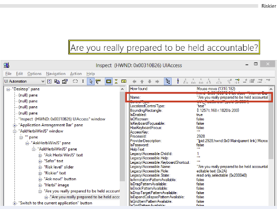
So I could have given the element one of the roles, but instead I left it as an “h2” with “aria-live” explicitly applied. This results in Inspect showing a Text control which is an assertive live region, and whose accessible Name property is the text shown visually for the element. (Interestingly, I also see that the Text control contains another Text control which has the same accessible Name property. I don't know why this hierarchy exists, but having two elements here does not affect what I’ll do when it comes to building my app, so I'll not worry about it.)
Having made my Text control a Live Region, I thought I'd run the AccEvent SDK tool to verify that the LiveRegionChanged events are getting raised as expected. I then noticed something really interesting, in that I'm getting two events raised with each click.
That seemed strange, given that I thought I only set the text once. But then I noticed that before I set the text, I explicitly set the Text control's text to be "", (an empty string,) before I set the actual results. I did this to force the text to change. If the text I display happened to be the same text that I previously displayed, then the displayed text wouldn't change, and I don't think I'd get the LiveRegionChanged event raised. So I set the text on the element twice in rapid succession. I'll bet what's happening is that when AccEvent sees the first event, it goes back to my app to get the new text shown in the UI. But rather than finding the empty string, it find the results text which was set on the UI since the first event was raised. Shortly after that AccEvent will react to the second event and get the same text, (which explains the results shown in AccEvent above). None of this will affect my customer's experience, as the effects of the second event will immediately stomp on the effects of the first, because the element is an assertive Live Region. So I'll leave all this as it is.
As I poke around my app with Inspect, I do notice one other thing that I’d like to tidy up. Before I invoke the button, the advice text element appears in the tree, but with no accessible Name property. This isn’t too surprising really, as I’ve yet to set any text on the element. So perhaps I should keep the element out of the tree whenever there’s no text set on it. I can do that through the use of the aria-hidden property, (https://msdn.microsoft.com/en-us/library/windows/apps/hh465705.aspx). I’ll add the following to my HTML.
aria-hidden="true"
Then when I set the text on the element later, I’ll change the state of the aria-hidden property.
appResult.setAttribute("aria-hidden", "false");
Now when I point Inspect to my app, the element doesn’t appear in the UIA tree until it’s presenting some text.
Presenting appropriate high contrast images
When my customers have specifically chosen a high contrast color theme to be used when my app presents its visuals, I want all visuals to be appropriately displayed. WinJS will do a great job at automatically changing the visuals for the text, button and slider in my app, but if I present a whacking great image in colours that contradict my customers’ wishes, then that’s hardly a good user experience. As it happens, WinJS makes it a piece of cake for me to have appropriate images shown.
My first step is to generate versions of my image which are black-on-white and white-on-black. The black-on-white version is to be shown when the “High Contrast White” theme is active, and the white-on-black image is to be shown when one of the light-on-black themes are active, (these being “High Contrast Black”, “High Contrast #1” or “High Contrast #2”). Having made my images, (doing my best with the Paint program), I add my images as assets in my app.
But here’s the key thing; I name the assets such that WinJS will know they’re appropriate for use when specific high contrast themes are active. Given that my original image was called Herbi.png, I give my high contrast image assets the following names.
Herbi.contrast-black.png
Herbi.contrast-white.png
My css for the original image-related element the following:
background-image:url(/images/Herbi.png);
WinJS will automatically show the appropriate one of Herbi.png, Herbi.contrast-black.png or Herbi.contrast-white.png depending on whether a high contrast theme is active. Pretty handy!
There is one very important step I do need to take. When I was building the app, I’d deliberately decided to present the image as a background image, given that at the time I thought I might be leveraging some of the scaling and cropping functionality that’s possible through css for background images. But WinJS considers background images to be potentially problematic for people who use high contrast themes. If an image is in “the background”, that suggests that there may well be something in “the foreground”. The point of high contrast themes is to show a high contrast between the foreground and the background. If text lies on top of some image, then this could really interfere with the goals of using a high contrast theme. So WinJS reasonably decides that by default, background images should not be shown when a high contrast theme is active.
In my cases however, I’ve chosen to present an image as a background image when it’s not really a background image at all. And I would like some image to be shown regardless of whether a high contrast theme is active. So I can override the default WinJS action of hiding background images, by setting the following css.
@media screen and (-ms-high-contrast)
{
#appImage {
-ms-high-contrast-adjust: none;
}
}
This means that an image will be shown, and WinJS will select the appropriate one based on which high contrast theme is active.
I should point out that the appropriate image will be selected based on which high contrast theme, (if any,) was active when my app starts. This will normally be sufficient for my customers. But if my app showed some small UI where I felt that a customer might need to switch to use a high contrast theme while performing a particular task, and switch out of high contrast once that task is complete, then I might choose to have my images react to changes in the state of high contrast while the app is running. I can achieve this will the css below.
@media screen and (-ms-high-contrast)
{
#appImage {
-ms-high-contrast-adjust: none;
background: url(/images/herbi.contrast-black.png);
background-size: contain;
background-position: center;
background-repeat: no-repeat;
}
}
@media screen and (-ms-high-contrast:black-on-white)
{
#appImage {
background: url(/images/herbi.contrast-white.png);
background-size: contain;
background-position: center;
background-repeat: no-repeat;
}
}
In fact, having written that css here, I might as well stick it in my app, and support changing the image as the state of high contrast changes while my app’s running, as shown below.

Summary
So by default, my app was fully keyboard accessible. This means that a customer who has mobility impairments, (including those with severe impairments and who use a foot switch or head switch), would be able to use an on-screen keyboard to leverage the features in my app. Also by default, my app exposed a lot of accessibility-related information and visual behaviors which could be leveraged by my customers who have visual impairments. By taking the additional steps described above, I’ve completed the accessibility story for those customers, such that whether they interact with my app using a high contrast theme or through touch with a screen reader, all of my customers can access the full functionality of my app.
Customizing the accessibility of my XAML and WinJS Windows 8 apps – Part 1: Introduction
Customizing the accessibility of my XAML and WinJS Windows 8 apps – Part 2: The XAML app
Customizing the accessibility of my XAML and WinJS Windows 8 apps – Part 4: Postscript


