Treasure Map under the bonnet (hood) #5 … Finishing touches, but not yet finished!
In v2 the team has invested a great deal of UX design and feature coding to improve the accessibility, the user experience and ensure that the user always has a snapshot of the latest information relevant to the treasure hunt. In this post we will peek into the App Bar, Splash Screen and Live Tiles.
Splash Screen
We start with the easiest finish touch, for which no complex coding is needed to show a splash screen while the application loads. All we need to do is define  an image with a named SplashScreen.jpg asset,
  scaled to 620x300, 868x420 and 1116x540 pixels.
Done!
UX Lead question time …
 |
Q: Why is the splash screen still using the v1 yellow mellow style, while the rest of the UX has migrated to the ocean style blue? |
|
Anisha Pindoria, our UX lead, replies … The splash screen is still mellow yellow, as the title has remained the same colour. The same principle still applies as to the tile – it is eye-catching and stands out from the rest of the apps that are out there. |
 |
Live Tiles
In version 1 the ALM Readiness Treasure map had a normal, wide and static Tile which resembled the splash screen. In version 2 the team decided to provide the user with real-time news and progress information, creating a dynamic feel … also known as Live Tiles ![]()
If we look at the start screen, we will notice that our ALM Readiness Treasure Map displays two Live Tiles, one displaying the latest News (left) and the other the exploration Progress by the user through the Treasure Map, displayed as percentages completed per treasure category (right).
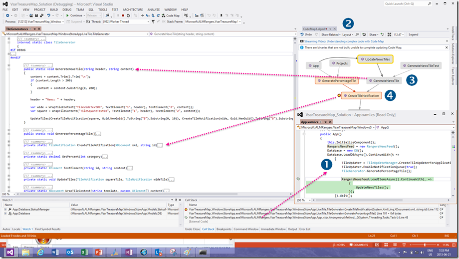
Open the LiveTile\TileGenerator.cs file to explore the magic:
Dev Lead question time …
 |
Q: Where is the magic that starts the Live Tile when the application has never run on the system? |
|
Robert MacLean, our dev lead, replies … There is none & it isn't possible. The tiles are only generated on app startup. Q: So in other words if you never run the app the Live Tiles will not show? It requires the user to run the app at least once?? Yip |
 |
App Bar
Last but not least we look at the App Bar, which supports the drive by Windows Store Applications to reduce the clutter on the user interface and focus on content. To enable the AppBar right-click the screen or swipe from the bottom or top of the touch screen.

The top AppBar is intended for navigation and the bottom AppBar for action command types. If we enable the AppBar when we are perusing one the the project treasures, we nota that the top AppBar allows us to go home (navigation) and the bottom allows us to pin or add as favourite (actions).
Now for the code exploration …
 |
|
| We have a TopAppBar defined in XAML, the same way as other page layouts as discussed in Treasure Map under the bonnet (hood) #1 … Windows 8 Layout Controls. Nothing mind boggling here |
|
| We also have a BottomAppBar … ditto to |
|
| For those with Eagle vision it is apparent that the bottom AppBar example we showed above had two action buttons (pin and favourite), whereas the XAML defines three (pin, unfavourite and favourite). If you explore the XAML for the second and third button you will realise that the visibility of each button is based on the IsFavourite property, ensuring that either the Unfavourite or Add as favourite button is displayed. The magic potion: Visibility="{Binding IsFavourite, Converter={StaticResource trueMeansVisibleBooleanToVisibility}}" | |
| To conclude we emphasise that AppBar is an object that resides in every Page object. |
UX Lead question time …
 |
Q: Should we define a Top AppBar on every page or an AppBar on the main page that is shared throughout the application to promote a consistent navigation? |
|
Anisha Pindoria, our UX lead, replies … App bars provide the user with easy access controls for the app when they need them. App bars – whether they are top or bottom app bars should only be made available when there are controls that a user may need for that particular area of the app they are in. For example: in a finance application in an app, there might be a return to ‘Home’ button, but the top app bar in the ‘Home’ does not need a home button, and may have a button that is ‘Apply’. For further information about this area, check out this MSDN page that describes the do’s and don’ts of app bars https://msdn.microsoft.com/en-us/library/windows/apps/hh465302.aspx |
 |
Dev Lead question time …
 |
Q: Hypothetically and assuming our UX expert is not watching, what happens when we fill the landscape AppBar with action icons from left to right, i.e. use up all real estate. Then we flip to vertical view. |
|
Robert MacLean, our dev lead, replies … This isn't even a portrait vs. landscape issue - it can hit landscape too if the horizontal resolution isn't high enough. Since we have a grid with two balanced columns (i.e. each uses 50%) & each have a stack panel in it, on lower resolutions like portrait, the inner icons (i.e. the ones to the right of the first column & the ones to the left in the second column) would disappear behind each column. |
 |
Next?
We will peek into the code that aggregates the blog feeds and thereafter the code that tracks the progress through the treasure map to see if we can reveal a few more gems.


