Layout Rounding
WPF’s layout engine frequently gives elements sub-pixel positions. Antialiasing algorithms cause these sub-pixel positioned elements to be rendered over multiple physical pixels after filtering. This can result in blurry lines and other non desirable rendering artifacts. Layout rounding has been introduced in WPF 4.0 to allow developers to force the WPF layout system to position elements on pixel boundaries, eliminating many of the negative side effects of sub-pixel positioning.
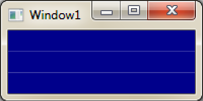
Two common situations where negative side effects display themselves are grid and image rendering. Many times grids are created using “star sizing,” resulting in all rows having proportional sizes (The same technique can be used for columns. For simplicity's sake, I will just refer to rows in this post). If the space being divided into rows is not a multiple of the smallest row, each row will have a fractional size. When this occurs, the content of each row will be antialiased at row boundaries. An example of this is below. The effect of the antialiasing creates the banding effect.
<Grid Height="100" Width="200">
<Grid.RowDefinitions>
<RowDefinition Height="*"/>
<RowDefinition Height="*"/>
<RowDefinition Height="*"/>
</Grid.RowDefinitions>
<Rectangle Grid.Row="0" Fill="DarkBlue"/>
<Rectangle Grid.Row="1" Fill="DarkBlue"/>
<Rectangle Grid.Row="2" Fill="DarkBlue"/>
</Grid>
XAML for a grid that uses “star sizing” to measure row height. Each row will have a height of 33.33… since the total space for all rows is 100, and this space must be divided equally between three rows.
The grid rendered from the above XAML and zoomed to 200%. Since the only contents of each row are a dark blue Rectangles, one could reasonably expect a solid dark blue window. Without layout rounding, seams will be rendered at the row boundaries. These are artifacts from antialiasing.
Image clarity can also be improved by layout rounding. Bitmap images contain color information for individual pixels.
A bitmap image of a smiley face. Each red square represents one image pixel.
If an image is not placed on whole pixel boundaries, the color of one physical pixel has contributions from multiple image pixels. This results in a blurry rendered image.
The bitmap image from above is placed at (1.5, 1.5). This results in the color of each physical pixel (black) depending on the color of 4 image pixels (red).
Below are a couple examples of the effect that sub-pixel image positioning can have on the clarity of an image.
The left image is the original. The right image is rendered on sup-pixel boundaries
The left image is the original. The right image is rendered on sup-pixel boundaries
Layout Rounding API
The attached property UseLayoutRounding has been introduced to allow layout rounding functionality to be toggled on or off.
This property can either be True or False. The value of this property is inherited by an element’s children.
· True – This element will use layout rounding
· False (default) – This element will not use layout rounding
Code snipit of this property in action
<Grid UseLayoutRounding="True" Height="100" Width="200">
<Grid.RowDefinitions>
<RowDefinition Height="*"/>
<RowDefinition Height="*"/>
<RowDefinition Height="*"/>
</Grid.RowDefinitions>
<Rectangle Grid.Row="0" Fill="DarkBlue"/>
<Rectangle Grid.Row="1" Fill="DarkBlue"/>
<Rectangle Grid.Row="2" Fill="DarkBlue"/>
</Grid>
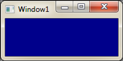
The grid rendered from the above XAML and zoomed to 200%. Notice that setting UseLayoutRounding=”True” resolved the banding issue in the image above.
UseLayoutRounding Usage
Layout rounding should be used in UI scenarios where the exact location of objects can be sacrificed for overall appearance of the application. Since rounding of layout parameters occurs when using this feature, precise element placement is lost. A few of the effects layout rounding can have on exact layout are…
· width and or height of elements may grow or shrink by at most1 pixel
· placement of an object can move by at most 1 pixel
· centered elements can be vertically or horizontally off center by at most1 pixel
If your app has an unexpectedly blurry image or icon, fuzzy lines or borders that should be crisp, or grid banding try using layout rounding.
-Chipalo
Comments
Anonymous
August 28, 2009
Great! I wanted this function for a current project, but you tagged it with WPF 4.0 so I think it is just for the upcoming NET 4 Framework? Maybe you can clarify in the heading.Anonymous
September 01, 2009
Yes, this is a new feature in WPF4.0. I'm sorry that I was not more clear in my original post which version of the framework this feature is included in. I have updated the first paragraph to include this info.Anonymous
October 26, 2009
this is great news, I hope. In 3.5 I am having issues with anti-aliasing of Geometry objects and drawing on visuals. The only answer I was given to used the RenderOptions to set the edgemode e.g. RenderOptions.SetEdgeMode ( aVisual, EdgeMode.Aliased ); But that only worked 'sporadically' (read : only sometimes in tiny test apps). Can you state that this new LayoutRounding addresses those issues too ?Anonymous
October 27, 2009
does WPF4.0 still honor the GammaLevel value documented here http://msdn.microsoft.com/en-us/library/aa970267(VS.85).aspx ?Anonymous
November 01, 2009
Good to hear that those blurry images are finally going to be fixed. Just wondering, what's the difference between Layout Rounding and SnapsToDevicePixels?Anonymous
November 09, 2009
Steve F – LayoutRounding only effects objects that derive from Framework element. Also, while shapes are a subclass of Framework element, they are not affected by this property either. In general, these objects contain carefully constructed path data that we do not want to modify through rounding. Piersh – Yes, WPF4.0 will still honor those registry settings. What’s even better is that the ClearType tuner that is part of Win7 also modifies those values so WPF will pick up any modifications that this tool has made. Chris – SnapsToDevicePixels is driven by guidelines (more info) whereas layout rounding is not. LayoutRounding should be a more intuitive feature to use.Anonymous
November 29, 2009
so, if WPF4.0 is honoring the cttune.exe settings, how come the VS2010 editor is not affected by them? https://connect.microsoft.com/VisualStudio/feedback/ViewFeedback.aspx?FeedbackID=499147Anonymous
December 03, 2009
Piersh - If I'm reading that thread correctly, the complaint is about light text on a dark background (specifically white text on a black background). We are already aware of this issue and are working on fixing it. I do not believe that the VS editor has done anything to prevent WPF from respecting the ClearType settings set by the ClearType Tuner. Do you have a specific repro of this happening?Anonymous
December 10, 2009
I'm very glad to hear you're looking into this! as for cttune/VS10 please see this image: http://codewithoutborders.com/posted/vsfonts2.png it's two screenshots of VS10b2 running with different cttune settings.
- notice how the "TextFile1.txt" in the header IS correctly affected by cttune.
- notice how the "ij=..." text inside the editor is NOT affected by cttune.
Anonymous
December 11, 2009
Piersh - Heh, I think that you are running into the light text on dark background bug again. I almost agreed with issue #2, but if you love VERY closely (and magnify the text a lot), you can notice that there are some differences. To verify, check the color values for corresponding pixels. You'll notice that the colors slightly change. I assume that once we fix the bug I just mentioned, the effects of the ClearType tuner will be more pronounced for light text on a dark background. That said, I believe that the CT tuner is modifying gamma and contrast values based on the pictures that you click during the tuning process. All of these pictures consist of dark text on light backgrounds. Thus the changes which are made may only apply to similar scenarios, and not light text on dark backgrounds.Anonymous
December 13, 2009
yup. i see the subtle differences now. i'm just happy to get some feedback that somebody has noticed this. i found the 'connect' experience to be very detached and impersonal. this really is a quality of life issue for me - i currently spend a considerable amount of my working life in the VS editor.Anonymous
December 15, 2009
Piersh – As you may expect, we also spend a lot of time working in VS, and we will work to provide the best possible user experience. WPF’s new text stack provides GDI level text clarity. If you were happy with VS08’s light text on a dark background text rendering, I expect you to be happy with VS10’s, once we fix the bug I mentioned earlier. I’m sorry that you’ve found the connect experience to be less personal than you would have hoped; however please continue to file any issue that you think may be a bug. Getting customer feedback as a key aspect in helping us create a quality product.


