WPF: Styling the Expander Control
I recently needed to style a WPF expander control for a prototype project. Our team’s UX designer came up with a nice visual design. So, I began to build my prototype and match his visual style (mocked up in Visio) in WPF. I thought it would be easy… it was, once I spent all morning figuring out how to do it…
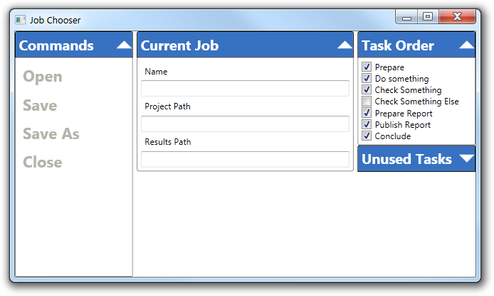
Here is screen shot of the prototype – it is pretty close to the mock up.
I started off with the Expander Control Template example on MSDN. This wasn’t a bad start – it showed me how to change expander toggle button – nice.
But, I also needed to change the font used in the expander header. That wasn’t shown in the example. Ok, no problem – just use a setter in the style like this - right?
     <Style x:Key="MainViewExpander" TargetType="Expander">
        <Setter Property="FontSize" Value="18" />
        <Setter Property="FontWeight" Value="Bold" />
        <Setter Property="Template">
            <Setter.Value>
                <ControlTemplate TargetType="Expander">
 Bzzzztttt… wrong. That set the font appearance in the Expander header like I wanted, but all the controls in the Expander content property inherited the font appearance. That’s not what I wanted at all.
I needed to style the appearance of the Expander header and its contents separately.
So, i dug around in MSDN a little more. The key information turned out to be in the documentation for the Headered Content Control class.
This is an important class as it defines the base functionality for controls including the Expander, Group Box and TabItem controls – all very commonly used controls.
They key to getting the look I wanted is using Data Templates. I’ve seen this used in many MSDN examples and WPF blog posts but until now, I never really understood them.
In short, data templates are like control templates but instead of defining how WPF structures the visual tree for a control, data template defines how WPF displays data.
We’ll, you might say “Duh Richard!” That’s what the docs say…. Ya, Duh! For sure… I didn’t grok exactly what this meant until now: they key for me was finally understanding that the data template is bound to the data it is intended to display.
All data template intentions are bound to a property on an object instance. You can refer to this binding by using the simple most binding which is "{Binding}". You can see how this is used below.
The key is that all Headered Content Controls have a data template for the header content. So, setting the font appearance for the Expander header was a simple matter of adding this setter to my style
         <Setter Property="HeaderTemplate">
            <Setter.Value>
                <DataTemplate>
                    <TextBlock
                        Text="{Binding }"
                        FontSize="18"
                        FontWeight="Bold"
                        Foreground="White"
                        />
                </DataTemplate>
            </Setter.Value>
        </Setter>
This worked great! As you can see in the screen shot at the beginning of the post, I set the text appearance to the white, 18 size bold text I wanted. Most importantly, the appearance of the content was not affected by the header’s appearance.
Now, in one case, I do want to determine the font appearance of all the children in an Expander’s content property. As you can seen in the screen shot, the commands are in a larger, bold font style.
To accomplish this, I simply created a style derived from the main expander style -like this:
     <Style x:Key="MainViewExpanderCommands"
           BasedOn="{StaticResource MainViewExpander}"
           TargetType="Expander"
           >
        <Setter Property="FontSize" Value="20" />
        <Setter Property="FontWeight" Value="Bold" />
    </Style>
Then, in the MainView.xaml file, I used the derived style like this:
         <Expander
            Header="Commands"
            Grid.Column="0"
            IsExpanded="True"
            Style ="{StaticResource
MainViewExpanderCommands}"
            >
            <StackPanel>
                <Label Content="Open"    Foreground="#FFB4B4A9" />
                <Label Content="Save"    Foreground="#FFB4B4A9"/>
                <Label Content="Save As" Foreground="#FFB4B4A9"/>
                <Label Content="Close"   Foreground="#FFB4B4A9"/>
            </StackPanel>
        </Expander>
This worked fine – mostly. If you look, you will see that each of the labels has the foreground set to a grey color. I tried to do this in the derived style, bit alas, this didn’t work because the the intervening stack panel (which is the content for the expander) does not have the foreground property, so it is not inherited.
Here is the source code download
This code builds with the release candidate version of Visual Studio 2010. It does not need any additional components (like NUnit).
Installing and building the project is easy: Just download and run the installer. It will put the project on your desktop. Note, it doesn’t really ‘install’ anything – there are no shortcuts and it doesn’t write to the registry. You can move the sample directory wherever you would like, or just delete it when you are done. No un-installing is needed. The contents are licensed with the Microsoft Public License.
Credit – I’d like to thank Josh Smith for his excellent examples of using the MVVM design pattern. All my new WPF projects are MVVM and I learned the ropes from his blog posts. The MVVM classes in this example are inspired by Josh’s MSDN article here. I’m still a noob with both WPF and MVVM – the learning curve is very steep, and long. But Josh’s blog and articles have been hugely helpful (as have many others…)
