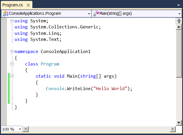
Visual Studio 2010 New Editor screenshot
I’m very happy with how the Visual Studio editor improved since Beta1:

This is all WPF and includes the WPF 4.0 text rendering changes (DWrite integration). Note the new Zoom combobox in the bottom-left (which is the visual counterpart of Ctrl+ScrollWheel). Also the cross to close the tab is now located ON the tab, and not on the rightmost edge of the document. It takes about a day to get used to, but after you get used to it, it’s really awesome.
I believe that the editor team has done a phenomenal job making the editor better for all of us. Note that although the screenshot was made from a remote desktop to a virtual machine, it still looks much better than in Beta1. And believe me, it is way faster and more reliable now.
I’m very excited for Beta2 and can’t wait to get the bits out for you to play with!
Comments
Anonymous
September 30, 2009
I can't wait to play with the beta 2 bits. Been itching for them for a while now. I'm giving a VS2010 extensions talk oct 24th and am really hoping to have beta2 to demonstrate.Anonymous
September 30, 2009
I don't suppose there's any ballpark for when Beta 2 (or RTM) would be is there?Anonymous
September 30, 2009
Unfortunately not. We're not allowed to say. But it will be this fall, and quite soon!Anonymous
September 30, 2009
Middle-click closes a tab. So the close cross being where ever never bothered me much. Trick works for most other applications as well.Anonymous
September 30, 2009
Brennan: interesting! Now that you tell me, I realize I knew about this before, but somehow didn't use. It sort of escaped my attention. But I'll try to use it this time! Thanks!Anonymous
September 30, 2009
Will this control avaliable as standalone assembly?Anonymous
October 01, 2009
Wow, that text is ugly. I hope I don't have to work with that all day. If I do I'll stick with 2008. It all looks a bit amateurish, from the poor text rendering quality to the poor alignment of lines and dodgy icons.Anonymous
October 01, 2009
Denis: yes. Anonymous: can you please give Beta2 a try once it's out and log a bug at MS Connect if you still don't like it? We really want to get it right for you. Thanks!Anonymous
October 01, 2009
Why would it take a day to get used to the cross being on the tab, when this is what browsers and other IDEs have done for ages? :) (It's always been annoying to me that it's been in the "wrong" place, so it's good to hear it's been improved.) I'm not sure that the zoom level is really important enough to be worthy of a permanent place on my editor screen though... really, how often do people change their zoom level?Anonymous
October 01, 2009
Also, when you're viewing this picture, make sure that the browser is set to 100% :)Anonymous
October 02, 2009
I hope you do sort it out and it would be nice to think that this is wanted. However, given the track record on the quality of on-screen type in WPF and Silverlight I won't hold my breath.Anonymous
October 02, 2009
Hi Kirill, the editor looks really awesome. I can't wait until beta 2 is out. So the first thing would be to acualize my WPF book and put in the new features of VS2010, and then to finish my book about Silverlight 4.0. Will there be integrated Silverlight Support in Visual Studio 2010, or do we still need to install the tools via separate download? ThomasAnonymous
October 02, 2009
The comment has been removedAnonymous
October 03, 2009
Would've looked even better if the top of the zoom combobox had been aligned with the scrollbar... ;)Anonymous
October 07, 2009
jalf: Thanks, I filed a bug on the Zoom combobox sizing, now let's see what the editor team says :) http://blogs.msdn.com/vseditor <-- make sure to give them your feedback, they are more willing to fix bugs if they know that it is a real customer complaint, not just some random kirill tester guy :)Anonymous
October 13, 2009
Вот интересно, вы пишете какой крутой редактор, как много новых суперфич. А хочется хотябы одного БАГФИКСА - нормальных шрифтов БЕЗ галимого сглаживания. Пока не будет пофиксено, 10-ой студии нет места на моем компе.Anonymous
October 13, 2009
Понял.Anonymous
November 05, 2009
I prefer to have the close cross outside of the tabs. When in the tabs, it widens them, each tab consuming more place than it should in the total horizontal space. I'd prefer to have an option for having the cross on the right hand-side of the editor, or hidden. I use middle-click anyway when I don't use CTRL+F4. I understand why it's on tabs by default. It seems some people like it this way. But please, give us an option. We need to save space.