Control Styling Tips: Slider
Hello!
In this article, I’d like to provide you with some information and tips that you’ll find useful when styling a Silverlight 3 Slider.
Visual states. CommonStates (Normal, MouseOver and Disabled) and FocusStates (Unfocused and Focused) and the following template parts:
Used when the Slider is oriented horizontally:
HorizontalTemplate (FrameworkElement)
HorizontalThumb (Thumb)
HorizontalTrackLargeChangeDecreaseRepeatButton (RepeatButton)
HorizontalTrackLargeChangeIncreaseRepeatButton (RepeatButton)
Used when the Slider is oriented vertically:
VerticalTemplate (FrameworkElement)
VerticalThumb (Thumb)
VerticalTrackLargeChangeDecreaseRepeatButton (RepeatButton)
VerticalTrackLargeChangeIncreaseRepeatButton (RepeatButton)
Template binding. Try template binding Background, BorderBrush, Foreground, BorderThickness or Padding.
Slider tips.
- There are two sets of parts, named with Horizontal- and Vertical- prefixes, each set appropriate for the horizontal or vertical orientation of a Slider, respectively.
- The Template part (either Horizontal, Vertical or both) is mandatory and its purpose is to contain all the elements that make up the Slider in a particular orientation. Create a Grid named HorizontalTemplate (or VerticalTemplate) that has three columns (or three rows) sized Auto, Auto and Star.
- The space in which the thumb moves is called the track. The track is not a part and it is optional. Place the object(s) representing the track into the Template part, spanning all three columns/rows.
- The Thumb part is mandatory. Make the object(s) representing the thumb into a Thumb control and name it HorizontalThumb (or VerticalThumb). Place the Thumb part in the middle column/row of the Template part and give it a Width and Height so that the column/row will size to fit it.
- So that the user can click on the track either side of the thumb to move it in large increments, place a RepeatButton in the two columns/rows either side of the Thumb part and name them VerticalLargeDecrease and VerticalLargeIncrease (or HorizontalLargeDecrease and HorizontalLargeIncrease). So that the RepeatButtons function but are not seen, give them zero Opacity. Alternatively, apply a template to the RepeatButtons that contains a single object with zero Opacity.
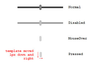
Make Into Control. A visual designer has comped out some Slider states together with the MouseOver and Pressed states of the HorizontalThumb part:

The comp artwork is then imported into Blend 3. Here’s the XAML for the Normal state. Note, this XAML is not yet a styled Slider, it is still just artwork consisting of Panels and Shapes.
The comp artwork is then imported into Blend 3. Here’s the XAML for the Normal state. Note, this XAML is not yet a styled Slider, it is still just artwork consisting of Panels and Shapes.
<Grid Width="146" Height="17" >
<Rectangle x:Name="track" Fill="#FF3D3D3D" StrokeThickness="0" Margin="0,6" />
<Rectangle x:Name="thumb" Fill="Gray" RadiusX="3" RadiusY="3" Width="7"/>
</Grid>
Practice making the artwork into a Slider with the following steps.
- Paste the XAML into a new Silverlight 3 Application project.
- Select [Grid] and click Tools > Make Into Control > Slider > OK. In this step, Blend removed [Grid] (and everything inside it) and put a new Slider in its place. Next, it turned [Grid] into the template of a new Slider style and applied that new style to the new Slider.
- Click the blue ruler above [Grid] to add new column dividers as shown:

- By drawing the column dividers as shown, the parts will be in the correct columns. track has a ColumnSpan of 3, and thumb is in Column 1.
- Let’s make the root of the template into the HorizontalTemplate part. Select [Grid] and click Tools > Make Into Part of Slider > HorizontalTemplate. [Grid] has been named HorizontalTemplate.
- Select thumb and click Tools > Make Into Part of Slider > HorizontalThumb > OK.
- Now to make the states look like those in the visual designer’s comp. Ensure the States panel is open and select the MouseOver state. Set thumb’s Fill to LightGray.
- You can make the same change to Pressed, or you can copy the MouseOver state to Pressed. With MouseOver still selected, click Tools > Copy State To > Pressed.
- Select the Pressed state. To offset the template to look like it does in the comp, select [Grid] and set RenderTransform.Translate.X and .Y to 1.
- Click the ‘Add transition’ button on the Normal state and click Normal -> MouseOver. Set the transition’s duration to 0.2 seconds.
- Return scope to SliderStyle1 (Slider template) .
- Select HorizontalThumb and Reset Margin.
- Select HorizontalTemplate and, in the Parts panel, double-click HorizontalTrackLargeChangeDecreaseRepeatButton to create that part as a child of HorizontalTemplate. Set the new part’s Opacity to 0.
- Select HorizontalTemplate and, in the Parts panel, double-click HorizontalTrackLargeChangeIncreaseRepeatButton. Set the new part’s Opacity to 0.
- Set the Widths of the three columns of HorizontalTemplate to Auto sized, Auto sized and Star sized. To set the middle column’s MinWidth correctly, either reset MinWidth or drag the rightmost column divider up snug against HorizontalThumb.

- Select the Disabled state. Select HorizontalTemplate and set its Opacity to 50.
- Build and run your application and test your Slider.
You should now have a working PasswordBox!
- Steve
Comments
- Anonymous
January 20, 2010
The last word of the article has a typo: "PasswordBox" should be "Slider". Carl.