Common Styling Tips: CheckBox
Hello!
In this article, I’d like to provide you with some information and tips that you’ll find useful when styling a Silverlight 3 CheckBox.
Visual states. CommonStates (Normal, MouseOver, Pressed and Disabled), CheckStates (Unchecked, Checked and Indeterminate), FocusStates (Unfocused and Focused) and ValidationStates (Valid, InvalidUnfocused and InvalidFocused).
Template parts. None.
Template binding. Try template binding Background, BorderBrush, Foreground, BorderThickness or Padding.
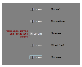
Make Into Control. A visual designer has comped out some CheckBox states.

The comp artwork is then imported into Blend 3. Here’s the XAML for the Normal state. Note, this XAML is not yet a styled CheckBox, it is still just artwork consisting of Panels and Shapes and text.
<Grid>
<Rectangle Stroke="#FF333333" Height="12" Width="12" HorizontalAlignment="Left" Fill="Transparent"/>
<Path x:Name="check" Height="8" Width="8" Fill="White" Stretch="Fill" Data="M14.820313,6.2333984 C14.90267,6.2333984 14.943848,6.2620444 14.943848,6.3193359 C14.943848,6.3730469 14.90267,6.4375 14.820313,6.5126953 C14.104166,7.1500649 13.353109,8.0613613 12.567139,9.246582 C11.781168,10.431804 11.117838,11.69043 10.577148,13.022461 C10.373047,13.520183 10.230713,13.825439 10.150146,13.938232 C10.06958,14.051025 9.8180342,14.107422 9.3955078,14.107422 C9.119792,14.107422 8.9470215,14.080566 8.8771973,14.026855 C8.807373,13.973145 8.6811523,13.80306 8.4985352,13.516602 C8.1834307,13.040364 7.8450522,12.610677 7.4833984,12.227539 C7.2936196,12.027019 7.1987305,11.873047 7.1987305,11.765625 C7.1987305,11.615234 7.3043618,11.467529 7.515625,11.32251 C7.7268882,11.17749 7.9005532,11.10498 8.0366211,11.10498 C8.2263994,11.10498 8.4546709,11.211507 8.7214355,11.424561 C8.9882002,11.637614 9.2719727,12.005534 9.5727539,12.52832 C9.9021807,11.776367 10.255778,11.057536 10.633545,10.371826 C11.011312,9.6861172 11.400717,9.0532227 11.801758,8.4731445 C12.274414,7.7928061 12.646811,7.3022461 12.918945,7.0014648 C13.0944,6.8081055 13.259115,6.6487632 13.413086,6.5234375 C13.502604,6.4518228 13.644043,6.3981118 13.837402,6.3623047 C14.306479,6.2763672 14.634115,6.2333984 14.820313,6.2333984 z" HorizontalAlignment="Left" Margin="2,2,0,2"/>
<TextBlock Foreground="White" Text="Lorem" Margin="15,0,0,0" VerticalAlignment="Center"/>
</Grid>
Practice making the artwork into a CheckBox with the following steps.
- Paste the XAML into a new Silverlight 3 Application project, inside a container with a Gray background.
- Select [Grid] and click Tools > Make Into Control > CheckBox > OK. Blend has done a lot of work in this one step. First, Blend removed the Grid (and everything inside it) and put a new CheckBox in its place. Next, it turned the Grid into the template of a new CheckBox style and applied that new style to the new CheckBox. The TextBlock in the Grid had a White foreground, so the new CheckBox style has a White foreground too. The TextBlock’s text was ‘Lorem’ so that becomes the content of the new CheckBox. And, in the template, the TextBlock has been replaced with a ContentPresenter that has the same layout properties as the TextBlock had.
- Now to make the template’s states look like those in the visual designer’s comp. Ensure the States panel is open and select the MouseOver state. Select [Rectangle] ’s Fill property and set the A (Alpha) value to 25. Note that the Rectangle now has a name: rectangle.
- You can make the same change to Pressed, or you can copy the MouseOver state to Pressed. With MouseOver still selected, click Tools > Copy State To > Pressed.
- Select the Pressed state. To offset the template to look like it does in the comp, select [Grid] and set RenderTransform.Translate.X and .Y to 1. Note that the Grid now has a name: grid.
- Select the Disabled state. Select grid and set its Opacity to 50.
- To give some life to the MouseOver state, click the ‘Add transition’ button on the Normal state and click Normal -> MouseOver. Set the transition’s duration to 0.2 seconds. When we move the mouse onto the CheckBox, the transition from Normal to MouseOver will take 0.2s. All other transitions, including the transition back to Normal when the mouse is moved away, and the transition from Pressed to MouseOver when the mouse button is released after a click, will happen instantly. Instant transitions are the default, and that’s what we want in all these other cases.
- Select Base and set check’s Opacity to 0. Select the Checked state and set check’s Opacity to 100.
- The visual designer drew a light blue rounded rectangle in the Focused state. But the rectangle is not present in the XAML of the Normal state so we’ll need to draw it into the template now. Creating a new object with a state selected is called ‘drawing into state’ and it means that the new object is only visible in the state you drew it into. This is a useful feature that we can make use of now. Select Focused, select grid, and double-click the Rectangle tool to create one default-sized.
- We now want to change the size and color of the new rectangle (rectangle1) but we want those changes to be made to Base and not to the Focused state. We can’t select Base because the Rectangle is transparent in Base so we won’t see the changes we’re making. So, instead, click the ‘Turn off record mode’ button on the Focused state (or click Ctrl+R). Now change rectangle1’s Margin to Left:-2, Right:-2, Top:0, Bottom:0, set its Fill to No brush, its Stroke color to LightBlue and its RadiusX and RadiusY to 2.
- Return scope to [UserControl] . Copy-Paste the CheckBox a couple of times and set one copy’s IsEnabled to false. Build and run your application and test your states.
You should now have a working CheckBox!
- Steve
Comments
- Anonymous
October 15, 2009
The "comp" Xaml from the visual designer - is that an example of the Xaml export from Adobe Illustrator? Or Design? Thanks