Exploring Microsoft Pivot, Live Labs’ Latest Creation
Microsoft Pivot is a new tool from Live Labs. What is pivot? According to the web site:
Pivot makes it easier to interact with massive amounts of data in ways that are powerful, informative, and fun. We tried to step back and design an interaction model that accommodates the complexity and scale of information rather than the traditional structure of the Web.
Pivot is a name that conjures data and visualization, and that is exactly what the application does. It organizes and displays information in a far more intuitive way than even advanced image searches.
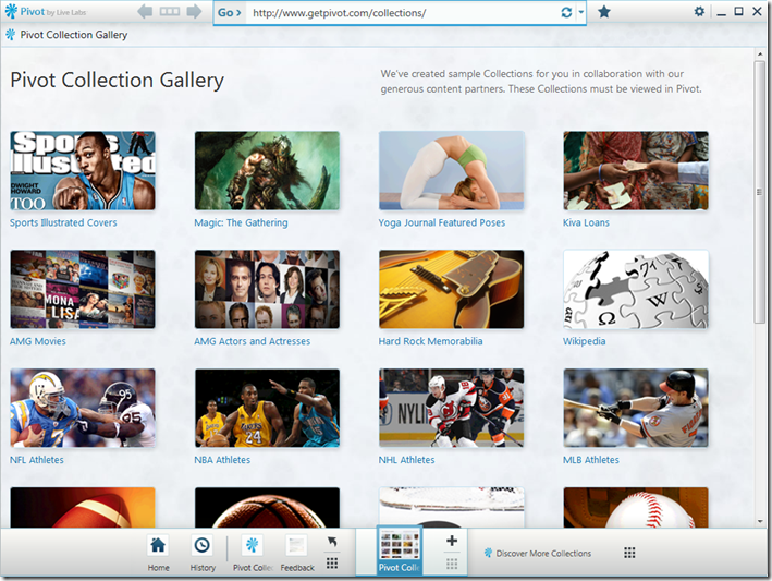
I downloaded and installed Pivot, and this is the first screen:
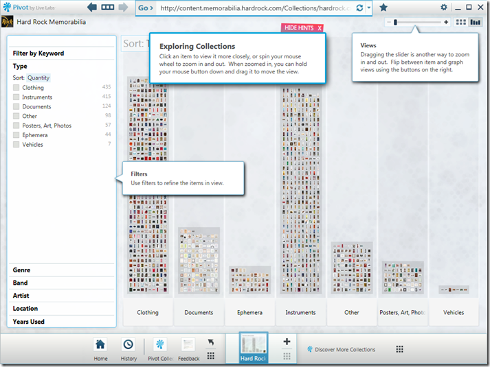
Here we see a bunch of sample collections of data, created by Microsoft’s network of content partners. I’ll drill into Hard Rock Memorabilia, seeing as I am a guitar addict:
This is a great way to visualize a huge amount of data. Imagine sifting through all of this memorabilia in a linear fashion, with no context. It would be quite an adventure. There are a number of ways to navigate this huge collection of images.
Features
Views.
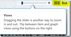
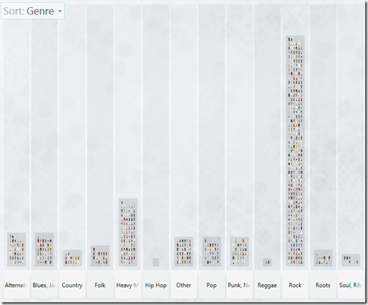
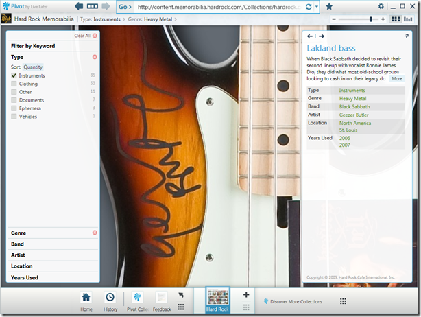
You can view collections either as a giant set of images (Grid View) or as a collection of bars as shown in the screenshot above, which categorizes groups of images into categories (which can then be sub-categorized, so you can have multiple levels of views). For example, if I click on Instruments, that brings me to another view (shown below) which shows me different categories of instruments. In the screenshot below, the instruments are categorized by genre. This sub-view (and all other levels of view) can be shown either as a grid or graph.Filters.
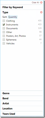 Filters allow you to look at only the items you are interested in. I’m assuming that the filter choices come from some kind of metadata definition for the collection. In this case, you can filter on type (of memorabilia), genre, band, artist, location, and years used. Selecting/deselecting a filter automatically updates the content of the current view.
1.
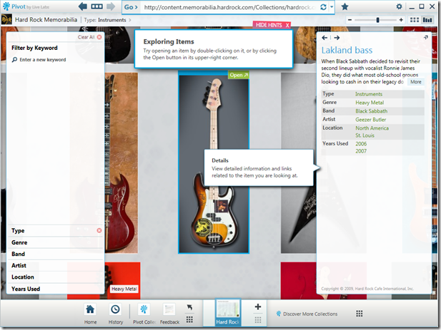
2. You can also filter by keyword, which is reminiscent of the Instant Search function found in Windows, Outlook, Zune, etc. Type just a few characters in the Filter box and see what your options are. Then apply the filter and again, the collection will change based on your criteria.
DeepZoom.
Take advantage of DeepZoom and Silverlight to get an up-close and personal look of every piece of information in the collection, similar to how the original Hard Rock Cafe DeepZoom Demo works. Double-clicking an item in the collection takes you to more details on the Hard Rock site.Breadcrumb and Forward/Back Navigation
It’s easy to navigate the collection once you get lost deep inside. Just use the intuitive forward/back arrows and breadcrumb navigation.Favorites and History
You can add different views to your favorites or to the quick list, and browse your history.
Wikipedia in Pivot
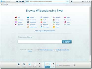
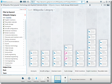
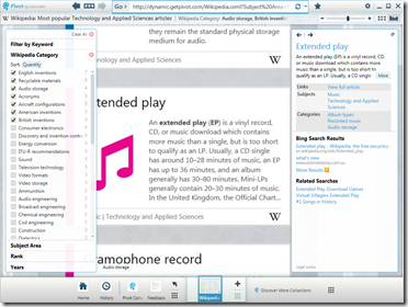
How might dictionary content look in Pivot? You can find out for yourself, or check out these screenshots of browsing Wikipedia with Pivot.
Conclusion
So far, I can see why Pivot is referred to as an experiment. I can see some potential uses for this technology, and they all involve dealing with the management of digital assets. Photographers. Forensic scientists. Animators. Geologists. But for now, it’s a really interesting way of visualizing data that is really rather intuitive!
Download it yourself and give it a try here.
