New Design for MSDN Newsletter
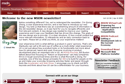
Yesterday we sent out our newly designed MSDN Developer Newsletter. Many of you have already sent your feedback on the new design. Thank you! As you probably noticed, the newsletter is in Beta format now, so we’ll review all your feedback and continue improving the newsletter design and content.
This is a significant milestone of our journey to provide you a great online experience. We want to help you connect with our Community Evangelism team and Microsoft at large. There are three major challenges we faced when re-designing the newsletter:
- MSDN newsletter in Canada has 55K subscribers including developers, architects, IT pros, and designers. How do we design for the mass audience with different needs and tastes?
- This newsletter is just part of the overall online experience, so how do we design it so that it remains connected (both visual and contextual) to other MSDN online properties such as MSDN blogs and the MSDN portal?
- This is our first major redesign in 5 years and there were many technical challenges we needed to overcome at the backend. More importantly, we want to make sure the new design still retains a sense of familiarity to regular newsletter readers.
Here, let me share with you our rationales for the new design and how we addressed the above challenges.
Structure: in order to design a more usable and useful newsletter for our many subscribers, we analyzed usage data of the old newsletter and conducted informal interviews with our readers.There was an overwhelming amount of information in the old design (6 pages long with content and links), so it was very hard for readers to navigate and find relevant information. In the new design, we limited the length of the newsletter to be 2 pages and presented content in a clear and easy to digest fashion.
Relevance: because the old design lacked a clear structure, it was hard to find relevant content. In the new design, we used peer review to pick out the relevant technical content and focused more on local content such as local event, news, and community activities near our readers.
Integration: from the new design, readers can connect to MSDN portal directly. The header of the newsletter mirrors the look and feel of the MSDN portal as well. In addition, readers can connect to one of the local Microsoft community blogs in the blog section.
Interaction: making the newsletter a two-way dialogue is our goal. In addition to making giving feedback easier, we added an interactive poll in the new design so that both our team and our readers can gain insights about the Canadian developer community on popular topics.
I hope this gives you some insights on why we re-designed the newsletter the way we did. However, we want you to be part of the journey as your experience matters. Feel free to share your feedback by commenting on this post or drop me an email (qixing.zheng at microsoft.com).
Technorati Tags: MSDN,newsletter,Canadian
Comments
- Anonymous
April 09, 2009
PingBack from http://price1000.co.cc/?p=1290
