How to Control the DataTemplateSelector in Windows Store Apps
I've been building SharePoint solutions for a while and now I get the opportunity to build a Windows Store App. One of the first challenges that I ran across is modifying the UI and tiles in a Windows Store app. To get this project started I fired up Visual Studio 2012 and selected the Grid App (XAML) project template.
Now you will have a basic Windows Store app that's based on the Grid App template that should look like this
The tiles shown above are ok but what if you want to change the look of some tiles based on data attributes in the data source? Here we will use the SampleDataSource that is part of this app template but you can use this concept with any data source. In this example I want to change the appearance of a few of the tiles to make them look as if they are disabled and I also want to prevent the tiles from being clickable. The first thing we're going to do is modify SampleDataSource.cs to add data values that will be used to disable some of the tiles. Scroll down around line 268 where the sample data exists and change "Item Title: 1" to "Missing Item". Feel free to change any of the other Title values to "Missing Item" for the purposes of this demo. Our code will be looking for any tiles with the Title of "Missing Item" and giving each of them the appearance of being disabled. Obviously you won't have multiple Title values being the same in your real data source. This is just a basic example of showing how to look at values in your data and use that as a way to change the appearance/behavior of your tiles.
Before we jump into the code sample I will preface this section with the fact that the code is not 100% mine and it is not production ready. There are no try/catch blocks to trap for errors and the like - which we would all use when we are writing production code. This is just quick, demo code and nothing more. With that said we will add a new class to GroupedItemsPage.xaml.cs which is going to do the bulk of the lifting. Our class is going to inherit from the DataTemplateSelector class which is what we need to eventually return to our Grid control in the XAML. Use the following code to create the new class:
  public class TileTemplateSelector : DataTemplateSelector
 {
 //These are public properties that will be used in the Resources section of the XAML.
 public DataTemplate Disabled250x250ItemTemplate { get; set; }
 public DataTemplate Standard250x250ItemTemplate { get; set; }

 protected override DataTemplate SelectTemplateCore(object item, DependencyObject container)
 {
 var currentFrame = Window.Current.Content as Frame;
 var currentPage = currentFrame.Content as Page;

 if (item != null && currentPage != null)
 {
 var data = item.ToString(); //Here we are getting the Title from the item and casting it as a string.

 if (!string.IsNullOrEmpty(data))
 {
 if (data.ToString() == "Missing Item") //Matching the right data value to return the DataTemplateSelector object.
 {
 var gridItem = container as GridViewItem;
 if (gridItem != null)
 {
 gridItem.IsHitTestVisible = false; //Disable the click event of the tile.
 }
 return Disabled250x250ItemTemplate; //Return the DataTemplateSelector for a disabled tile.
 }
 else
 {
 return Standard250x250ItemTemplate; //Return the DataTemplateSelector for a normal tile.
 }
 }
 else
 {
 return Standard250x250ItemTemplate; //In case of an error above return the DataTemplateSelector for a normal tile.
 }
 }
 return base.SelectTemplateCore(item, container);
 }
 }
Now open StandardStyles.xaml and scroll down around line 1645. The tiles are all using the style of "Standard250x250ItemTemplate". Copy the DataTemplate section of "Standard250x250ItemTemplate", paste the copied XAML directly below as a new DataTemplate section and rename it to "Disabled250x250ItemTemplate". For the end result you should have the following XAML pasted directly below the DataTemplate for "Standard250x250ItemTemplate". The style of the DataTemplate can be modified to fit your needs.
  <!-- Template to make the tile appear as disabled -->
 <DataTemplate x:Key="Disabled250x250ItemTemplate">
 <Grid HorizontalAlignment="Left" Width="250" Height="250" IsHitTestVisible="False" IsTapEnabled="False" Background="Black">
 <Border Background="Black">
 <Image Source="{Binding Image}" Stretch="UniformToFill" AutomationProperties.Name="{Binding Title}"/>
 </Border>
 <StackPanel VerticalAlignment="Bottom" Background="Black">
 <TextBlock Text="{Binding Title}" Foreground="Gray" Style="{StaticResource TitleTextStyle}" Height="60" Margin="15,0,15,0"/>
 <TextBlock Text="{Binding Subtitle}" Foreground="Gray" Style="{StaticResource CaptionTextStyle}" TextWrapping="NoWrap" Margin="15,0,15,10"/>
 </StackPanel>
 </Grid>
 </DataTemplate>
The next step is to modify GroupedItemsPage.xaml and wire all of this together to see the end result. Go ahead and add the following code to the <Page.Resources> section. This adds an instance of the custom DataTemplateSelector to the page:
<local:TileTemplateSelector x:Key="TileTemplateSelector" Disabled250x250ItemTemplate="{StaticResource Disabled250x250ItemTemplate}" Standard250x250ItemTemplate="{StaticResource Standard250x250ItemTemplate}" />
Finally we modify the horizontal Grid control on the page and add our DataTemplateSelector to the ItemTemplateSelector attribute. There should be an attribute named ItemTemplate already on the Grid control. You need to remove that attribute and replace it with the ItemTemplateSelector attribute as I've highlighted below. The end result should look like this (this is not the complete Grid control XAML but enough to give you an idea of what you should end up with).
 <!-- Horizontal scrolling grid used in most view states -->
 <GridView
 x:Name="itemGridView"
 AutomationProperties.AutomationId="ItemGridView"
 AutomationProperties.Name="Grouped Items"
 Grid.RowSpan="2"
 Padding="116,137,40,46"
 ItemsSource="{Binding Source={StaticResource groupedItemsViewSource}}"
 ItemTemplateSelector="{StaticResource TileTemplateSelector}"
 SelectionMode="None"
 IsSwipeEnabled="false"
 IsItemClickEnabled="True"
 ItemClick="ItemView_ItemClick">
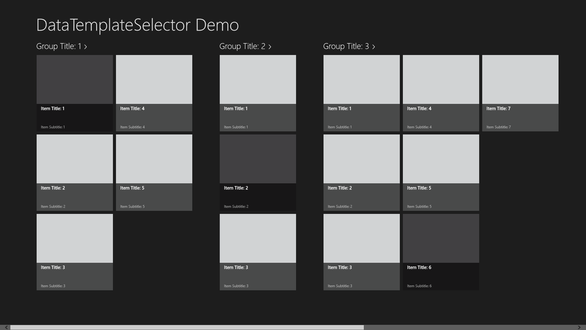
Now it's time to run the project and see the end result. You should have a screen similar to what I have in this screen shot below. I added the yellow border around the three tiles that have the new Disabled250x250ItemTemplate with MS Paint (yes this is a low budget effort) to show which tiles have picked up the new DataTemplate. The tiles have the appearance of being disabled and they aren't clickable.
Comments
- Anonymous
November 17, 2013
HiThis is great and very helpful What I am missing is how does it bind the the Title field, example may want to change to to the Subtitle field?


