What’s new with SSMS Plan Comparison Tool?
Cross post with https://aka.ms/sqlserverteam
With the SQL Server Management Studio February update, we released a new update for the Plan Comparison Tool. In case you missed it before, we introduced this tool inside SSMS back in October (CTP2.4), with which you can do offline comparison of execution plans, from SQL Server 2005 to the latest and greatest. You can learn more about how to start comparing your plans in the previous post here.
So what has changed since then? A lot in fact, and to address the feedback we got, we needed to go one step beyond the Comparison Tool itself. We made changes to the user experience even when you are viewing a single execution plan, which in turn improves plan comparison.
Beginning with overall plan viewing, improving usability even with a single plan:
We have improved the performance of opening large plans (large is not necessarily plan size in MB but in number of statements). Opening a plan with 85 statements took 1m 55s in SSMS 2014, and 29s in SSMS 1026 RC, in my test machine.
Then there’s improved “real-estate” usage and navigation:
Remember those larger plans where operators were placed at the end of long vertical lines, and you quickly lost track of what you were trying to look at? Because it’s said a picture is worth a thousand words, just look at the same plan below.
In SSMS 2016 RC

Whenever possible, the optimized operator placement will allow you to better navigate the plan.Still looking at large plans, wasn’t it painful to navigate using the scroll bars?
That’s right, mouse dragging is enabled. Open a plan and just click-and-hold your mouse button, and start dragging around. I personally have a hard time going back to a time I didn’t have this.Also, we enabled in-scope live zoom. If you have selected an operator in the plan, just press the CTRL key and use your mouse wheel to zoom in or out, while focused on the operator you selected.
I want to edit my query, how can I do that easily?
So far, you would probably click on the root node, open the Properties tab, click on the Statement and a new window pops up, where you copy the text to a new SSMS window for editing. That’s a lot of work…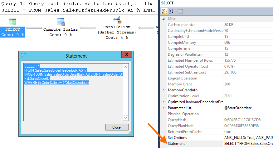
Or you would use the context menu option Edit Query Text that was introduced some time ago. Maybe you didn’t even notice it was there.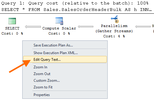
Now you have a button right next to your query. Click on it and start editing the query in a new window. Simple.
Moving to what is specific to the Plan Comparison Tool, using the same practical example in previous post.
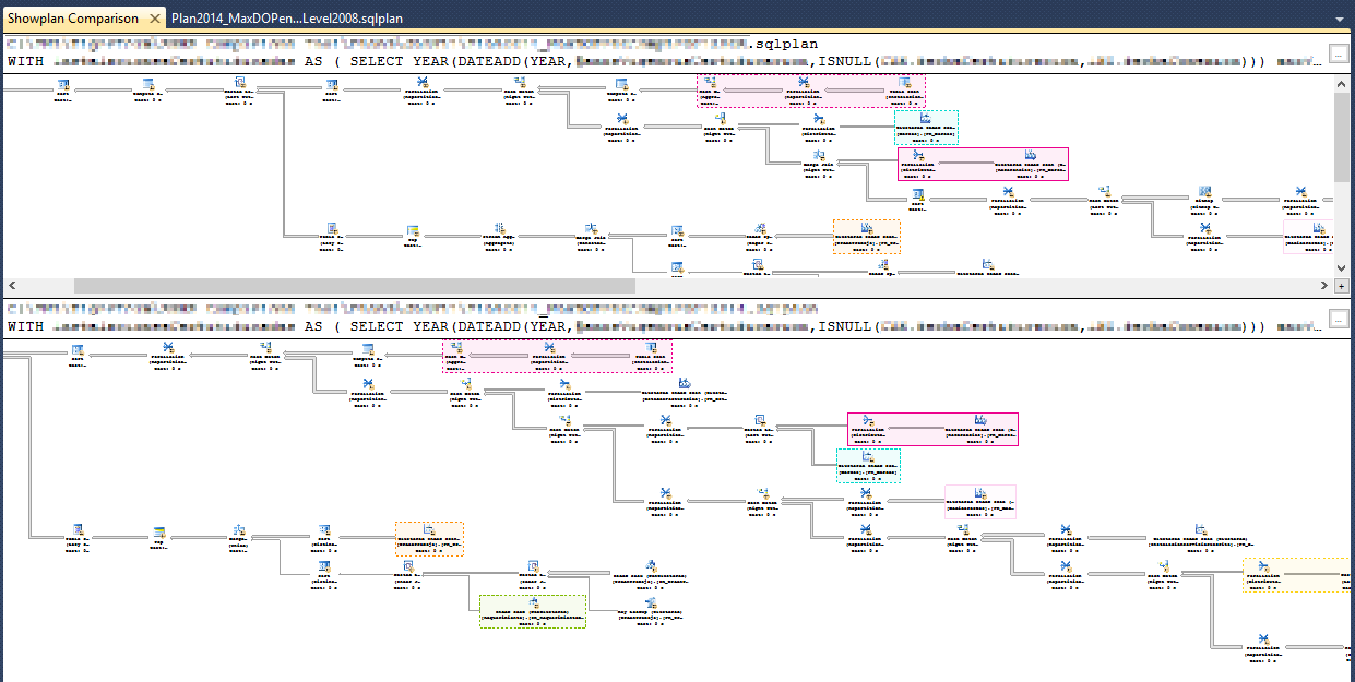
Same as before, when two showplans are compared, regions of the plan that do essentially the same thing are highlighted in the same color and boundary texture. But now we are highlighting the entire similar region/segment (which can still be a single operator though), as seen below, marked as 1.
Live zoom is simultaneous in both compared plan windows.
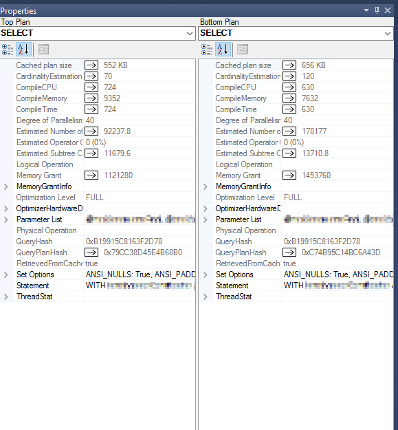
In the properties tab, which now opens by default when you compare plans, differences in property values between plans are highlighted with an arrow, making it easier to spot differences in a long list of properties, as seen below, marked as 2.
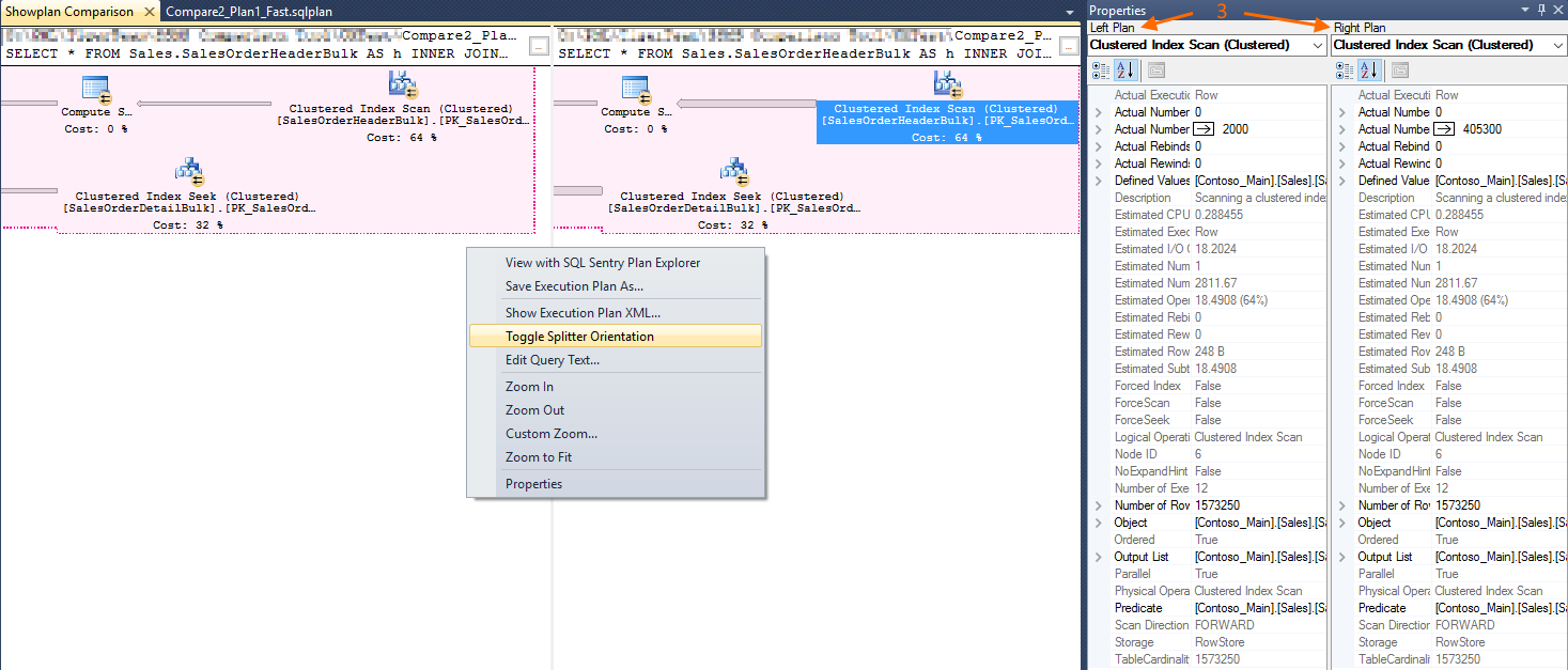
Also in the properties tab, each plan is now tagged with its position in the comparison window for better mapping of which plan is which. In the picture below, marked as 3.
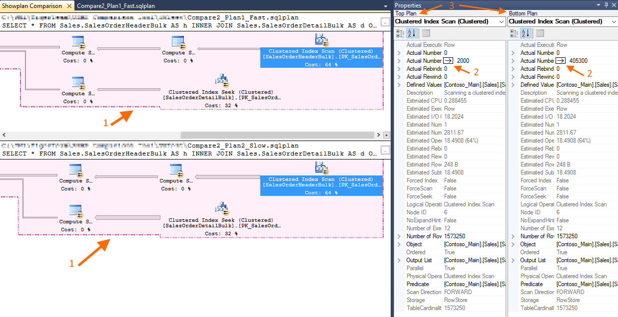
But if you right-click anywhere on a compared plan and choose to toggle the orientation, the tag changes accordingly. In the picture below, marked as 3.
Finishing up with a more complex example of similar regions/segments being highlighted and a wider set of plan differences:
There are a few more exciting improvements planned, several already in the making, which will be released in upcoming releases of SSMS.
All these and upcoming improvements would not be possible without user feedback, so keep it coming. Please use the comment section or better yet, the “Email Blog Author” on the right for that purpose – many thanks in advance for your feedback!
Pedro Lopes (@sqlpto) – Senior Program Manager


